Client |
Pinnacle Liquor Group |
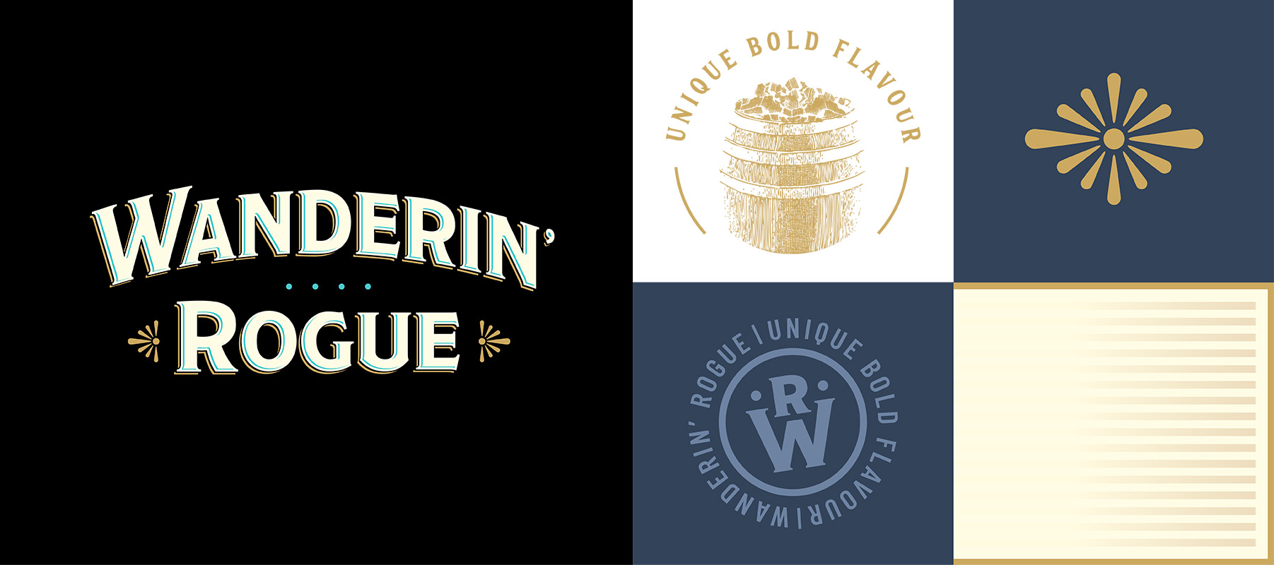
Capabilities |
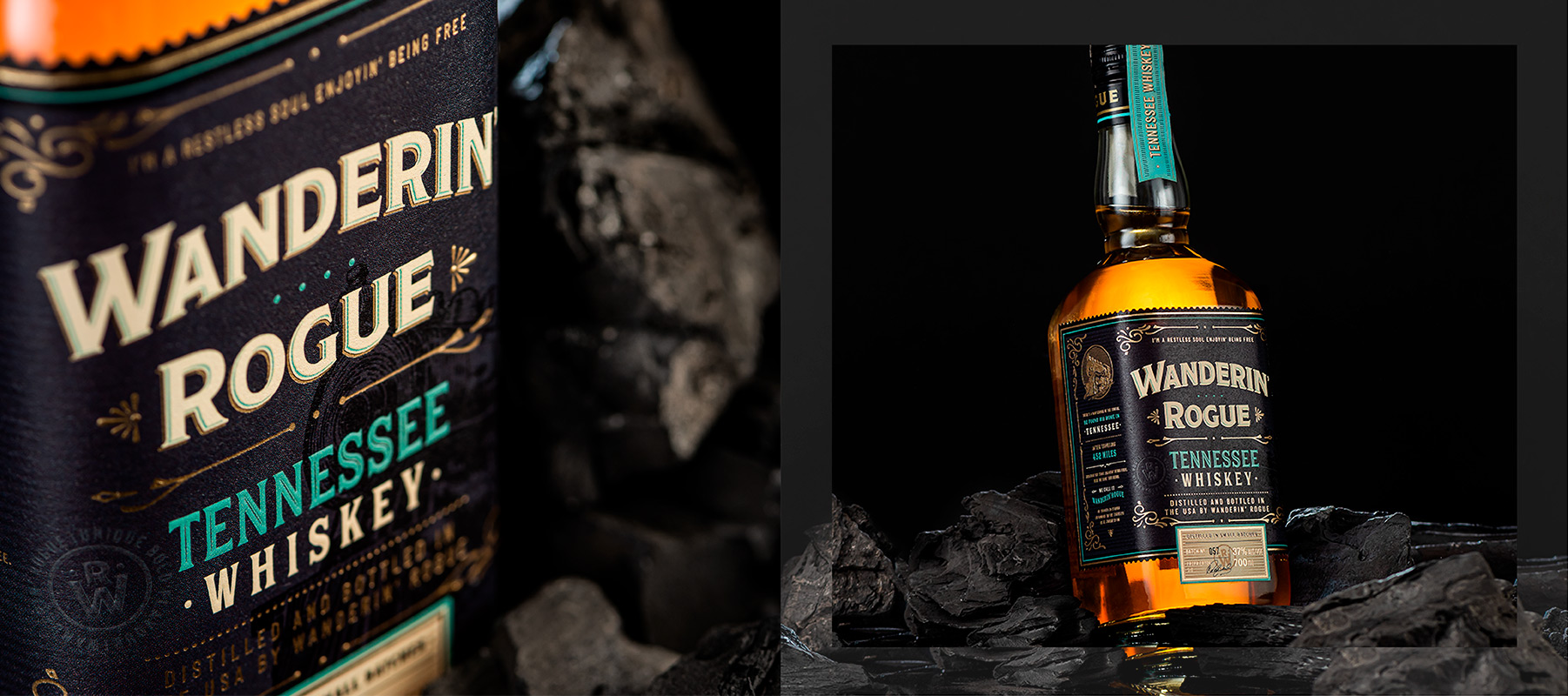
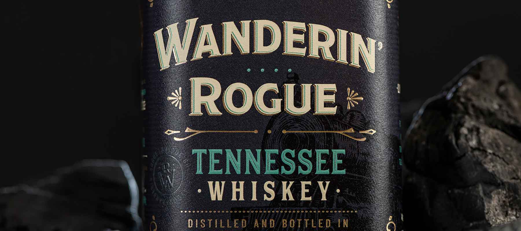
Brand Story |
We took a deep dive into the processes of whiskey making, from sour corn mash to the Lincoln County process, which includes filtration using sugar maple charcoal. We studied the geography, typography and history of the state of Tennessee and were inspired by the idea of a mysterious, free-spirited travelers who might roam the state of Tennessee on foot or by train.
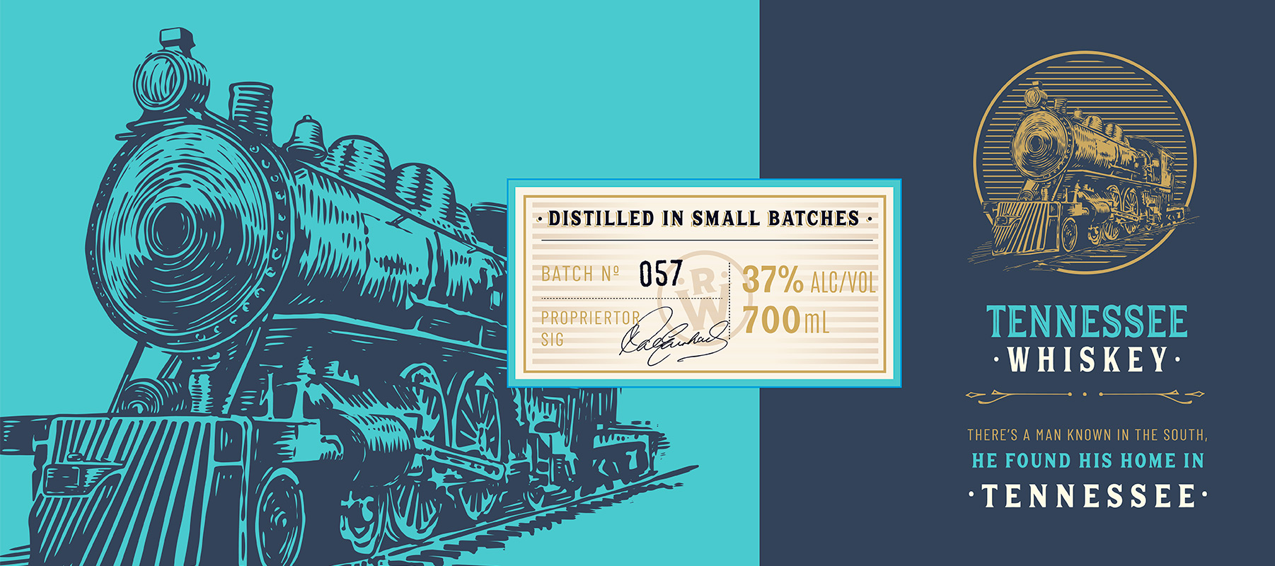
There’s a man known in the south
He found his home in Tennessee
After traveling 452 miles
Through the state
Enjoyin’ being free
Here we have this drink
We call it
Wanderin’ Rogue
Of quality so strong
as an honor to the traveler
as he travels on