Freshness That Stands Together
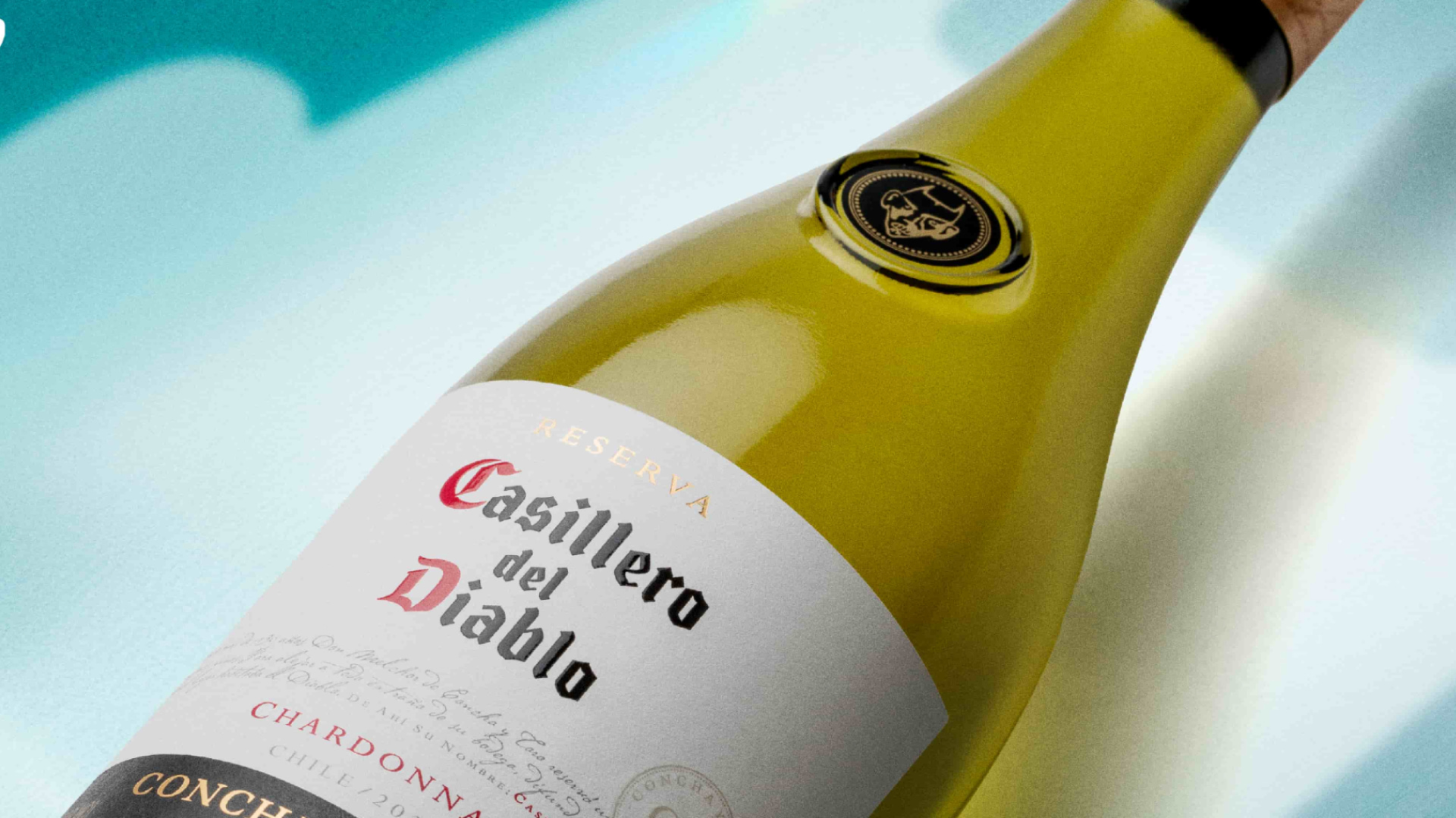
For the summer season in the UK, Casillero del Diablo and Diablo teamed up to strengthen the presence of its key white wine varietals through a modular key visual designed for print. The challenge was to create an image that could feel fresh, young, and eye-catching, while helping shoppers discover the breadth of the brand’s white wine offering.
A fresh summer opportunity
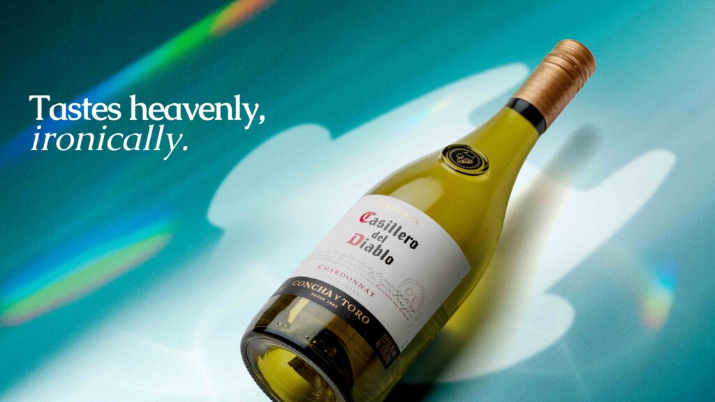
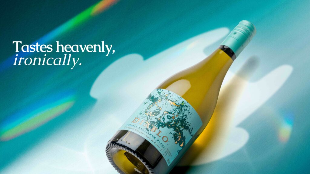
The creative approach focused on freshness, brightness, and modern appeal, moving Casillero del Diablo into a lighter seasonal territory without losing its bold brand character. The modular structure gave the KV flexibility across different print formats, while keeping the product at the center and creating a strong visual block for in-store visibility.
A brighter visual language
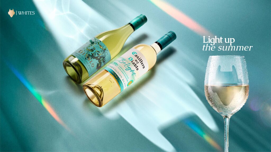
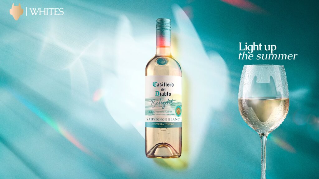
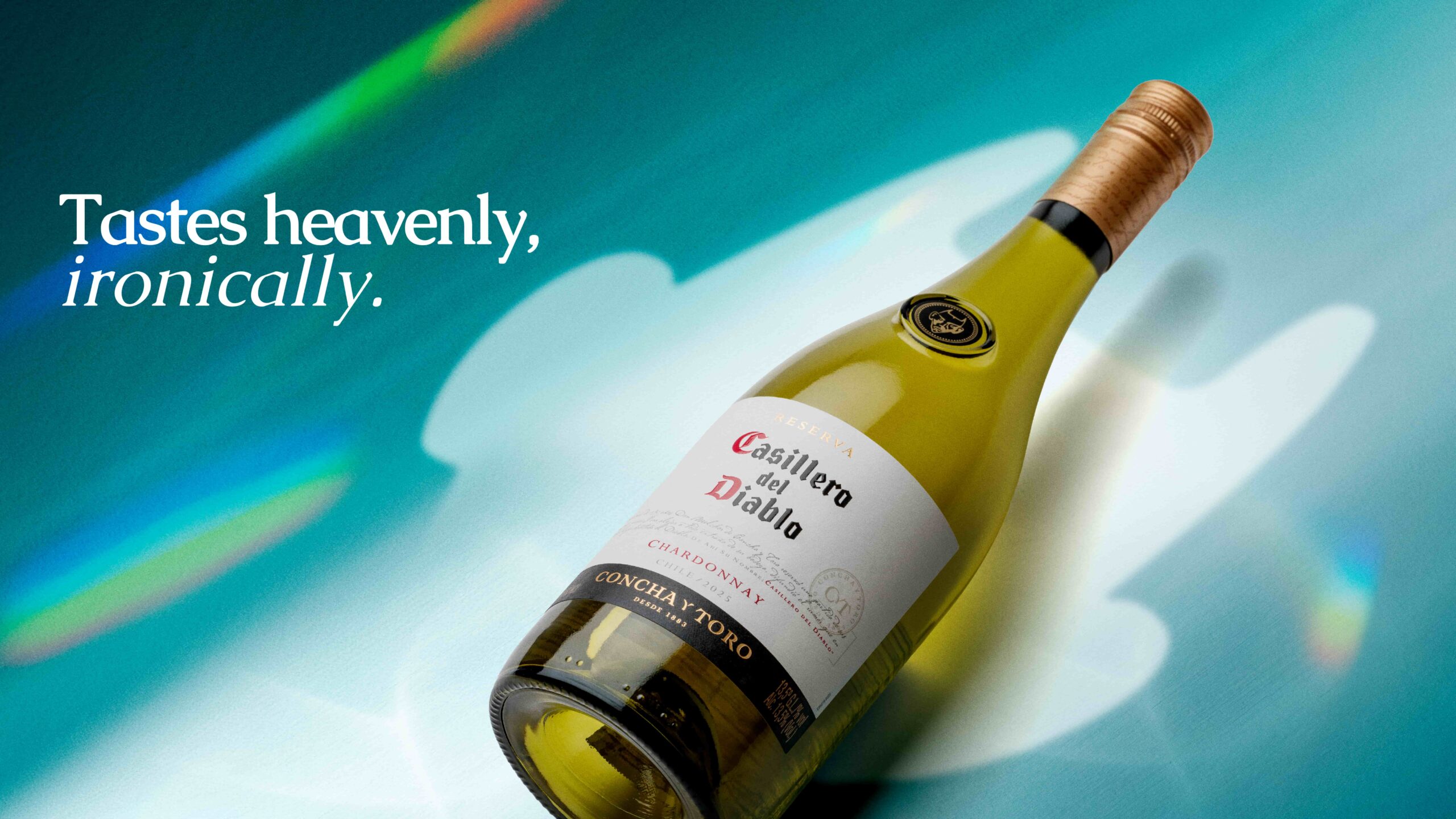
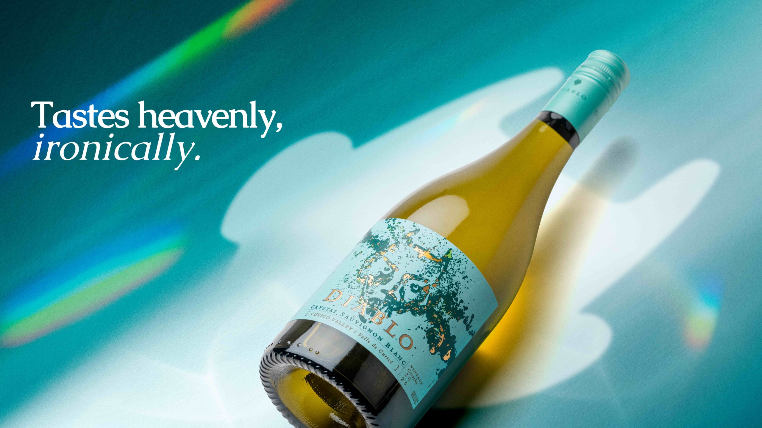
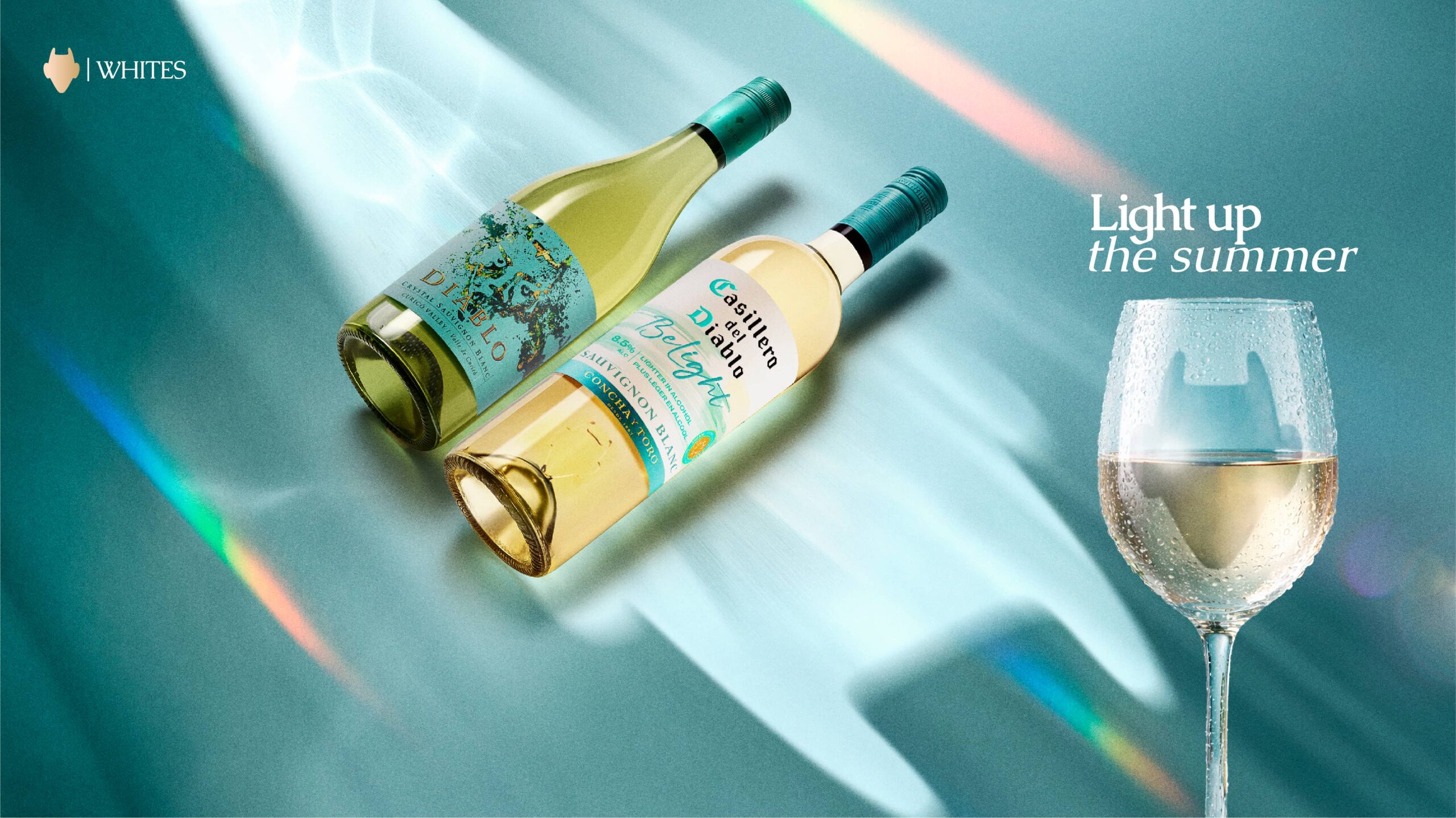
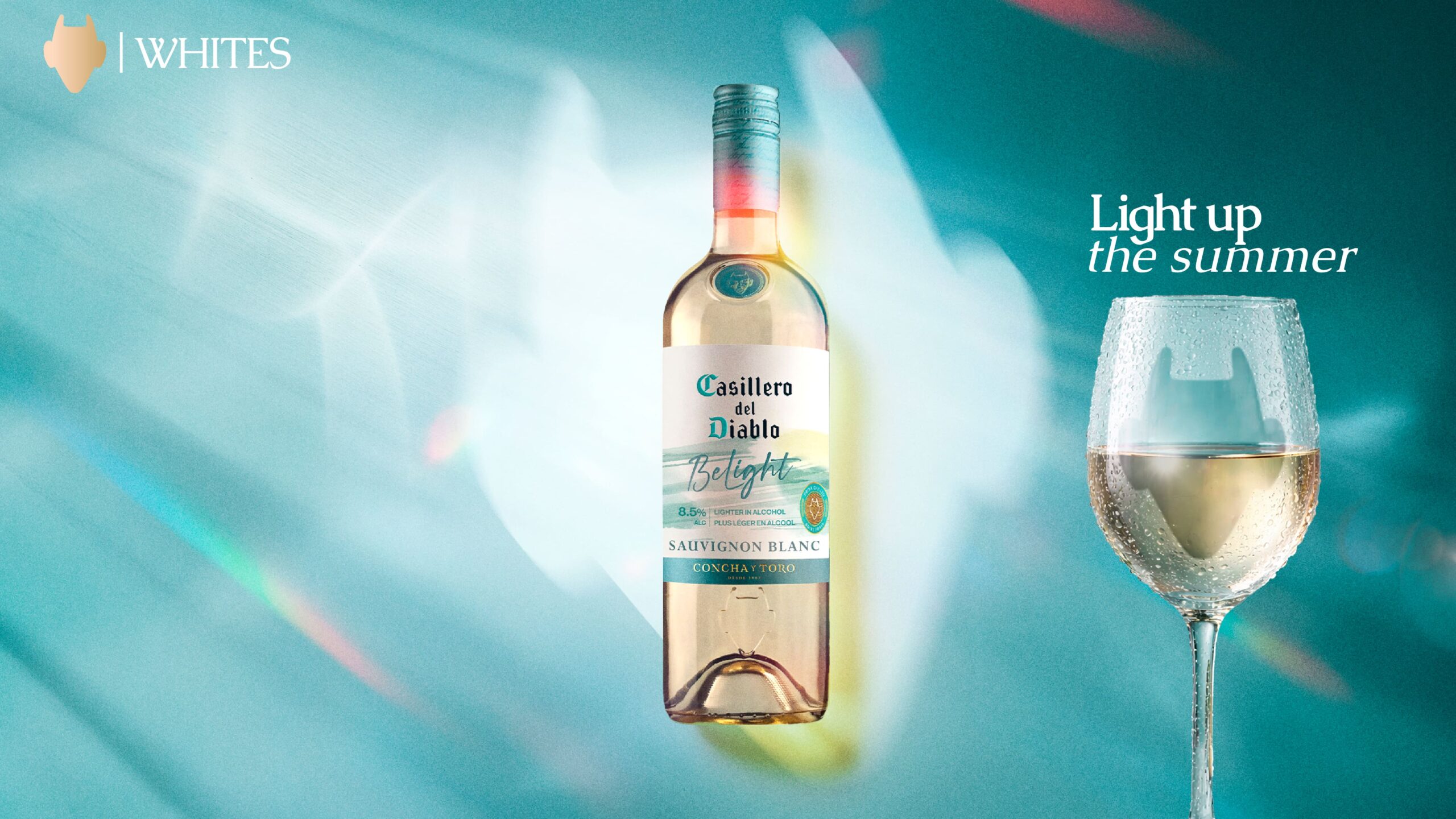
Rather than presenting each wine separately, the campaign brought the main white varietals together under one cohesive visual system, helping Casillero del Diablo differentiate its white wine portfolio in a competitive retail environment. By grouping the range in a way that felt vibrant, accessible, and relevant for the UK summer, the KV combined product clarity with a fresher visual expression designed to dazzle in gondola and make the wines easier to recognize, understand, and remember at shelf.