New Territory for a Classic Spirit
Osborne
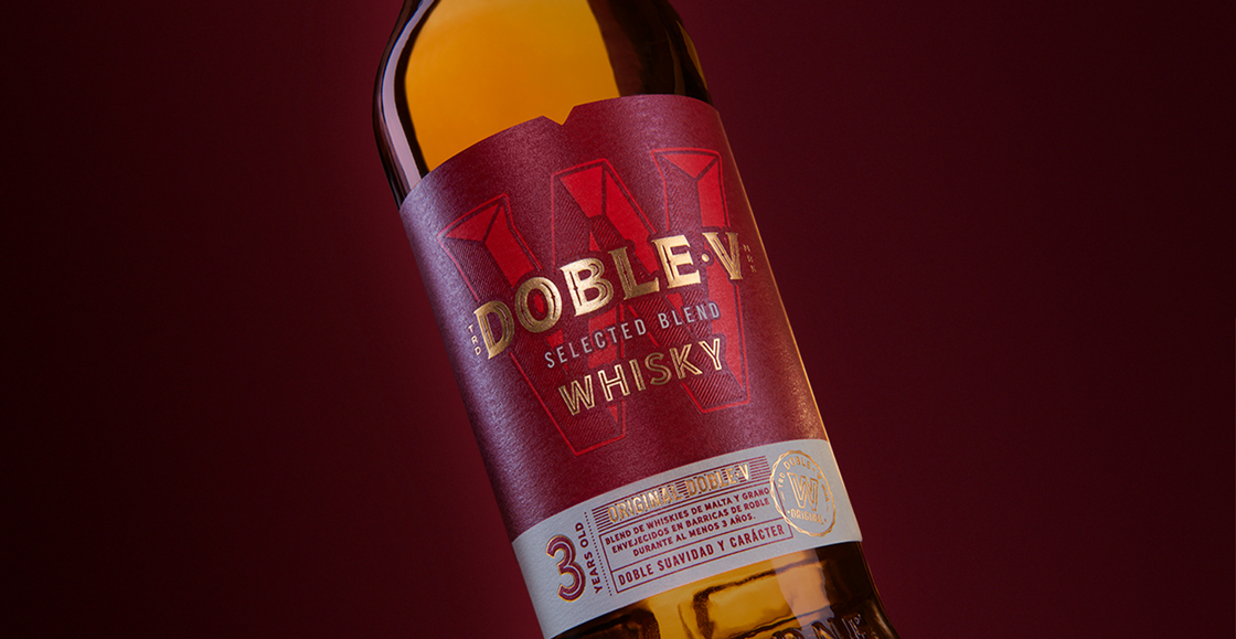
When the Spanish wine and spirits company Osborne added whisky Doble·V to their portfolio, they needed to reposition the brand to capture mid-Millennial whisky consumers- an audience already familiar with Scotch but largely unaware of Spanish whisky. The challenge was to discover how to make this unfamiliar origin feel compelling, contemporary, and culturally relevant. Osborne asked DAf to develop a full brand platform, including a manifesto, claim, packaging redesign, key visuals, social media content, and a comprehensive brand book.
Spanish whisky enters a Scotch-dominated mindset

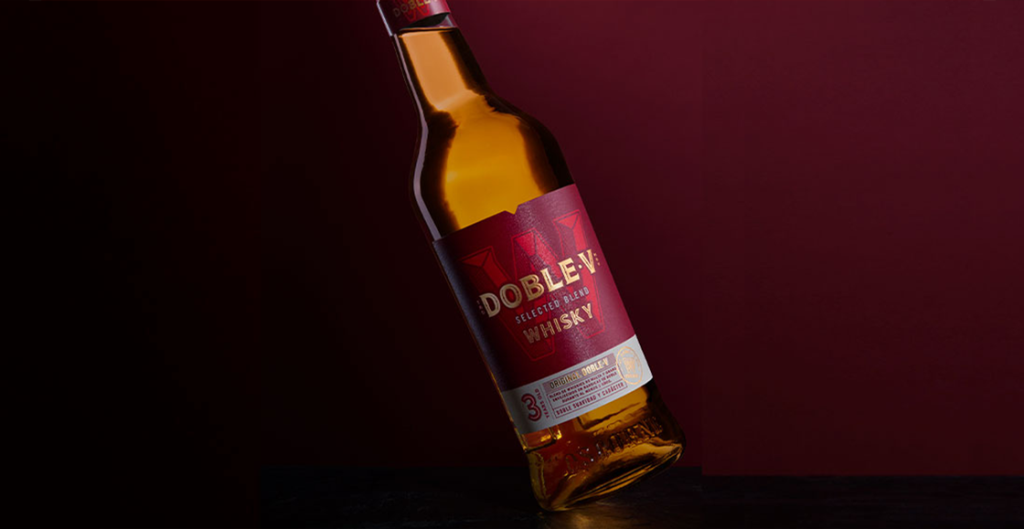
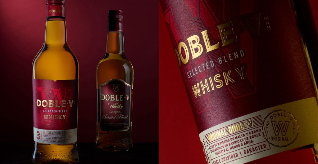
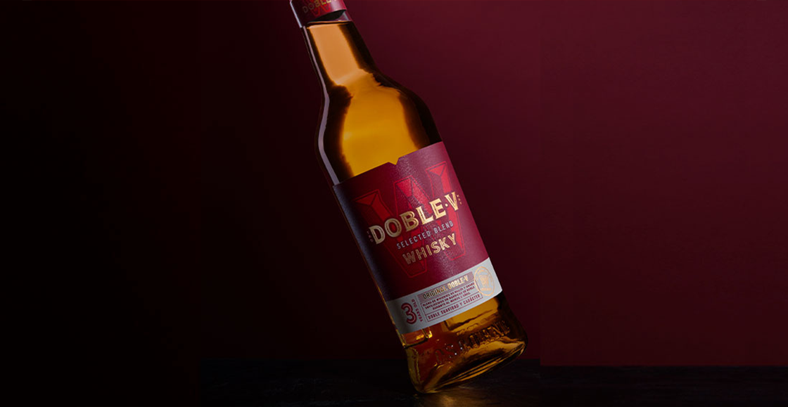
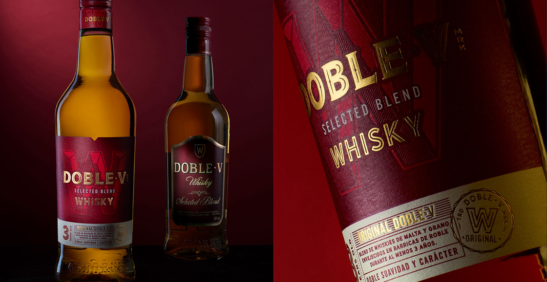
We redesigned Doble·V’s packaging with a cleaner, more modern aesthetic centered on the iconic ‘W,’ transforming it into a bold, recognizable symbol. This new visual language helped differentiate the brand from traditional whisky cues, signaling warmth, accessibility, and contemporary energy rather than heritage rigidity. The streamlined design and warm red palette created a distinctive shelf presence while reinforcing the brand’s approachable personality.
A recognizable symbol




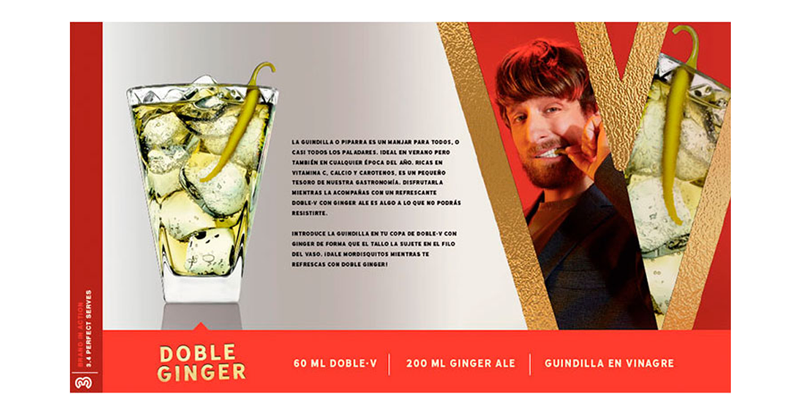
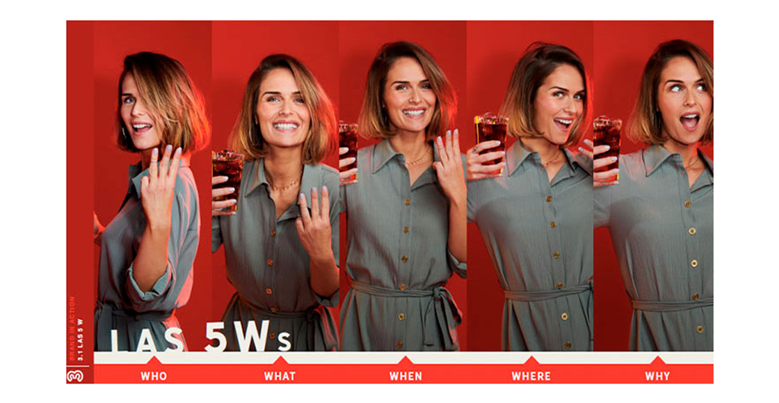
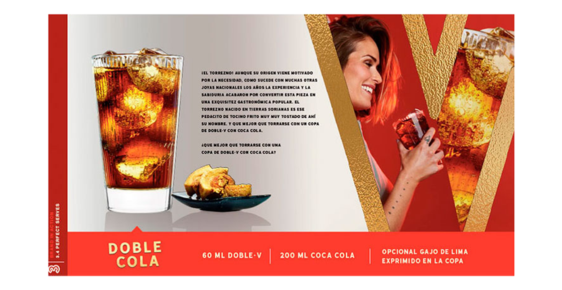
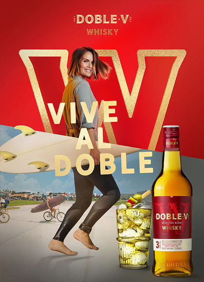
For the key visuals, we introduced a sociable, irreverent protagonist, an affable jokester who lives life intensely and unapologetically. Captured through dynamic double compositions, these visuals embodied the tagline “Vive al Doble,” showing a character who experiences everything twice as boldly. The warm red tones became the visual anchor across executions, while transparent messaging ensured clarity and impact across media.
Living life at double intensity
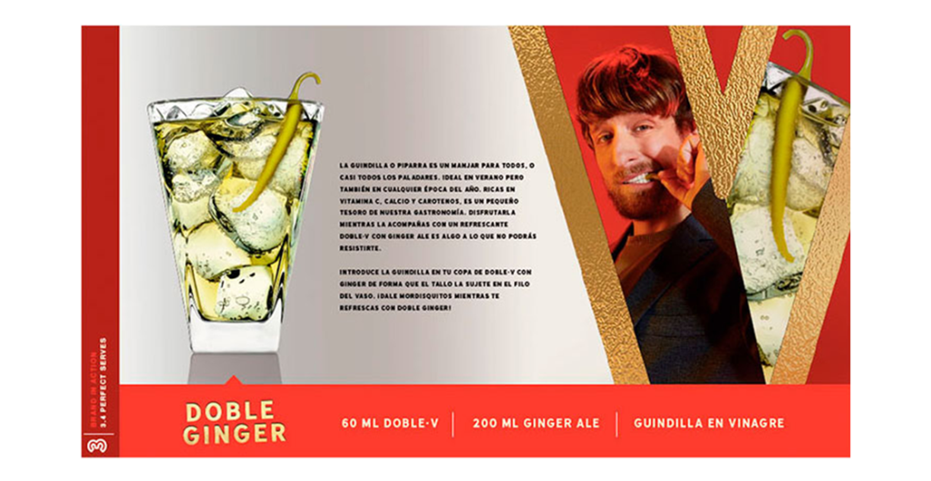
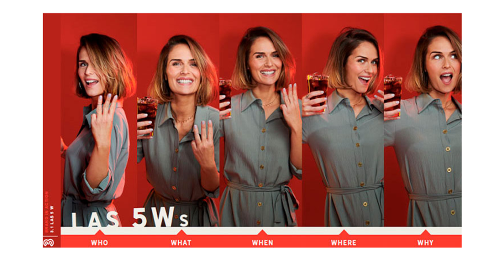
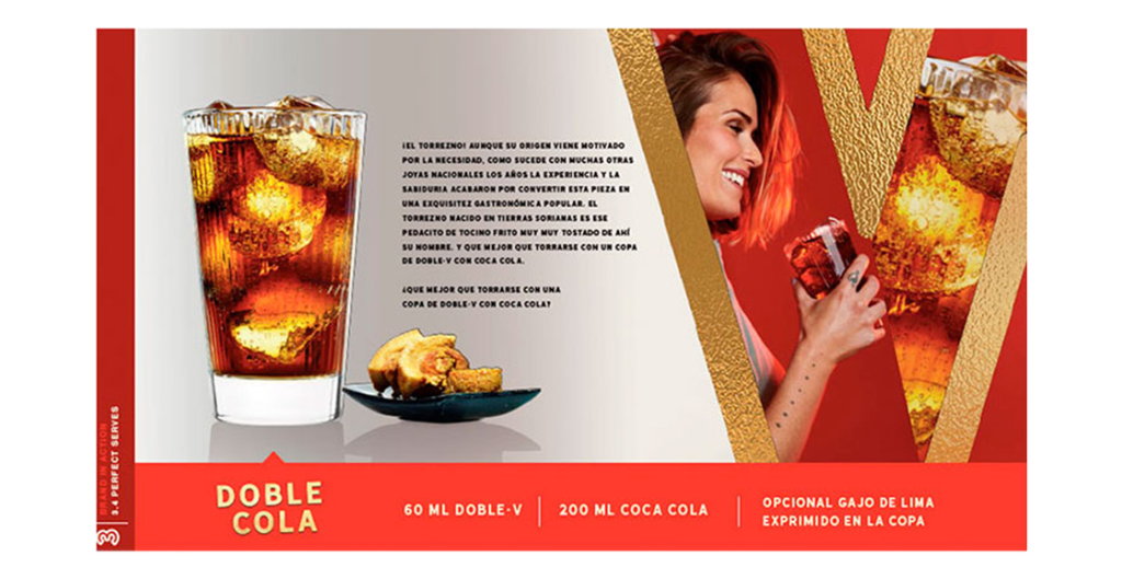
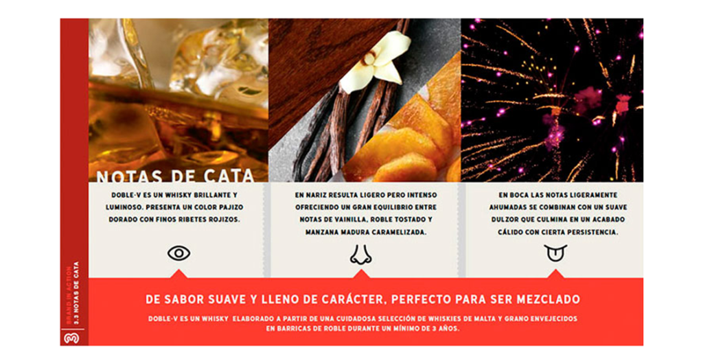
Departing from established whisky conventions allowed Doble·V to claim new territory within the category. By embracing energy, humor, and contemporary confidence, the brand repositioned itself as an accessible yet distinctive alternative for younger drinkers. The result is a revitalized identity designed to dazzle across touchpoints while proving that even a classic spirit can reinvent itself for a new generation.