A Living Expression of Place
Odfjell
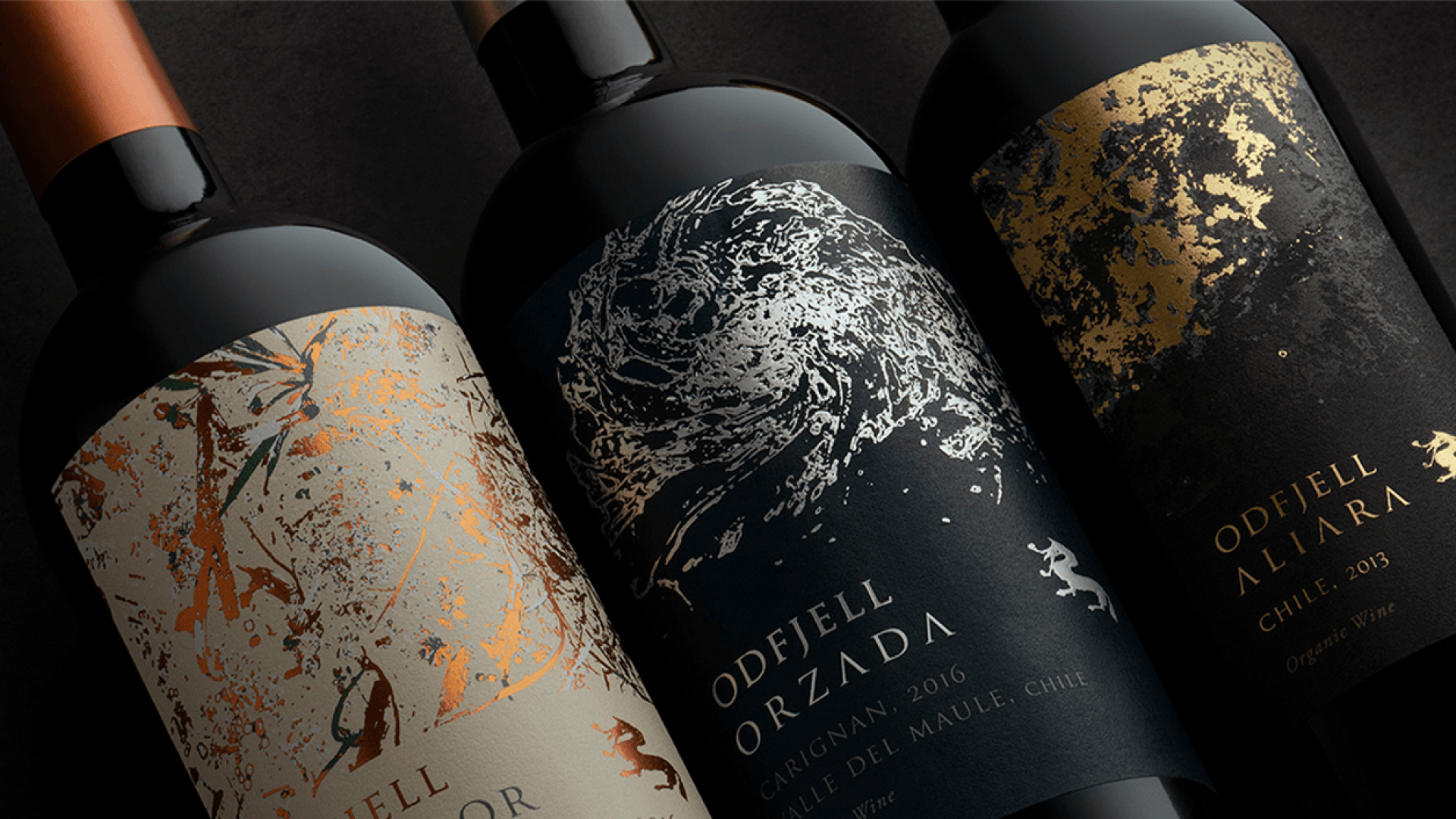
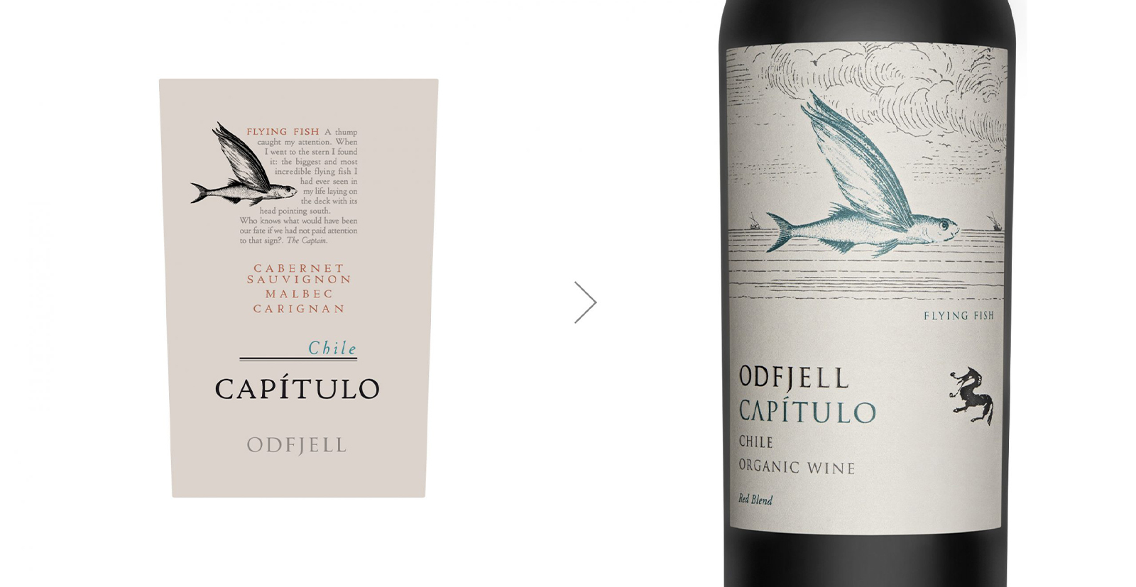
Odfjell Vineyards asked DAf to redesign the packaging for three of its wines to give them a more premium feel, followed by a second request to update the Capítulo line with a sleek evolution aligned with the initial work. The first step was to discover how to elevate perceived quality while preserving the brand’s distinctive identity, ensuring both projects would feel cohesive yet capable of standing confidently on their own.
Two phases, one vision
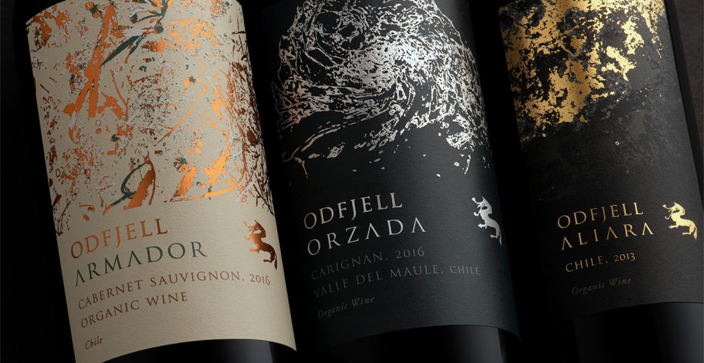
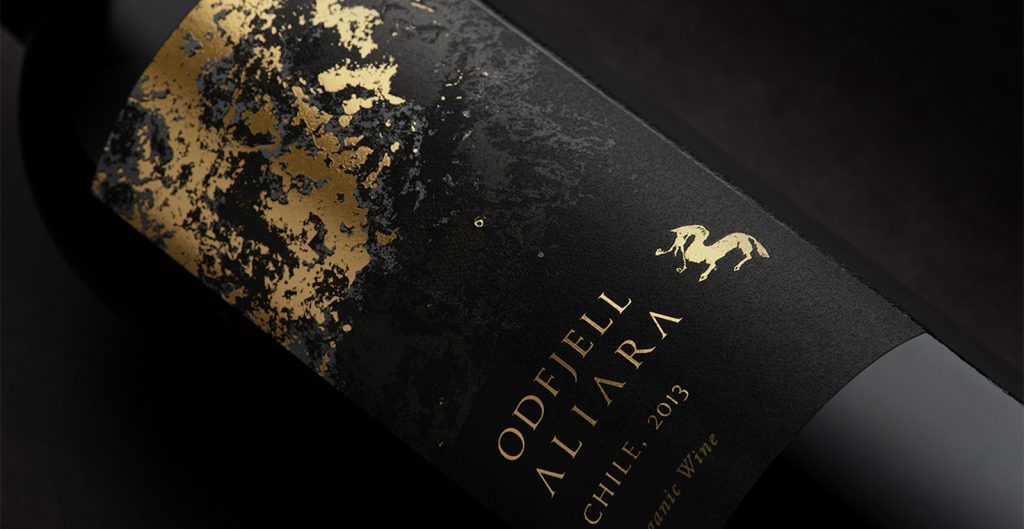
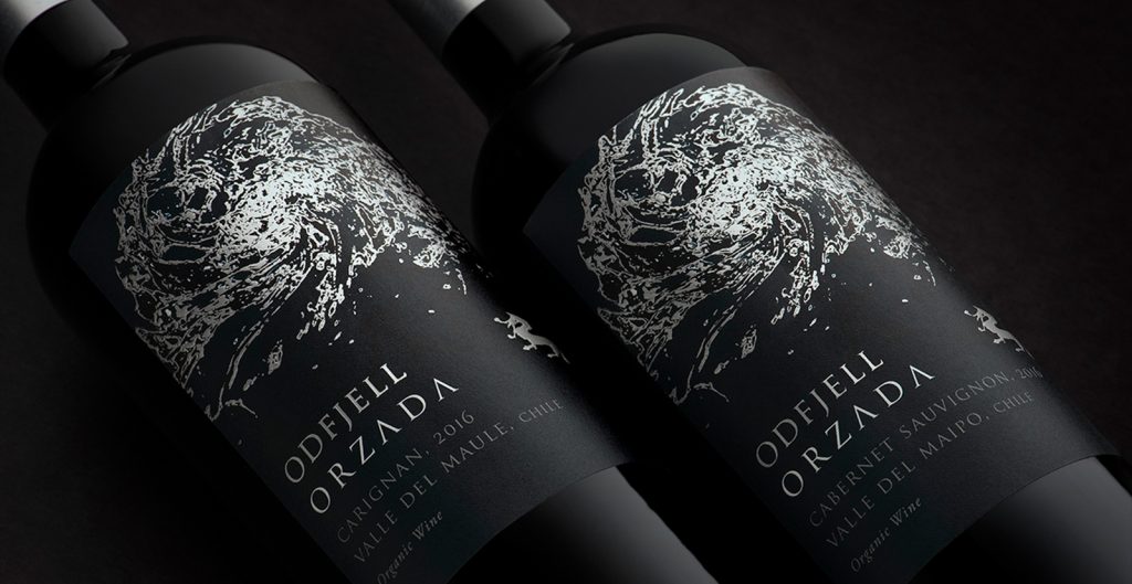
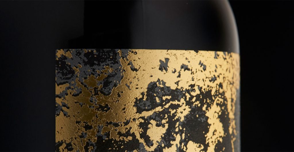
For the first three wines, we drew inspiration from nature, using metallic tones to create individual personalities while maintaining a unified visual language. This approach allowed each bottle to differentiate itself on shelf without fragmenting the brand, balancing uniqueness with recognizability through carefully controlled color, texture, and composition.
Nature as visual inspiration
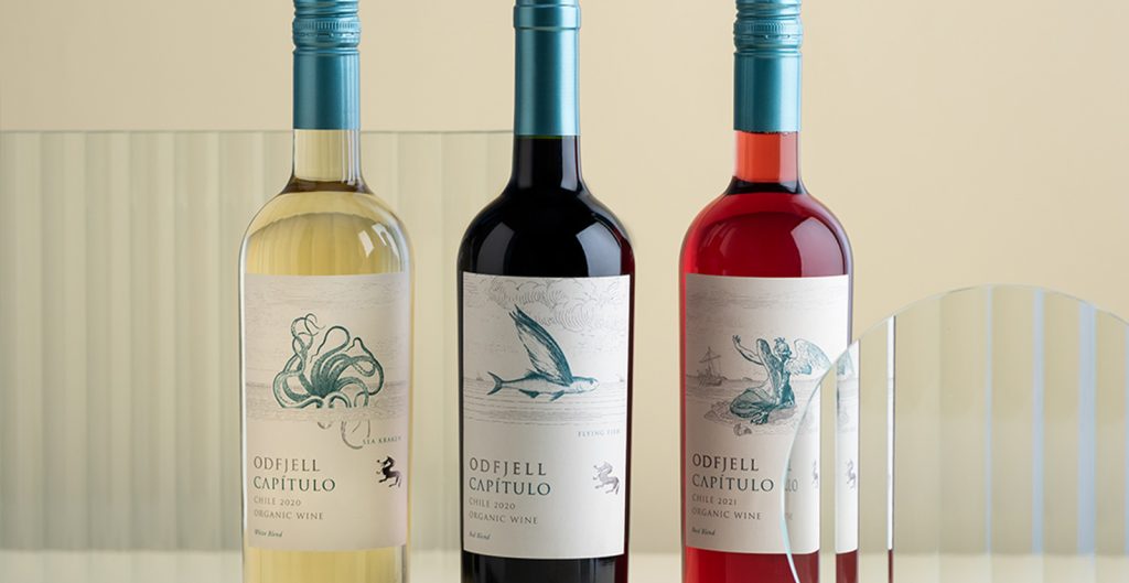
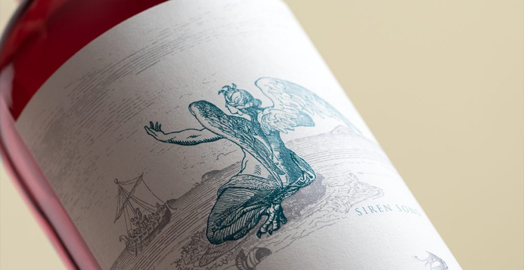
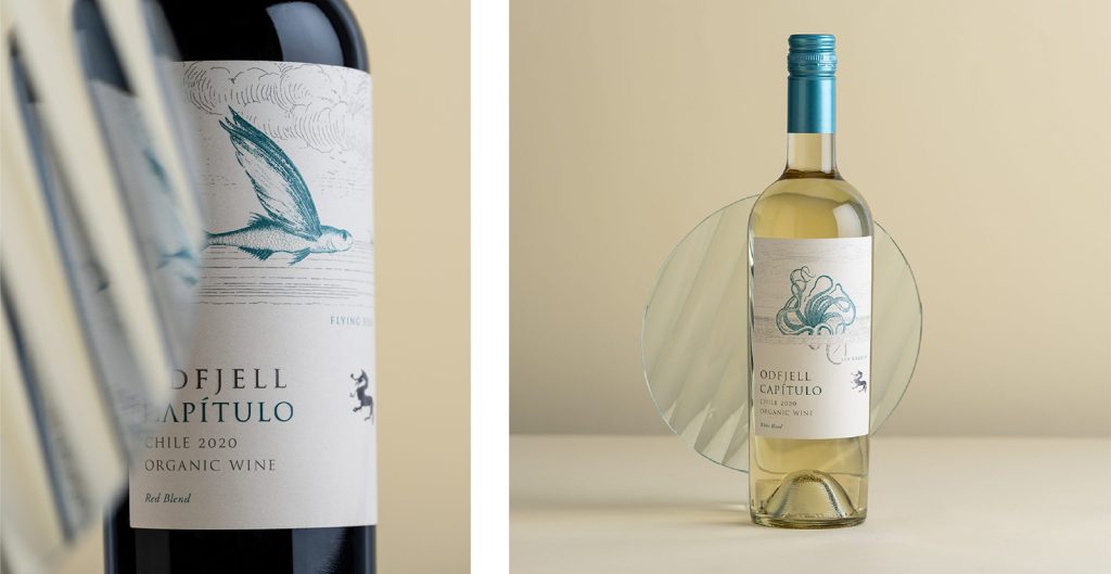
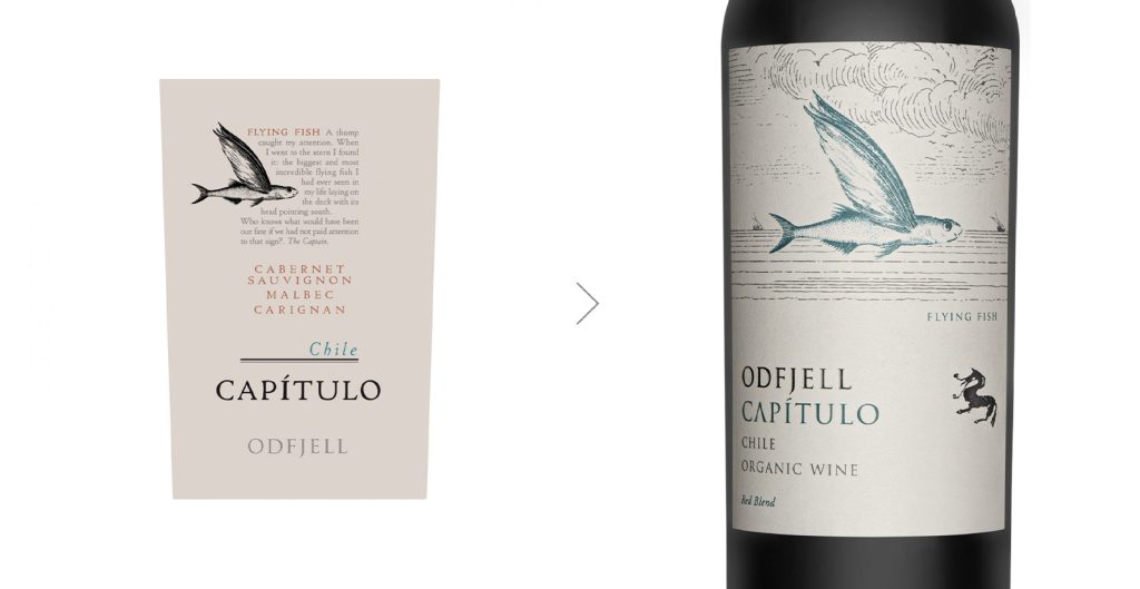
For the Capítulo line, DAf developed a broader brand architecture strategy to guide not only this redesign but future packaging evolution. The refreshed labels incorporated maritime-inspired graphic elements and a palette of fresh, tranquil colors, reinforcing Odfjell’s connection to place while introducing a more contemporary, elegant expression.
Maritime cues as identity markers
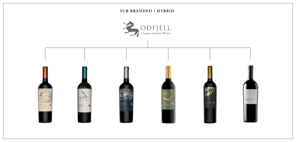
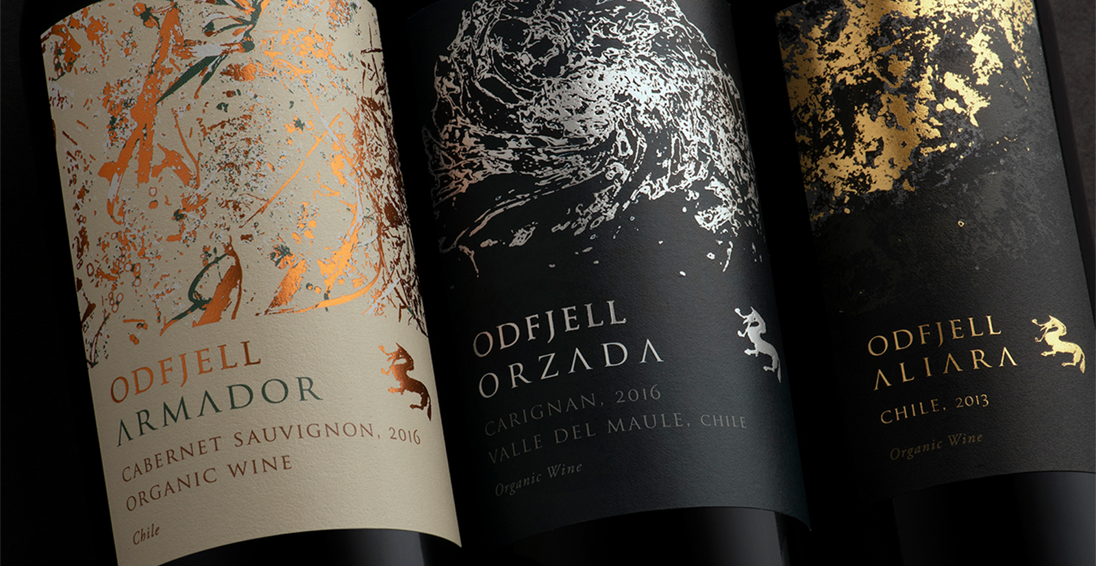
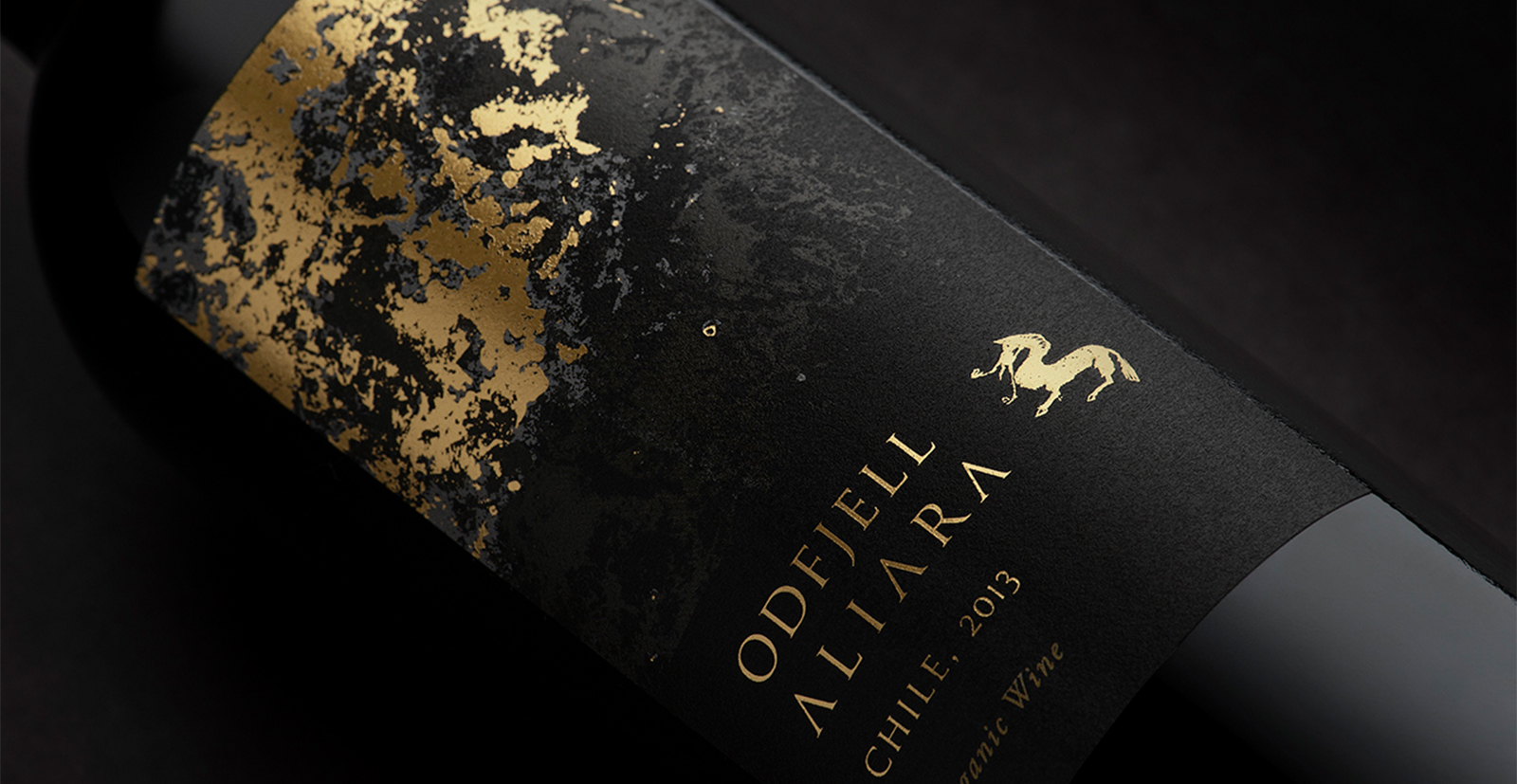
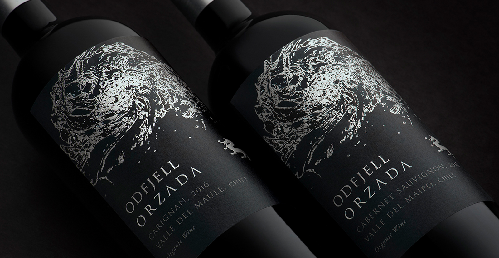
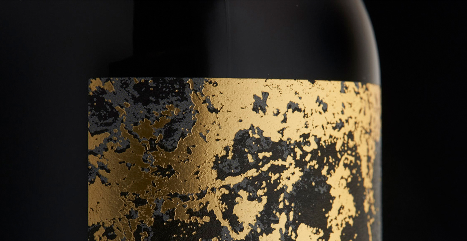
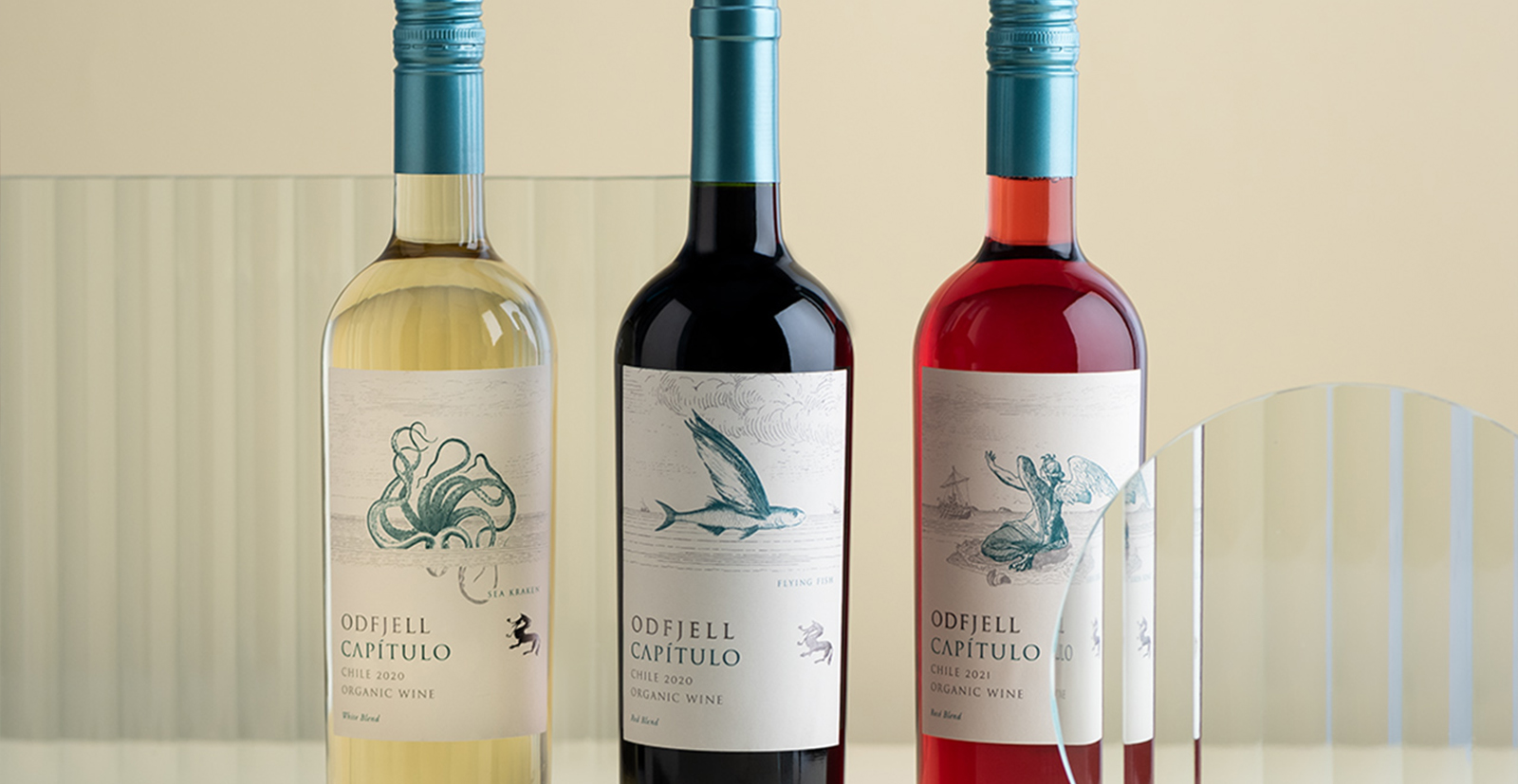
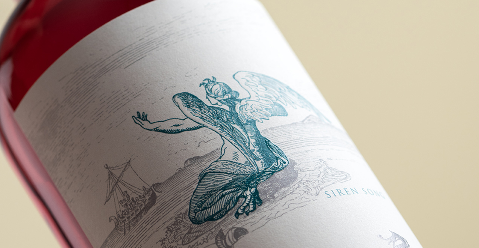
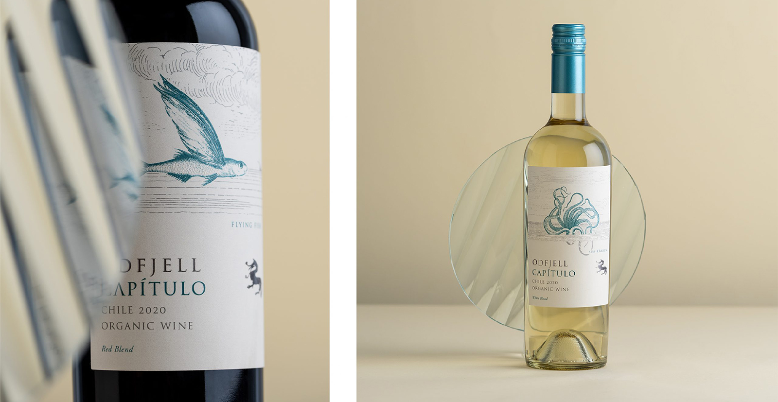
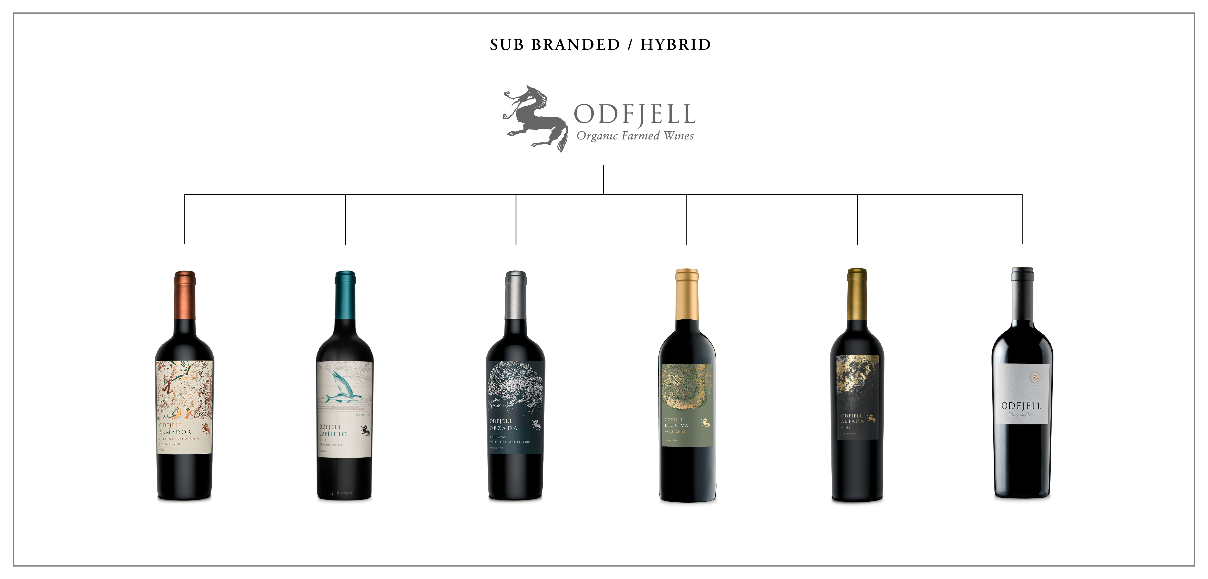
By grounding the work in context, coherence, and strategic clarity, the updated packaging system delivers a streamlined yet expressive visual presence. The result is a portfolio that feels modern, premium, and unified and designed to dazzle on the shelf while providing a flexible foundation for future releases and line extensions.