A Bespoke Sparkling Packaging
Ritmo

Amid the pandemic-driven shift that redefined sparkling wine consumption - moving from rare occasions to everyday enjoyment - a long-time DAf client sought to discover how to claim relevance within this evolving landscape. The brief called for a brand that could capture a strong sense of place while expressing latinidad: the warmth, rhythm, and emotional expressiveness associated with Latin culture. Designed for export markets yet rooted in Chilean terroir, the three varieties needed to communicate authenticity, accessibility, and joy to younger consumers newly entering the category.
Latin American spirit as inspiration
Ritmo: rhythm as brand essence
Working within the Borgoña-style segment, DAf created the name Ritmo - Spanish for “rhythm” - to evoke movement, vitality, and a distinctly Latin way of life. Supported by the Spanglish claim “Live the Latin Pasión,” the brand immediately signals cultural energy while remaining accessible to international consumers. This naming and positioning helped differentiate the wine from traditional European-coded sparkling brands, presenting instead a vibrant, contemporary identity rooted in emotion rather than formality.

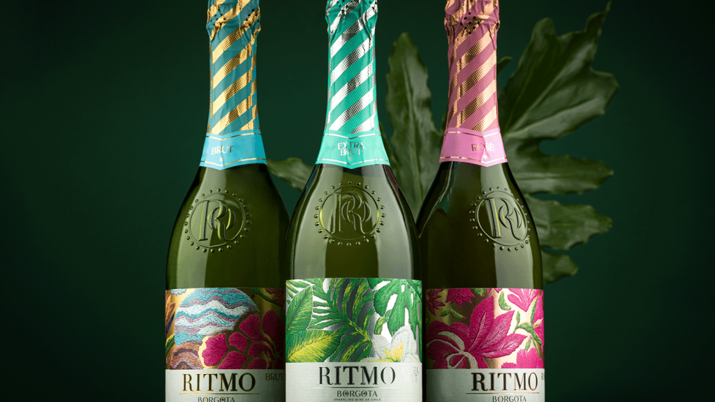
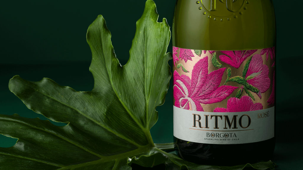
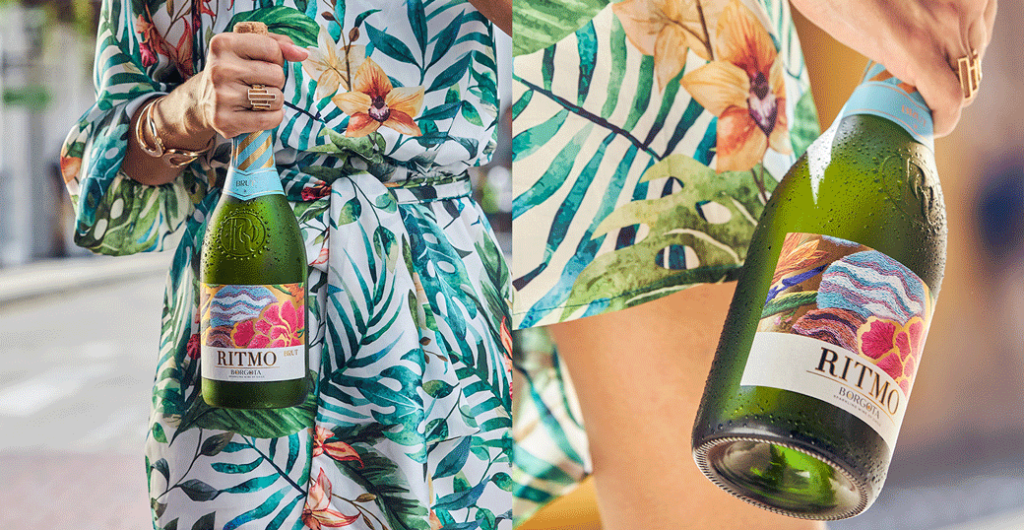
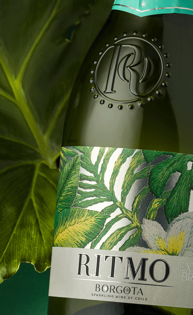
To bring this world to life, DAf developed a bespoke bottle featuring a raised monogram seal, reinforcing premium quality while establishing a distinctive tactile signature. The label design draws from Latin American traditions of movement, color, and ornamentation, translating cultural vibrancy into a modern visual language. A collaboration with needle-painting artist Javiera Ballacey introduced richly detailed botanical motifs inspired by the exuberance of regional nature, adding authenticity and artistry while amplifying the sense of joy and vitality.
Intricate compositions to celebrate Latin America

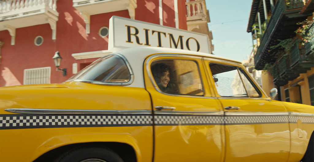
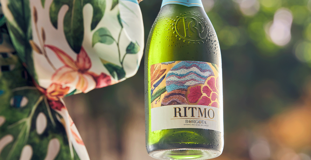
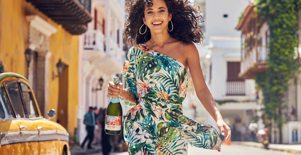
The brand’s personality was further expressed through a dynamic campaign filmed in the colonial streets of Cartagena, Colombia. Scenes of spontaneous gatherings, from coastal sunsets, to rooftop parties with DJs, and relaxed moments among friends, Ritmo is portrayed as youthful, positive, and effortlessly celebratory. Across film and photography, a bold color palette and casual yet upbeat styling captured the spirit of Latin life in motion, while color-coded foil capsules for each variety enhanced shelf impact and collectability, helping the bottle itself dazzle across both retail and social environments.
More than packaging, transforming every bottle into an invitation to celebrate
Through a three-pronged approach - structure, art, and cultural storytelling - DAf delivered a cohesive brand experience that resonates across touchpoints. Ritmo stakes a confident claim within the familiar territory of sparkling wine while redefining it through approachability, energy, and Latin expressiveness. The result is a brand that transforms everyday moments into occasions, expands consumption beyond tradition, and positions our client at the forefront of a more inclusive, celebratory future for the category.