Client |
Ventisquero Wine Estates |
Capabilities |
Brand Strategy |

DAf conducted a series of interviews with key winery executive and enological players in order to understand the company culture, and how their challenge had impacted upon staff, importers, distributors and consumers.
Throughout it became clear that the company culture was one of optimism, exploration and openness, in which employees feel comfortable and at home. In addition, at every interview a particular desire was raised: To communicate that the winery owned and operated their own vineyards in Chile’s principal winegrowing regions, a key differentiator between competitors of similar size or prestige.


Based on the concept of “home“, the storytelling reveals Ventisquero Wine Estates’ four pillars of sustainability, innovation, passion and vineyard ownership; while introducing the optimistic, team-based attitude the brand presents.
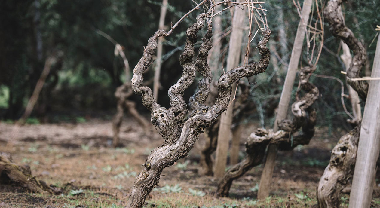
When it comes to vineyards, we feel at home. In a place of trust, humility and commitment.
At home we are conscious; cultivating our relationship with the planet through sustainable practices.
We are innovators; experimenting with different winemaking styles and advances in technology.
We are explorers; reaching out as founders of our own estates in Chile’s most recognized wine regions.
But above all, at home we are a family.
A family united not by surname, but by a single passion: To share Chile’s finest origins with the world.
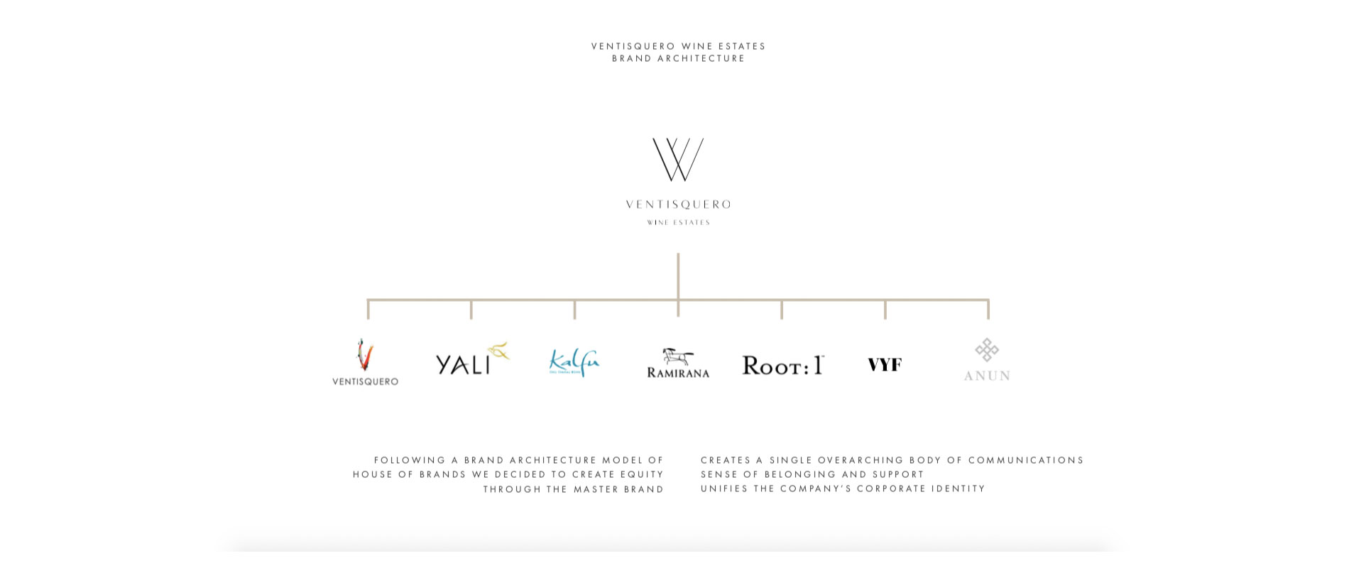
Ventisquero Wine Estates
Growing Origins