Client |
Grupo Osborne |
Capabilities |
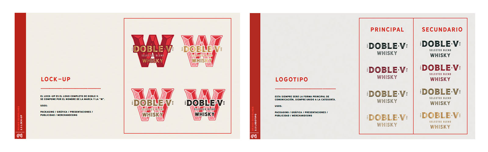
Packaging |
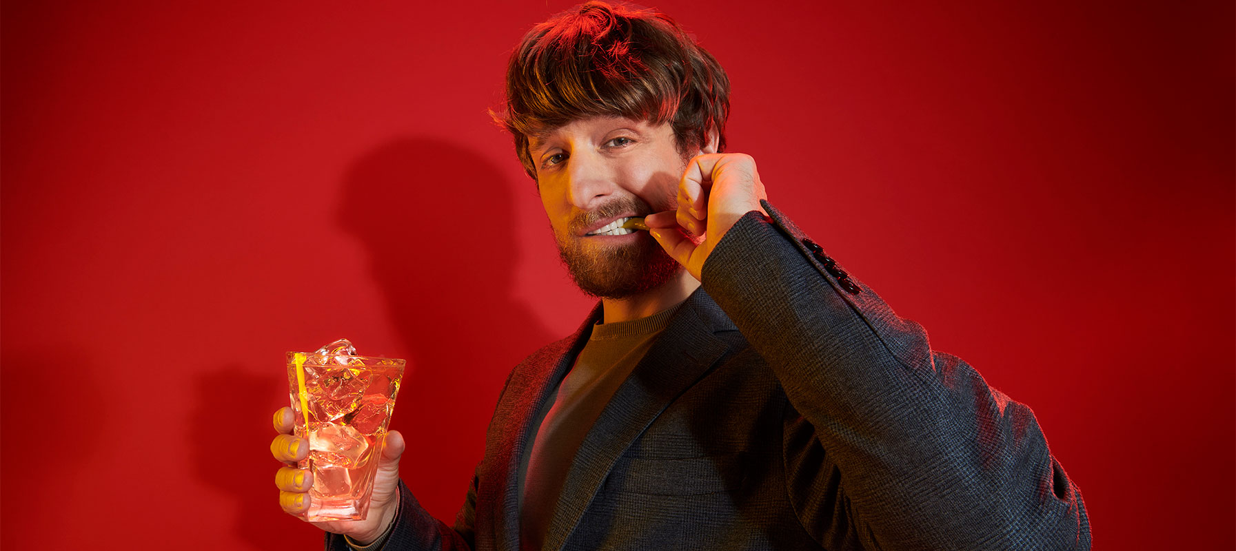
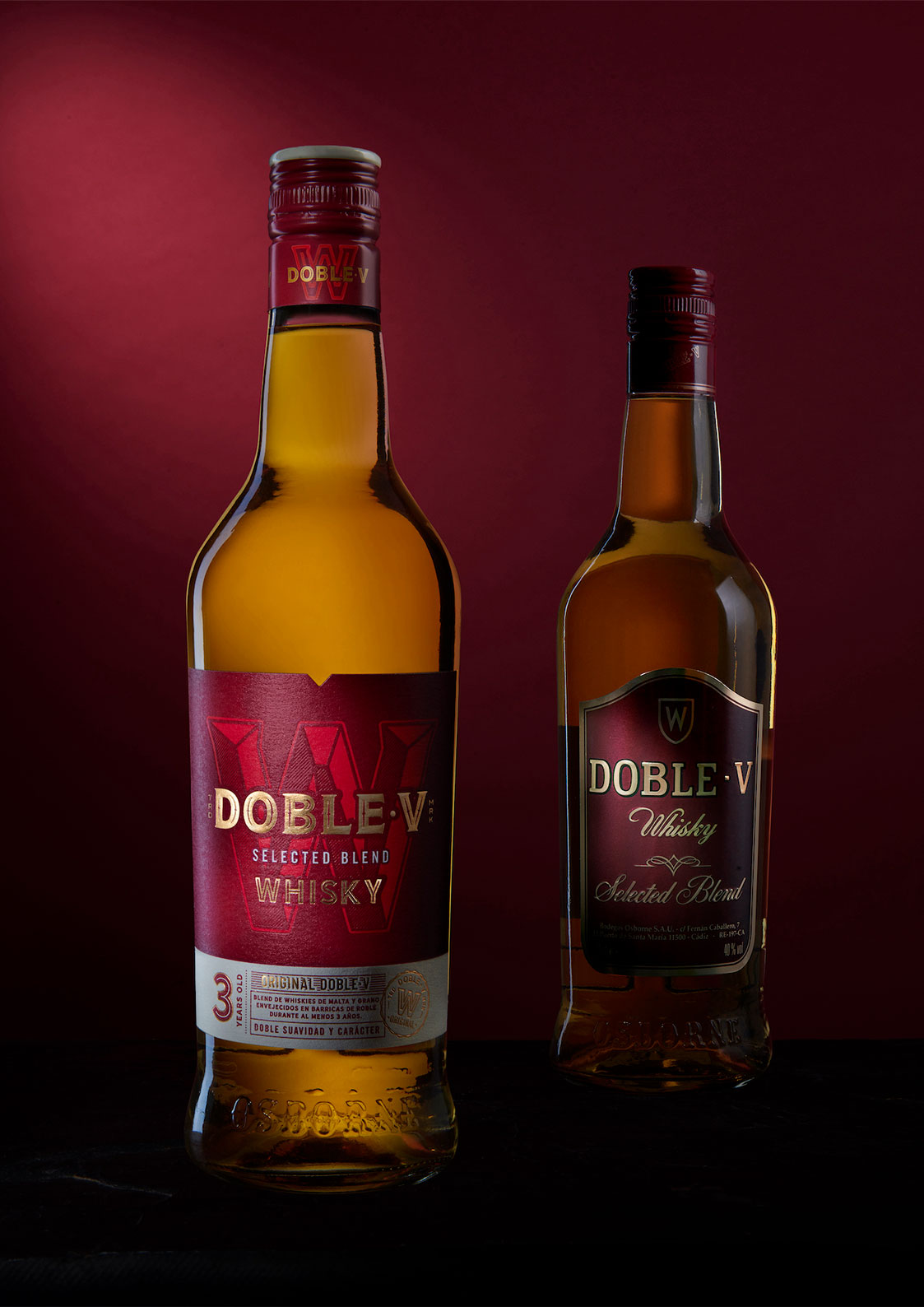
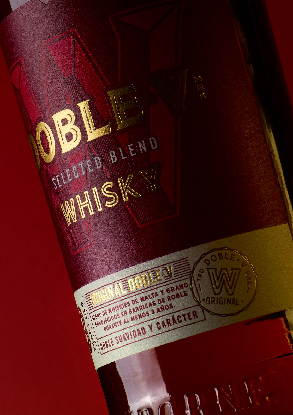
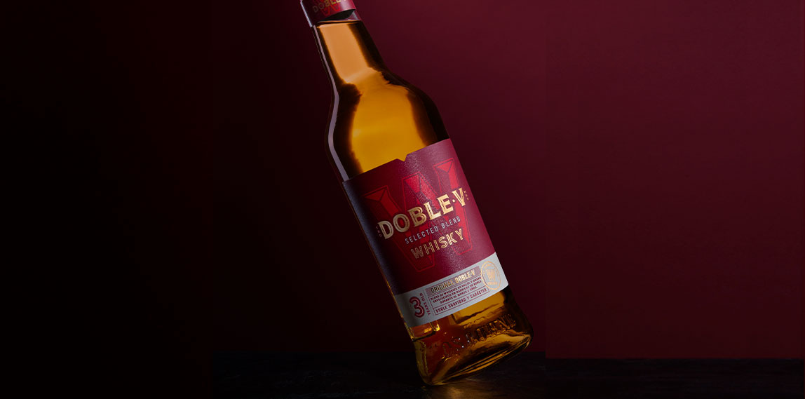
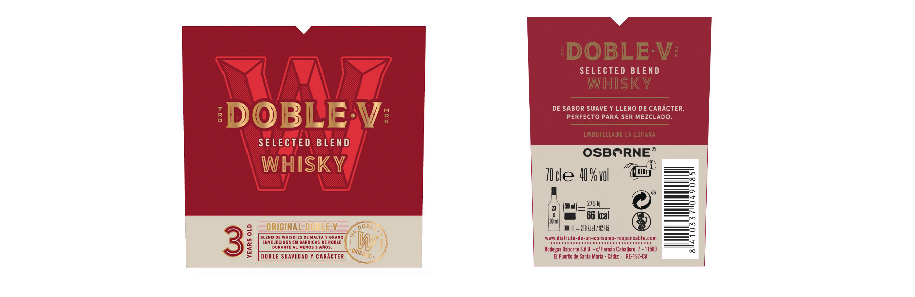
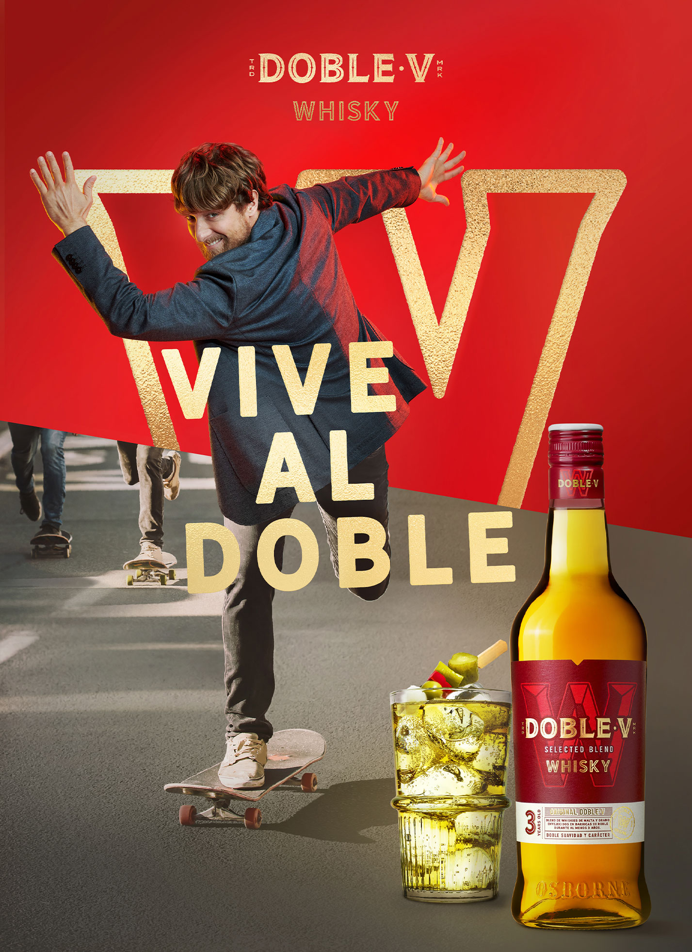
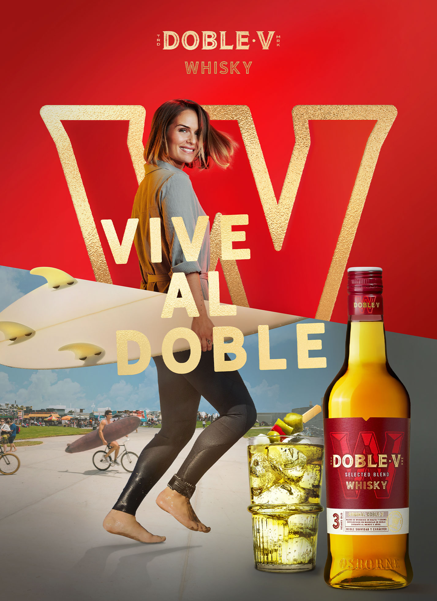
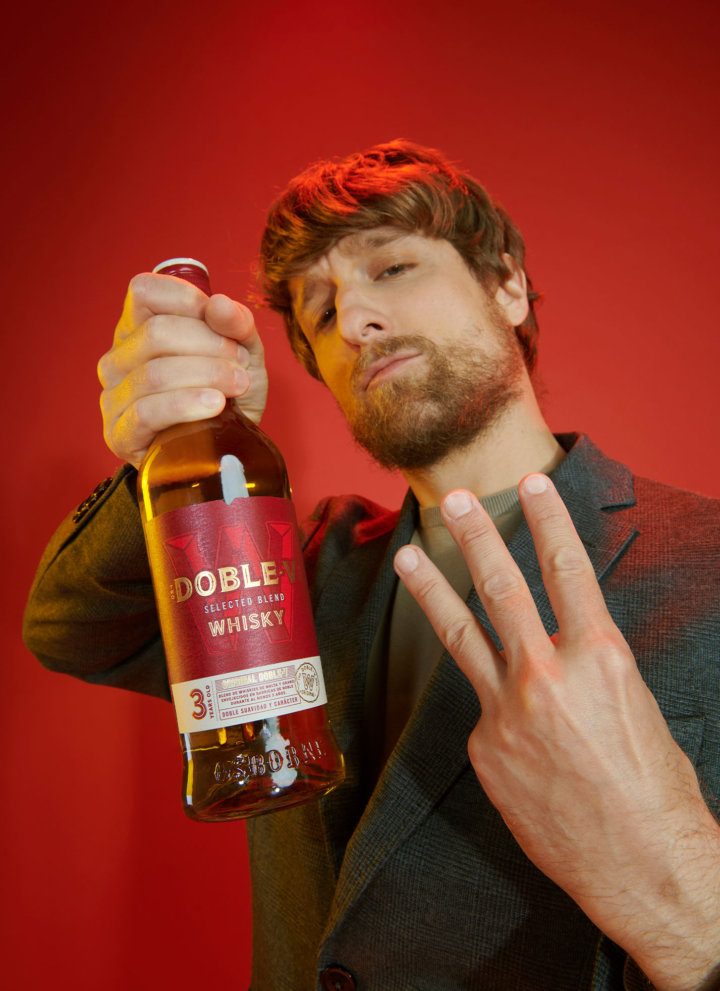
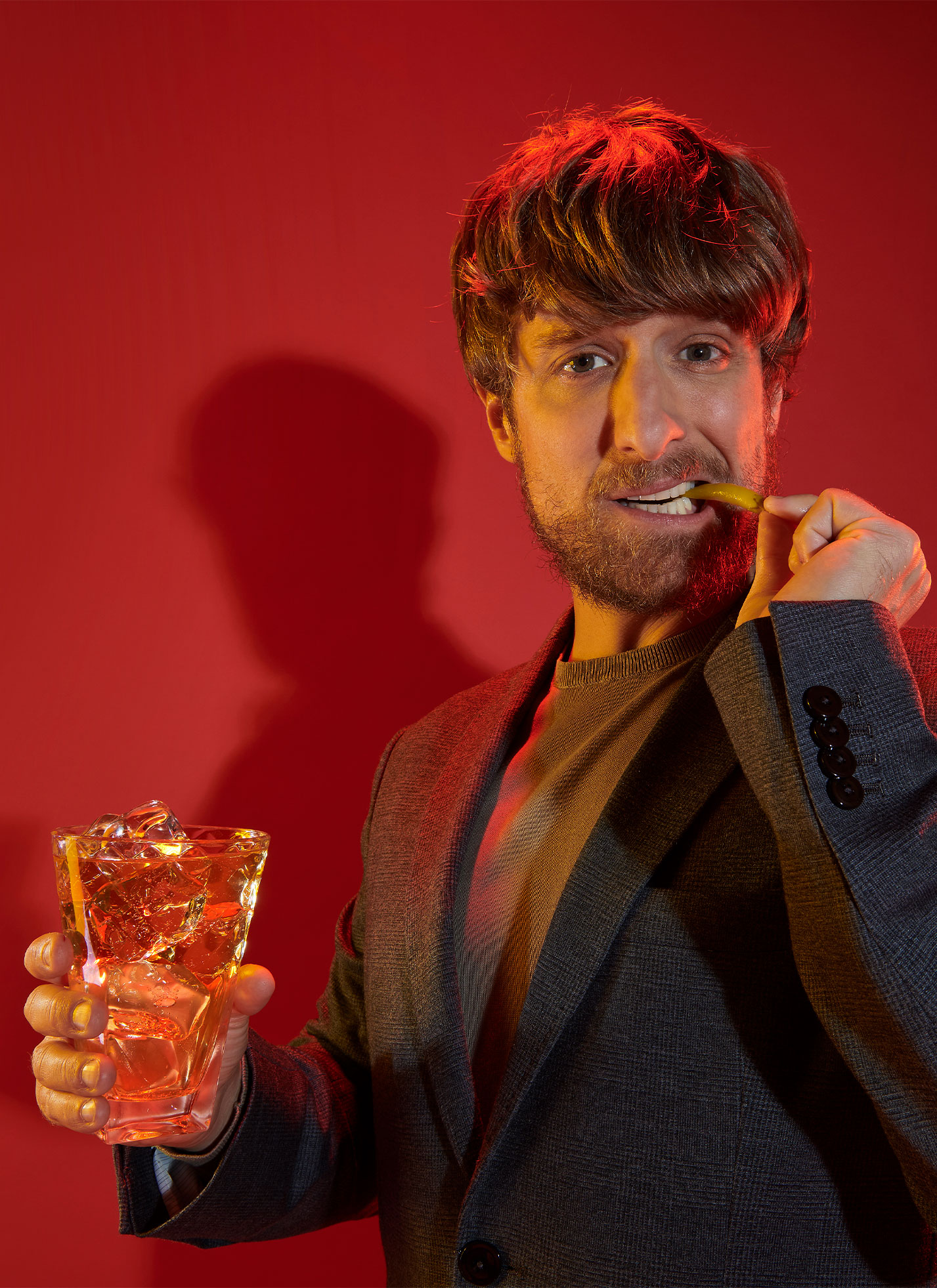
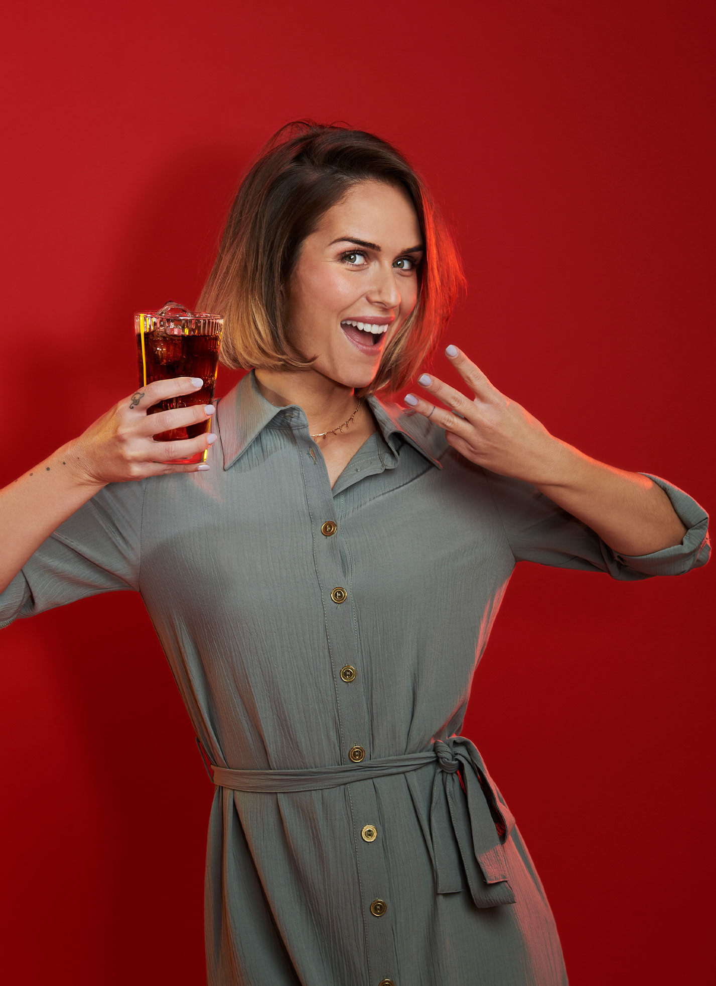
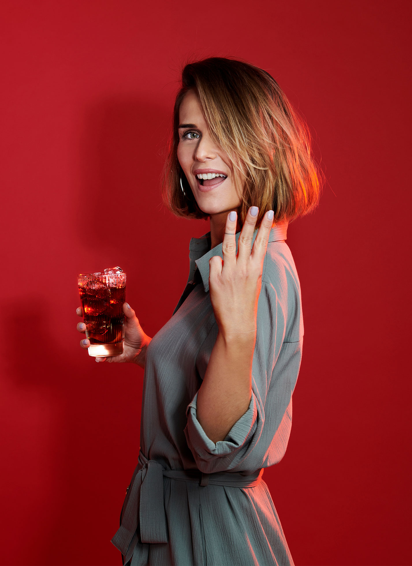
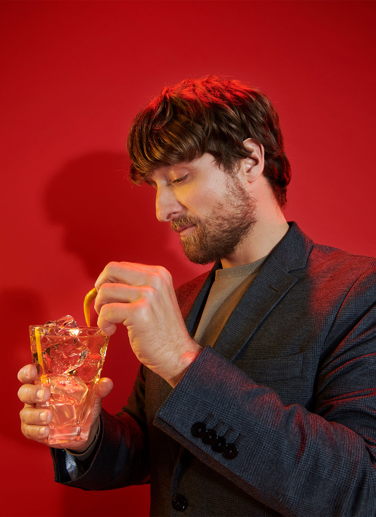
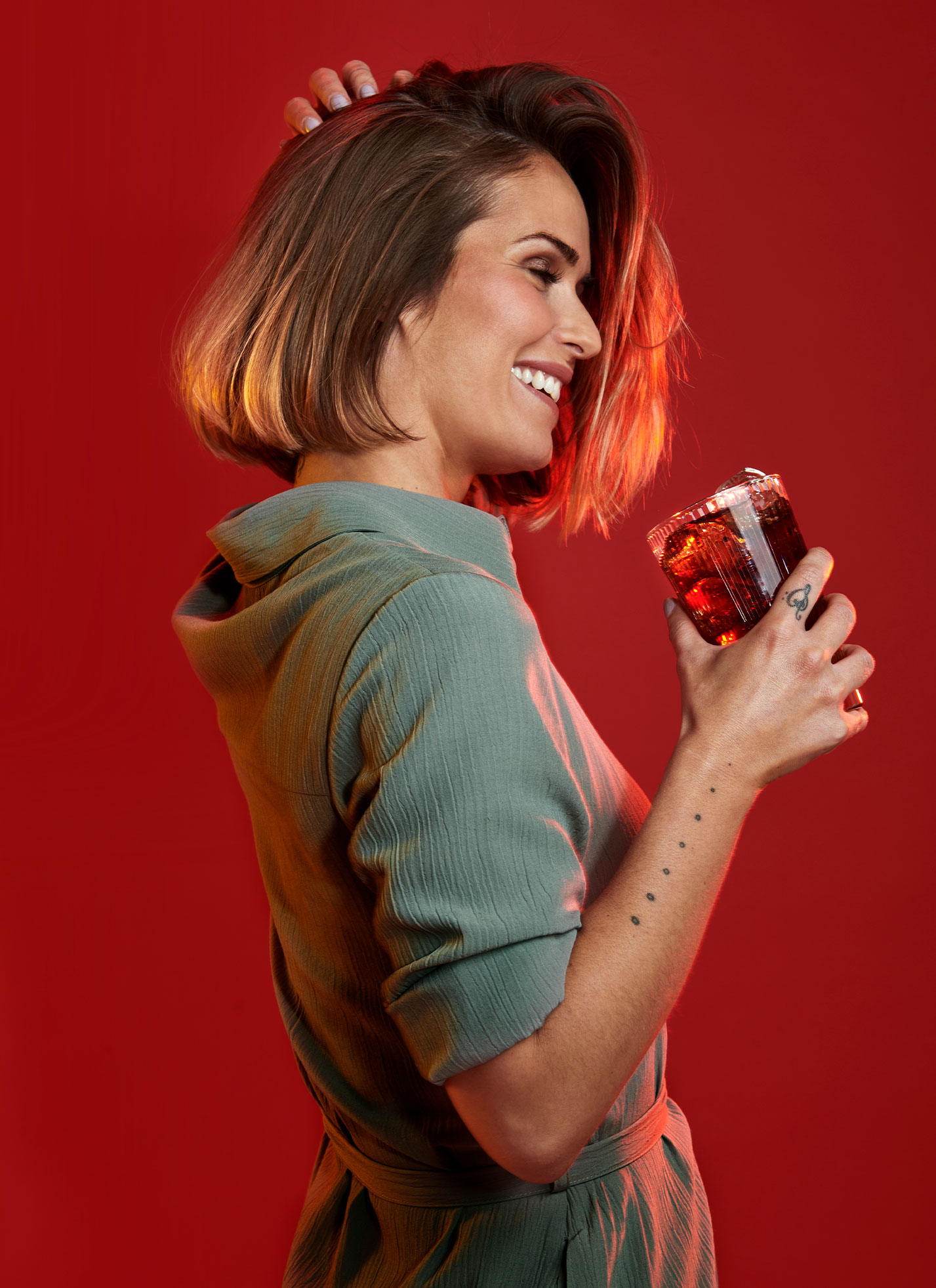
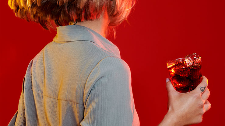
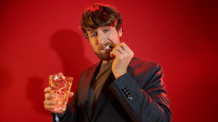
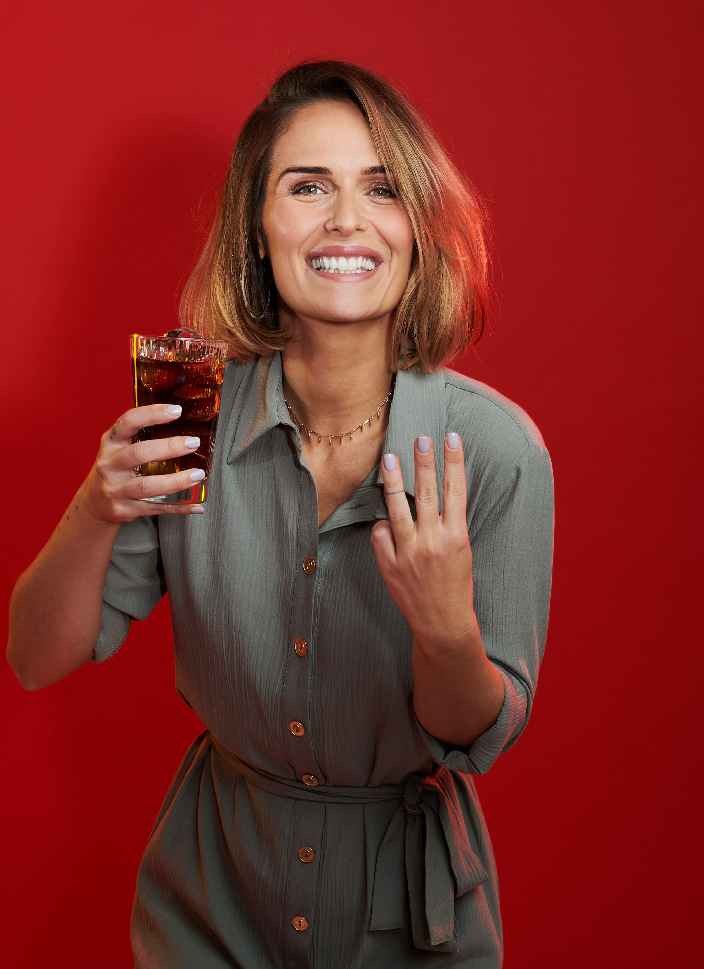
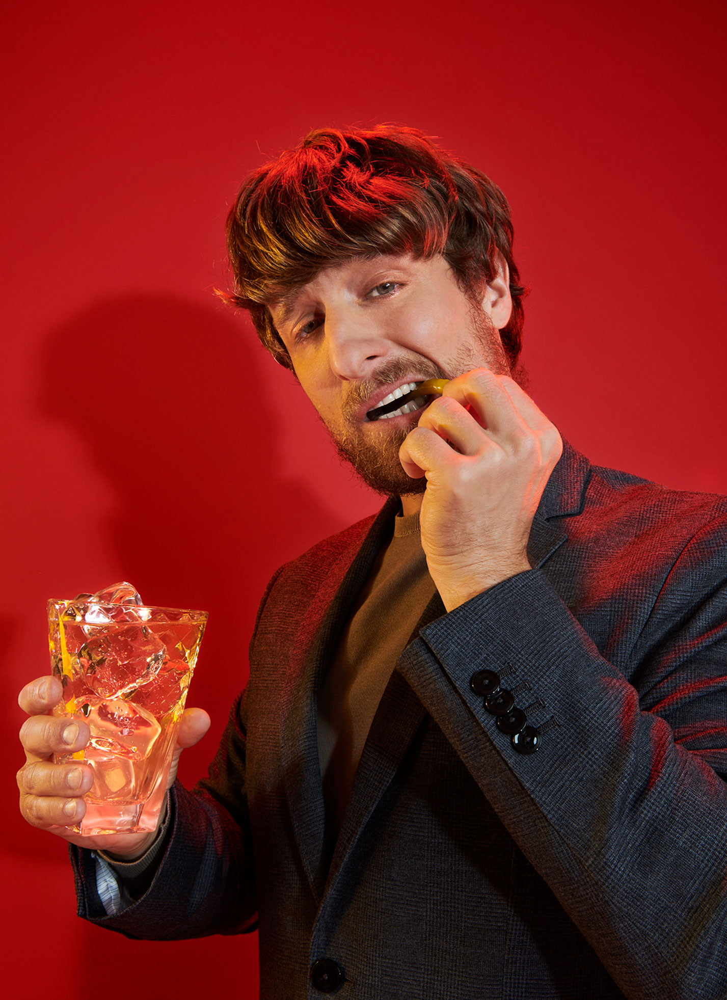
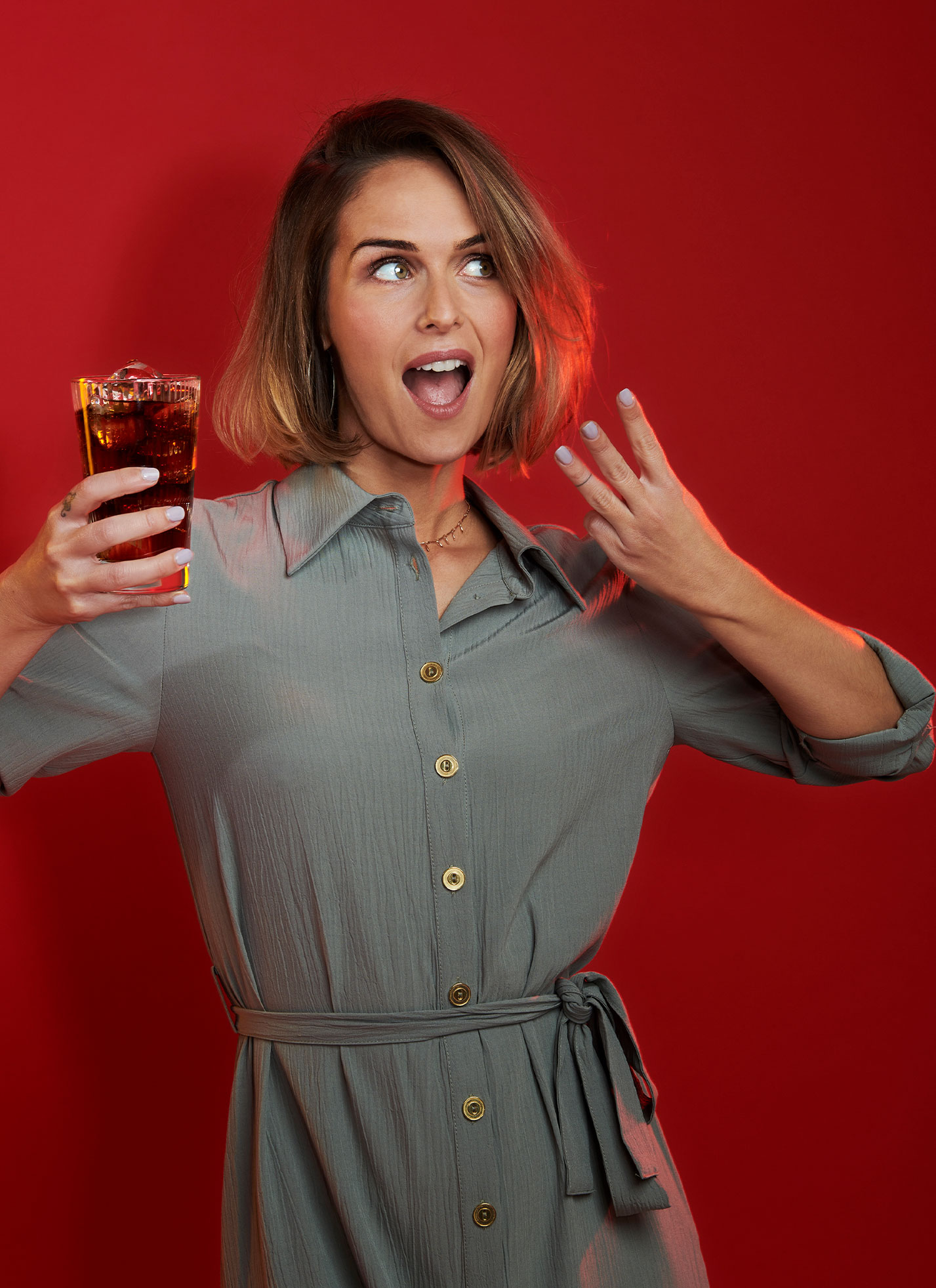
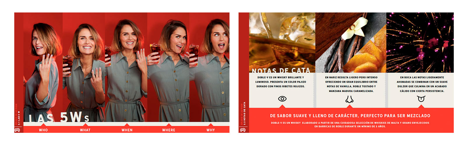
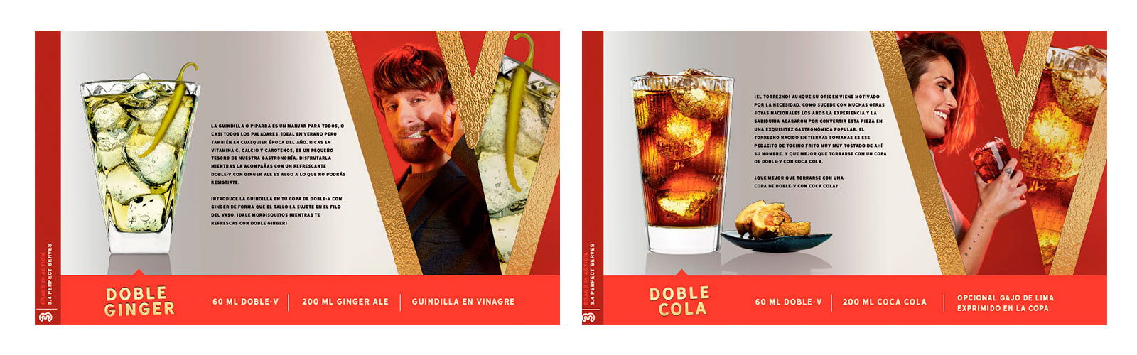
DAf created fresh, attractive pieces where the liquid was the star, drawing from Doble·V’s distinctive warm red tones and the icon of the “W” to create transparent, uncomplicated communications. The results shy away from the typical complexities of the whisky world and present our attitude-forward consumer at the forefront.
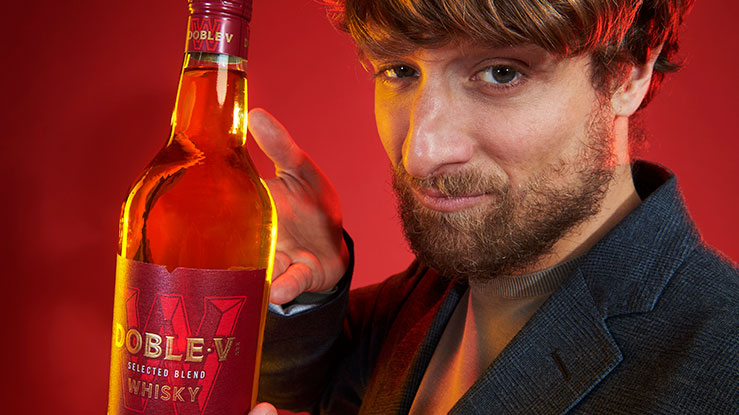
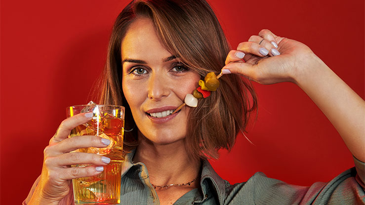
Key in all materials was the unencumbered, highly sociable attitude of the consumer. Described in Spanish as a “picarón” (similar to a “jokester”), they are the type of person who lives life intensely. This attitude was expressed in the claim “Vive al Doble,” a play on words in Spanish, inviting consumers to live more.