Client |
Patriarche |
Capabilities |
Packaging Design |
DAf approached both projects by revisiting the brand’s storytelling and creating an updated version centered on celebrating the essence of the modern French women, in turn showcasing contemporary France as something that can be shared through enjoying Veuve du Vernay.
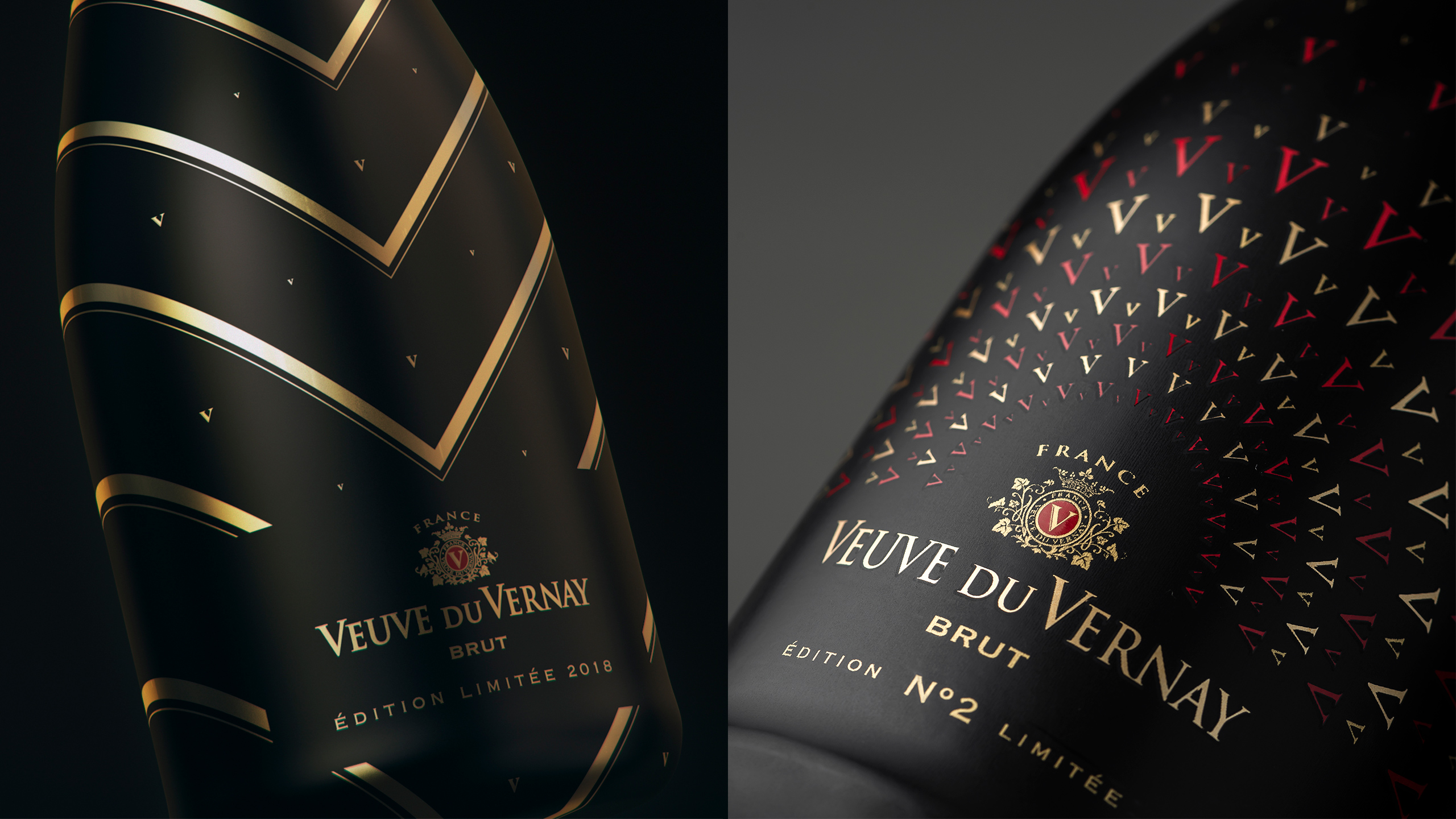
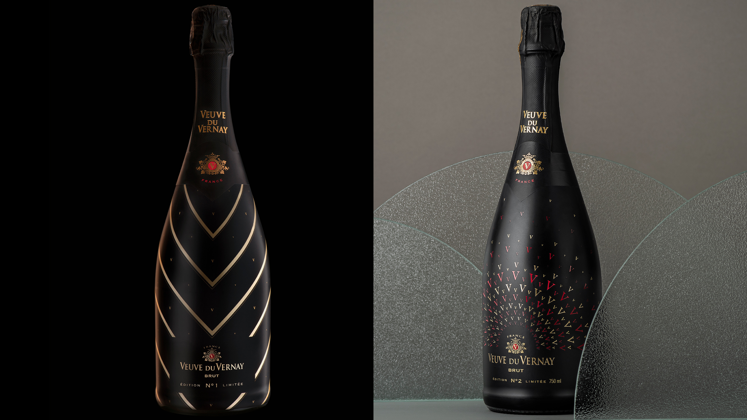
For the first limited edition creation, Nº 1, DAf developed a sleeve with an elegant, black and gold design with the effervescence and energy of a mysterious French woman as the inspiration. The letter “V” was incorporated into the design with golden small letters dotting the bottle, creating a playful glint against the black background.
For the next limited edition design, Nº 2, DAf built further upon this sophisticated, minimalistic design, this time adding red to the design to reflect the brand’s logo. The large lines were removed and a semi-circle shape of red and gold “V”s of varying sizes were added. The letters get more sparce as they move away from the bottle, creating a radiating effect.
Both bottles resulted in a sophisticated look that stands out amongst traditional French wine houses and appeals to an international audience.