Challenge
The Portuguese winery João Portugal Ramos wanted to launch a new red blend wine in the United States, and asked DAf to create a full concept for the wine, to appeal to Gen X and Millennial consumers in the US, conscious of the fact that much of their target audience was not familiar with Portugal as a wine region or in general. They asked DAf to create a concept and world around this wine, with a captivating story based in Portuguese culture or history to educate people about Portugal at the same time as promoting the wine.
Client |
João Portugal Ramos |
|
|
Capabilities |
Packaging
Storytelling
Key Visual
Brandbook |
|
|
Solution
After extensive market research and investigations into Portuguese history and culture, we came across the importance of the area surrounding Lisbon as a nexus for spy activity during WWII, which we used to build a rich conceptual world, including storytelling, and developed the name Spyland for the wine.
Packaging
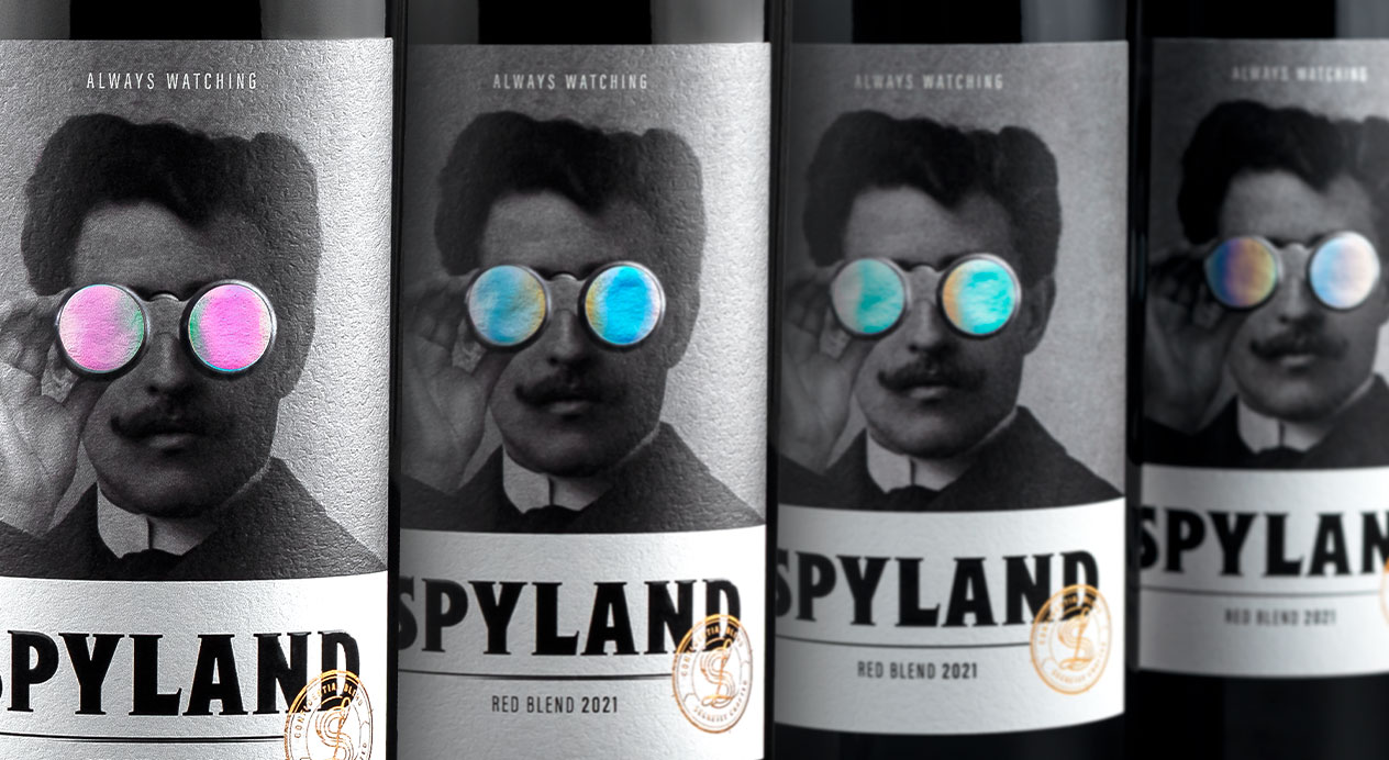
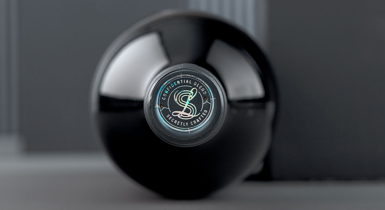
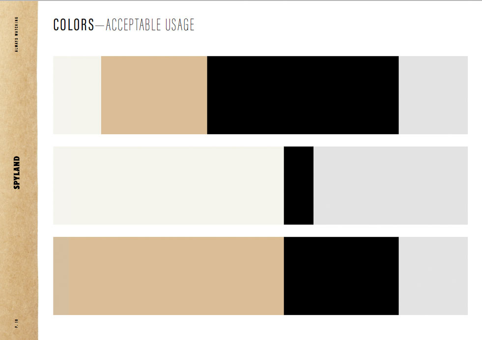
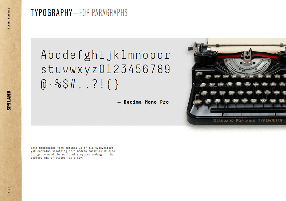
The wine’s label features a black and white photograph from the era, showing the spy, a young mustachioed man holding up an early iteration of binoculars to his eyes. The binocular lenses on the label are iridescent colors. Below the main character is the brand name and above him are the words “Always Watching.” On the lower right is a seal evocative of a wax seal or passport stamp, used to connote secrecy. We used a historic almost sans serif text, with a purposely tight kerning, using less space and with the idea that it could go unnoticed if it were strewn among other papers.
Storytelling
We created a brand story for Spyland based on Portugal’s role during WWII as a “hive of spies,” imagining a secret society that used a bottle of wine to send hidden messages on the bottle and cork of this wine. We gave it the name “The Secret Society of the Red Blend,” and later parlayed these secrets to the website and for social media use.
Key Visual
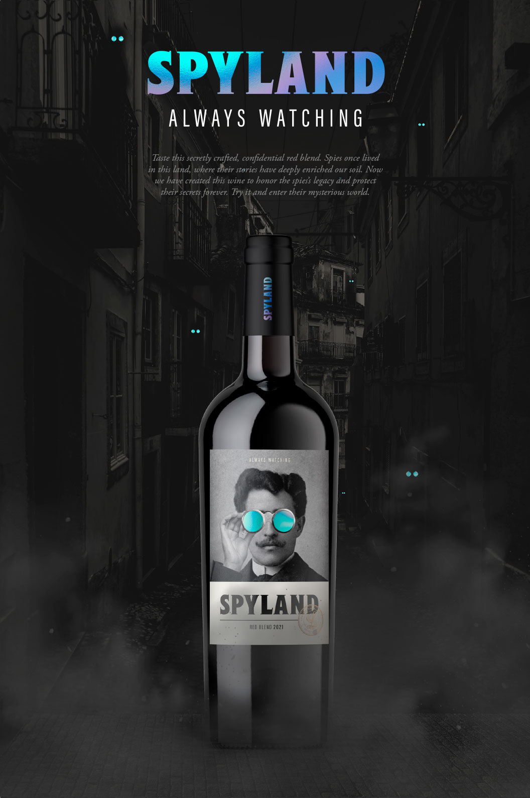
The bottle as described above is seen superimposed on a spooky, black and white scene of Lisbon’s streets, with the iridescent brand name above, with the tagline “always watching.” Below, a short text invites consumers to try the wine to enter this mysterious world. The bottle appears larger than life below this text.
Brand Book
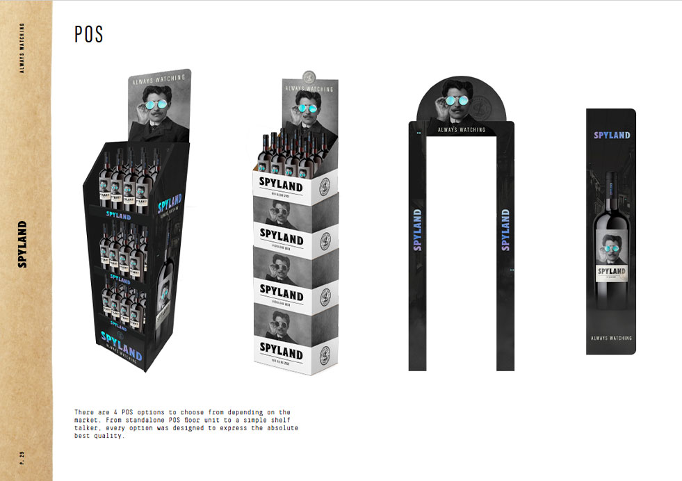
We developed a brand book to describe the brand identity, identify the target consumer and create the look and feel for the brand, including the iconic character of the spy, the seal, typography and color palette. We also developed designs for four POS options, including a standalone floor unit (a walkthrough arch), and a simple shelf taker, all emblazoned with the spooky spy imagery and the signature iridescent spy glasses.
Niamh Tumbleton December 27, 2022
Challenge
Aveleda is a family-owned winery based since 1870 in the Portuguese region of Vinho Verde. Having developed a new red blend especially for the palate of US consumers, Aveleda required a name and packaging design for their new wine: to be positioned as a concept wine from Portugal, and marketed to Millennial consumers searching for new experiences from lesser-known regions. They turned to DAf to develop this new product, including naming, packaging design, key visual, POS material and brand book.
Client |
Aveleda |
|
|
Capabilities |
Packaging Design
Brand Book
Key Visual |
|
|
Solution
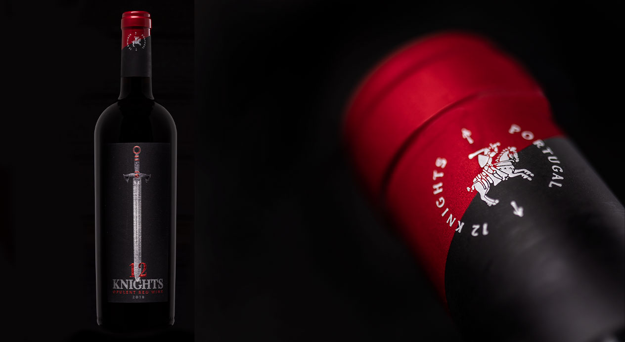
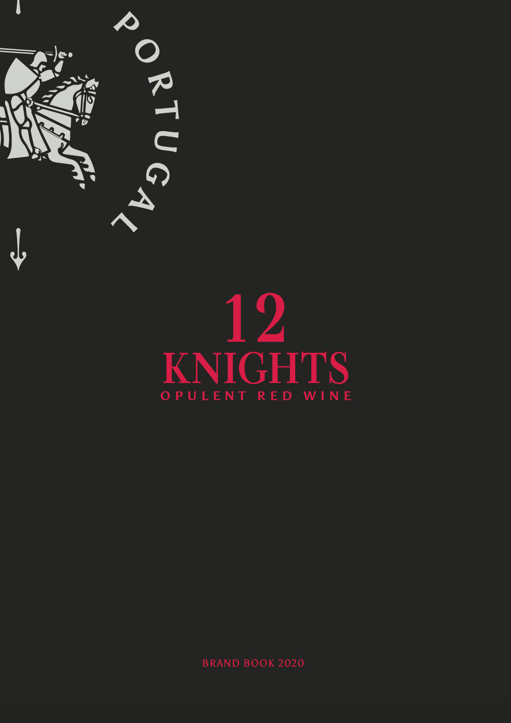
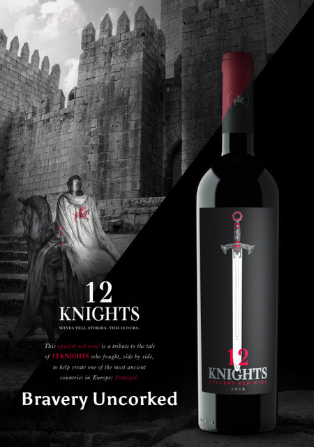
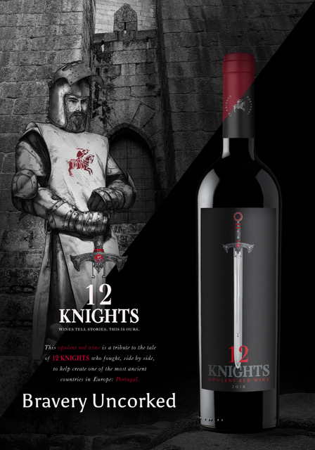
Studying the history and culture of Portugal alongside this new product’s current competitive market, DAf discovered a wealth of evocative names to explore, inspired by the country’s music, landscapes, cuisine, language and literature. After consulting these with the client, the brand name “12 Knights“ was selected, inspired by a medieval tale of bravery and camaraderie, intimately known to the Portuguese.
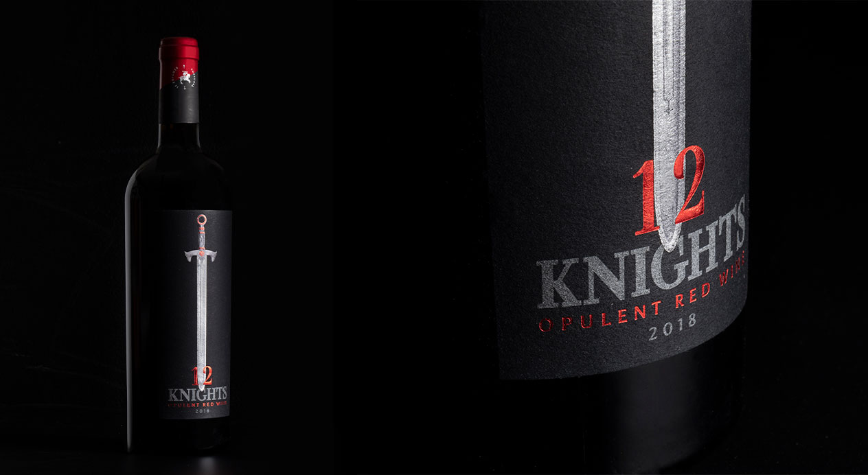
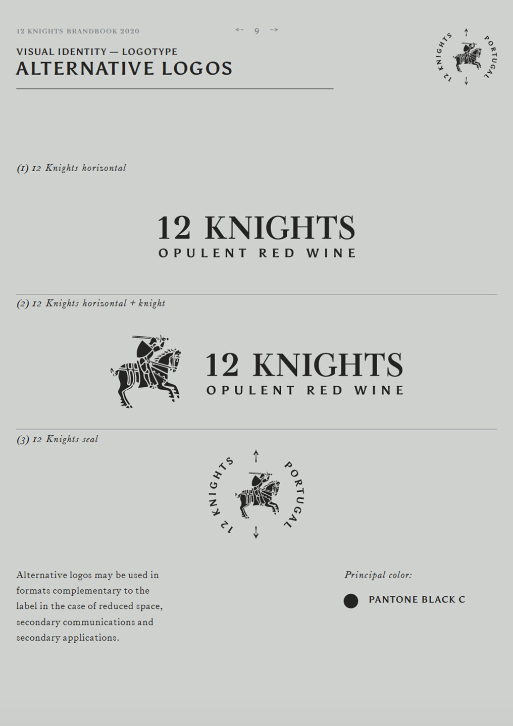
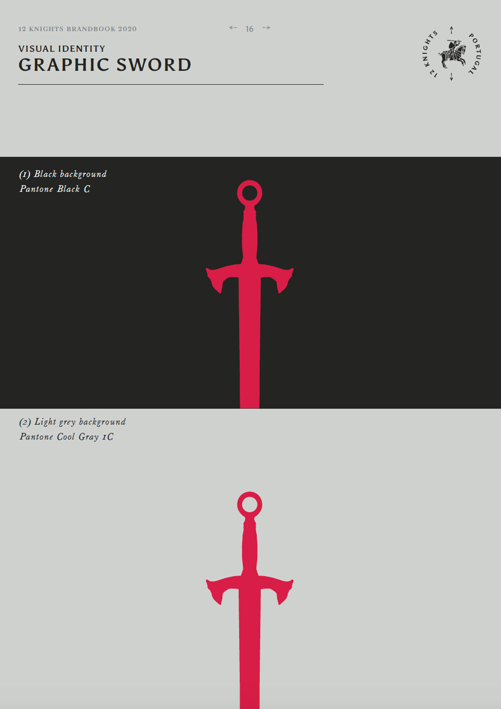
Packaging Design
Abundant in symbolism, the sword was chosen to represent the knight. Positioned vertically along the bottle and accompanied by minimal text, the sword, powerful and memorable, stands out on the shelf.
Brand Book
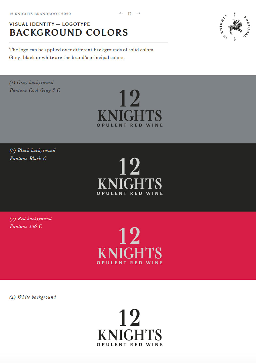
DAf created the 12 Knights brand book, outlining logo, copy, colors, typography and guidelines for print and digital end-use.
Key Visual
The Key Visual presents a medieval armored knight standing by a castle wall, with turrets visible in the background in tones of black, white, grey and red. His face shield is raised and his serious facial expression can be seen. In his hands is the iconic sword with an elaborate hilt, which has a seal depicting a mounted knight on it, which is also shown on the garment he wears. On the right side of the visual is the bottle, which is the same height as the knight.
Result
12 Knights is currently being distributed throughout target US states.
Patricia Contreras January 5, 2021
Challenge
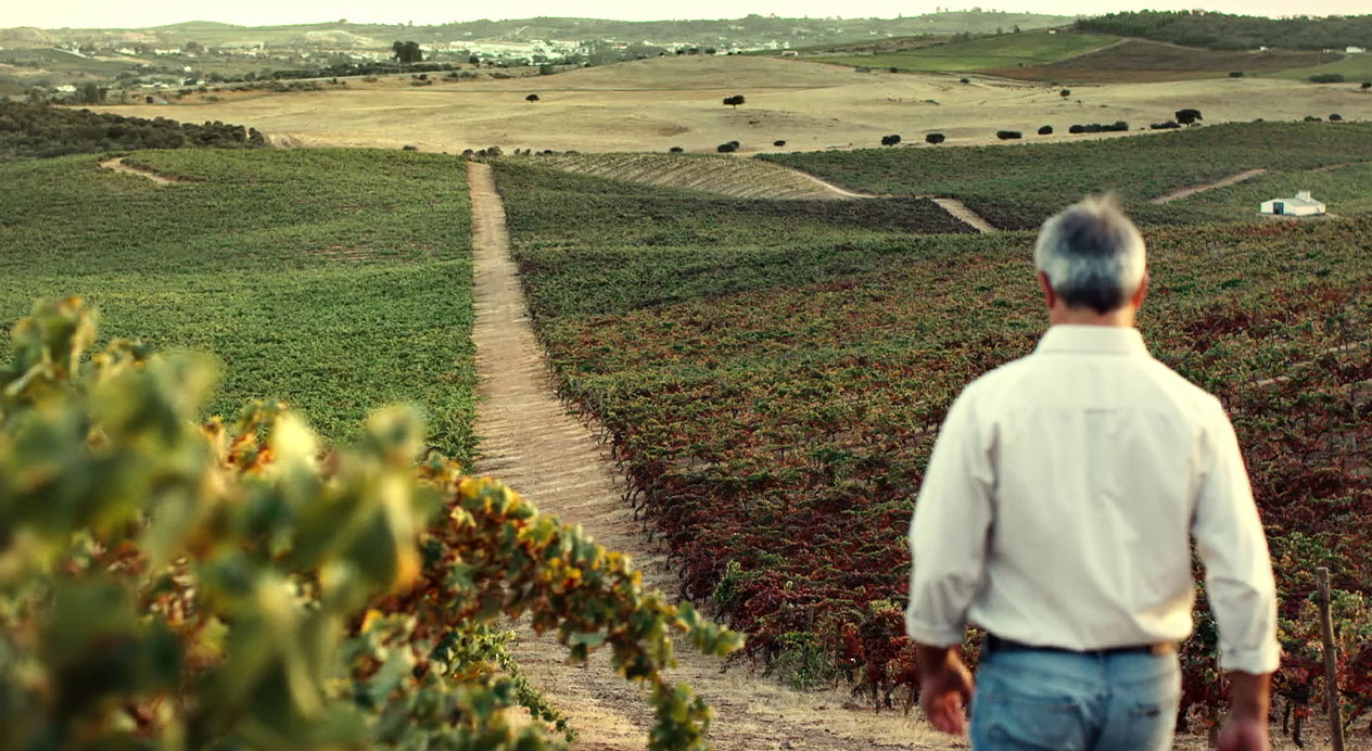
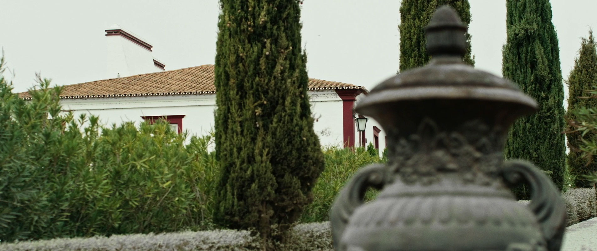
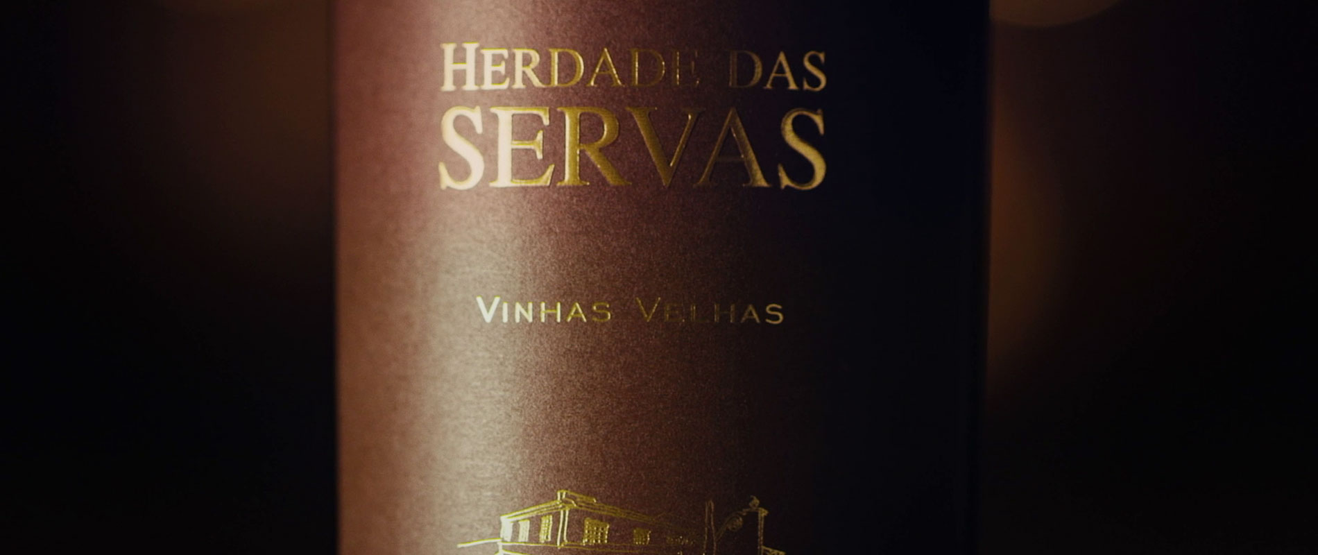
A new market has joined DAf’s portfolio, with historic Portuguese vineyard Herdade das Servas approaching DAf about creating a brand video to celebrate its icon wine Vinhas Velhas. Born to create wines that reflect the richness of the Alentejo region and with a history stretching back to 1667, Herdade das Servas wanted to highlight their tradition with a powerful, romantic video to showcase the vineyard in all its glory, transmitting this sense of history to its icon wine brand.
Client |
Vinhas Velhas |
|
|
Capabilities |
Video
Storytelling |
|
|
Solution
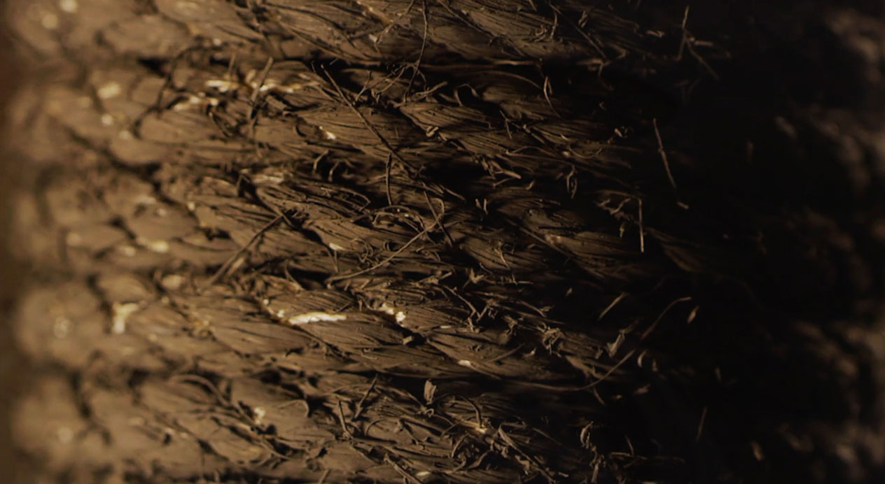
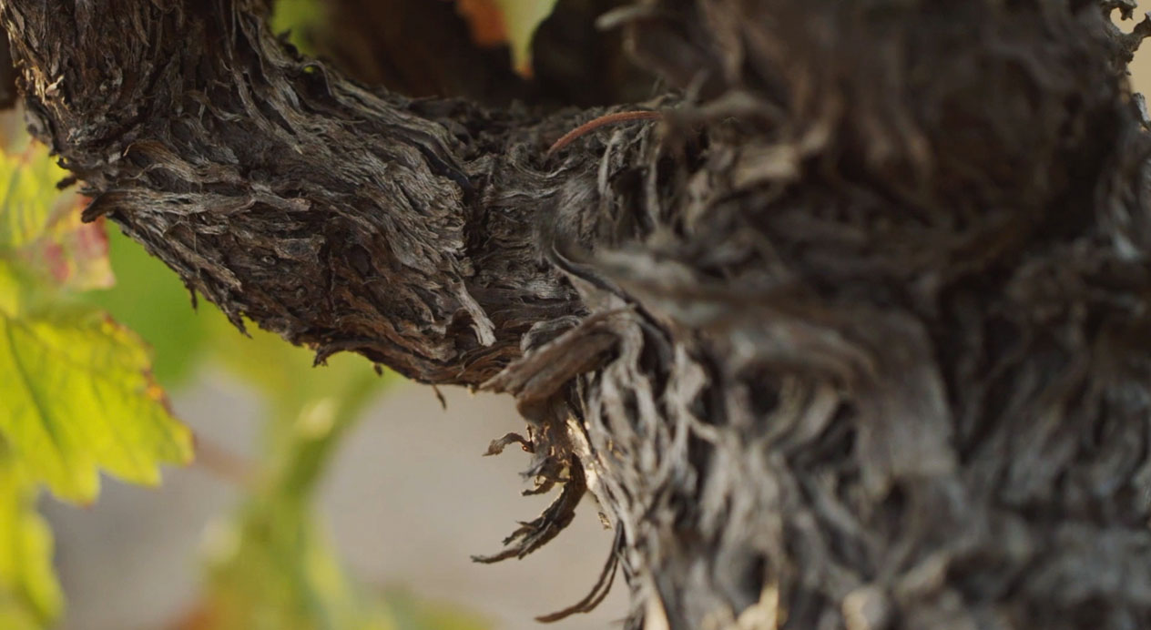
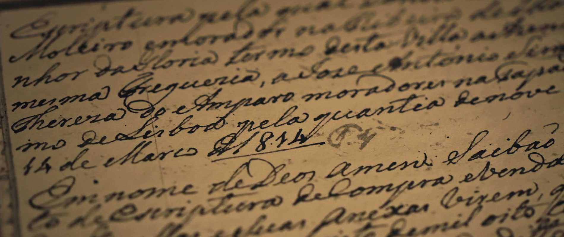
Visiting the vineyard, DAf was enchanted by the original clay vessels belonging to the winery, one of which had the date 1667 carved into its surface. We based the video on this particular ancient clay amphora, wrapped in old rope that slowly unraveled, transporting us through 350 years of history. Through this visual, the corporate video explored the history of this area of Portugal, supported by a script highlighting this romantic look at the past, introducing, as the rope unwound, a family deeply tied to their past.
Corporate Video
Luis Mira, who inherited the vineyard, present in his family for 13 generations, was chosen as the narrator, thereby giving the story a personal touch alongside a visual feast of historic and modern imagery. The result was a beautiful video that paid homage to the vineyard, its icon wine and the area’s rich winemaking heritage.
Voice Over
We were born of this arid land.
Born to work the soil, plant vines, harvest.
Born to create wines that reflect the richness of the Alentejo.
And the tradition of Estremoz.
It’s in our blood.
It’s what we do.
It’s what we’ve always done.
Our historic vines bind us to our past
and our clay amphoras stand as testament to our winemaking heritage,
a reminder of times gone by.
Touch the smooth, cool clay and you are transported back 350 years
To 1667.
When our wine was fermented in Alentejo’s unique talha style.
They are the legacy our forefathers left us,
along with their winemaking knowledge
and the aged, twisted vines that lace our arid lands…
Weaving together the generations
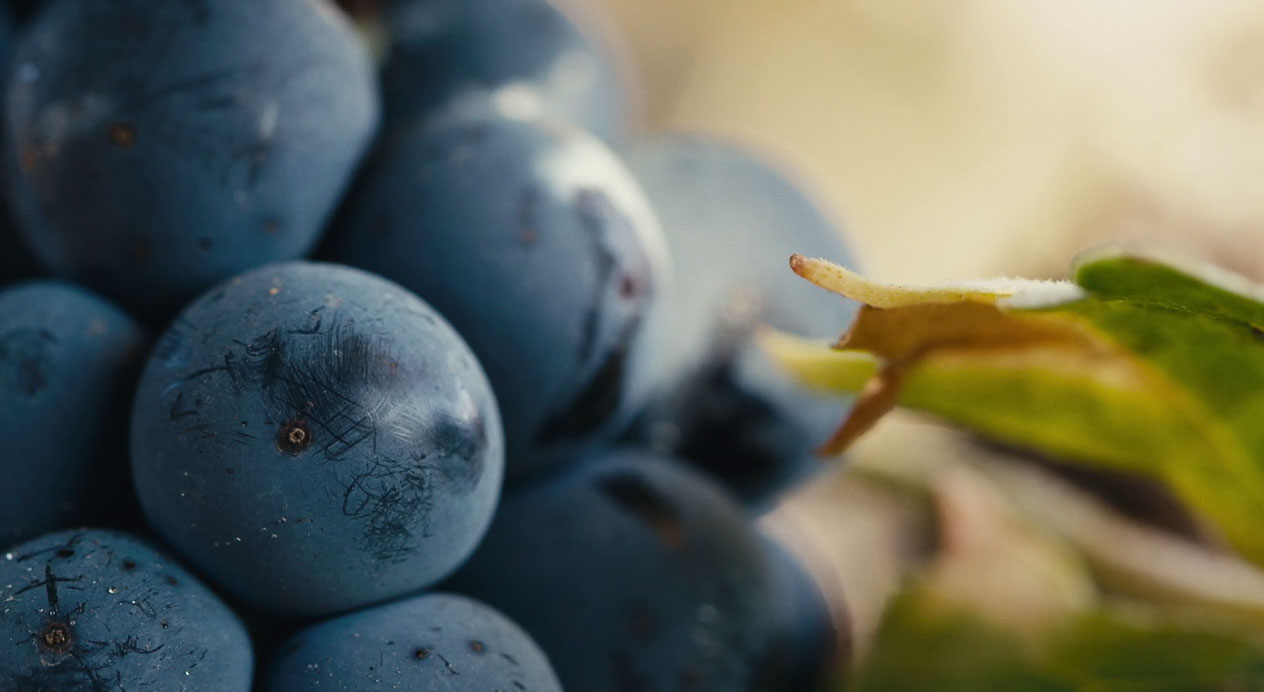
and bearing the rich grapes
that produce our Vinhas Velhas wine.
We are Herdade das Servas,
and we are bound to our family’s legacy.
Bound to our family’s legacy.
Patricia Contreras September 30, 2020