Challenge
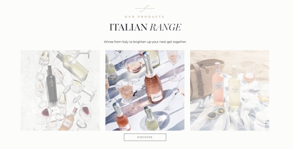
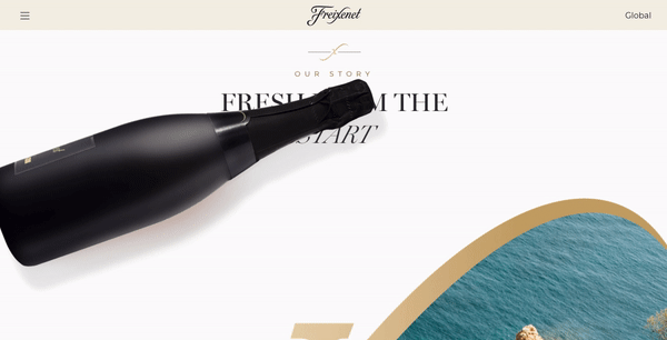
Freixenet, a world force in sparkling wine based in Catalonia, Spain was looking to create a global website to represent its products in 22 markets. They approached DAf due to our experience working with global brands and our specialization in the wine and spirits industries. Prior to coming to us, each of Freixenet’s markets had its own website, which they felt diluted the brand’s strength and which were at times not fully aligned with one another.
Client |
Freixenet |
|
|
Capabilities |
Strategic Workshops
Website |
|
|
Solution
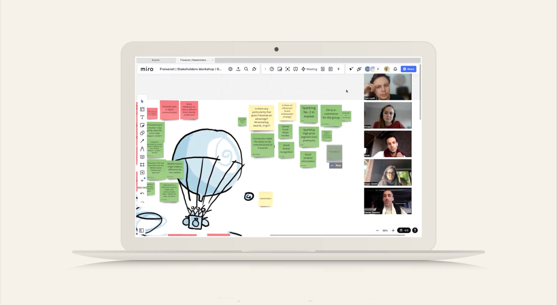
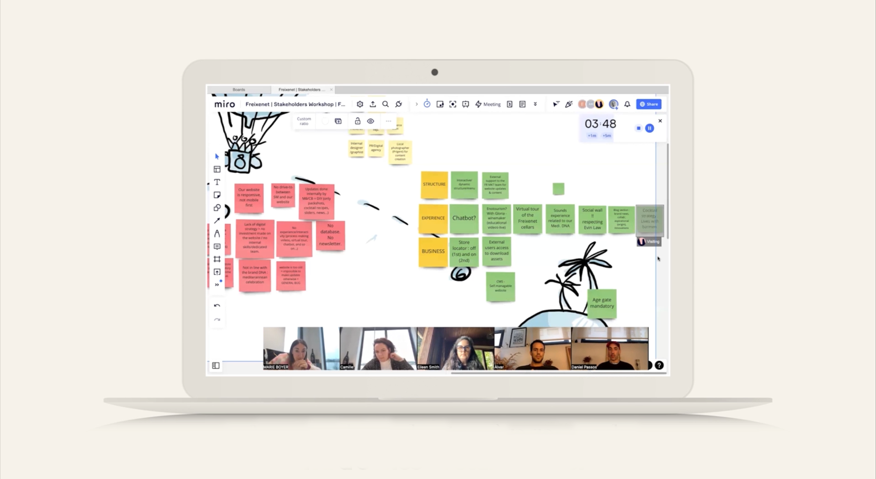
DAf planned and carried out a series of interactive workshops with key stakeholders in each of the five main markets, representing Spain, France, Germany, the United States and the United Kingdom as well as traveling to Spain to work in-person with the home team. As a result of these workshops we harmonized each market’s needs to create an architecture to suit them all, with dynamic content for each of the markets to put their own special touch on them.
Strategic Workshops
DAf planned and carried out a series of interactive workshops with key stakeholders in each of the five main markets, representing Spain, France, Germany, the United States and the United Kingdom, as well as traveling to Spain to work in-person with the home team. Using an interactive format that allowed representatives of each market to dream big about the future website and clearly communicate their needs, we were able to understand where these needs overlapped and where they diverged in order to tailor the final result to each market while maintaining a cohesive overall feel.
Website
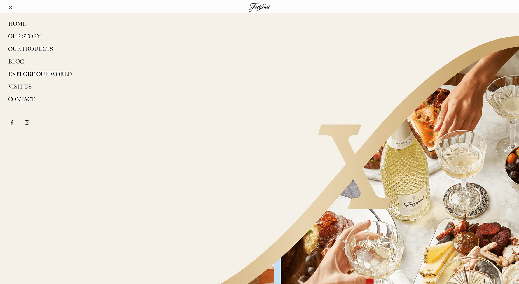
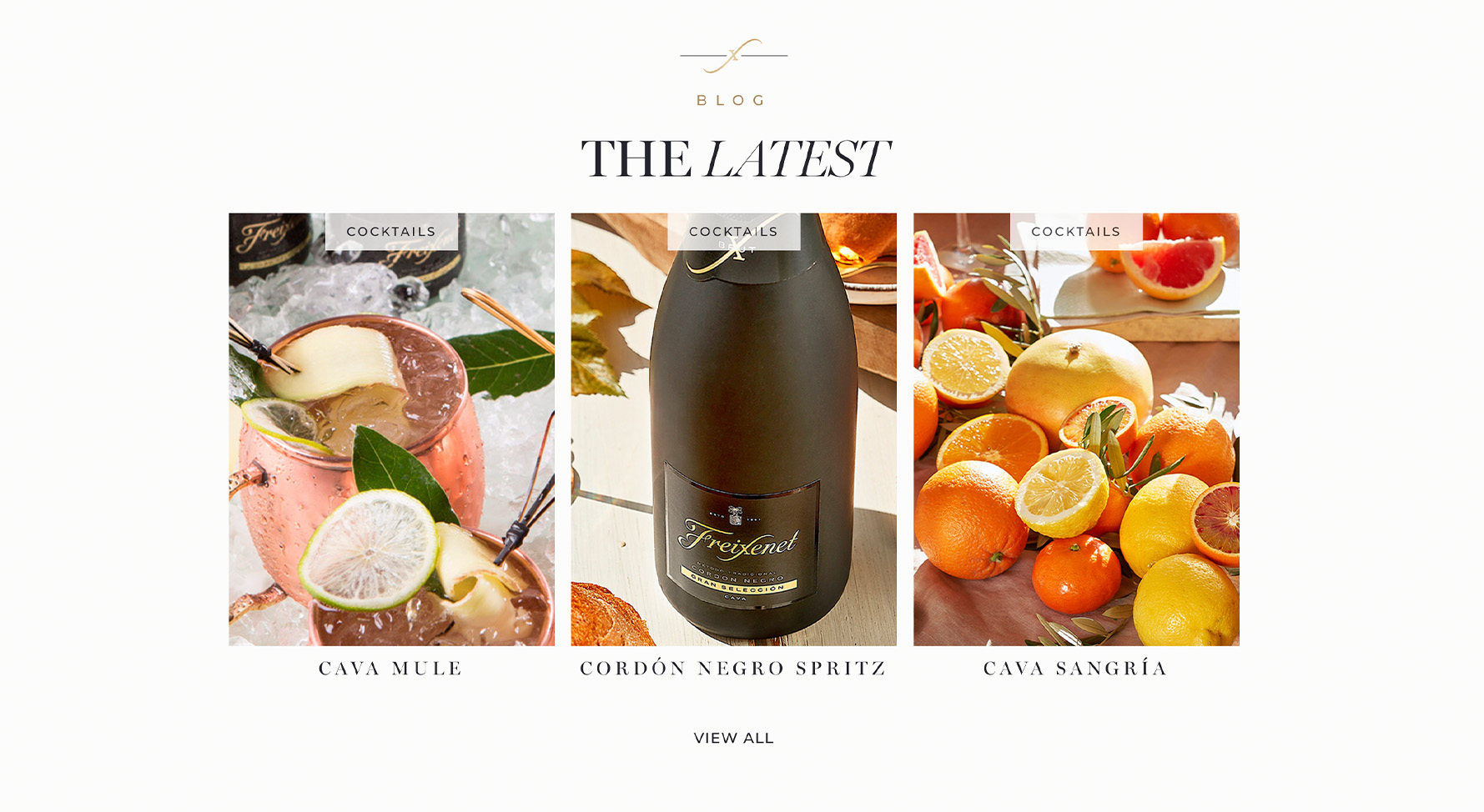
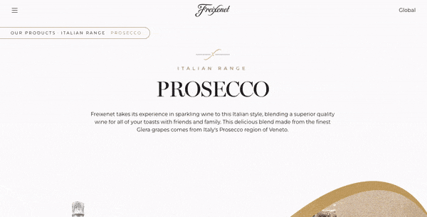
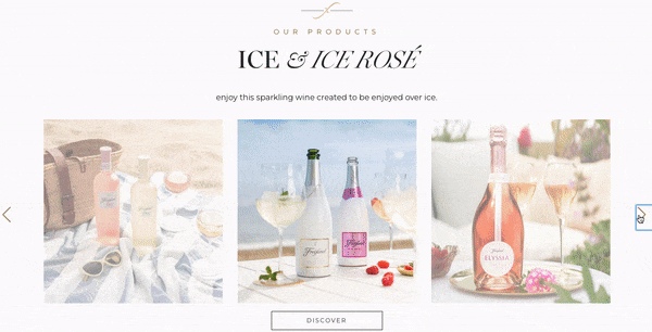
Within this framework, we also took into account the different market realities, both in terms of different products offered and legal requirements of each country, such as Evin’s law in France, which strictly controls how alcohol is advertised, including limitations on what can appear in photos. Local markets can upload their own content to announce upcoming events and market-specific recipes, and we also built in integration with e-commerce where available.
We then worked to build the content for each of the sections based on Freixenet’s existing content and databases. In tandem with developing the architecture, we also worked on the look and feel together with a local creative agency, and also on the messaging of the website, hammering out the precise phrases to best communicate the overall spirit of their brand, which they express as “Celebrate la vida.” Our talented team of programmers developed the graphics and animations for a unique user experience with an elegant rolling bottle that appears on screen.
The resulting website, which serves the 22 markets, is sparkling and stylish, like the wine itself, and follows the global guidelines, with adaptations for local contents and products.
Visit the site here.
Niamh Tumbleton November 2, 2023
Challenge
Freixenet, a world force in sparkling wine based in Catalonia, Spain was looking to create a global website to represent its products in 22 markets. They approached DAf due to our experience working with global brands and our specialization in the wine and spirits industries. Prior to coming to us, each of Freixenet’s markets had its own website, which they felt diluted the brand’s strength and which were at times not fully aligned with one another.
Client |
Freixenet |
|
|
Capabilities |
Strategic Workshops
Website |
|
|
Solution
DAf planned and carried out a series of interactive workshops with key stakeholders in each of the five main markets, representing Spain, France, Germany, the United States and the United Kingdom as well as traveling to Spain to work in-person with the home team. As a result of these workshops we harmonized each market’s needs to create an architecture to suit them all, with dynamic content for each of the markets to put their own special touch on them.
Strategic Workshops
DAf planned and carried out a series of interactive workshops with key stakeholders in each of the five main markets, representing Spain, France, Germany, the United States and the United Kingdom, as well as traveling to Spain to work in-person with the home team. Using an interactive format that allowed representatives of each market to dream big about the future website and clearly communicate their needs, we were able to understand where these needs overlapped and where they diverged in order to tailor the final result to each market while maintaining a cohesive overall feel.
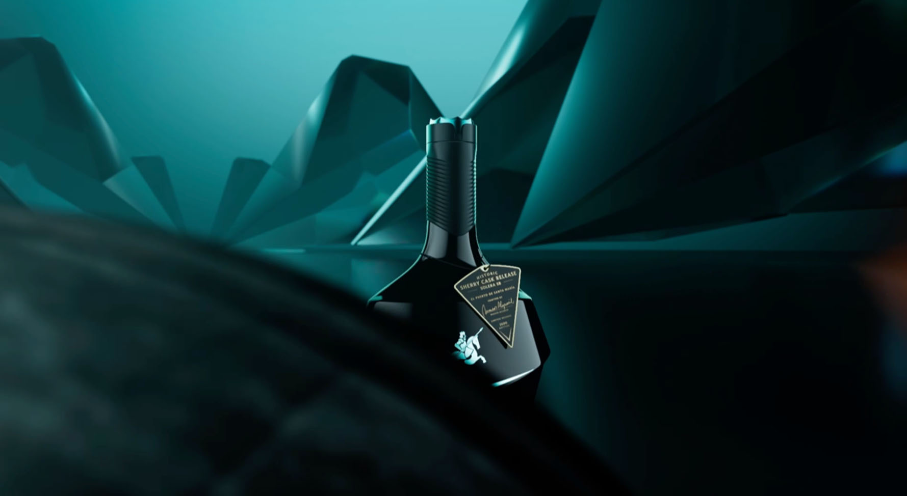
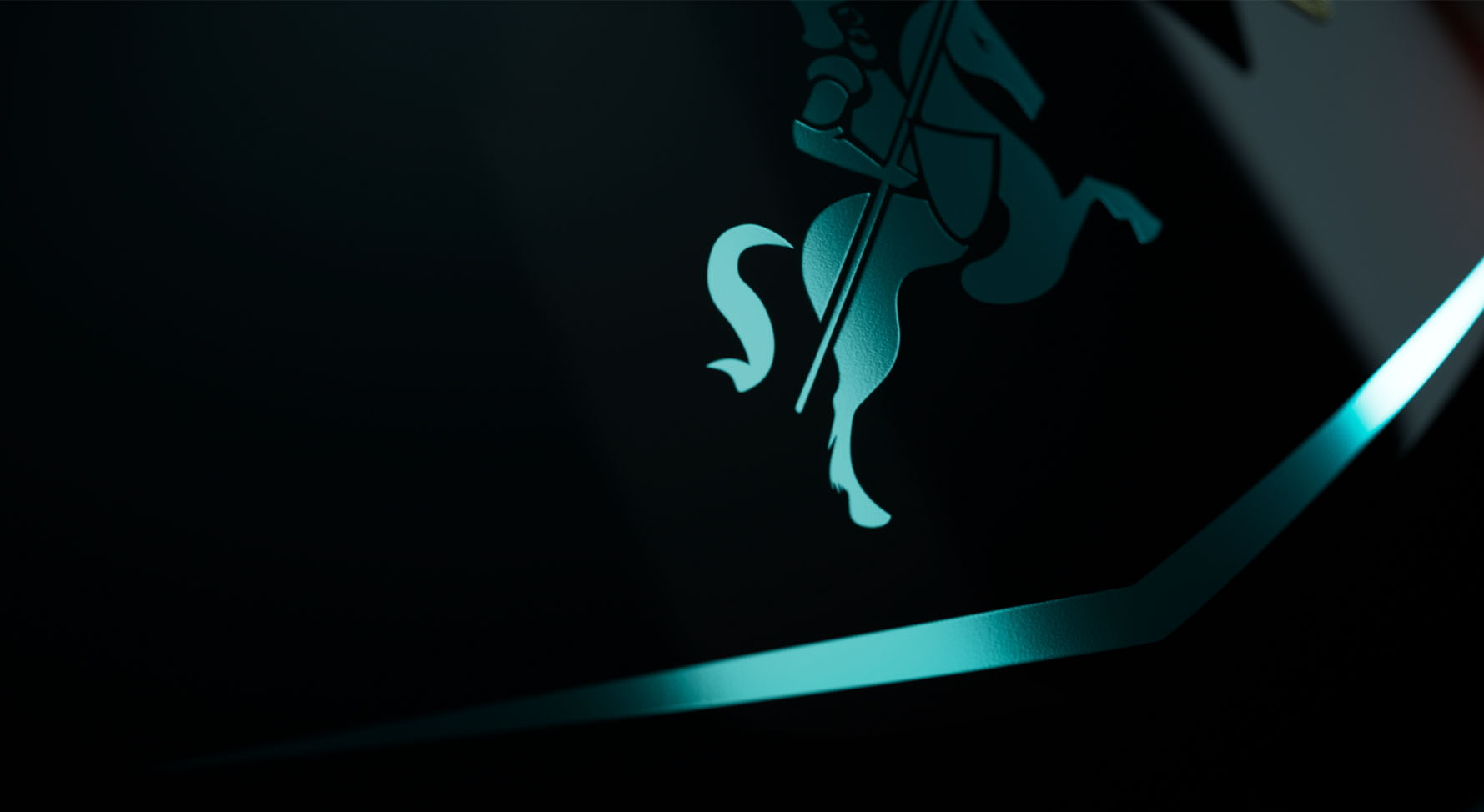
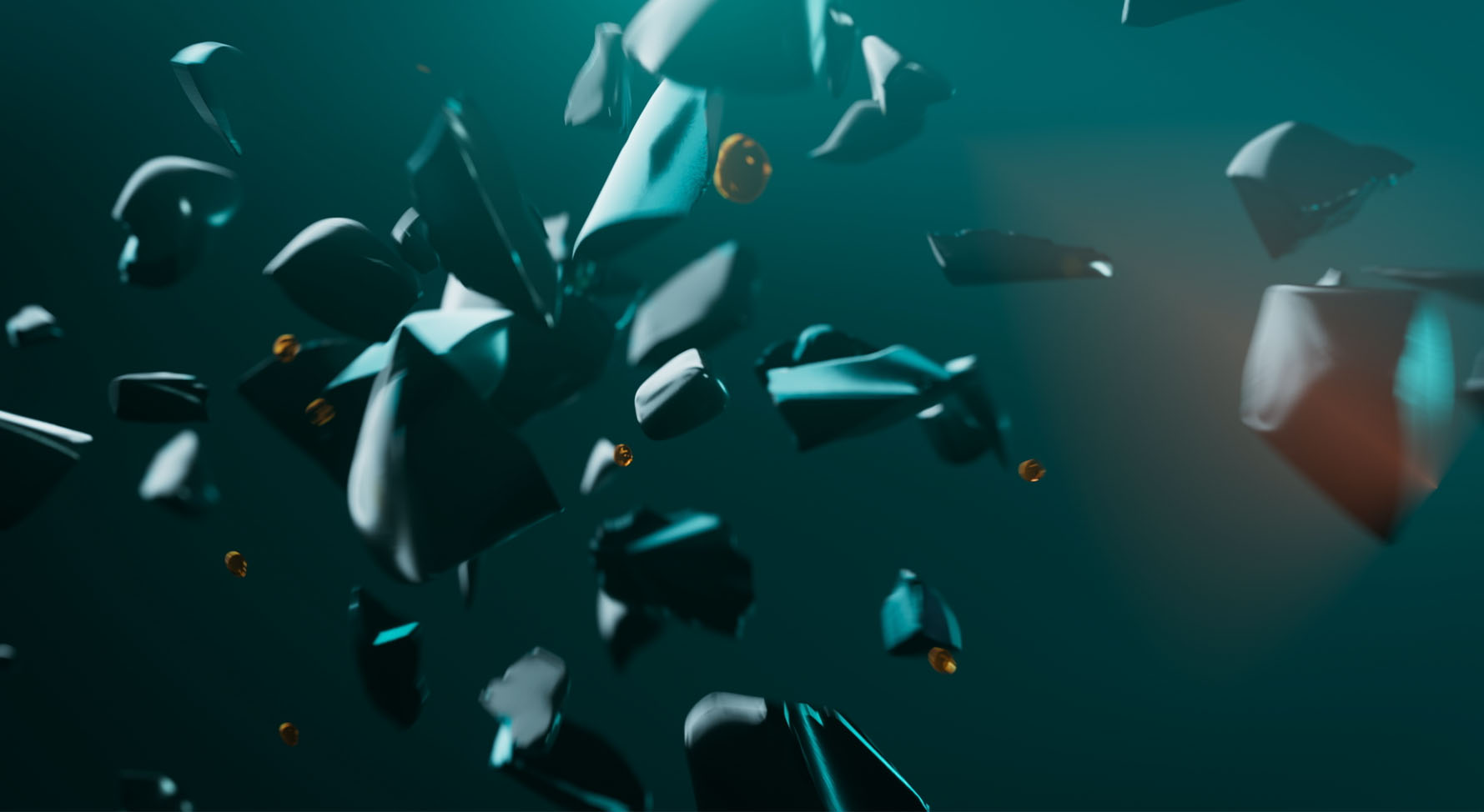
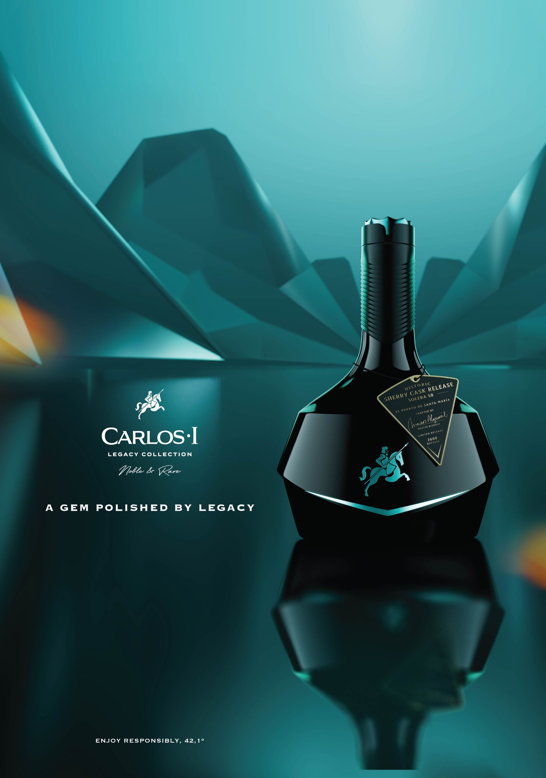
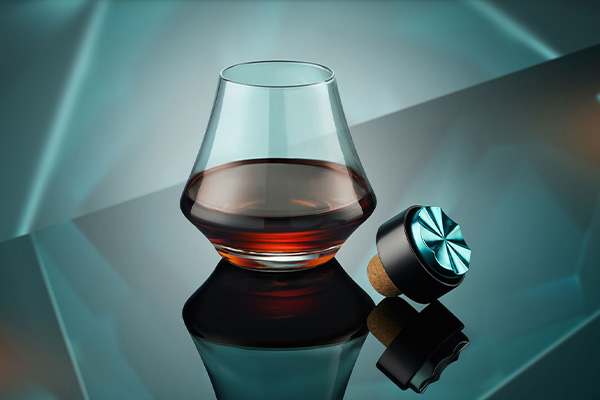
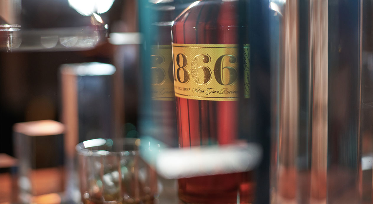
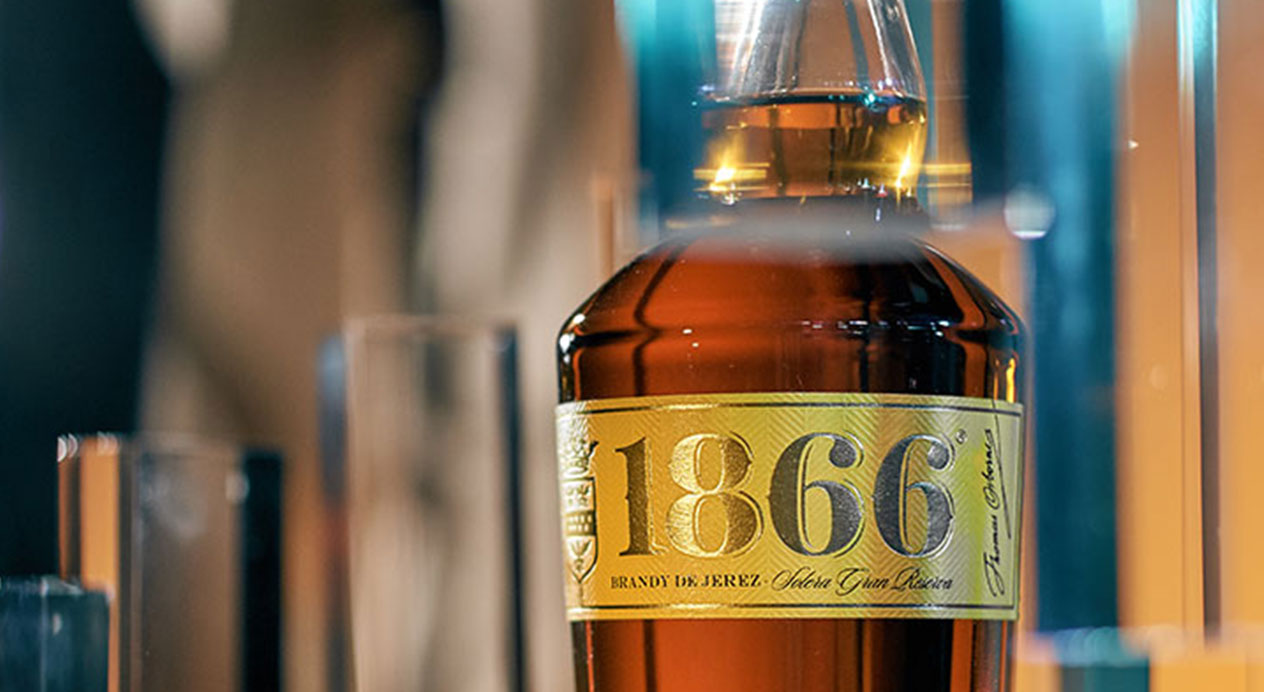
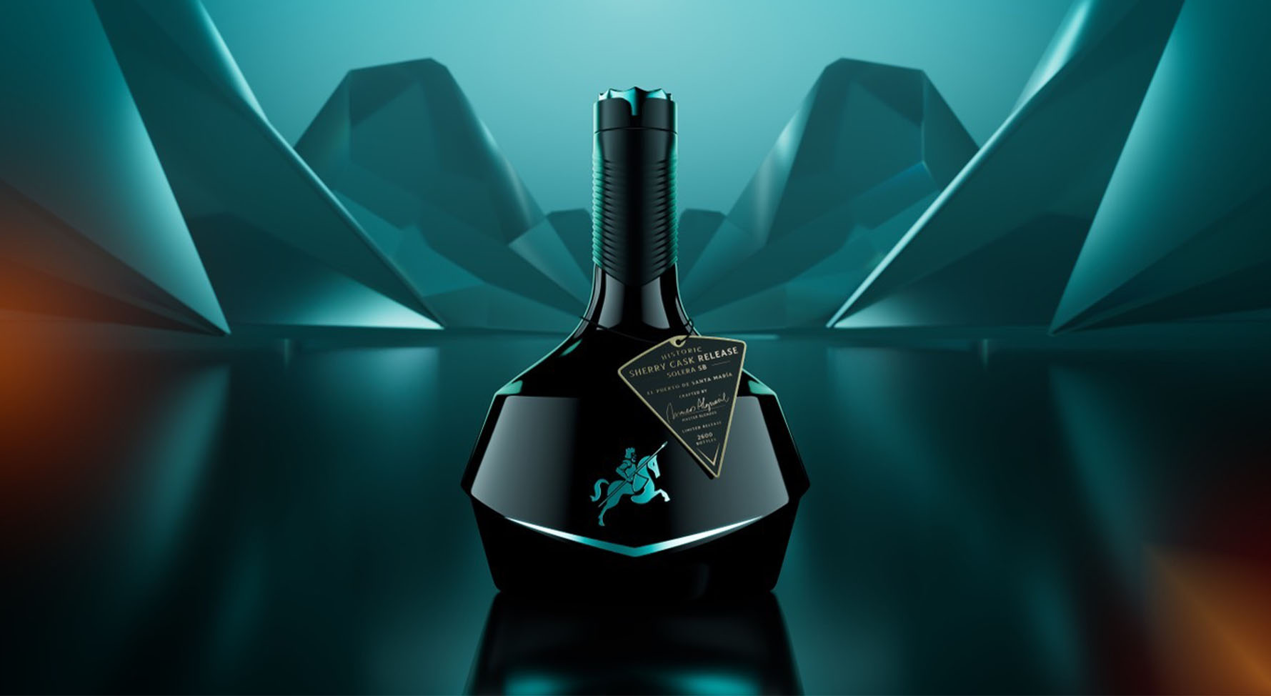
Key Visual
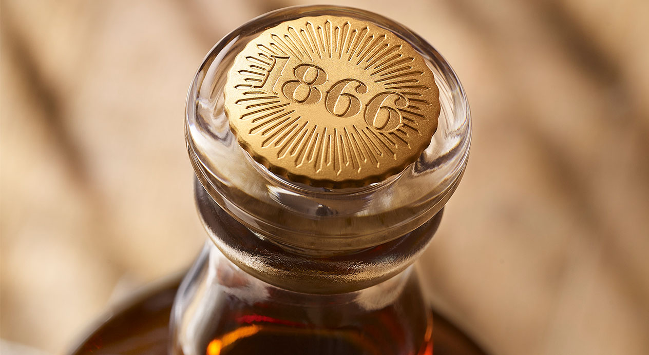
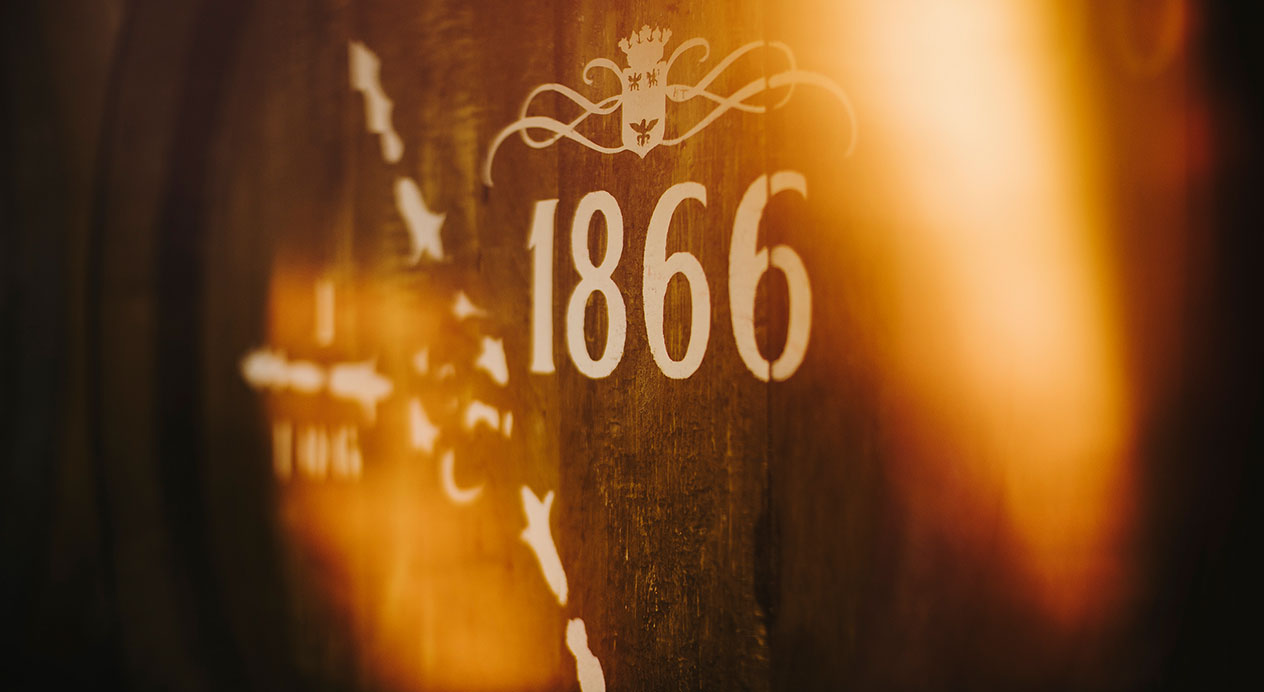
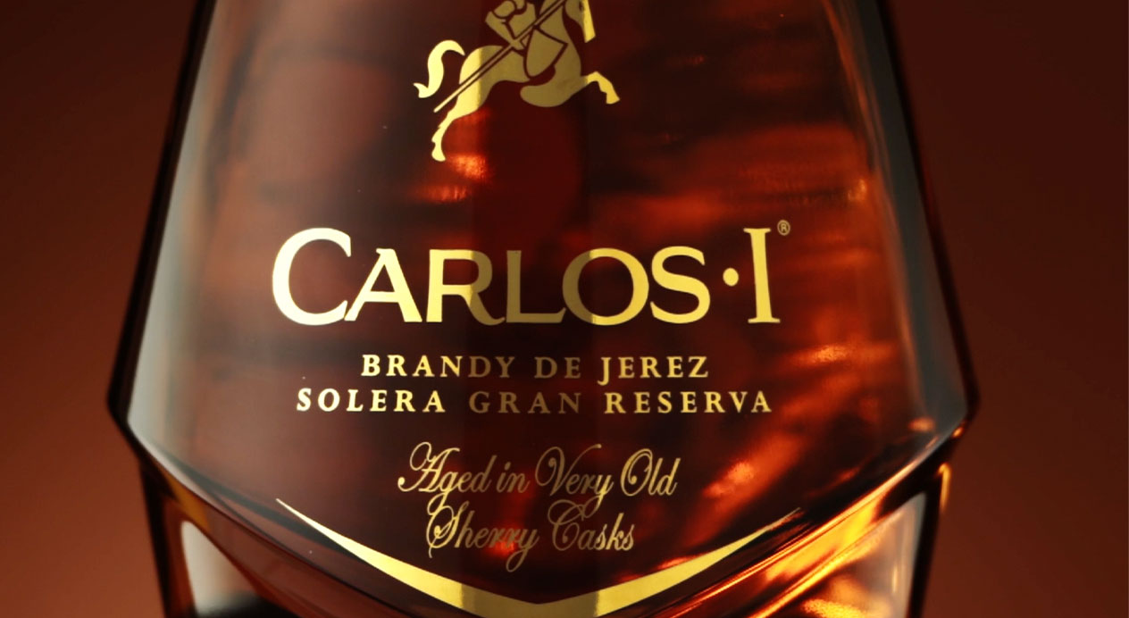
The key visual focuses on the bottle, with its gem-like angles, in front of a 3D background that gives the impression of jewels. It includes the claim “A gem polished by legacy,” which springs from the client’s concept that each of the three releases of the Legacy Collection will be an enological jewel. The phrase makes clear that this is no ordinary brandy and that its premium nature comes from the history of Carlos I and its oak tonneaux.
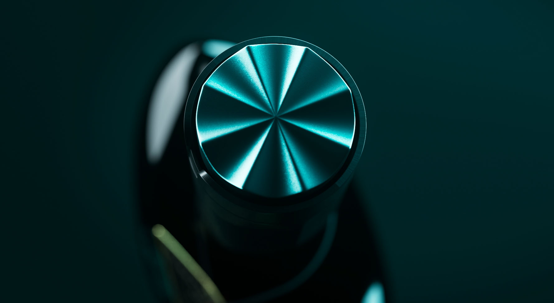
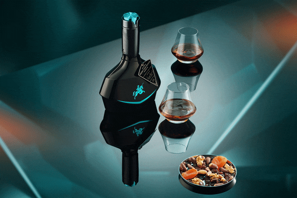
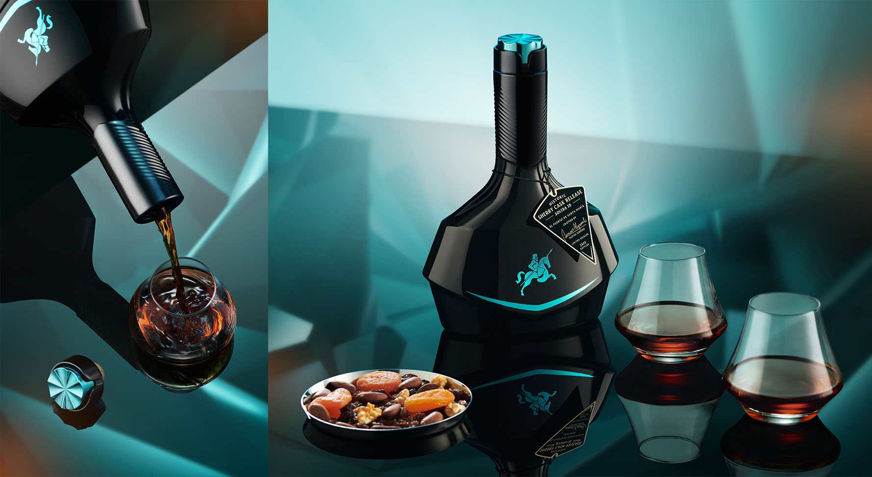
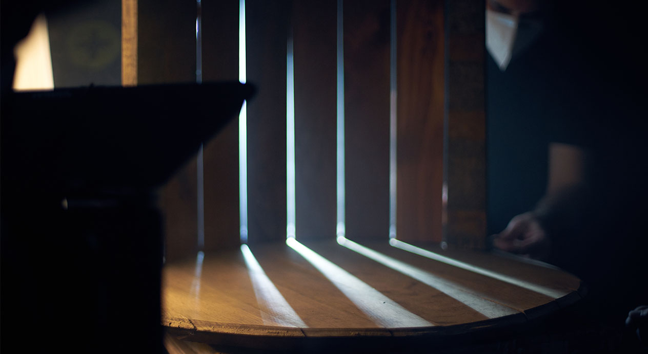
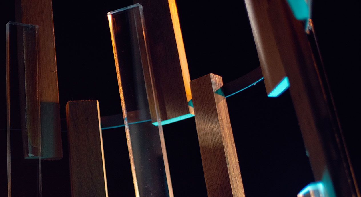
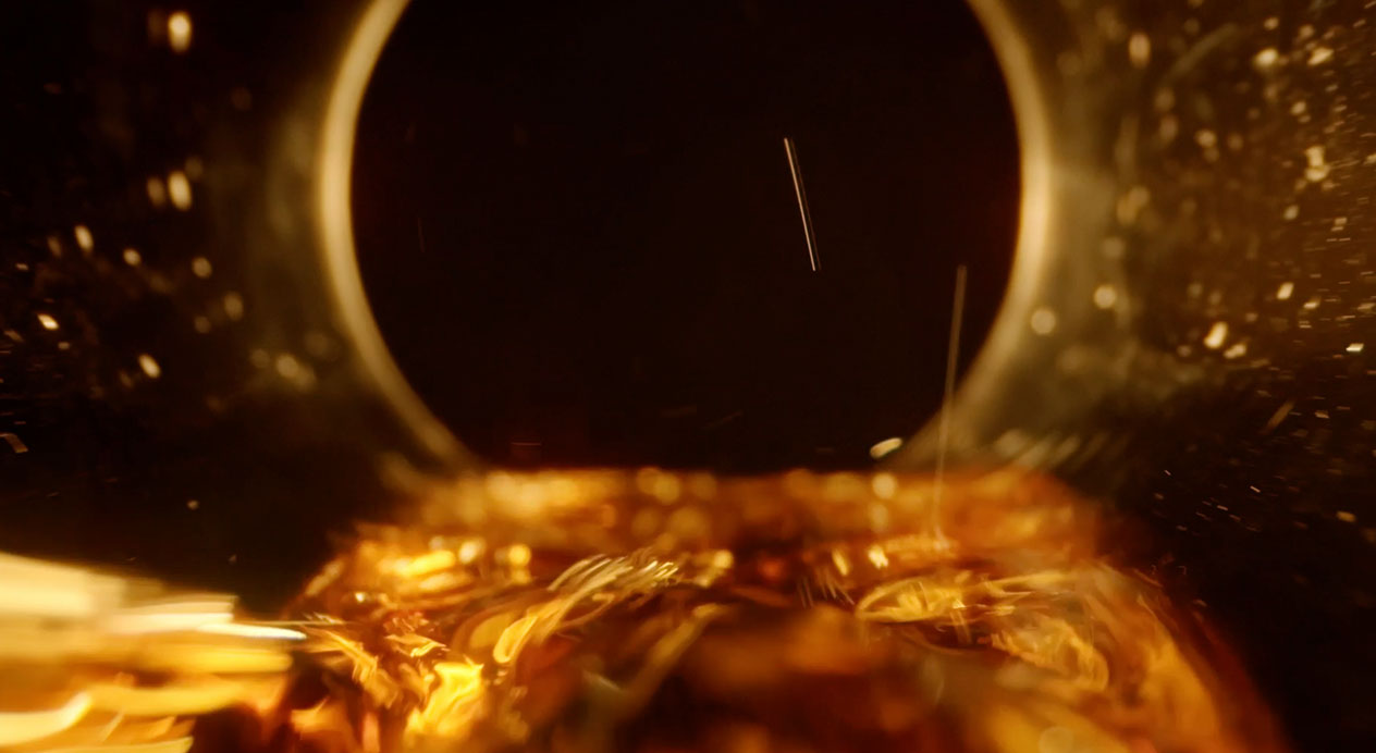
Photography
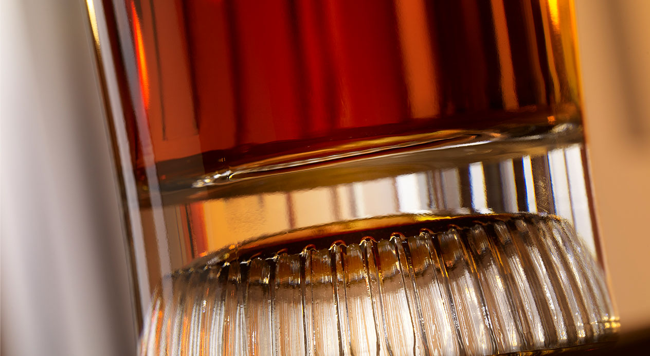
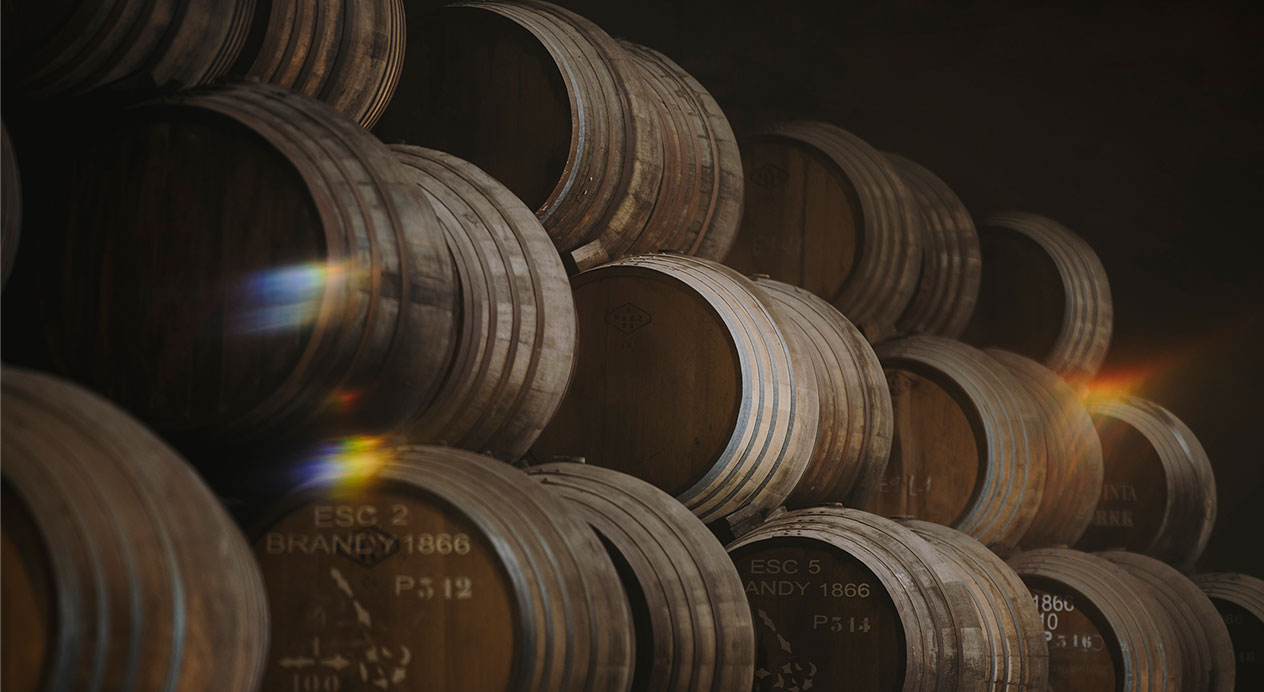
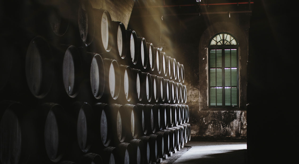
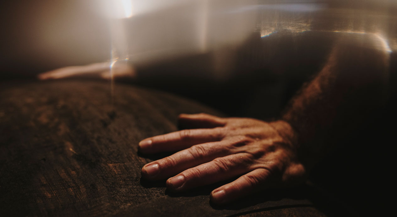
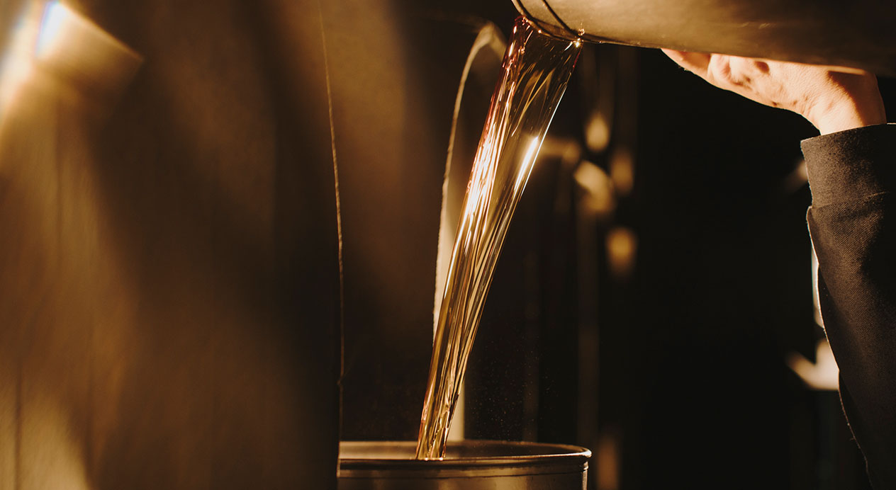
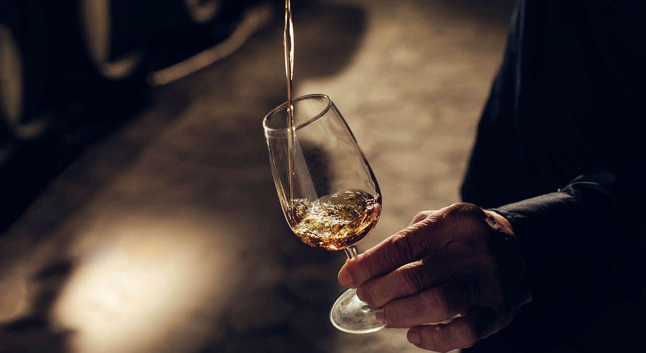
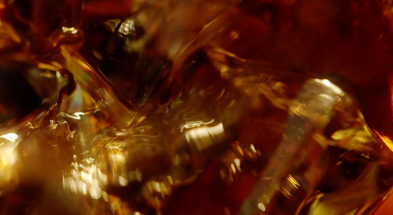
DAf’s Barcelona office shot on-site and studio photographs. In the studio, we captured images that share the details of the specially-designed bottle and show the richness of the brandy itself. We also created a stop motion video. The blue-green 3D background is similar to that of the main videos.
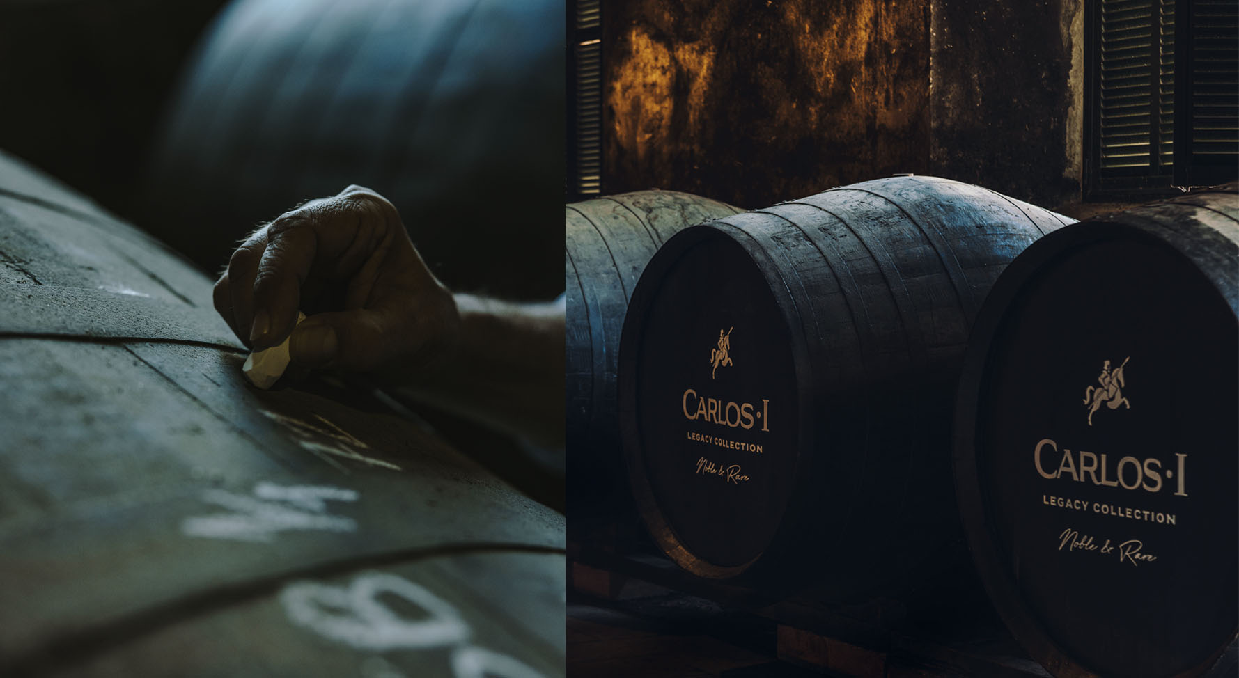
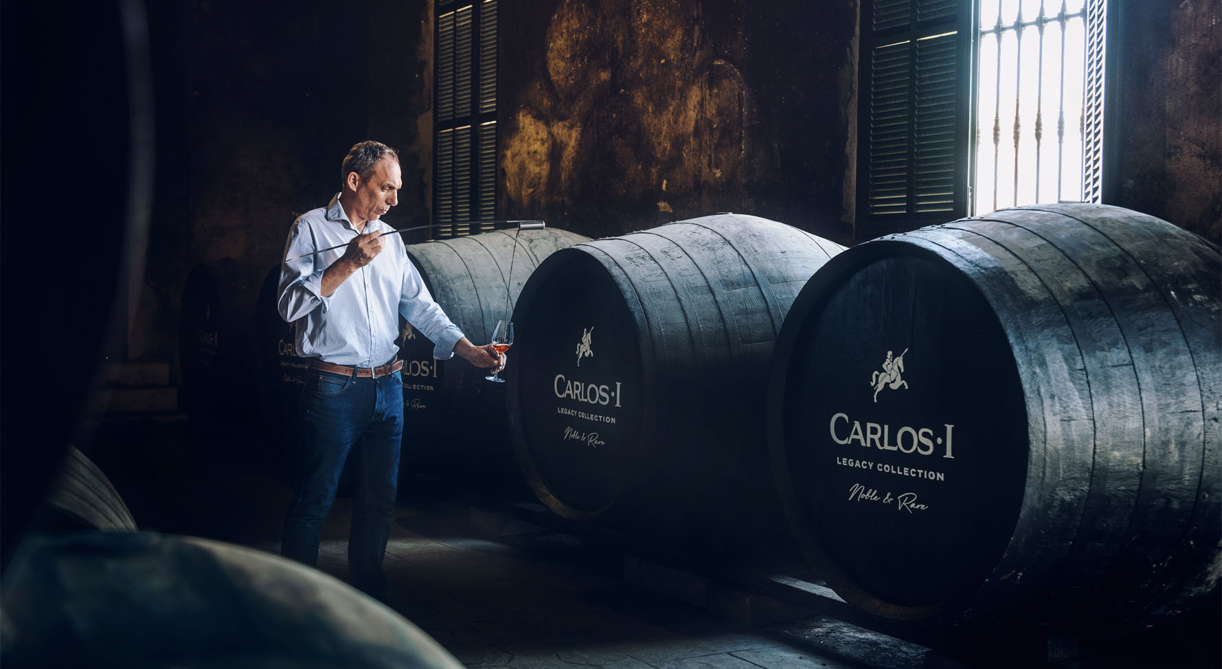
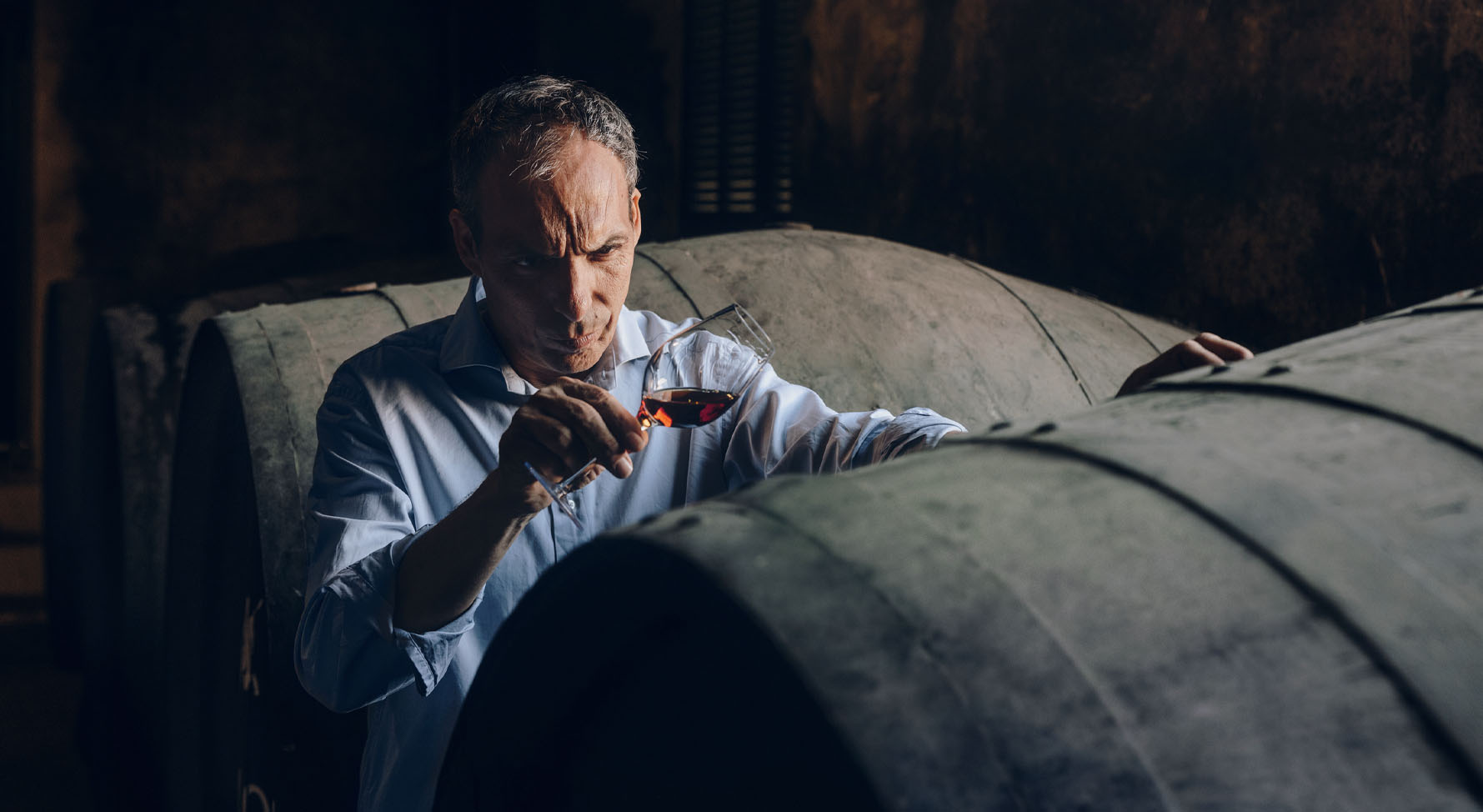
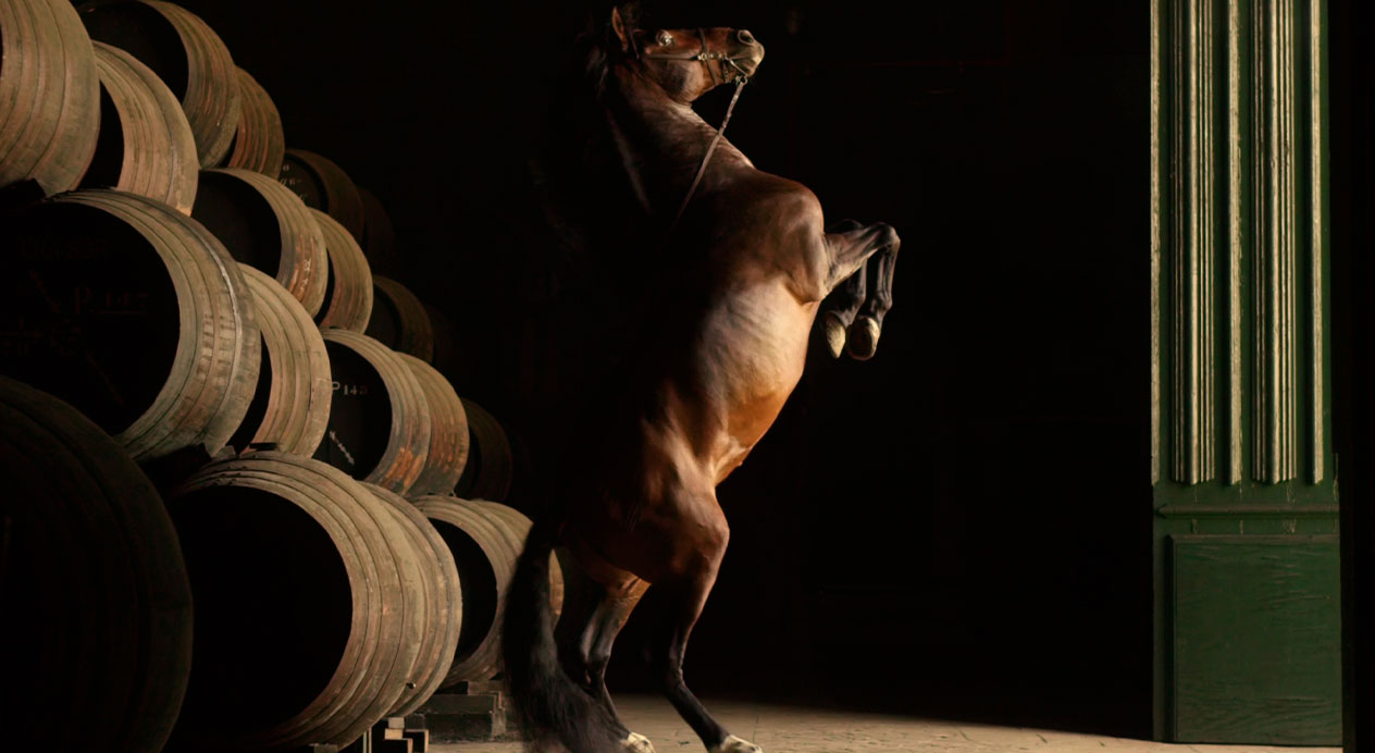
We also went to the Carlos I bodega, where the sherry casks provided an atmospheric backdrop for our shots of Master Blender Marcos Alguacil sharing his process. The style, lighting and color of the photos all lend a gravitas that reinforces the experience and artisan talent behind each bottle.
Niamh Tumbleton November 2, 2023
Challenge
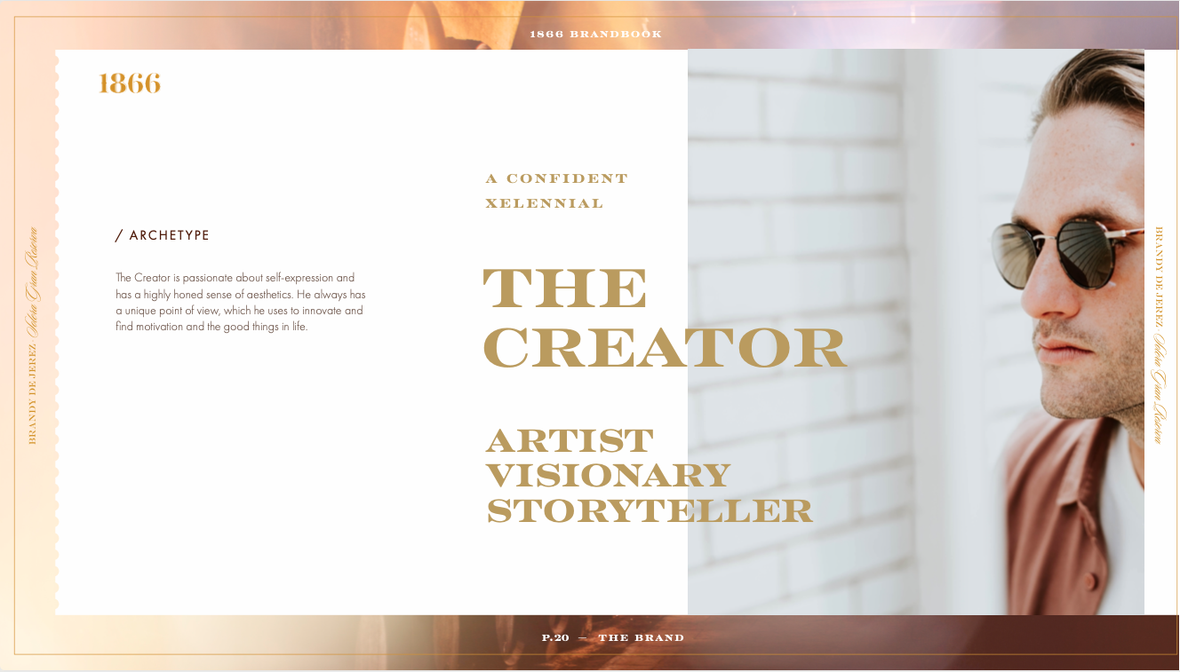
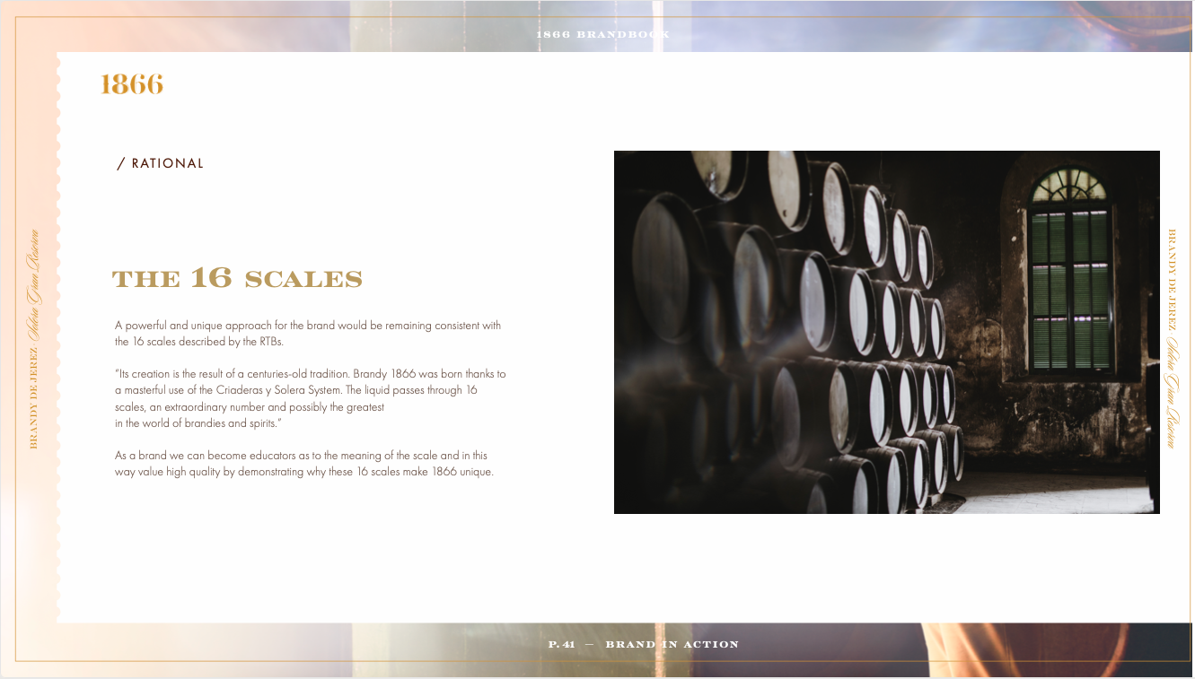
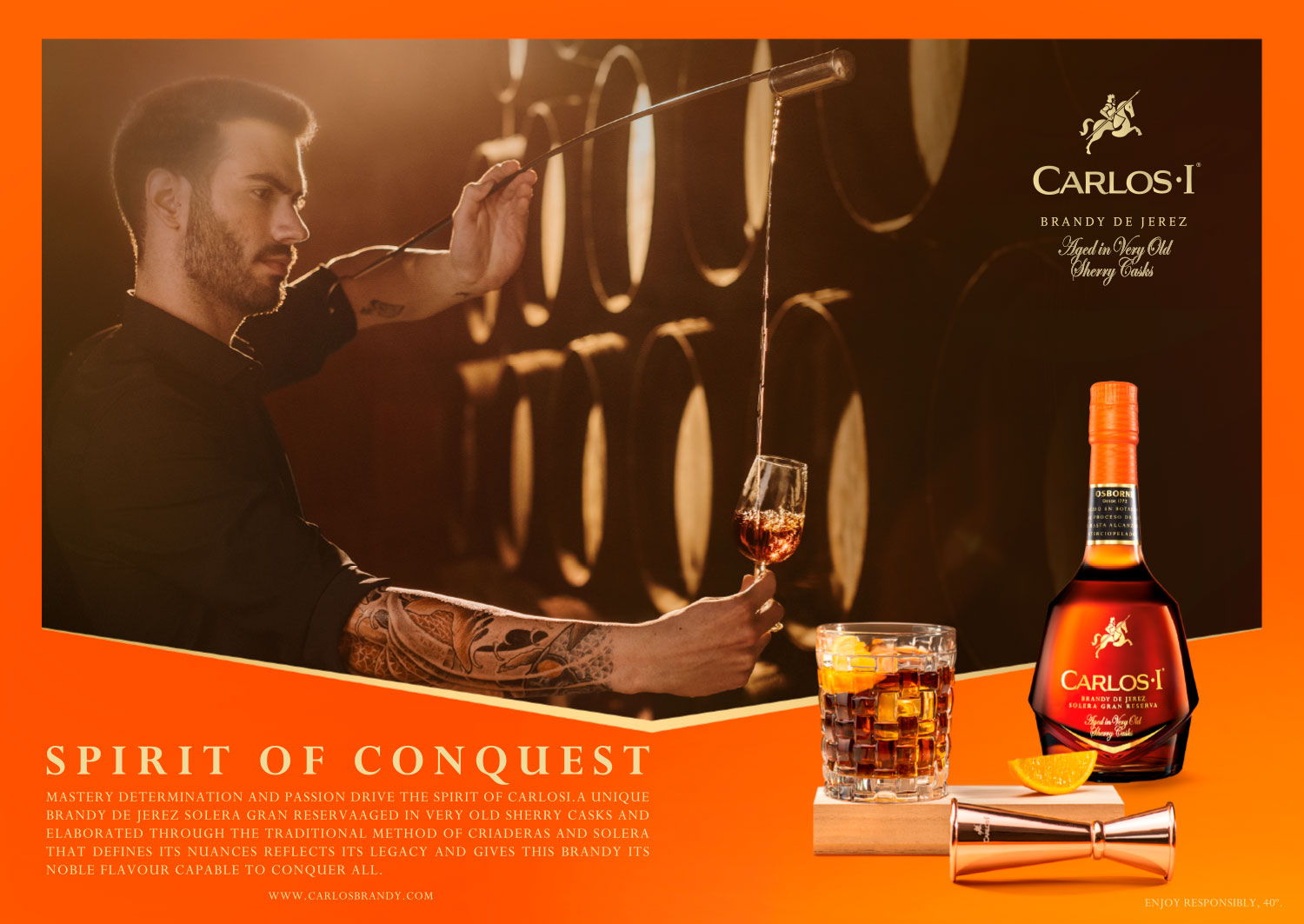
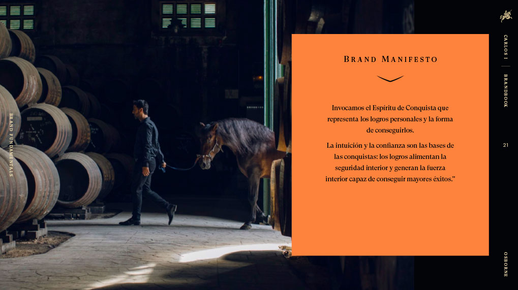
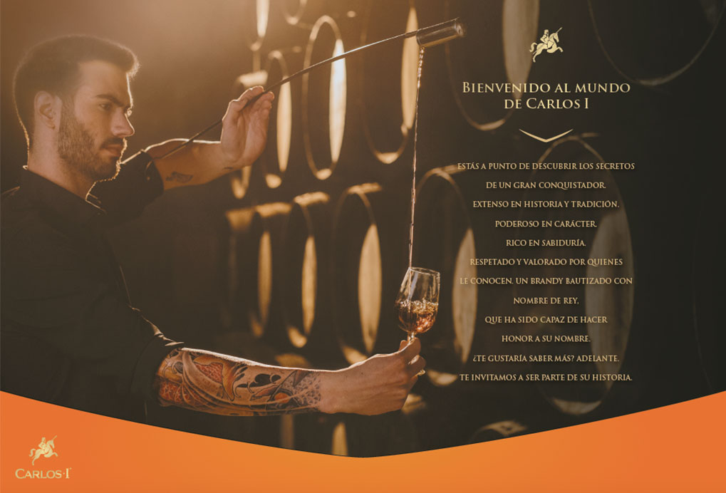
Due to the growth of rum and whisky, coupled with connotations of stuffiness, brandy has been confronted with the challenge of attracting and maintaining a younger consumer base. Given this context, Carlos I, one of the world’s most recognized brandies and part of Spanish stronghold Osborne’s portfolio, wished to compete strategically to captivate new 35+ consumers of dark spirits.
To deepen its claim “Spirit of Conquest,” Carlos I invited DAf to develop its new brand strategy, supported by a consumer campaign to create growth key markets of Spain and Germany by underpinning its principal image characteristics: premiumness, quality, flavor and prestige.
Client |
Osborne |
|
|
Capabilities |
Brand Strategy
Brand Film
Key Visual
Brand Book |
|
|
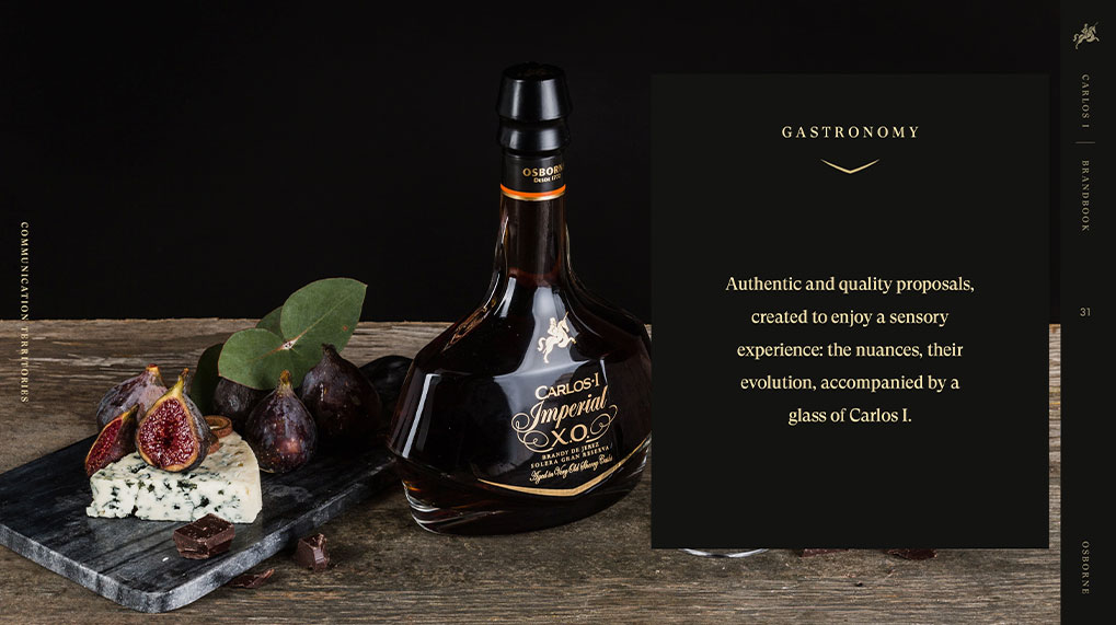
Solution
The intense focus of the "achiever" was selected as the attitude behind the campaign, as a means to zoom in on the different stages involved in brandy making and brandy mixology. Throughout the brand film, the pillars of origin, nobleness, determination and wisdom are unpacked, ultimately identifying the one thing our consumer most needs to conquer their goals: intuition.
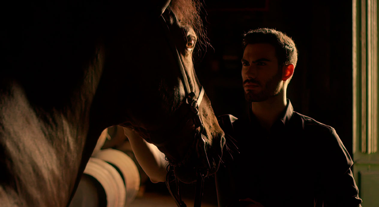
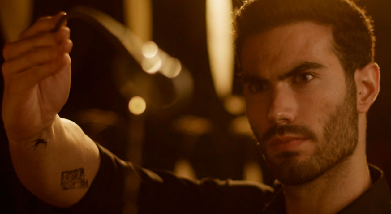
Brand Video
The video presents a bodega worker, mixologist, and the brand’s Master Blender, to present the different people key in the creation and enjoyment of Carlos I. By highlighting young, high-achieving brandy professionals, the aim is to reflect the attitude of intuition and conquest key to the brand and its new, younger target market.
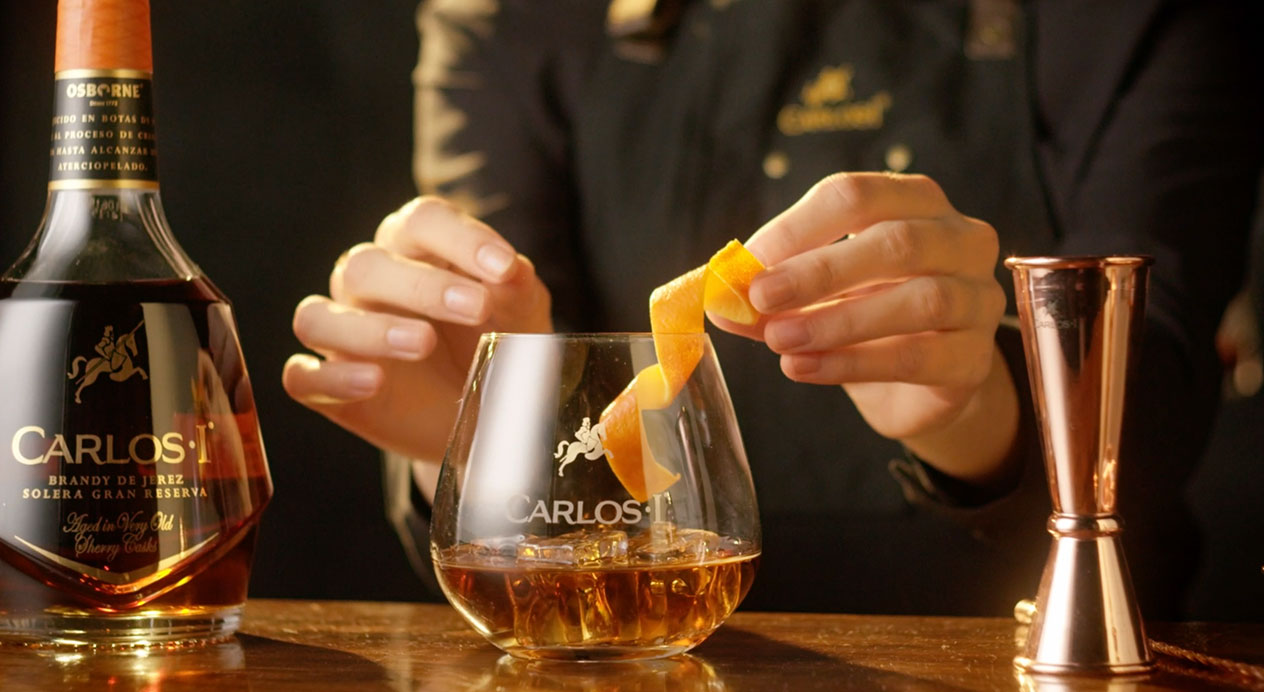
Key Visual
Our determined, young bodega worker is shown in Osborne’s cellars, alongside mixology tools that remind newer consumers that there is more than one way to enjoy brandy.
Brand Book
DAf developed the brand book for Carlos I, outlining its history, brand pillars, manifesto, consumer archetype, logo, graphics and all other elements essential for key markets to implement the campaign
Patricia Contreras August 13, 2021
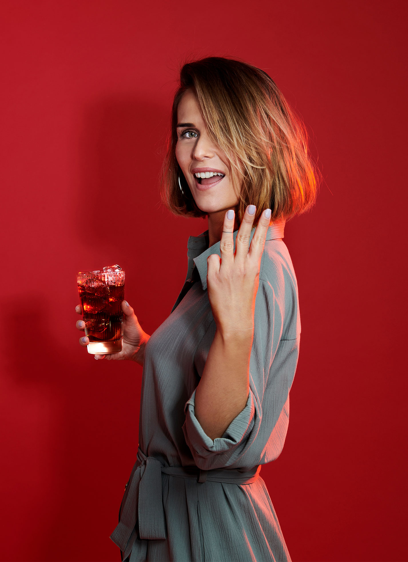
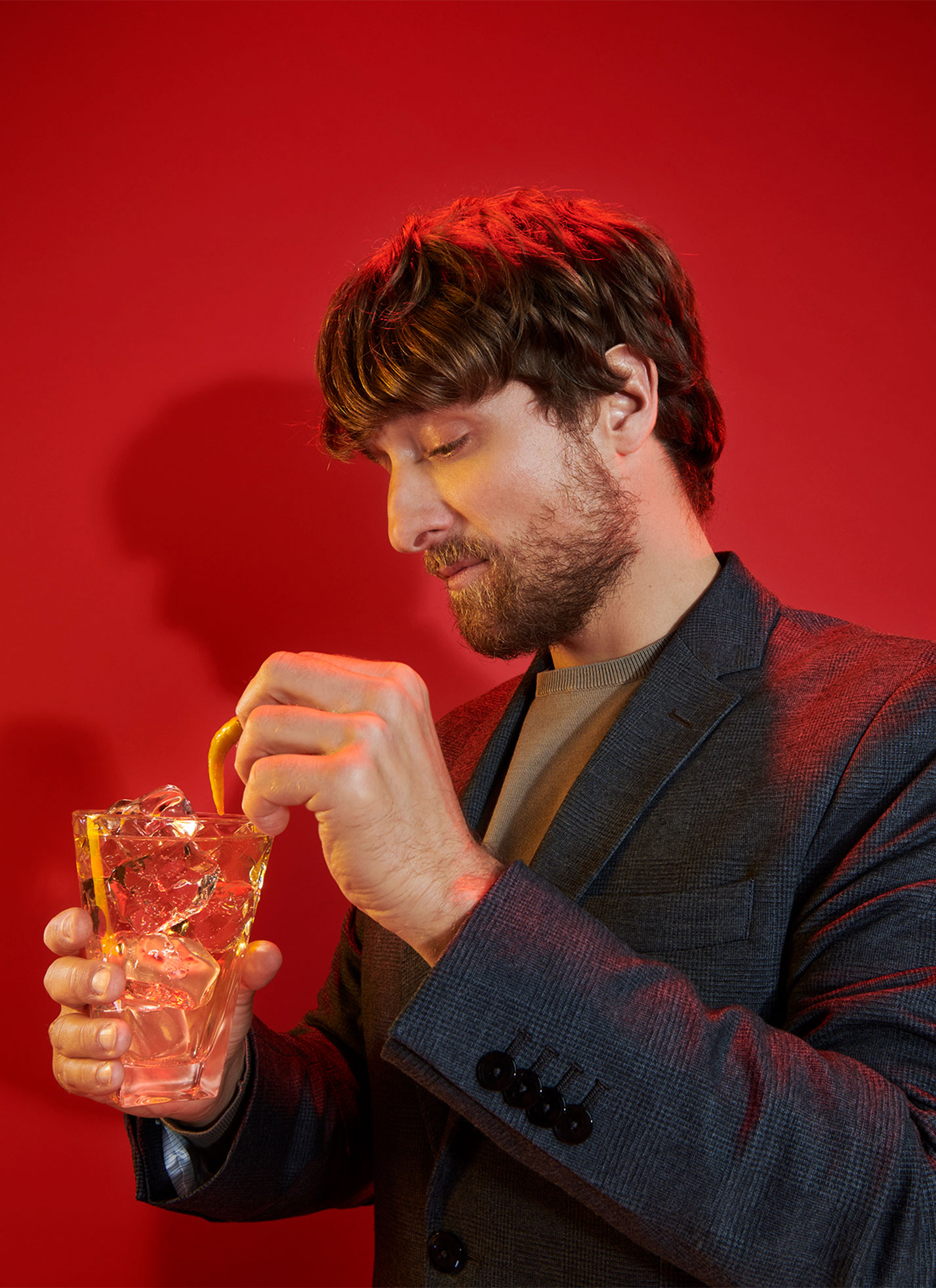
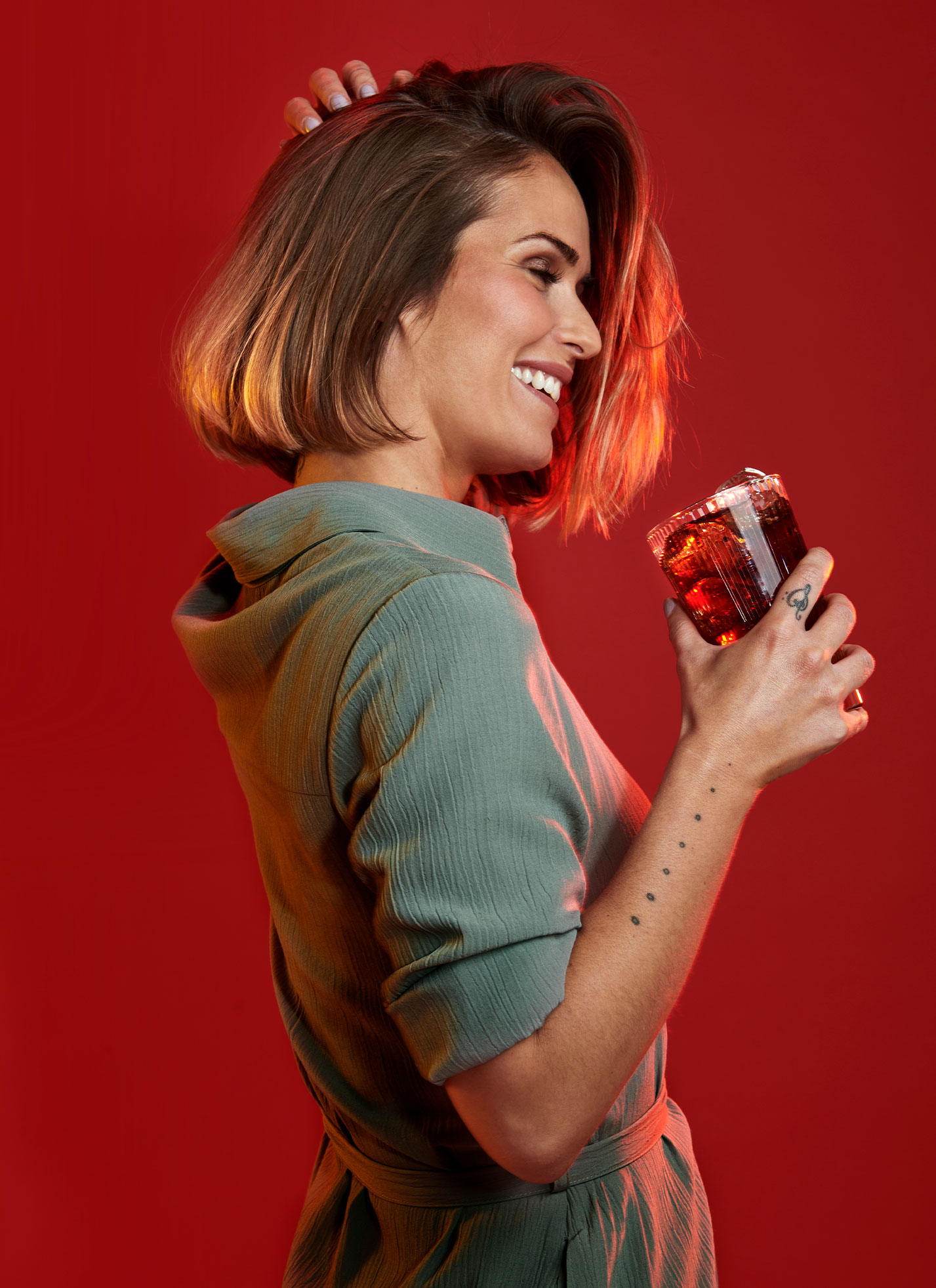
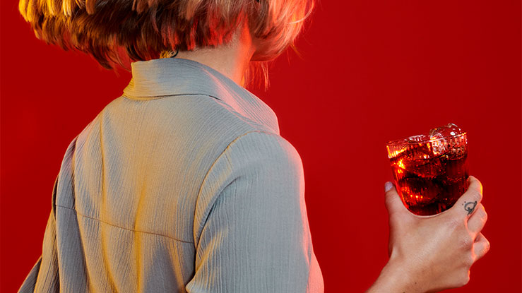
Challenge
Carlos I, one of Spain’s most well-known brandies, continues to look inward to search for new ways to connect to brandy drinkers, especially the younger target. As one of the brand’s pillars is mixology, DAf was asked to create photography and capsules for use in social media to remind younger consumers of the versatility of Carlos I when it comes to cocktail hour.
Client |
Grupo Osborne |
|
|
Capabilities |
Photography
Social Media Capsules |
|
|
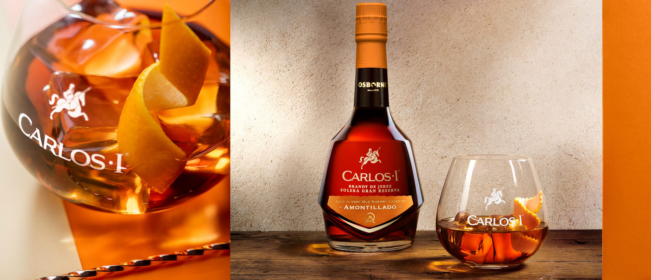
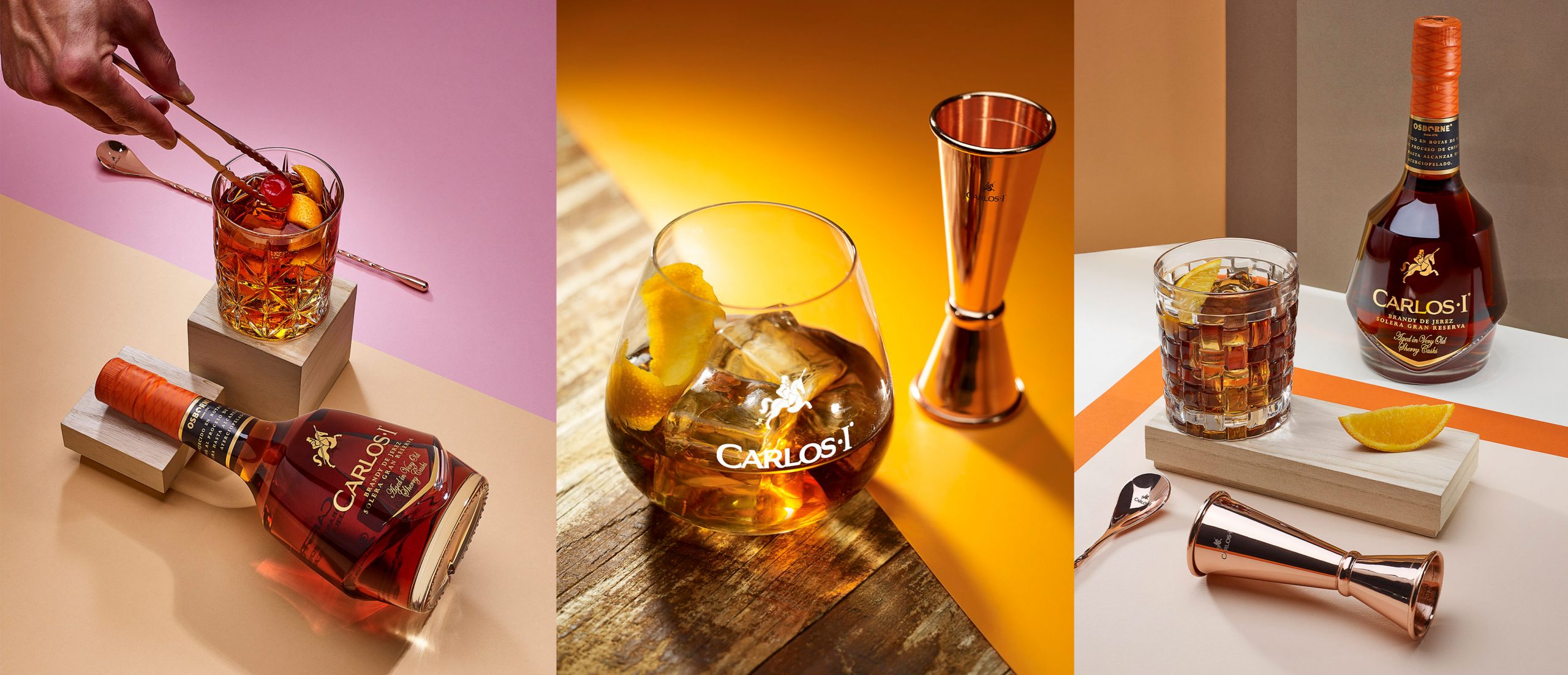
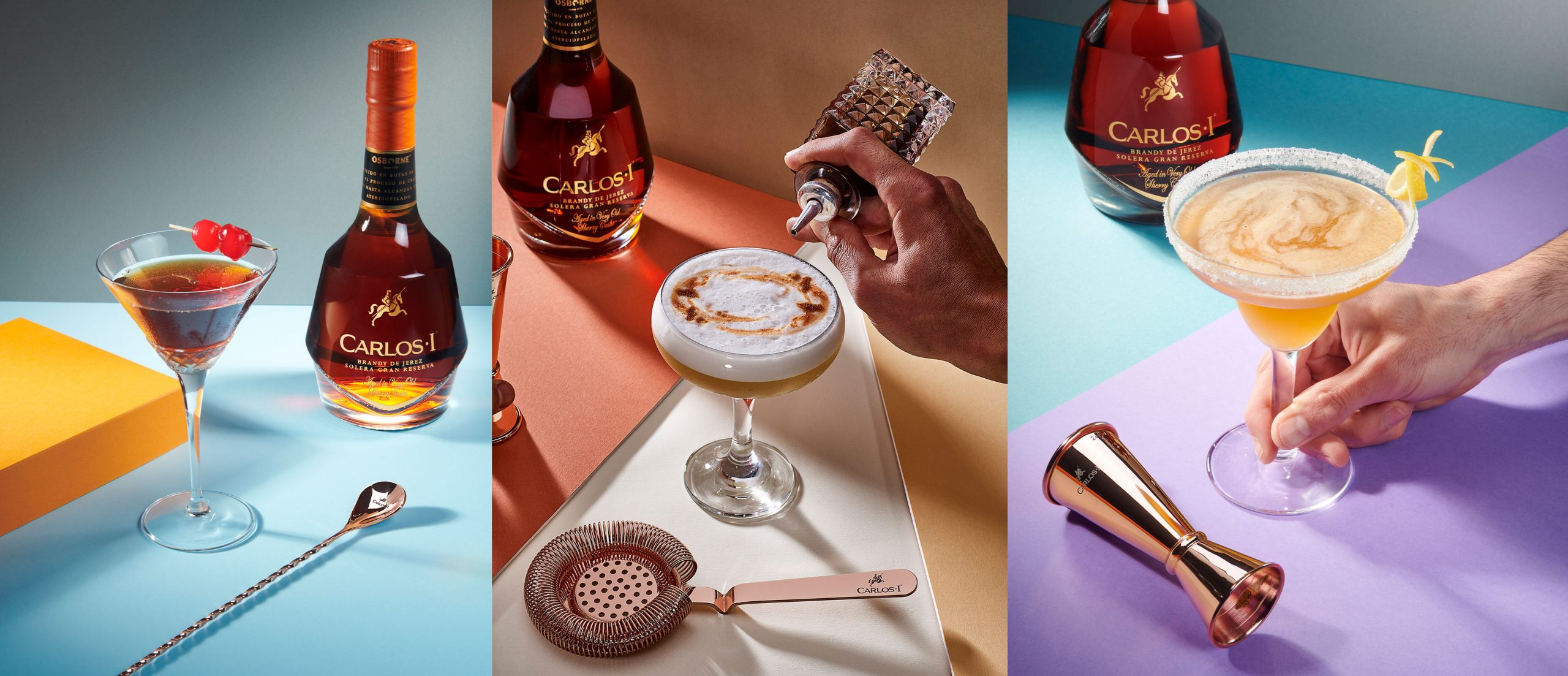
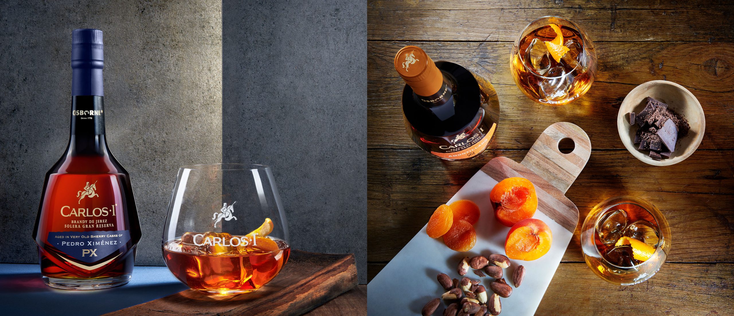
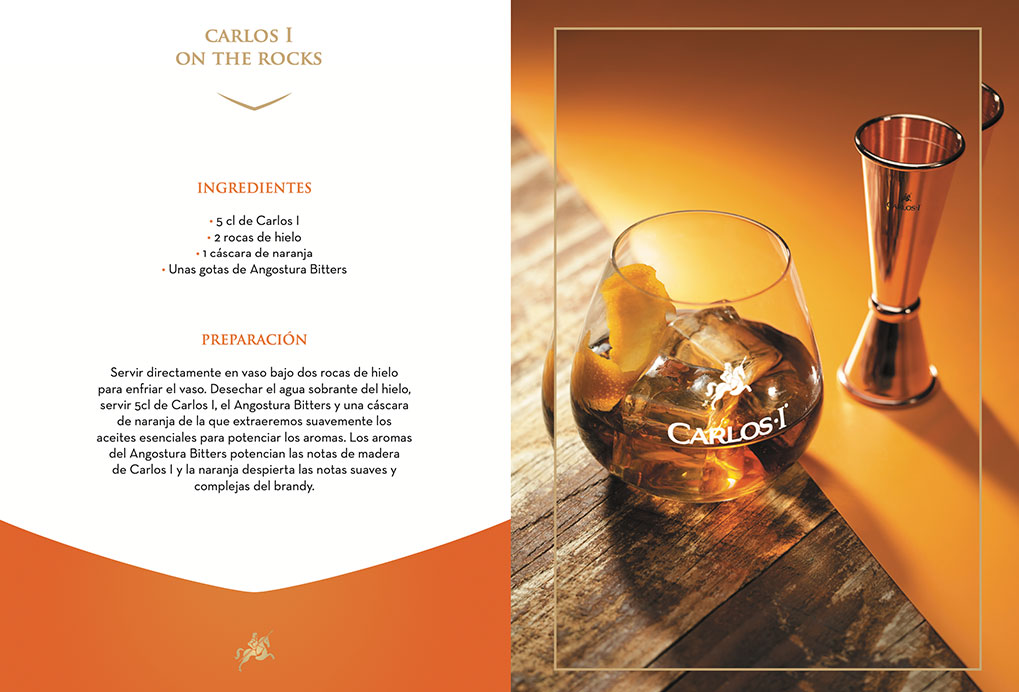
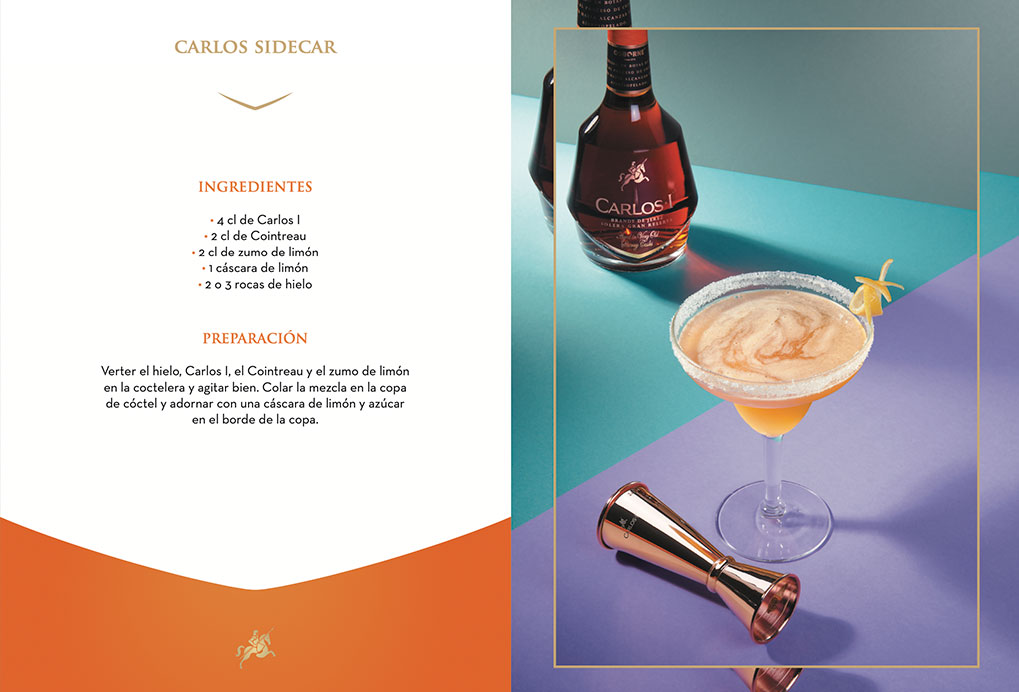
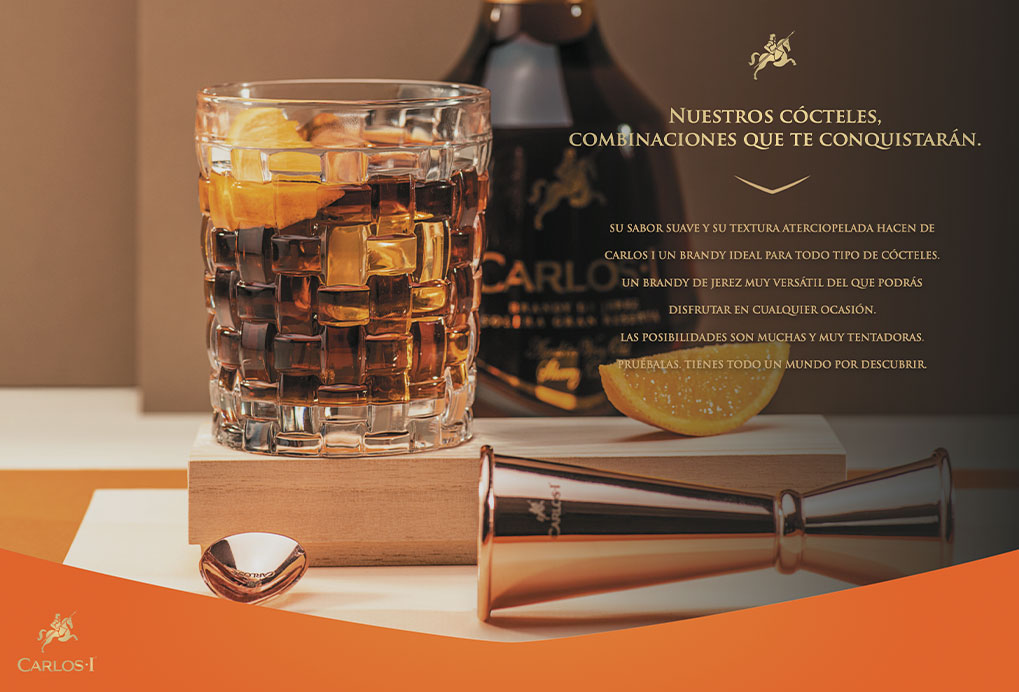
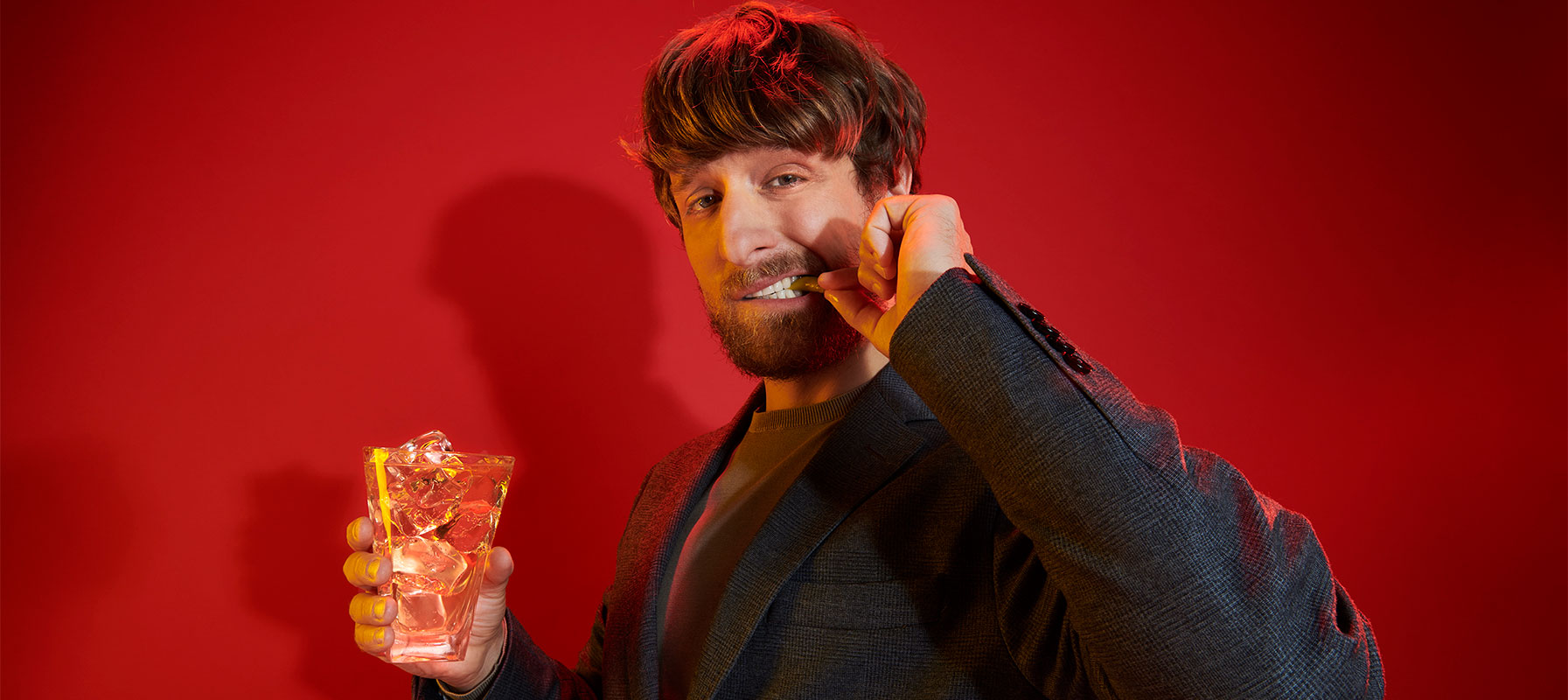
Solution
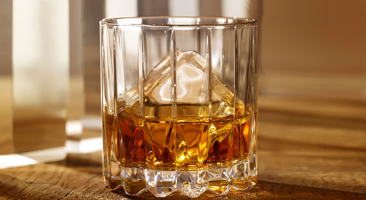
DAf worked with mixologists to create a series of ten classic brandy cocktails. Our team worked with a premium though contemporary color palette, based on the composition of each cocktail. Photographed in studio using simple geometric props, block color boards and a copper-hued cocktail set as support, the bottle is front and center of all material.
Photography
Each cocktail was photographed in studio, accompanied by the elements essential to create it. The extra premium Amontillado and Pedro Ximénez brandies were coupled with a more sophisticated art direction.
Capsules
DAf created 8” capsules of each cocktail, showing each in all its beauty, ready to be served.
Cocktail Book
DAf designed a book of classic recipes featuring Carlos I, to inspire our consumers’ next cocktail hour with friends.
Niamh Tumbleton May 4, 2021
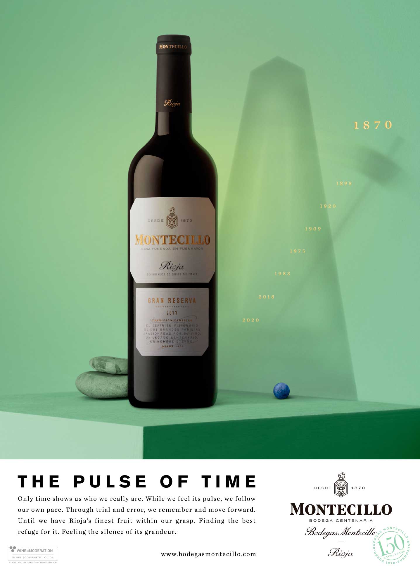
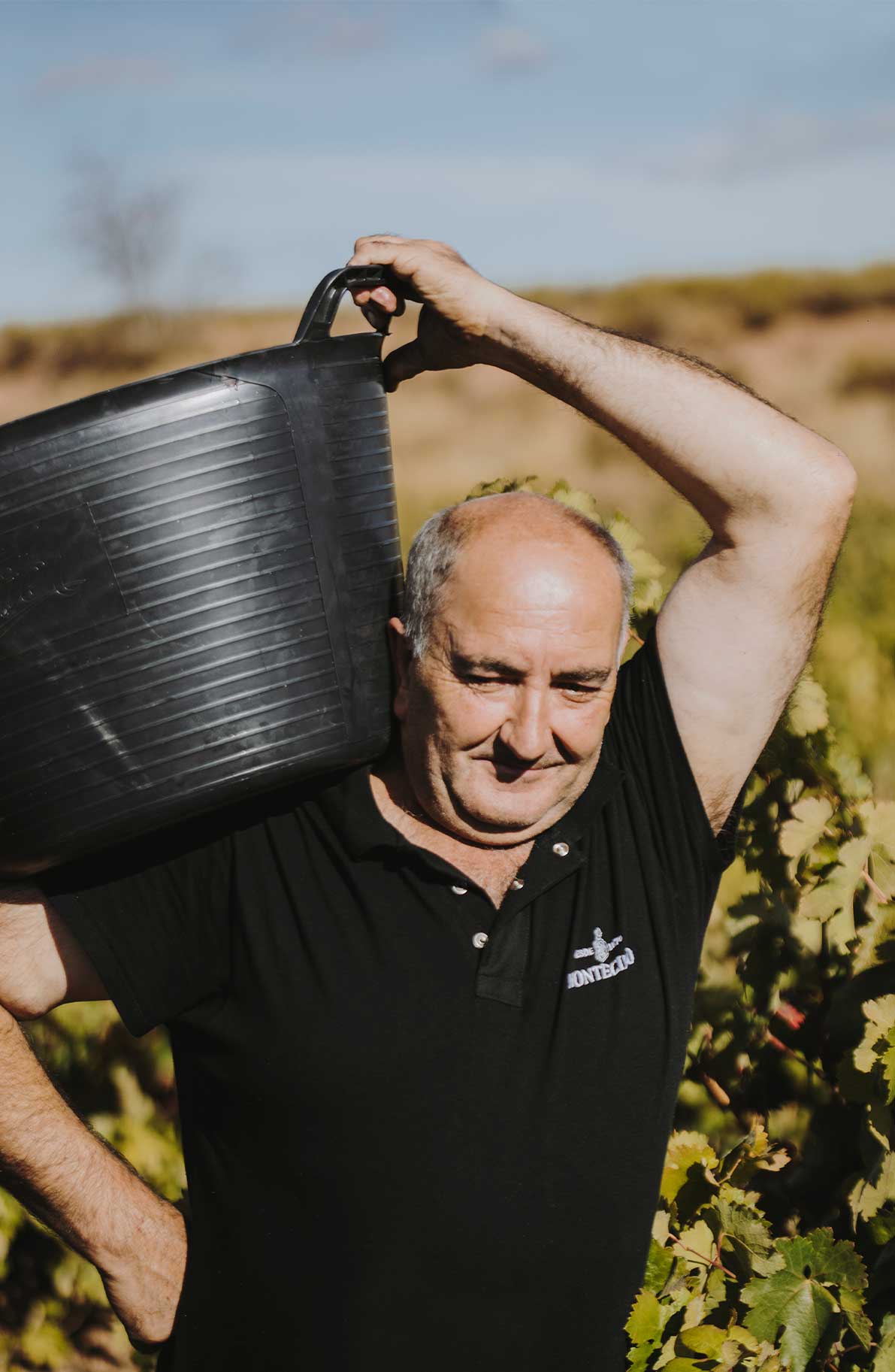
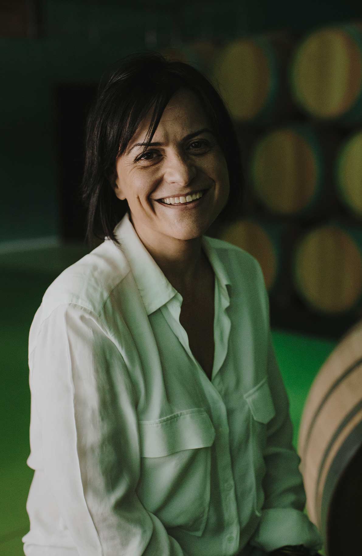
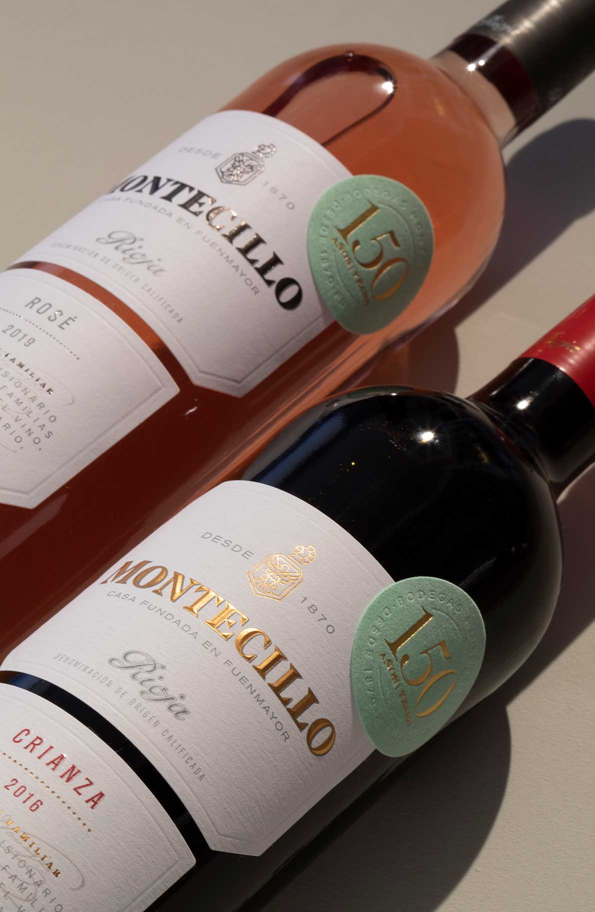
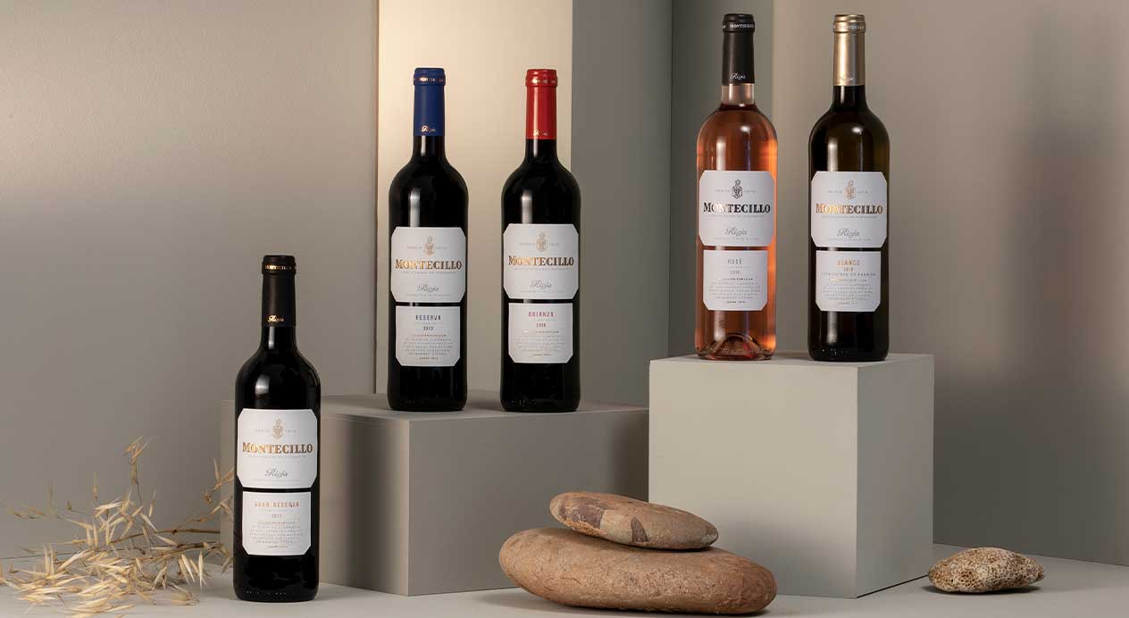
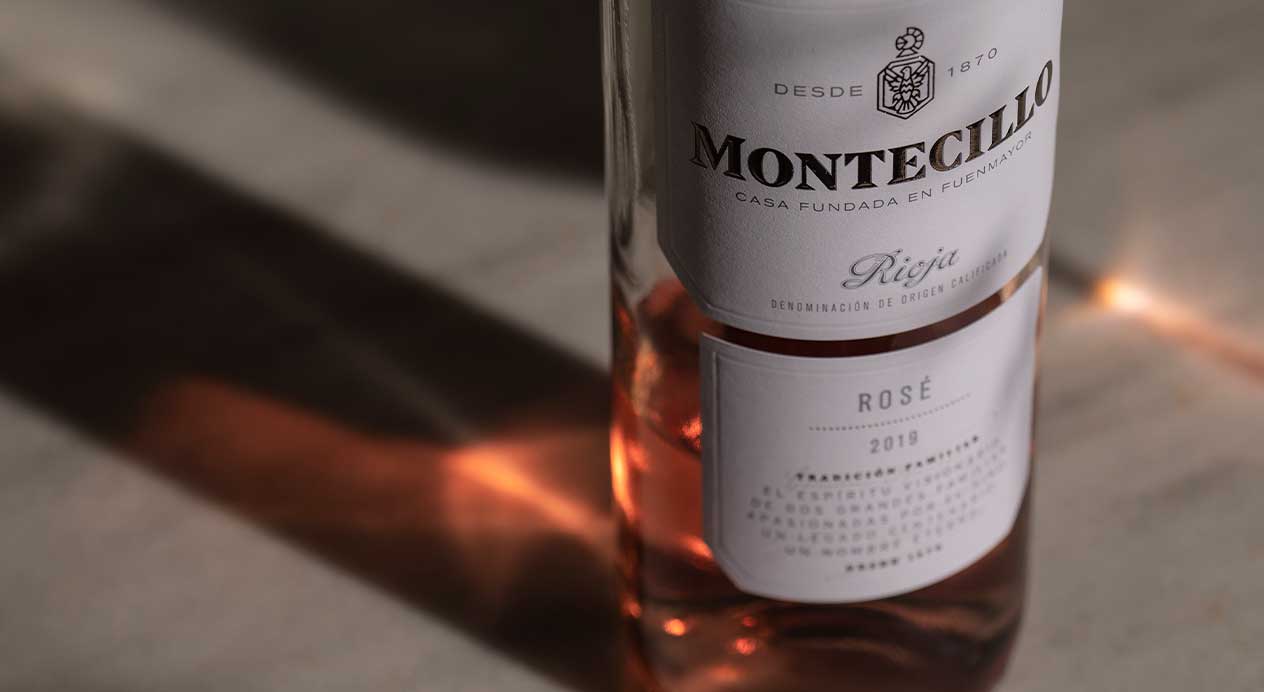
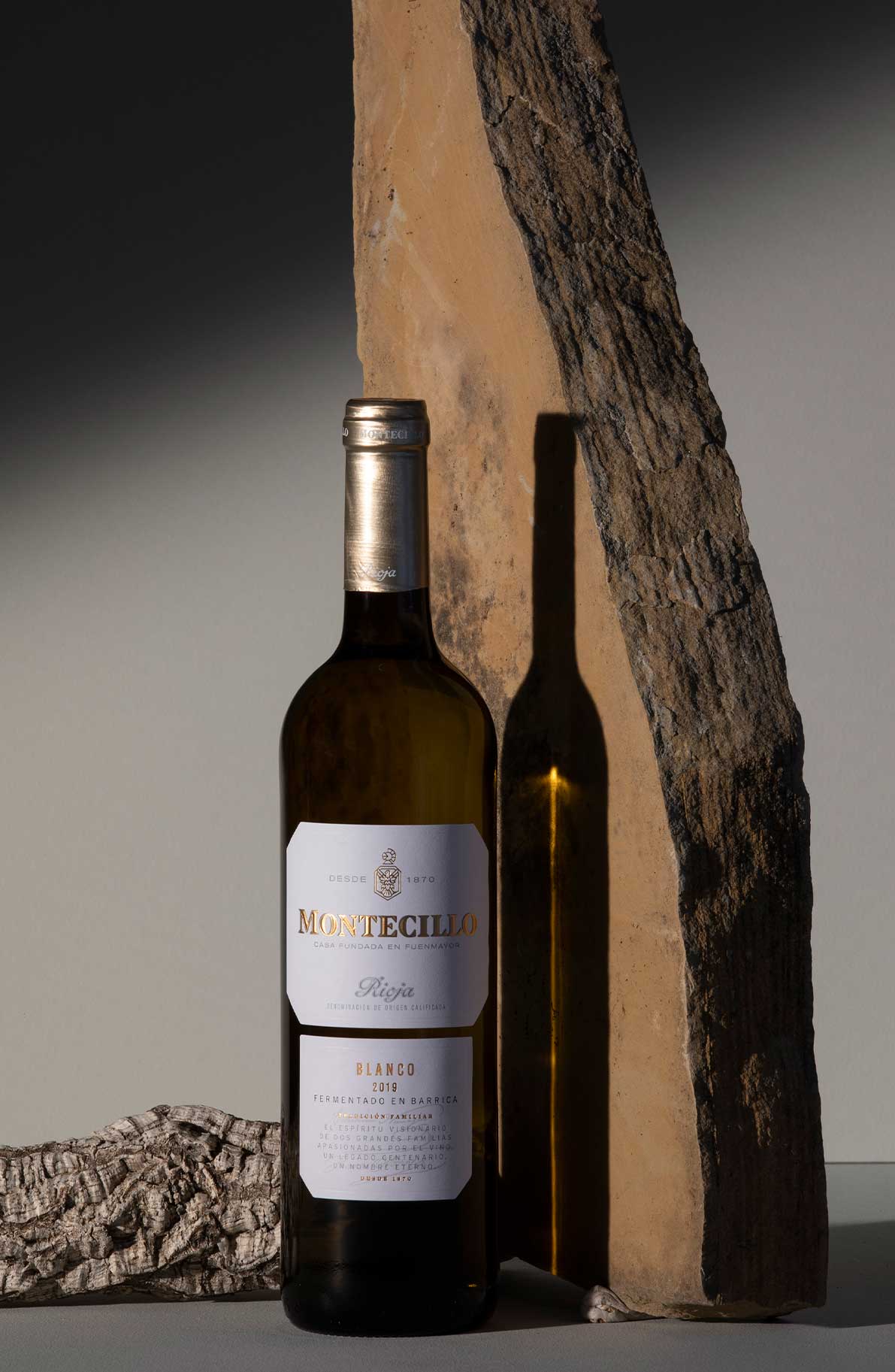
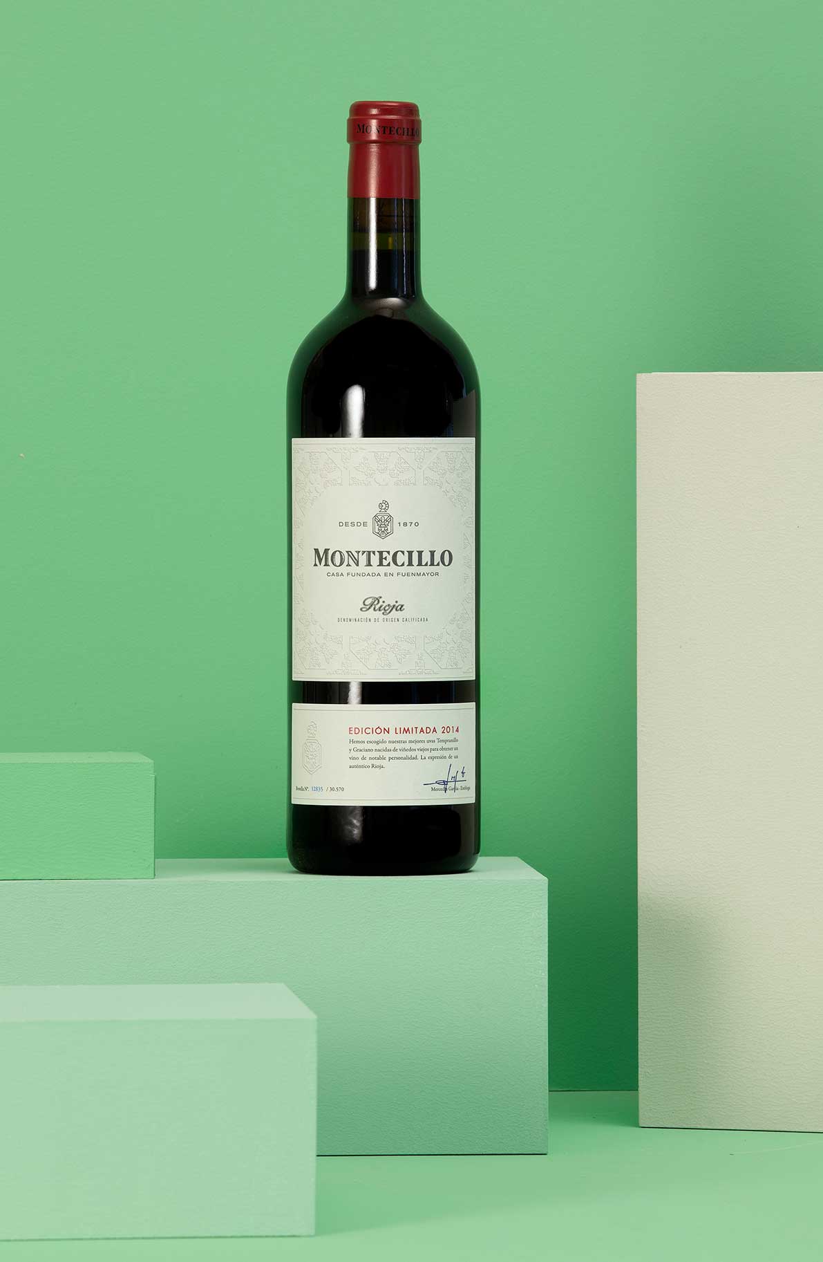
Challenge
Having reached the milestone of their 150th anniversary, Bodegas Montecillo required a new campaign to premiumize their brand and explain their winery’s background, without relying on overly traditional creative codes. DAf was approached to create the concept behind this campaign and communicate the authentic history and savoir-faire of Rioja’s third-oldest winery through a brand film, key visuals for the main SKUs and photography for social media.
Client |
Bodegas Montecillo |
|
|
Capabilities |
Video
Key Visual
Photography
|
|
|
Solution
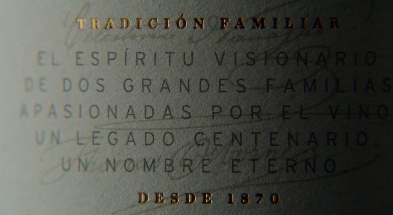
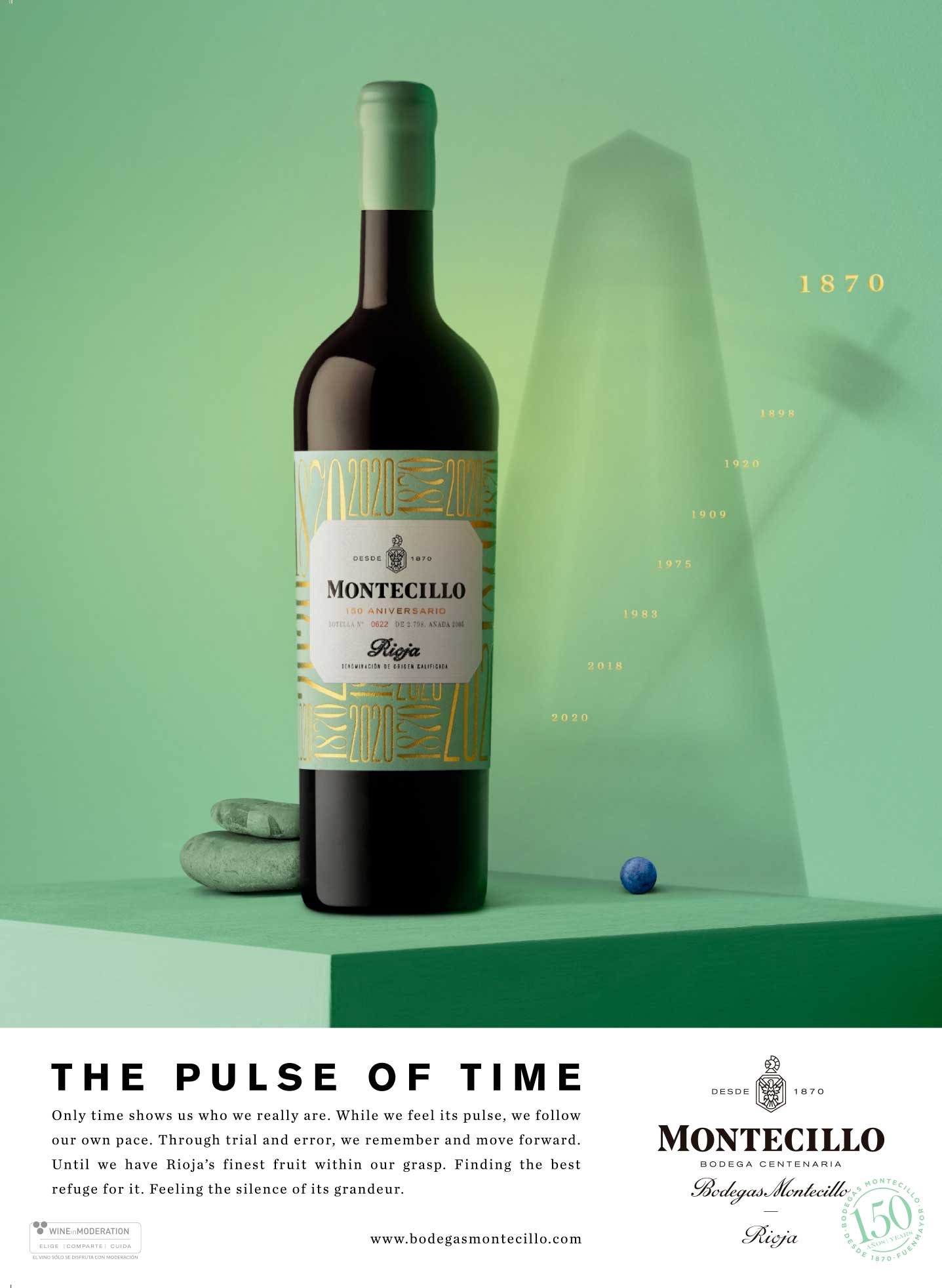
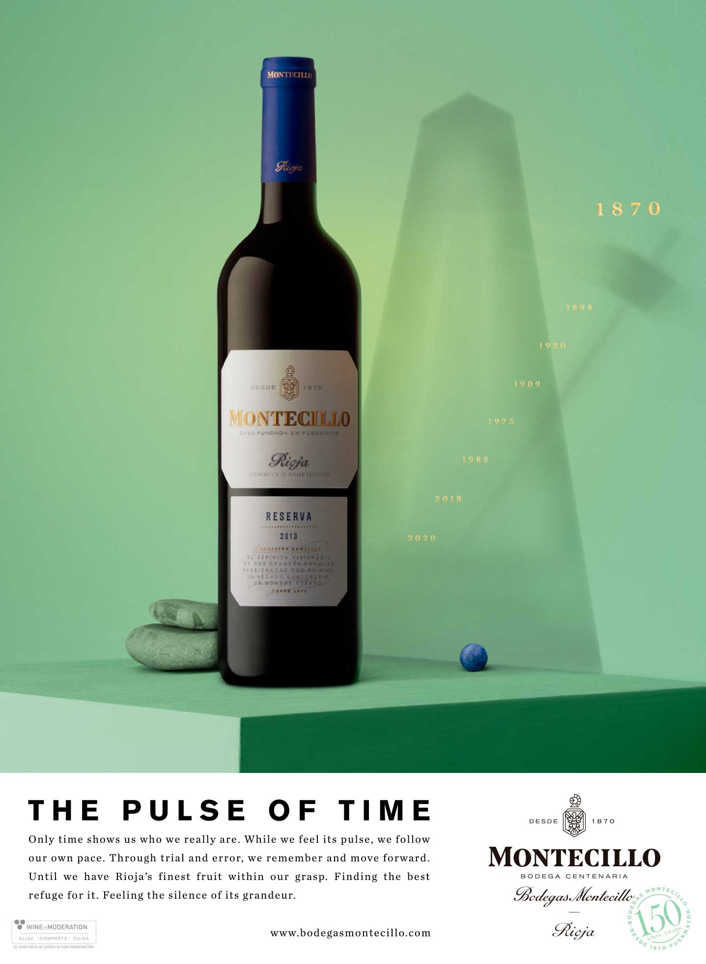
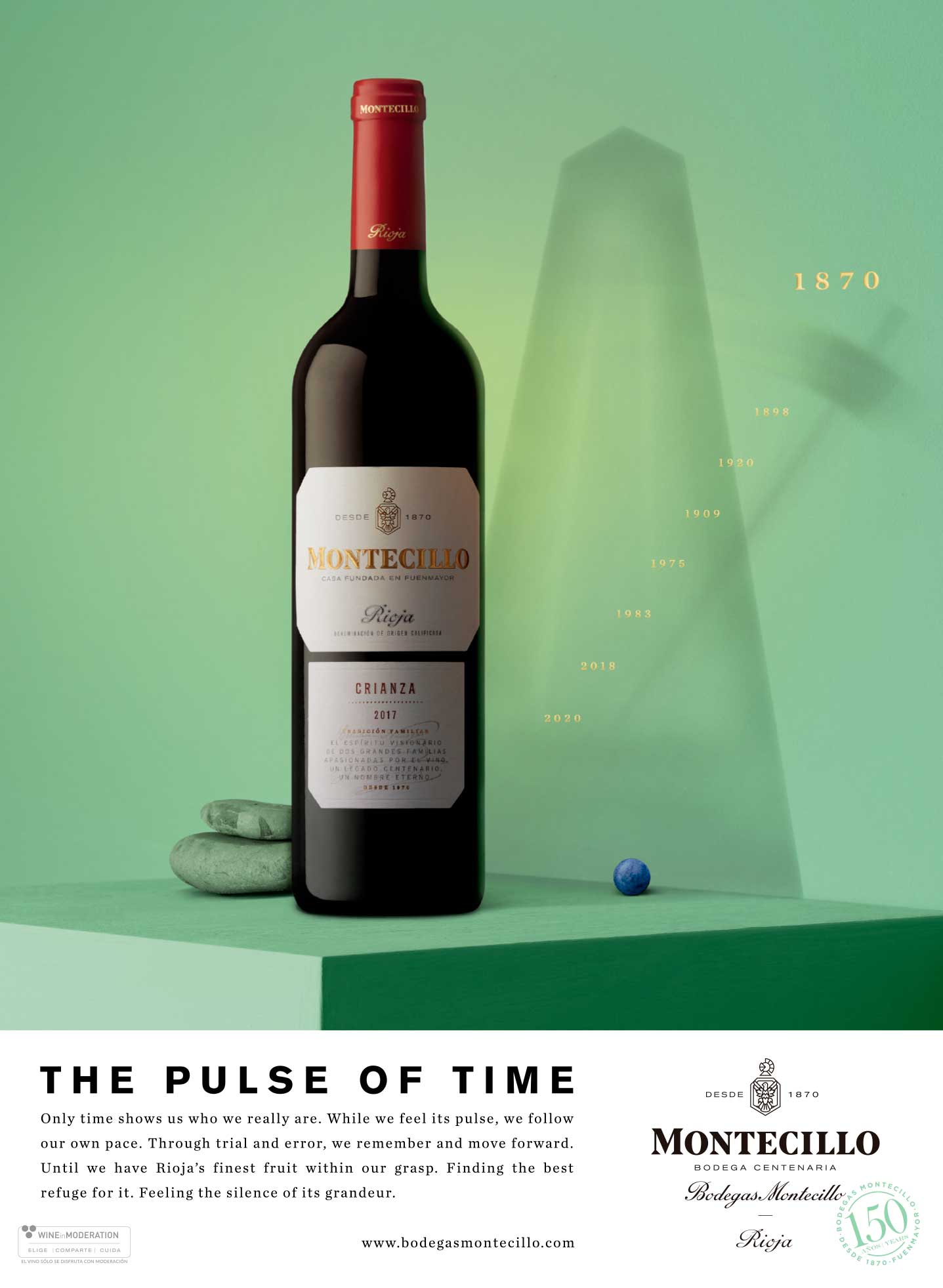
150 years after their founding on the very same Rioja lands, one thing is clear to the team at Bodegas Montecillo: the passage of time is intimately connected to winemaking, both in terms of the growth of a winery and in terms of the creation and cellaring of each bottle. However, for Bodegas Montecillo, time’s passing is a cause for celebration rather than nostalgia. Through the claim “The Pulse of Time”, the winery shows how the beat of time inextricably connects the winery to its past and to its work, with optimism for the future.
Brand Film
The video shows us luscious scenes of Rioja and featuring the brand’s Chief Winemaker, a beat builds throughout the brand film, beginning in a heartbeat and supported by the visual of a metronome, symbolizing the passing of time and work of the team.
Key Visual
Key Visuals highlighted the winery’s four main SKUs and their revitalized brand color. The metronome’s hand marks time, displaying the winery’s key dates in gold.
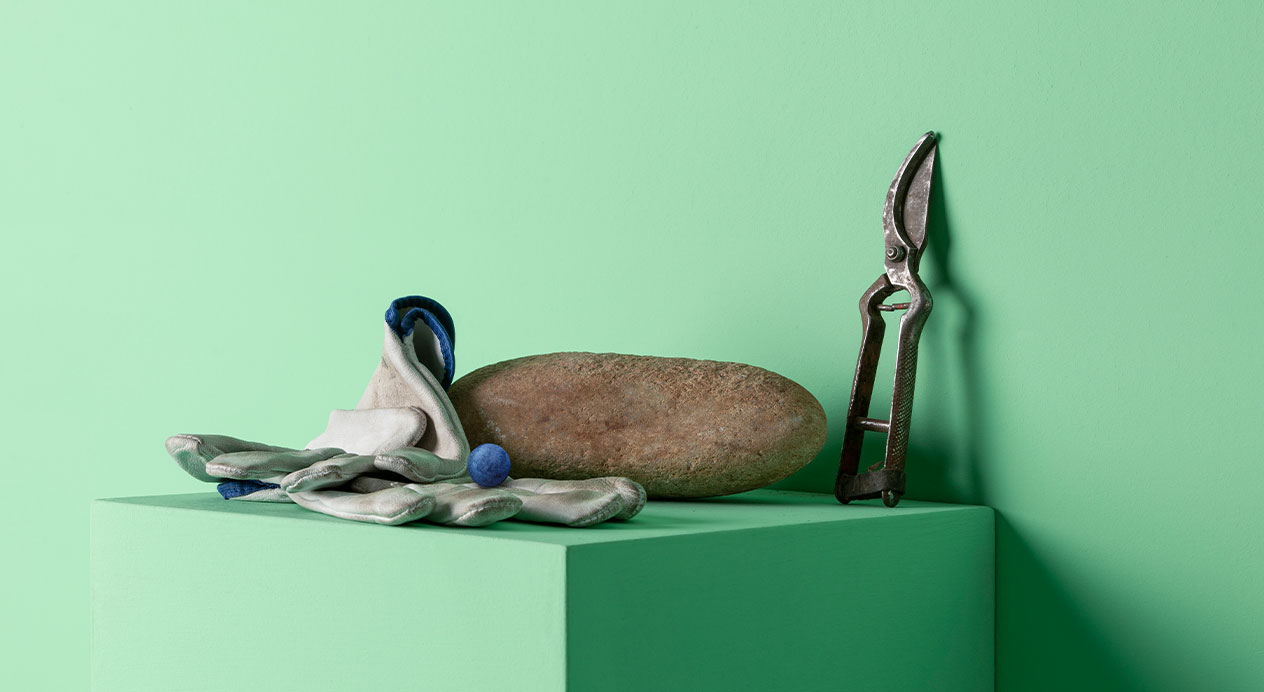
Photography
We shot in studio and on location at the winery, developing a suite of assets that showed Bodegas Montecillo’s portfolio in a newer, more modern light, accompanied by geographic shapes, natural architecture and shadows.
Patricia Contreras March 30, 2021
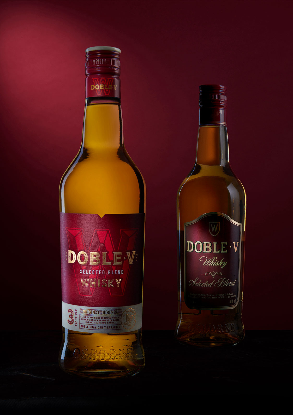
Challenge
When Osborne added the whisky Doble·V to their portfolio, they were faced with the challenge of relaunching the brand to attract mid-Millennial whisky consumers to this Spanish, rather than Scotch, whisky. DAf was approached to create a range of assets to reposition the brand, including brand manifesto and claim, packaging design, key visuals, social media content and brand book.
Client |
Grupo Osborne |
|
|
Capabilities |
Packaging
Key Visual
Social Media Content
Brand Book |
|
|
Solution
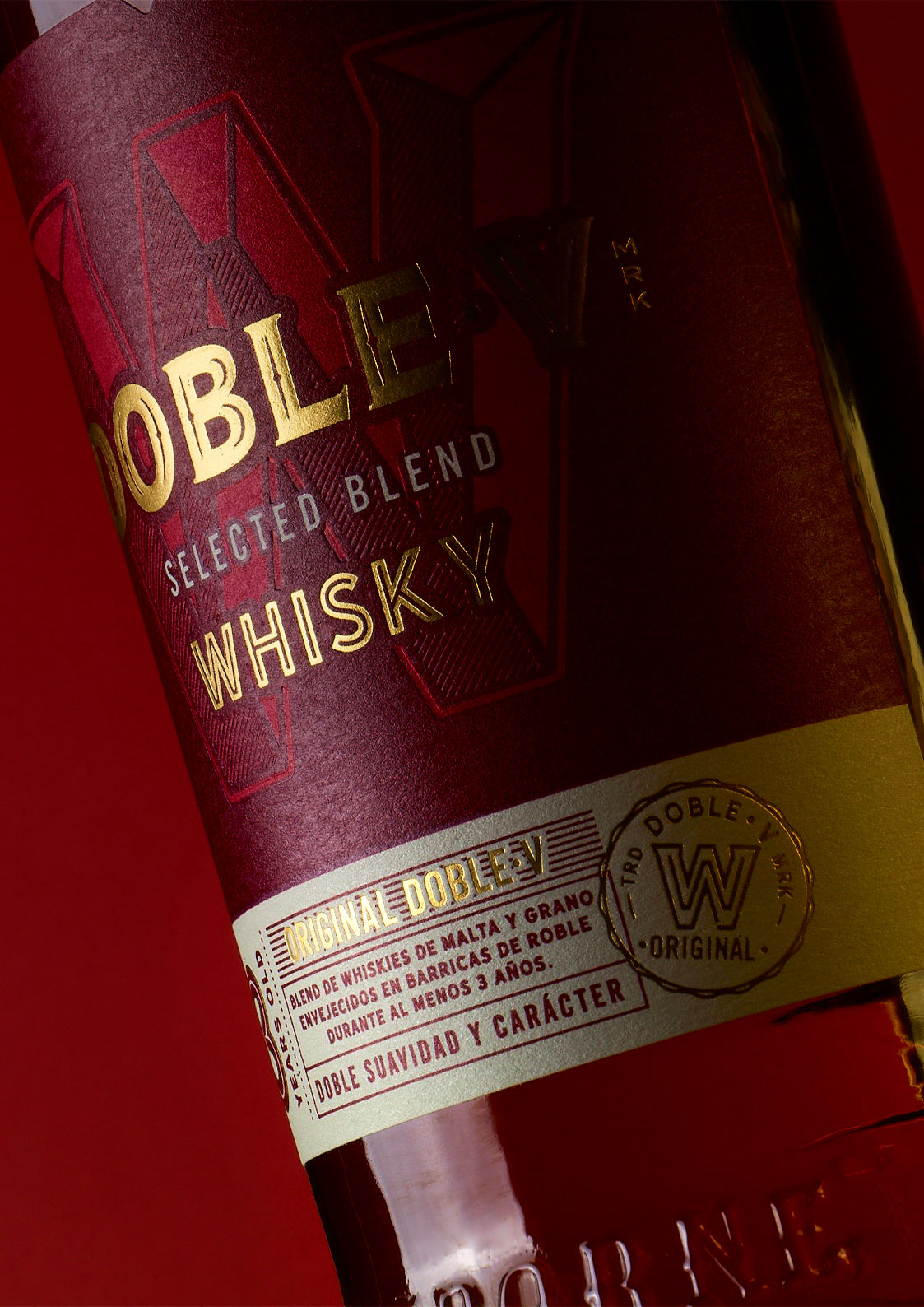
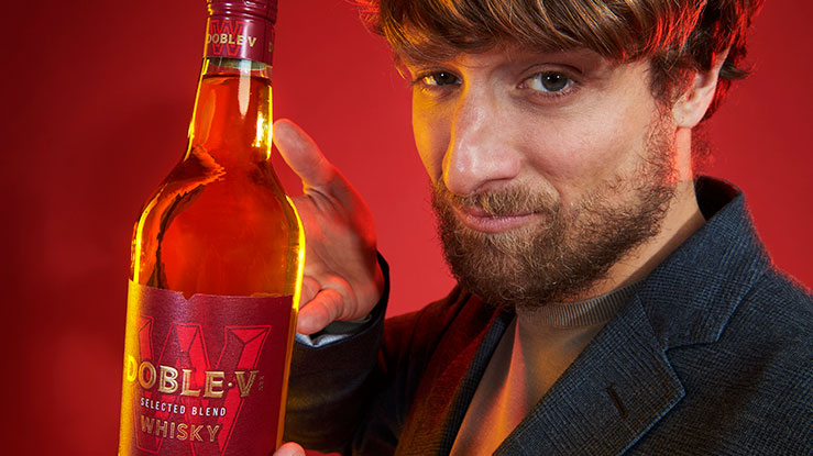
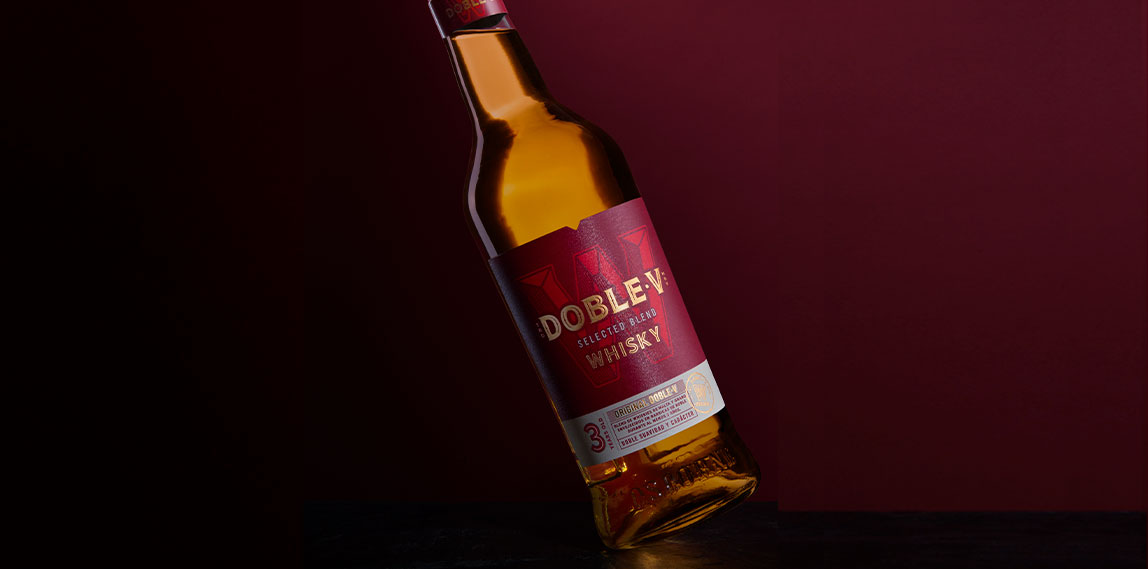
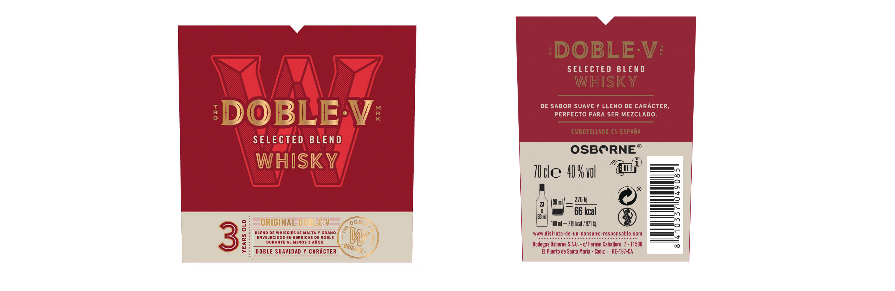
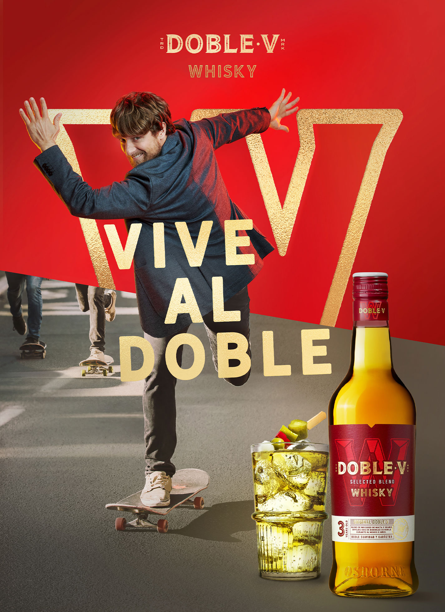
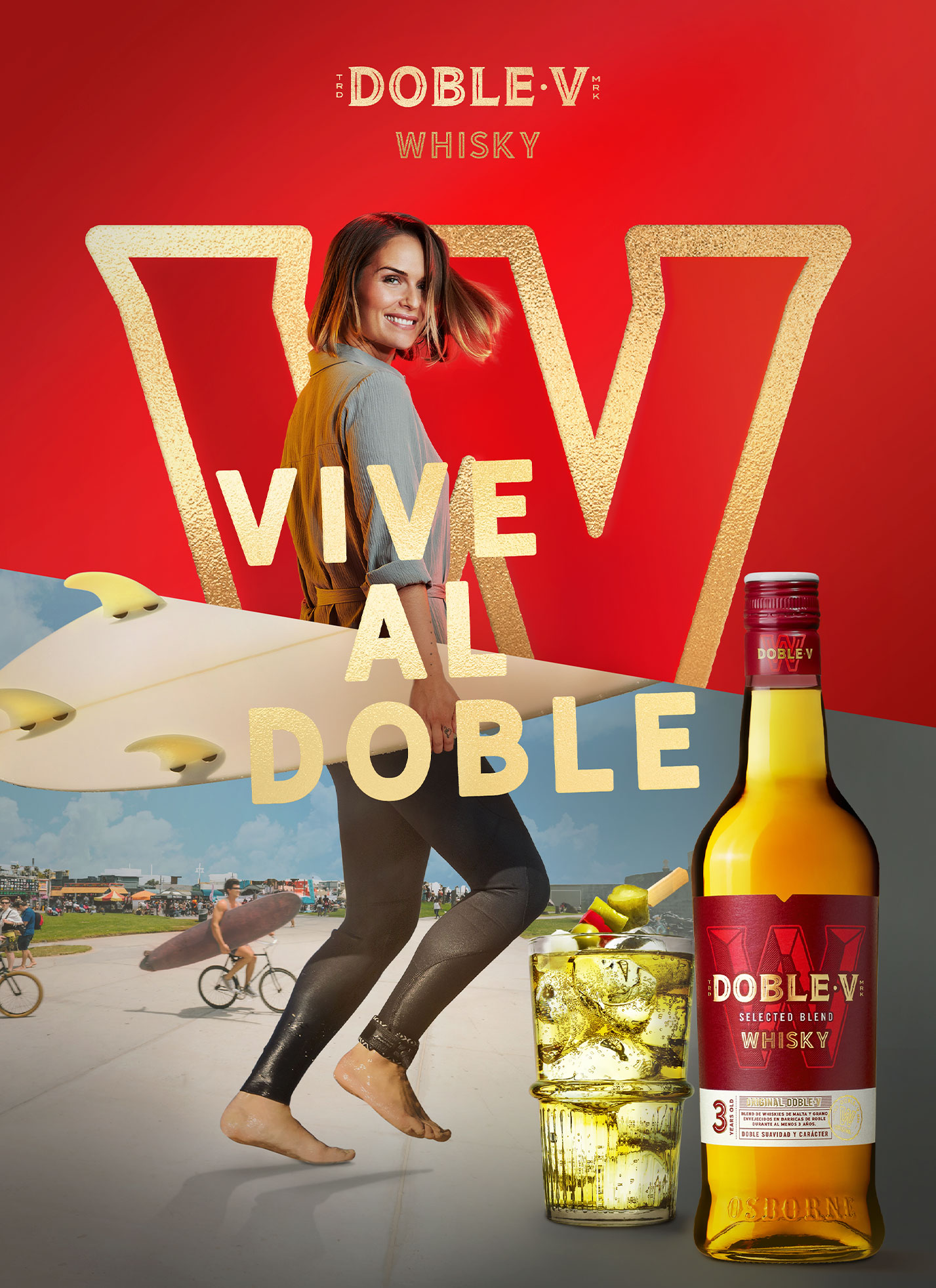
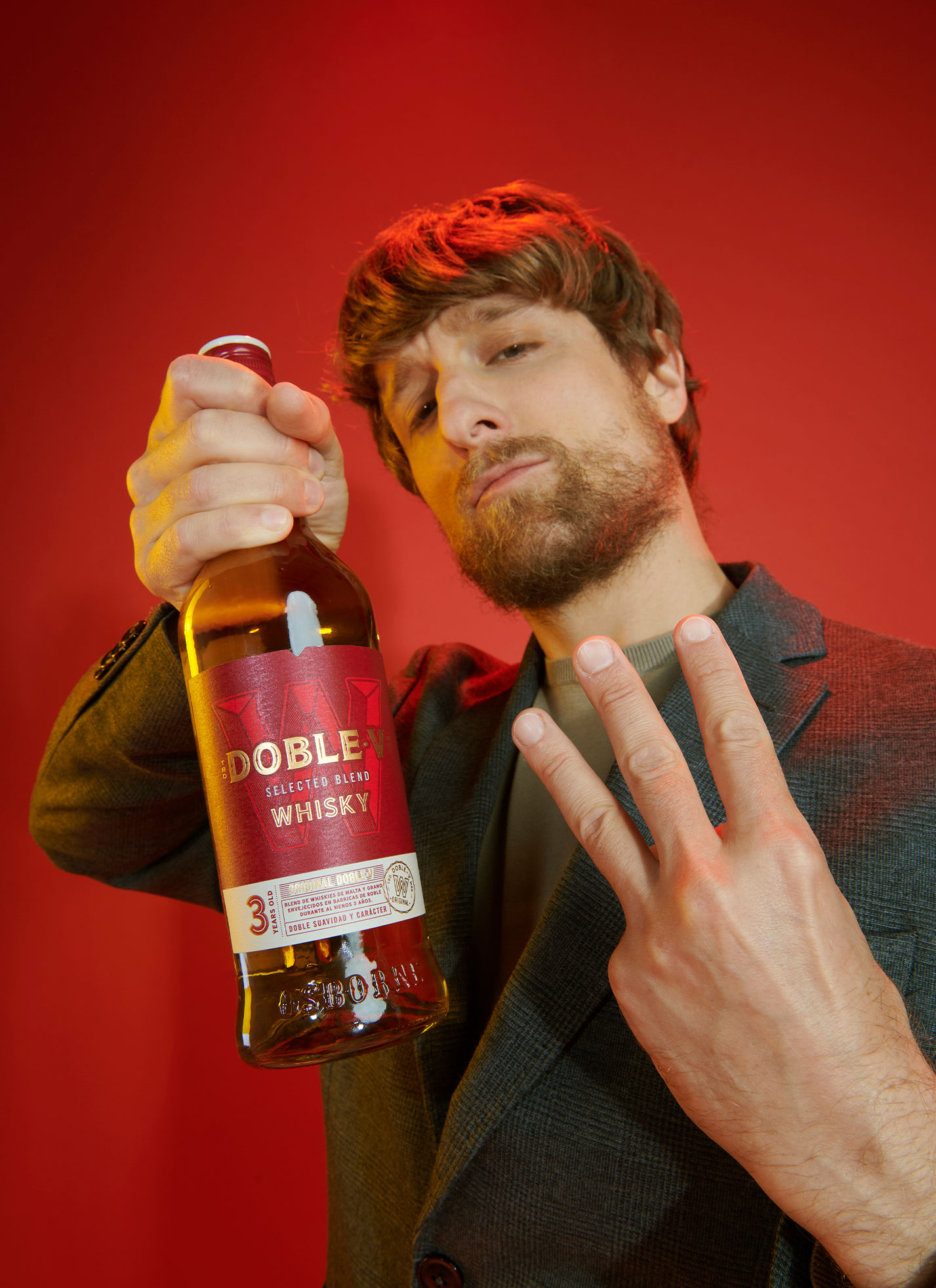
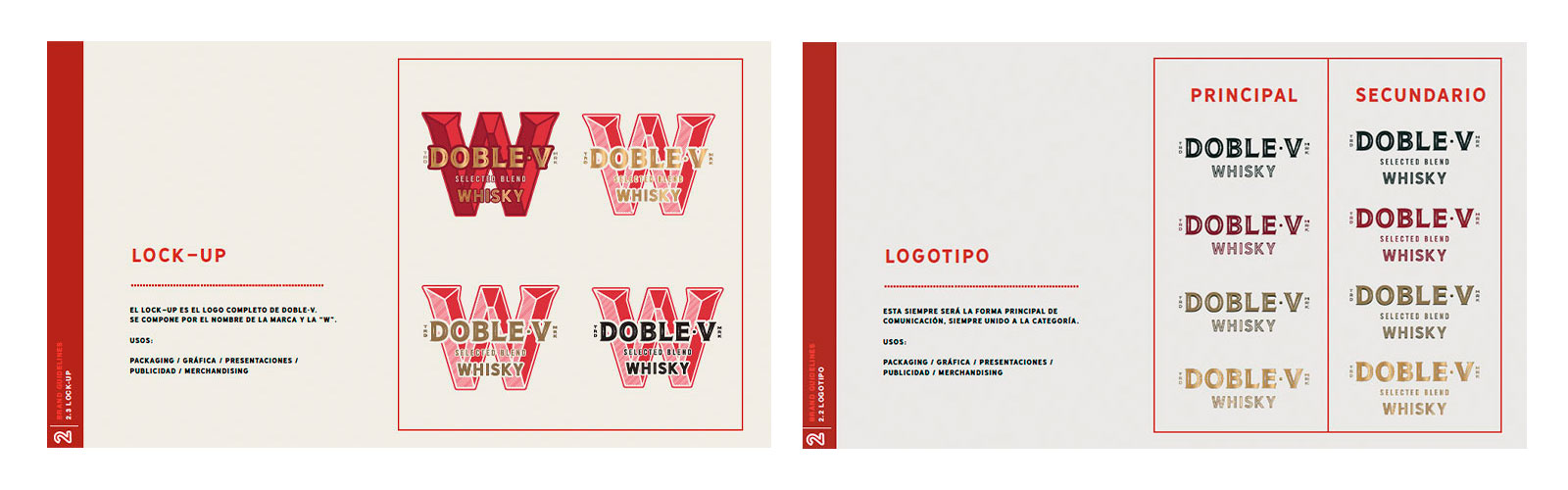
DAf created fresh, attractive pieces where the liquid was the star, drawing from Doble·V’s distinctive warm red tones and the icon of the “W” to create transparent, uncomplicated communications. The results shy away from the typical complexities of the whisky world and present our attitude-forward consumer at the forefront.
Key in all materials was the unencumbered, highly sociable attitude of the consumer. Described in Spanish as a “picarón” (similar to a “jokester”), they are the type of person who lives life intensely. This attitude was expressed in the claim “Vive al Doble,” a play on words in Spanish, inviting consumers to live more.
Manifiesto
Cuando somos nosotros mismos, vivimos al doble.
Nos reímos, jugamos y disfrutamos al doble.
Pensamos menos en qué dirán y mucho más en qué vendrá.
Siempre atrevidos, listos y con audacia.
Así bailamos con el tiempo.
Dándole al pasado una doble vida
para hacer el presente mucho más interesante.
Y si tenemos en mano el whisky ideal, ¡pues mucho mejor!
Con doble suavidad y carácter, con doble sabor y espíritu.
Tan versátil como nuestro destino, tan auténtico como nuestra actitud.
Perfecto para celebrar todo lo que venga.
Sin importarnos cómo, ni tampoco dónde.
Justamente de eso se trata,
Vivir al doble.
Packaging Design
We updated Doble·V’s packaging to present a cleaner, more modern design featuring the iconized “W”.
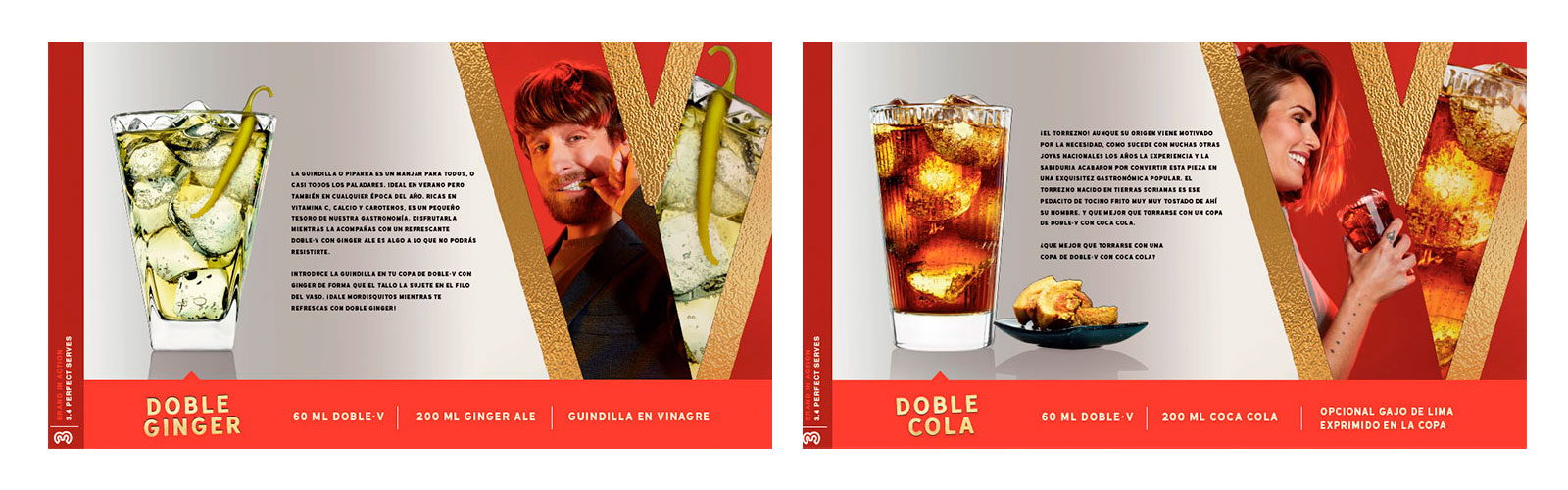
Key Visual
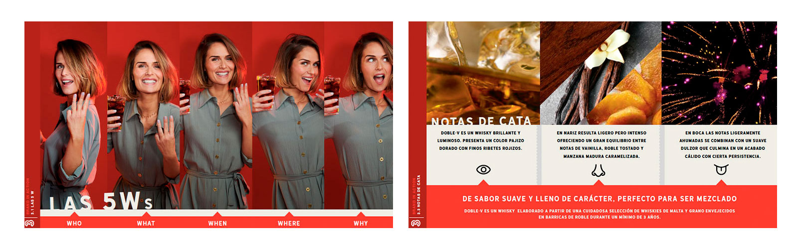
Doble·V defines itself as a brand that invites consumers to live intensely, forgetting about what others may say, and instead focusing on future opportunities. This attitude, summarized by the tagline “Vive al Doble” (a play on “life” and “double”) is expressed in the key visuals. Divided in two, they show our consumer, the “picarón”, living life to the fullest in everything they do.
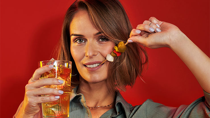
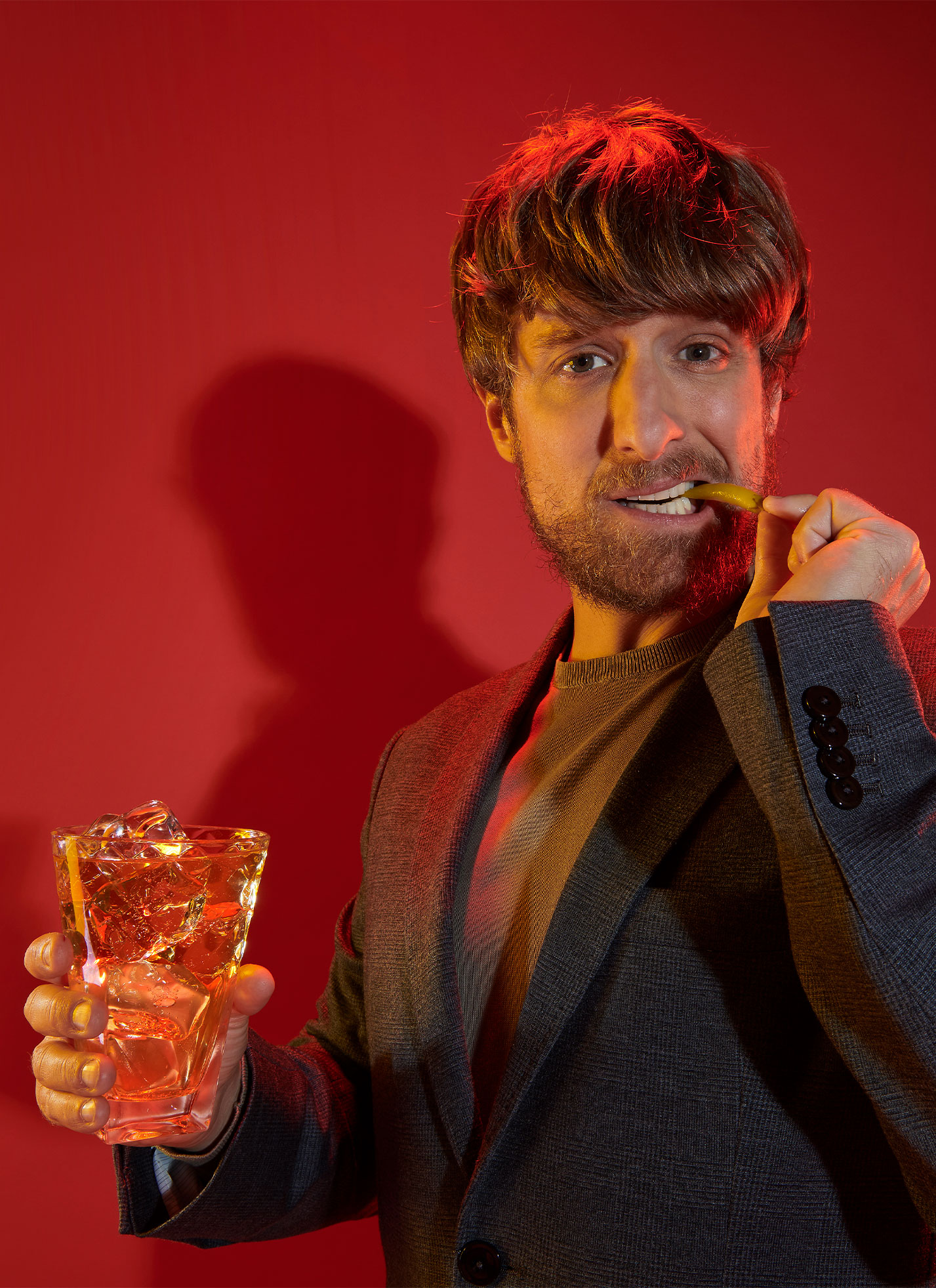
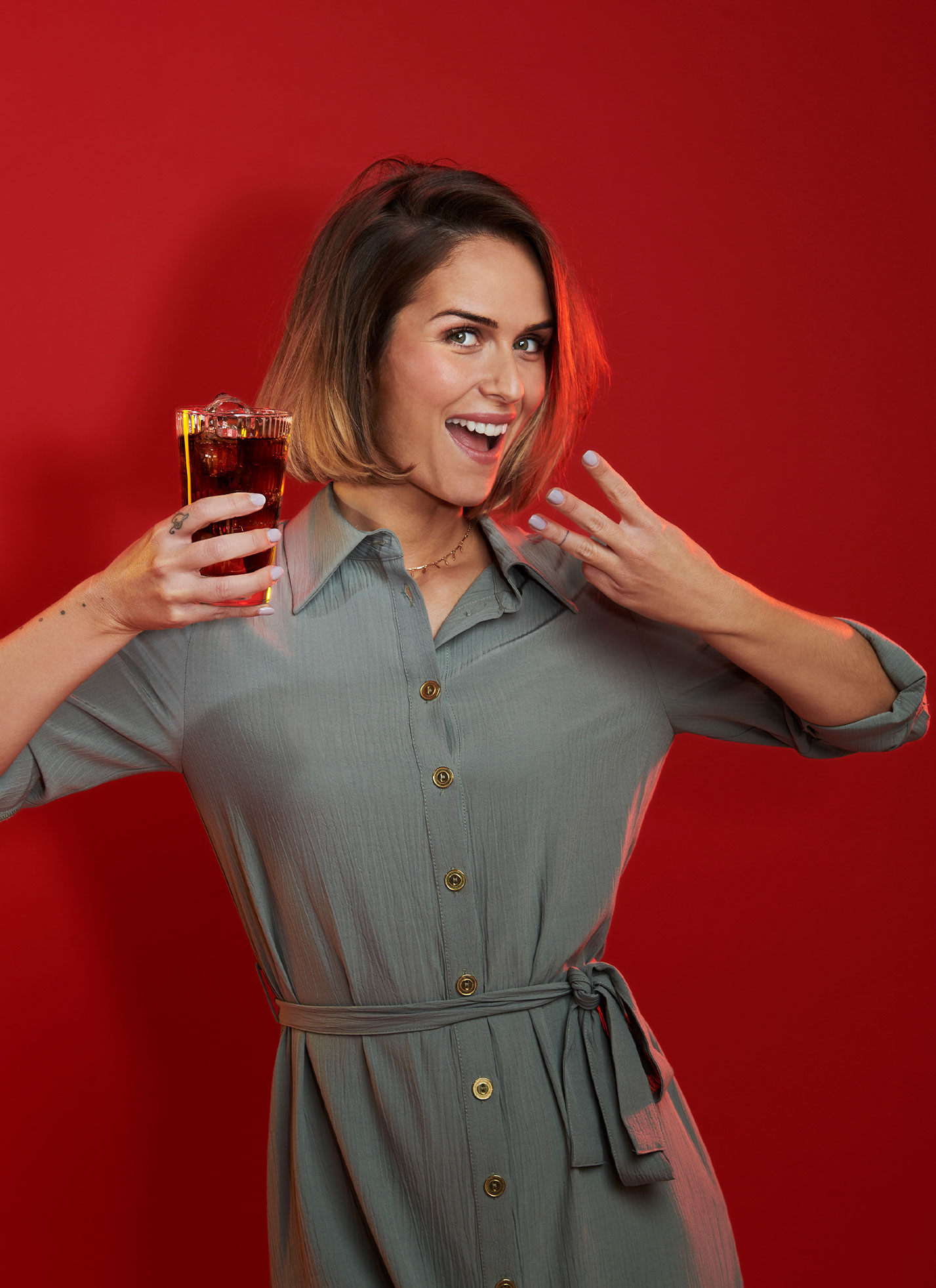
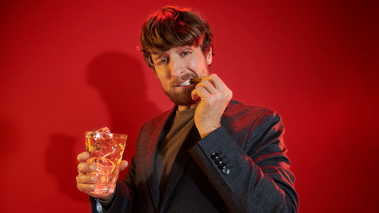
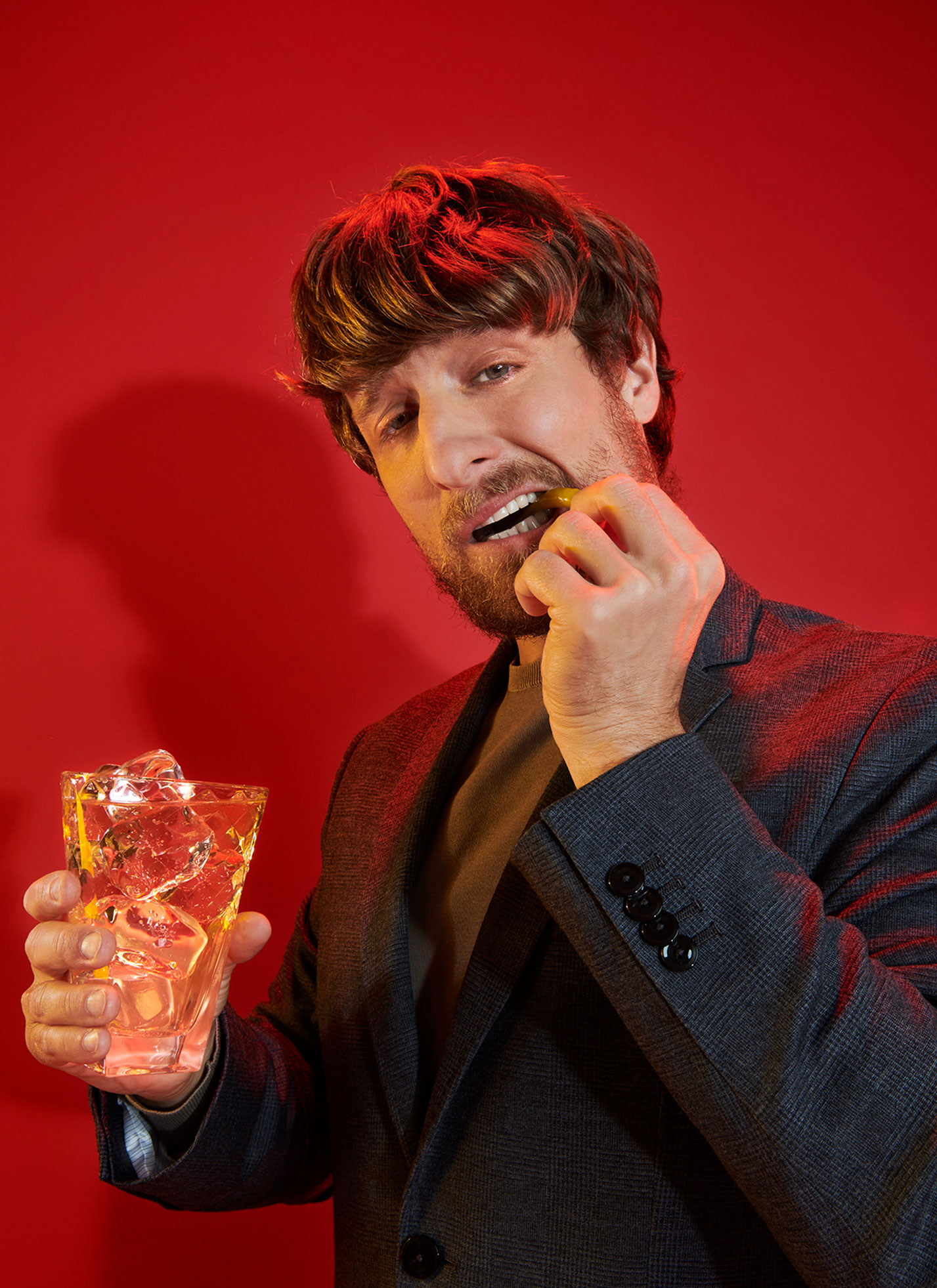
Perfect Serves
Key in this campaign is the inclusion of “perfect serves”, typical Spanish aperitivos that pair beautifully with the whisky.
Photography
We shot in-studio to capture our consumers’ authenticity and happiness.
Brand Book
DAf developed and designed the brand book for Doble·V, including the brand concept, guidelines and actions to present the refreshed product to market.
Patricia Contreras June 1, 2021
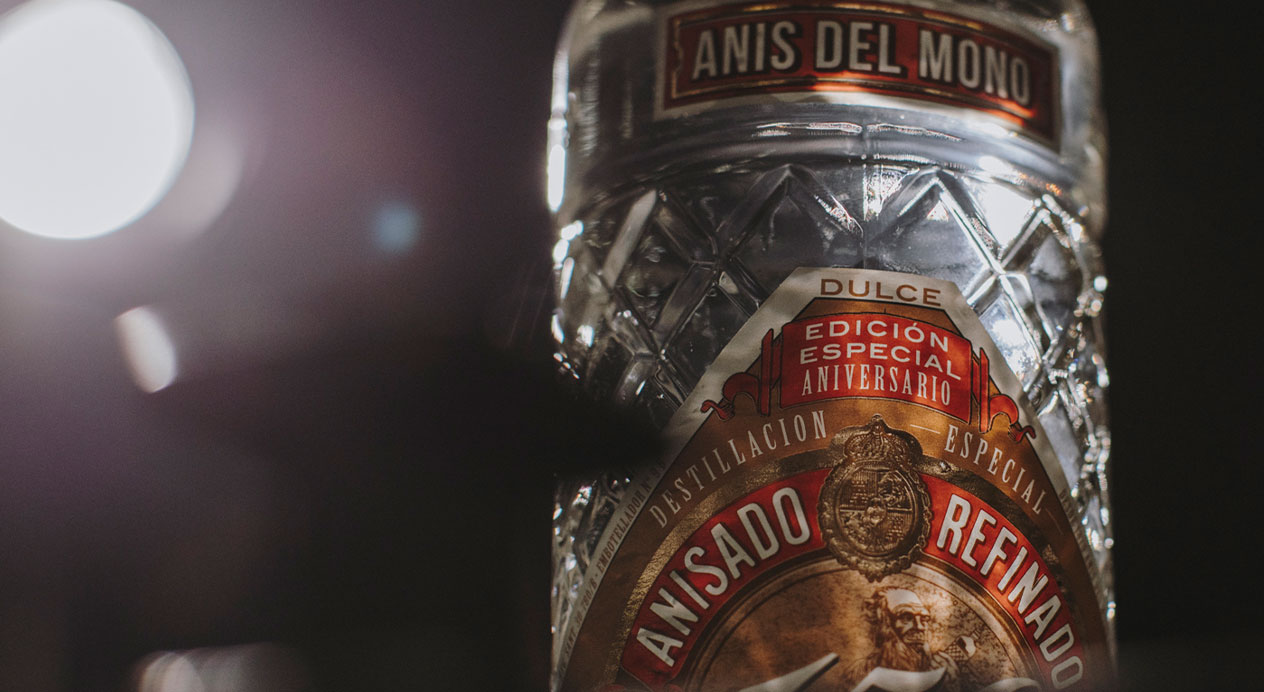
Challenge
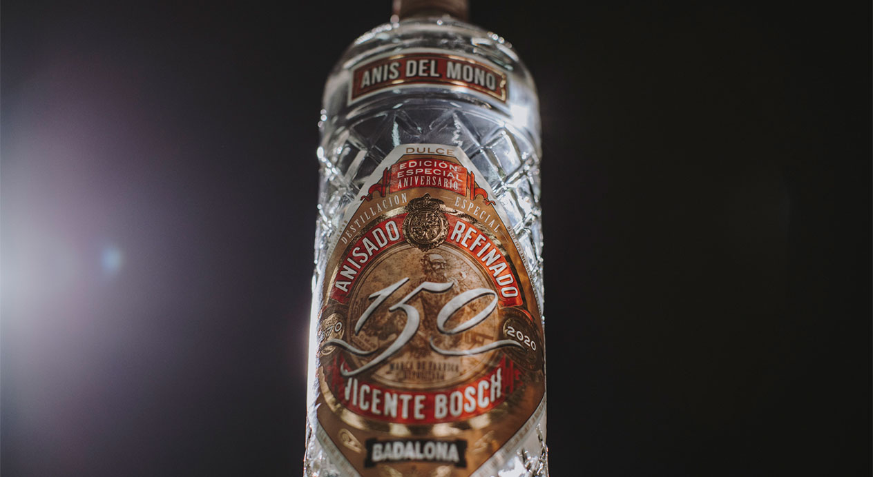
As an iconic brand of Anís, a digestif often taken after meals and incorporated in pastries, Anís del Mono is a beloved part of everyday and specifically Christmas tradition in Spain. Its faceted bottle, which is styled after an elegant perfume bottle is also used as a style of percussive instrument to accompany songs at Christmastime.
The brand approached DAf to celebrate 150 years of Anís del Mono, produced in Badalona, Catalonia. They call back to the persevering tradition of the liquor, whose formulation and production have not changed in 150 years. Using their newly-designed label to celebrate this long-lasting tradition, we developed stills for social media, a key visual as well as a brand video in 60“, 30“ and 15“ formats as well as capsule videos for use on different social media platforms.
Client |
Grupo Osborne |
|
|
Capabilities |
Brand Video
Key Visual
Social Media Content |
|
|
Solution
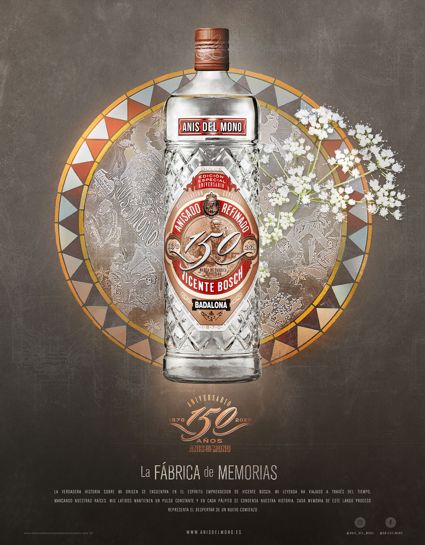
Anís del Mono occupies an important place in Spanish tradition, and has many unique elements to its branding, from the stylized faceted bottle, to its namesake monkey, and even the misspelling of a word on its classic label. We are called back to the unchanged history of the spirit as something that brings nostalgia and that has deep roots that transport us back to our past, even as they distill into our present.
DAf wanted to show that though the liquor dates back 150 years, it continues as a strong force that tells not just the story of the liquor, but brings back strong memories for those who drink it.
The tagline “La Fábrica de Memorias“ or “Where Memories Are Made“ encapsulates the past and present quality of the spirit, which harkens to tradition, but lives on until today.
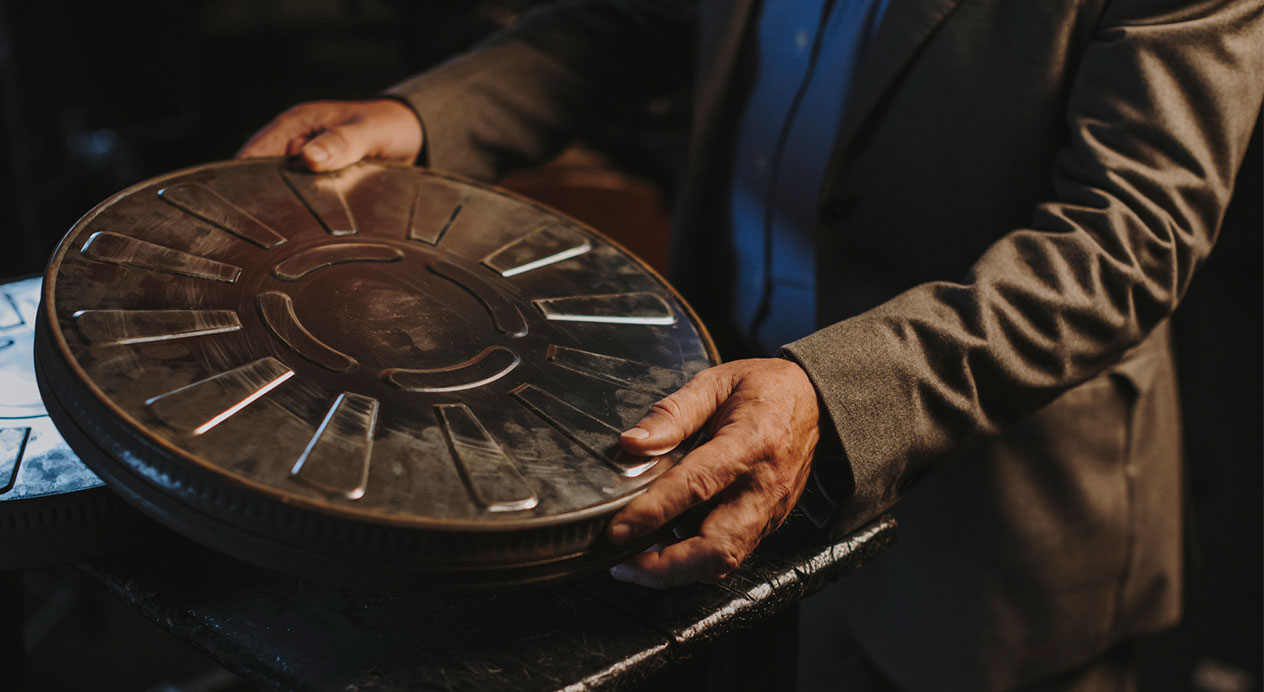

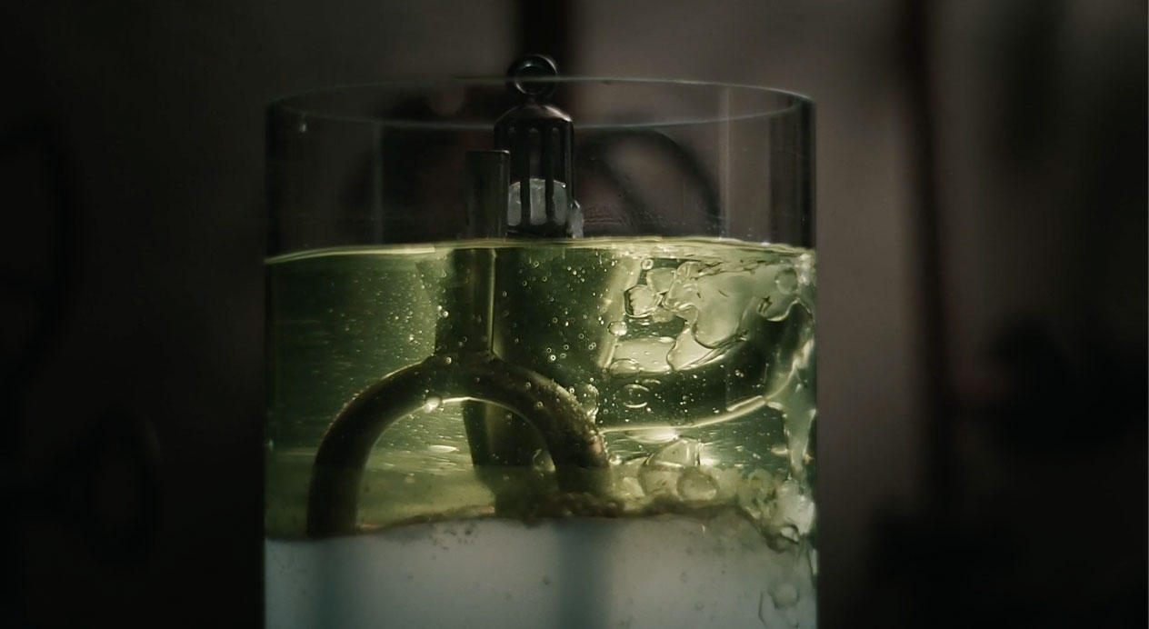
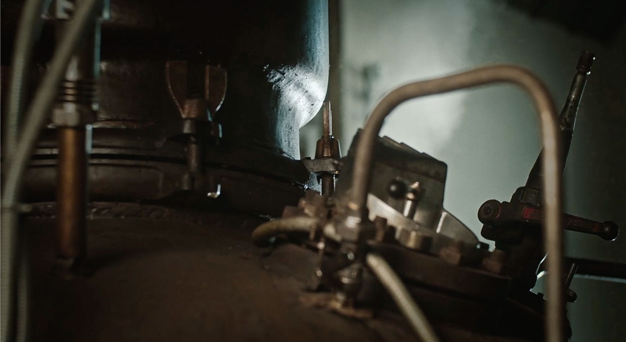
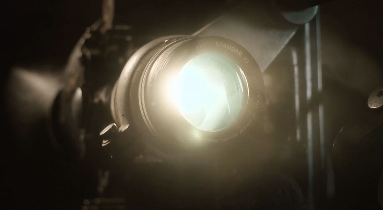
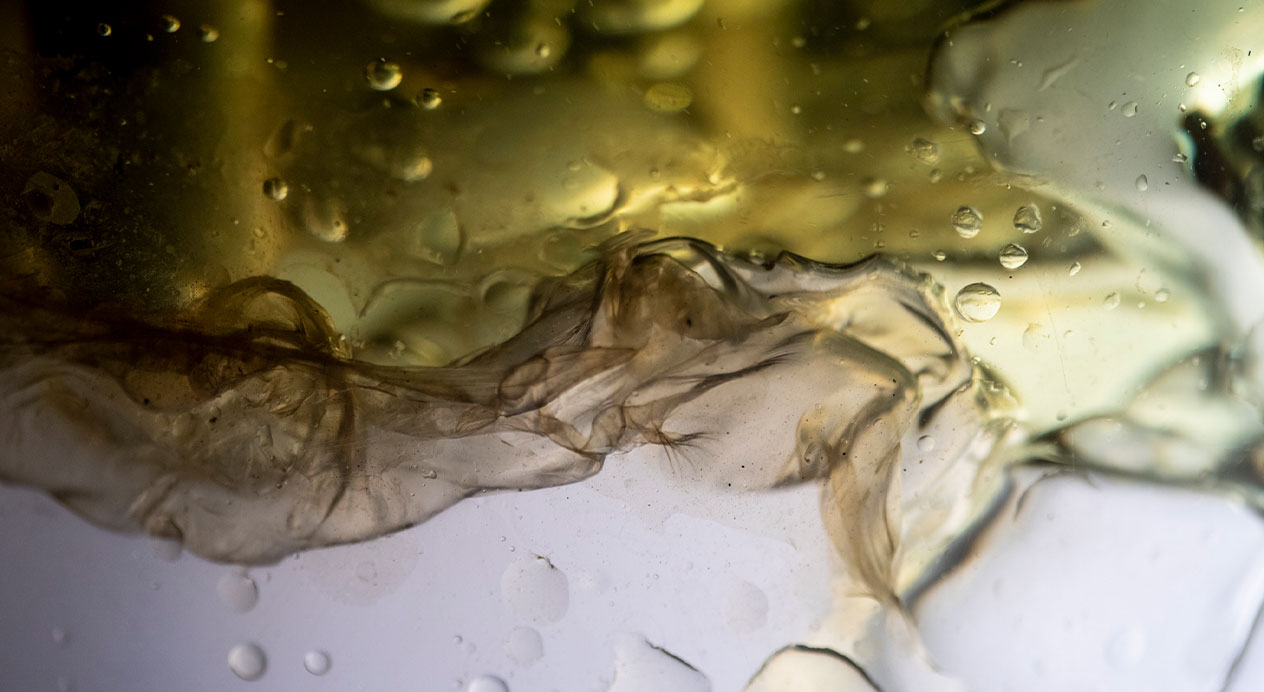
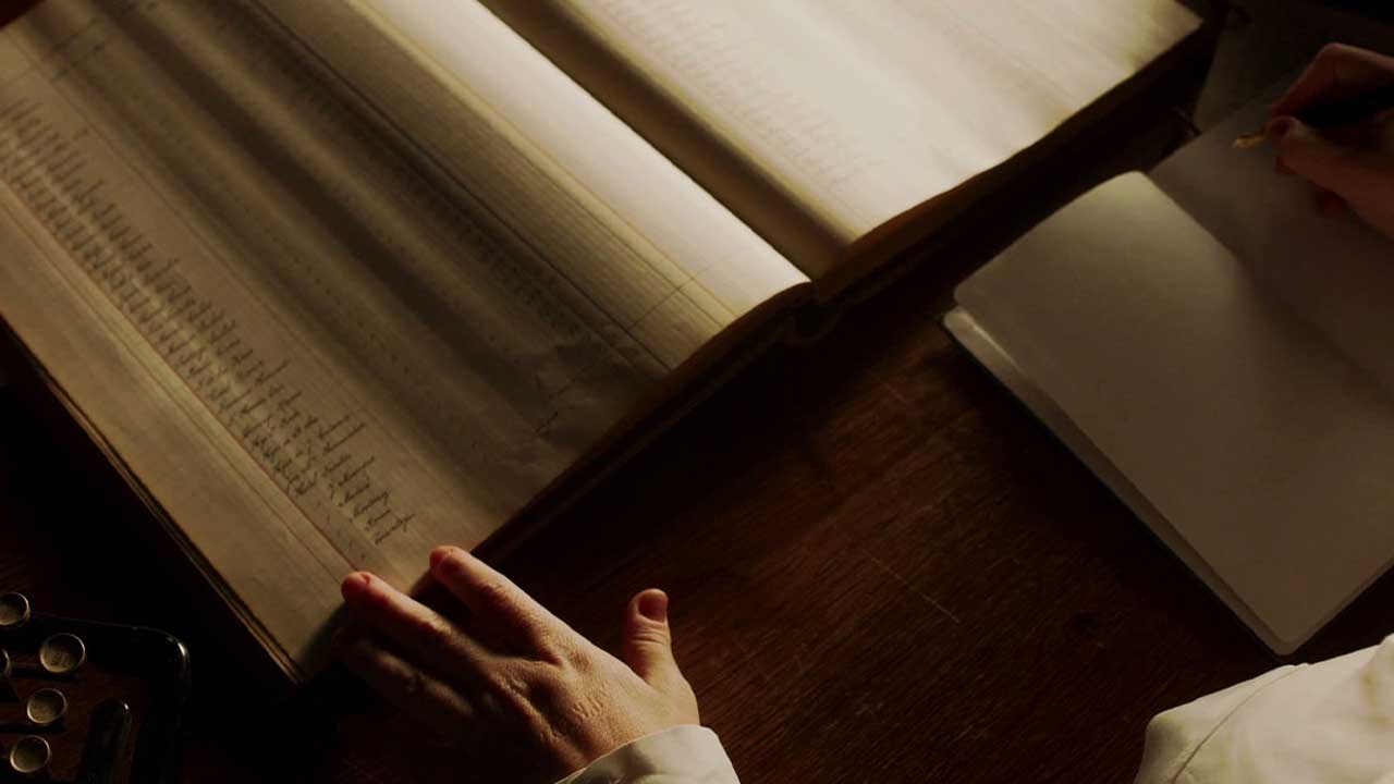
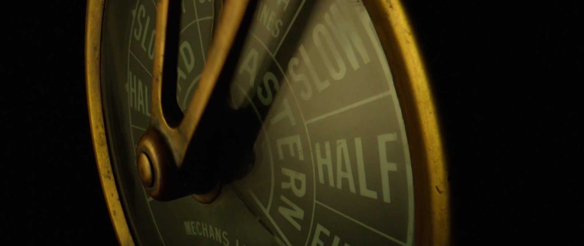
Brand Video
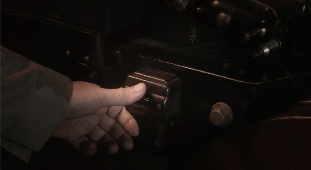
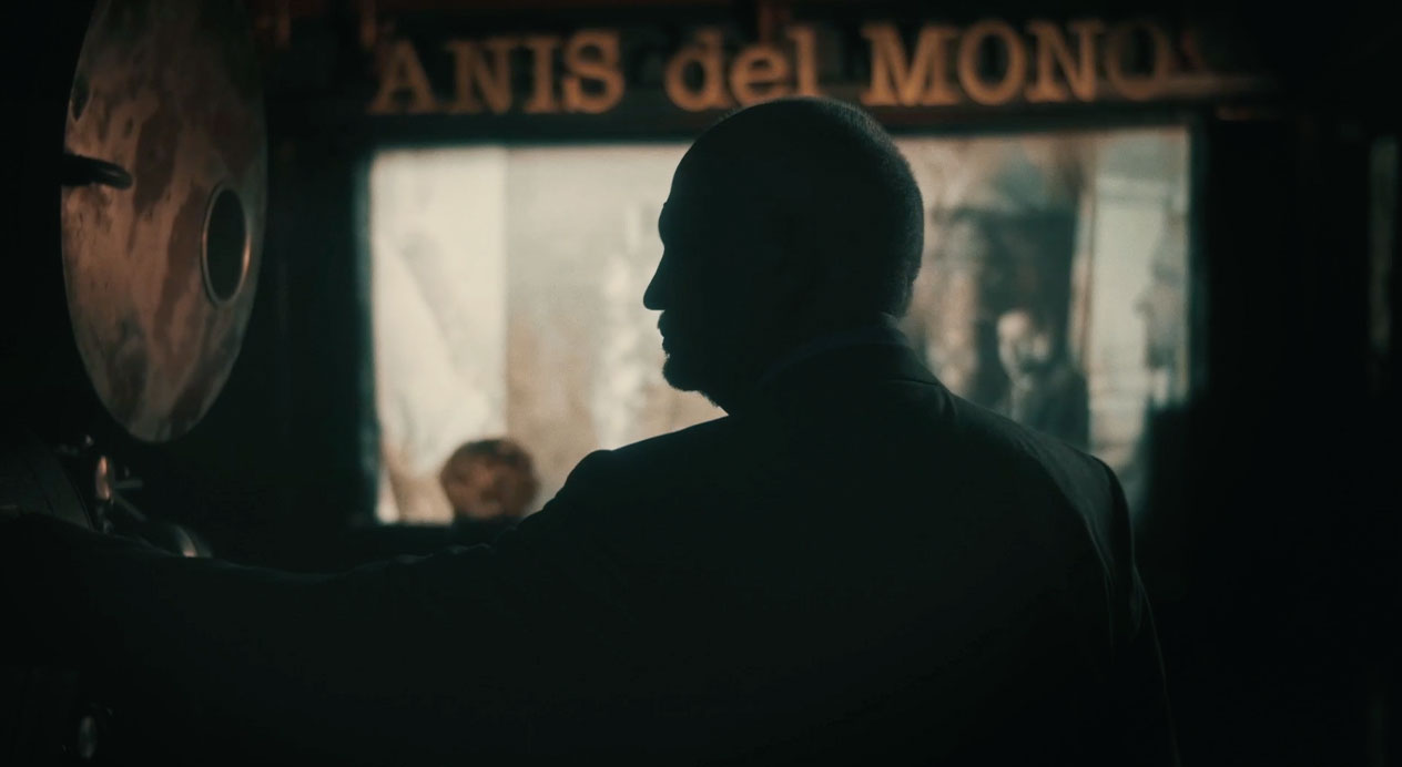
The brand film opens with a stained glass window with the liquor’s namesake monkey on it, which is located in the distillery. It then shows hands leafing through a ledger with the word Badalona printed at the top of the page. DAf constructed a small scale old-fashioned movie theater in the distillery to join together the nostalgic feeling of watching an old school movie with the essence of the liquor. The reel to reel projector projects over parts of the still before showing the distillation of the liquid itself. As the faceted bottles roll past, the trilling sound that the bottle makes when played as an instrument is heard, and the voice over is told from the perspective of the liquor itself.
Key Visual
The key visual is an image of the bottle with the redesigned label, in front of the stained glass window, giving an ethereal yet traditional look, with touches of copper in allusion to the stills used to distill the liquor. A sprig of flowering anise completes the visual with the words “Fábrica de Memorias“ and a text recalling founder Vicente Bosch below.
Social Media
DAf developed a series of stills for use on social media, showing the bottles, still, liquid and the projections of historic photos over the stills. We also developed short capsules for Facebook, Instagram feed and stories. These 15“ videos show the rolling bottle with the melodic sound it produces when played, the liquid being distilled as well as a reel-to-reel film being shown. The voice over is in first person, as though the liquor itself is speaking.
La Fábrica de Memorias / Where Memories Are Made
Patricia Contreras December 16, 2020
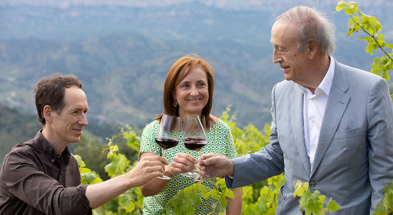
Challenge
Familia Torres, one of the world’s largest and most recognized wineries is a long-standing DAf client. They are very commited to sustainability, which, given the size of their winery has a large impact on the planet. The client wanted to communicate their long-term commitment to sustainability and develop a claim that could work for the coming years that represents everything that the family is doing to achieve it.
Client |
Familia Torres |
|
|
Capabilities |
Key Visual
Social Media Content |
|
|
Solution
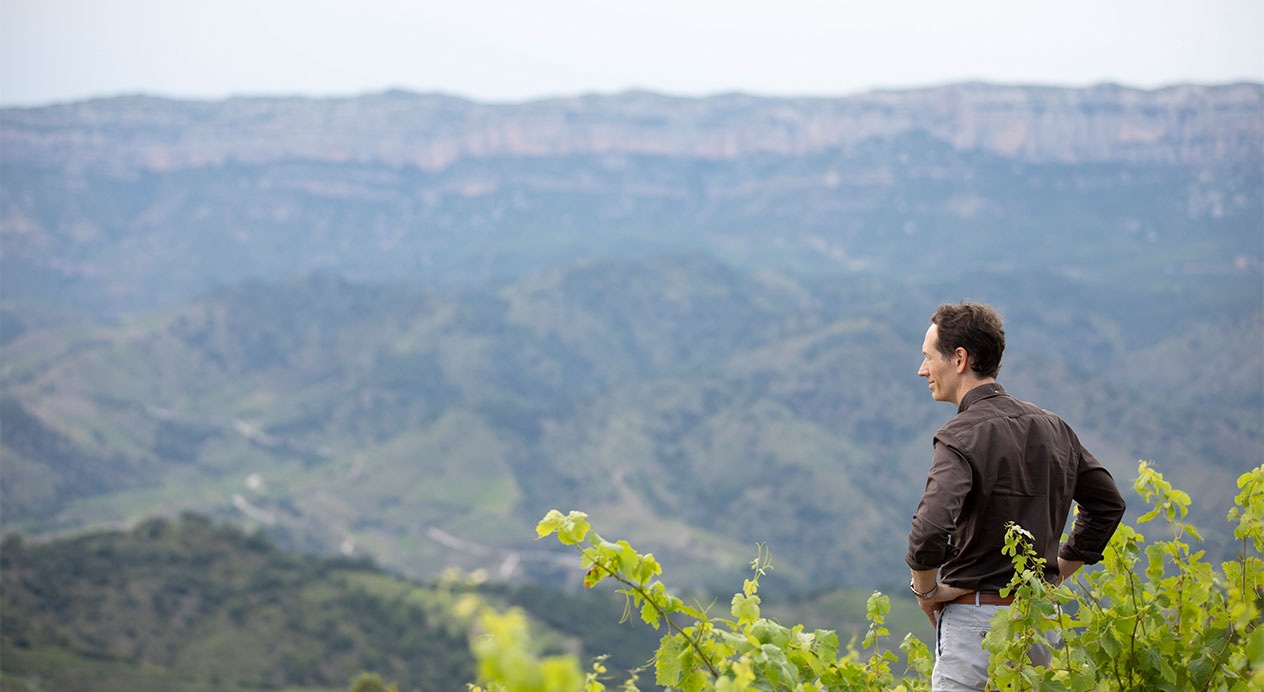
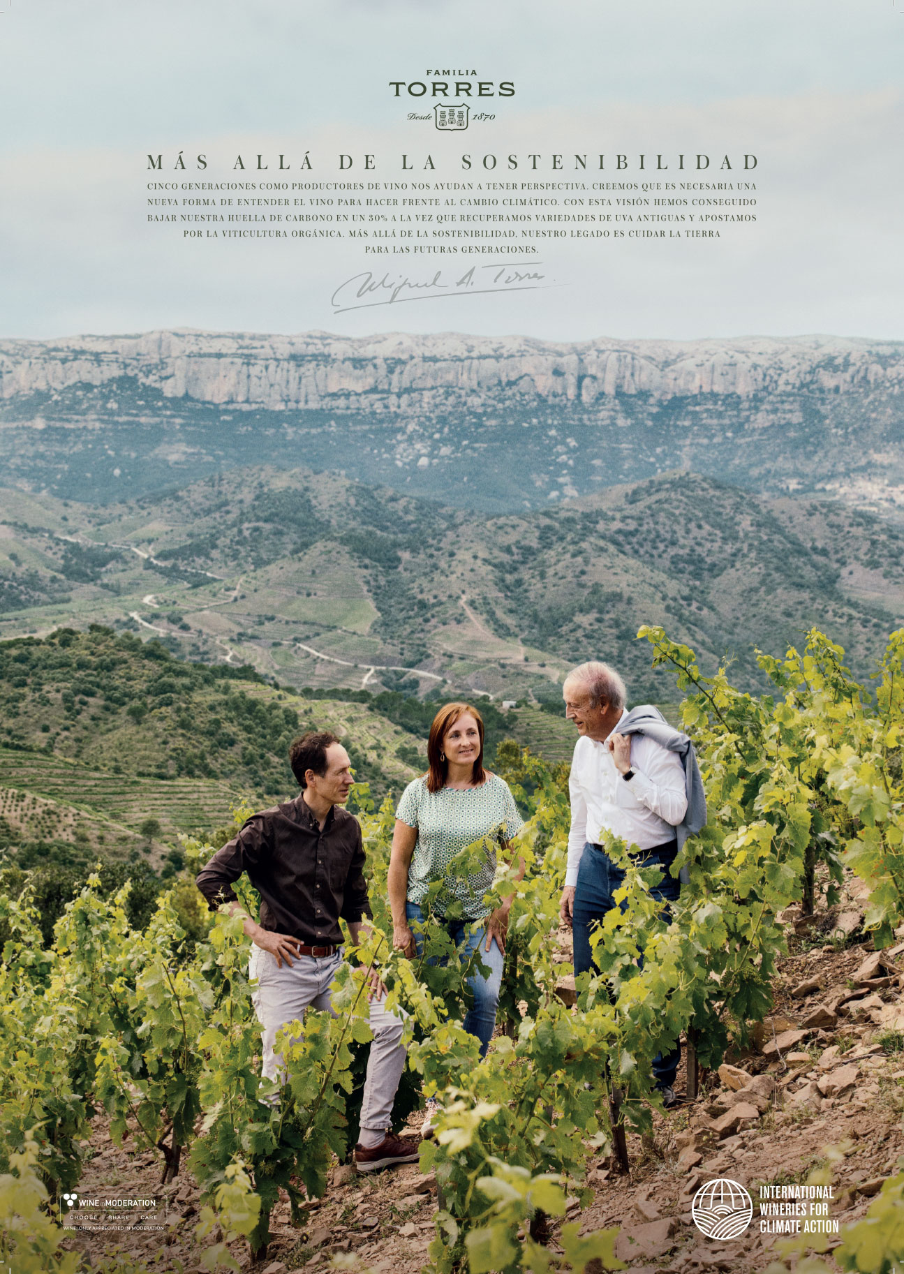
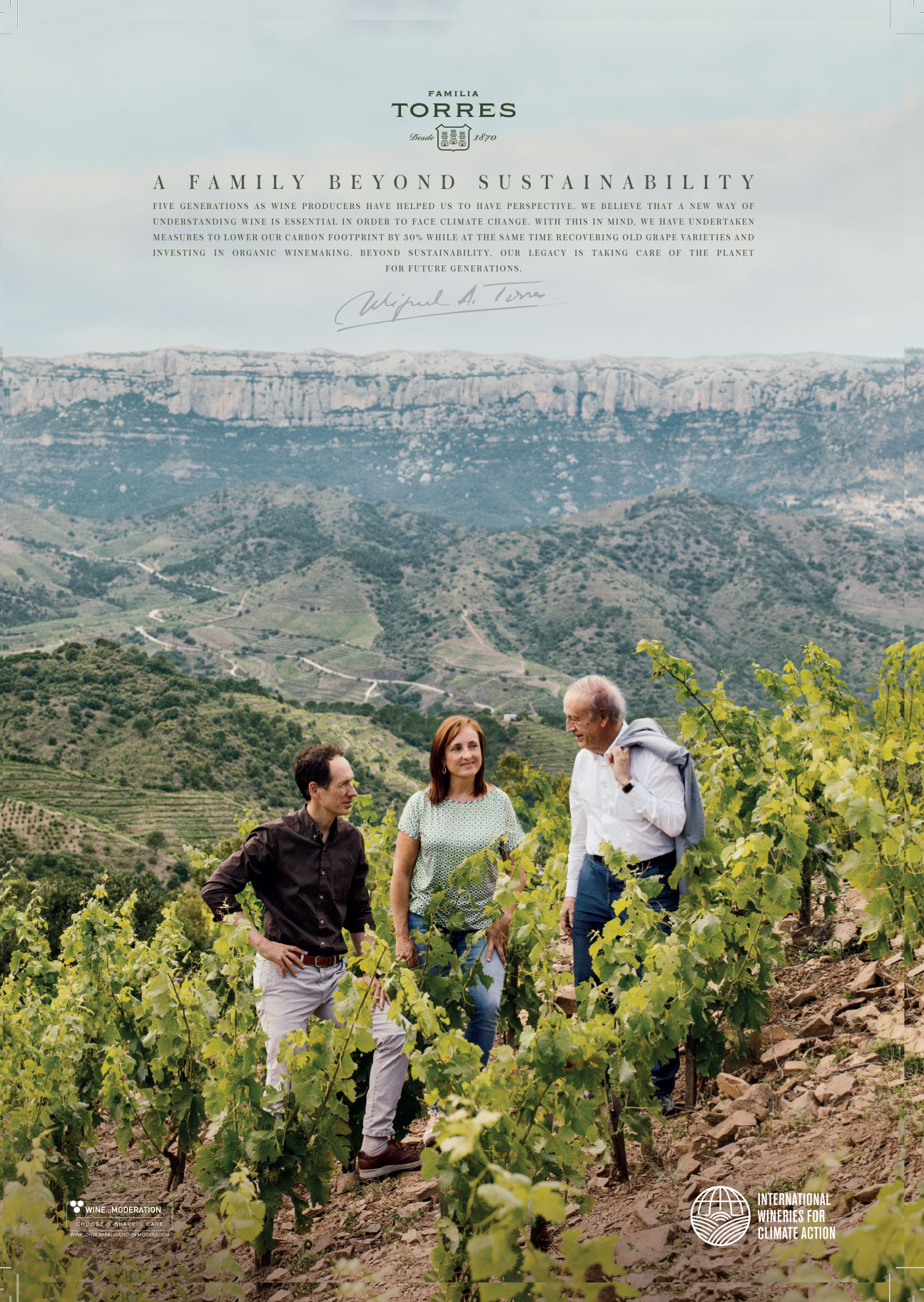
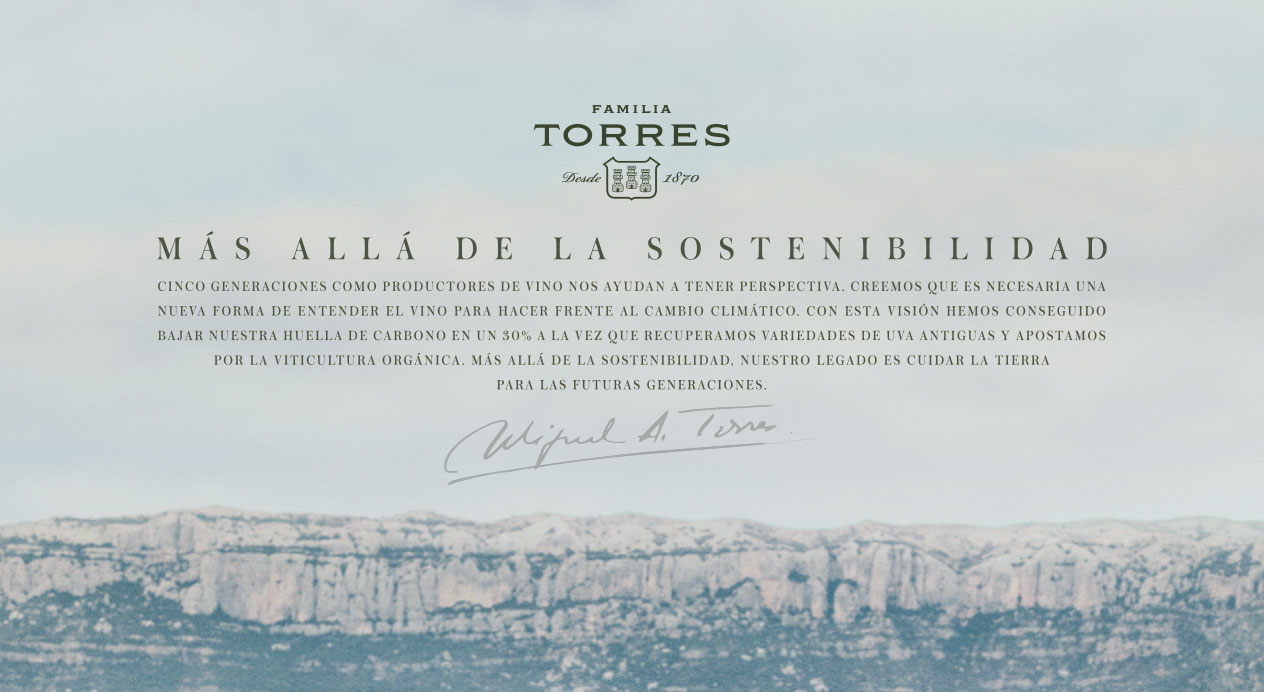
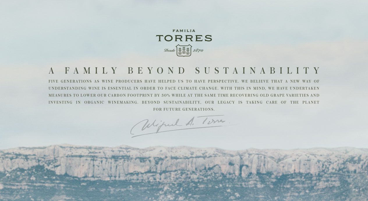
We focused on the legacy of the Torres Family, and the stewardship they have of the earth, which includes undertaking measures to lower their carbon footprint by 30%, recovering old grape varieties and investing in organic winemaking. The history of their five generations, and the care they take of the planet to keep this legacy going are an essential part of the winery’s identity.
Key Visual
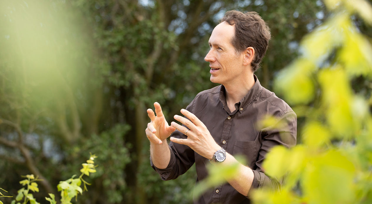
The key visual shows Miguel Agustín Torres (president and 4th generation) with his 5th generation children, Miquel and Mireia, who both hold high-level positions in the winery, representing the multiple generations of the Torres Family on the steep slopes of Finca Tossals, Familia Torres’ highest winery in Priorat, Spain, overlooking a valley, and backed by a mountain ridge. The overlay features a text with the claim “A family beyond sustainability“ and a paragraph detailing the steps they are taking to be good stewards of the land. The paragraph is underlined with Miguel Torres flourished signature. There are versions of the key visual in English, Spanish and Catalan.
Key Visual Text Overlay
Five generations as wine producers have helped us to have perspective. We believe that a new way of understanding wine is essential in order to face climate change. With this in mind, we have undertaken measures to lower our carbon footprint by 30% while at the same time recovering old grape varieties and investing in organic winemaking. Beyond sustainability, our legacy is taking care of the planet for future generations.
Social Media
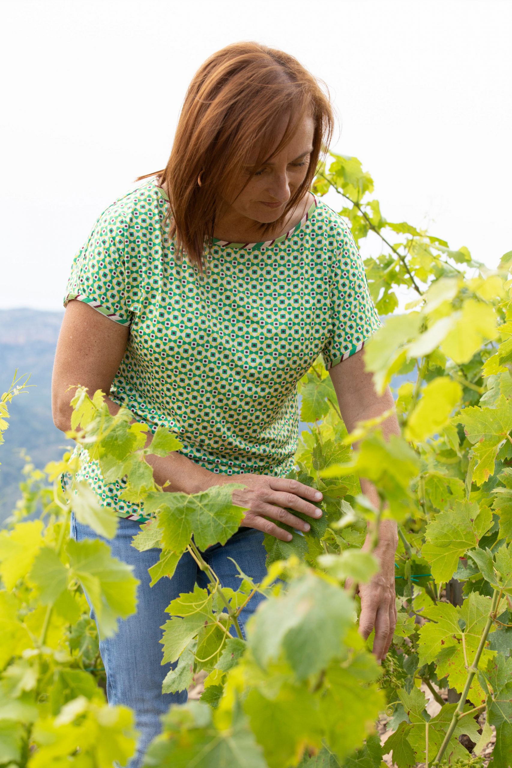
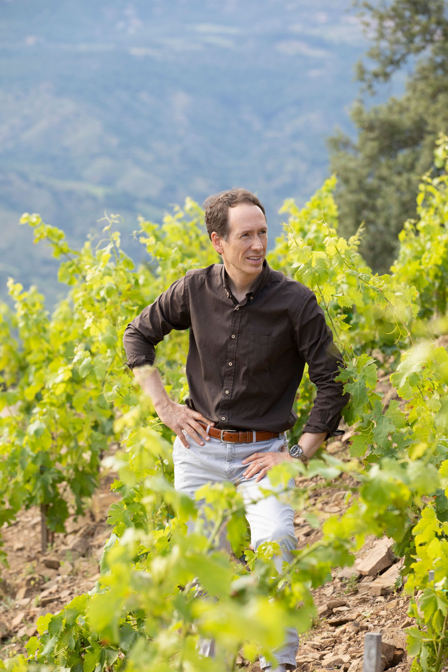
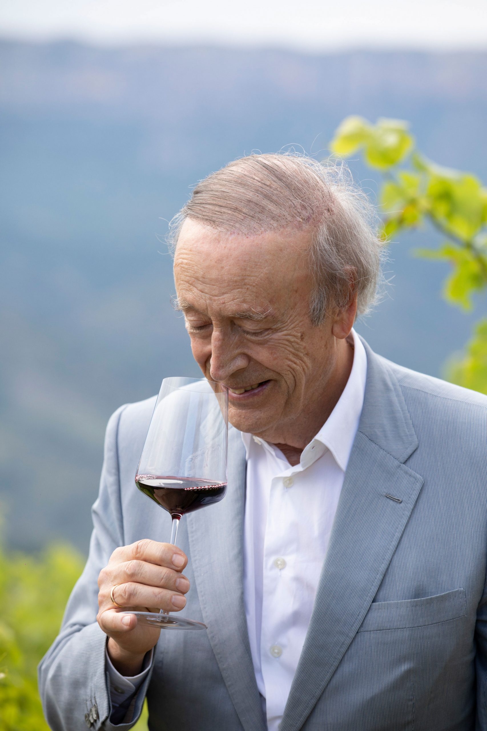
Individual photos of the fourth and fifth generation, Miguel Agustín Torres, Miquel and Mireia at the mountaintop winery in Priorat, Catalonia, Spain will be used in social media.
A Family Beyond Sustainability
Patricia Contreras January 5, 2021
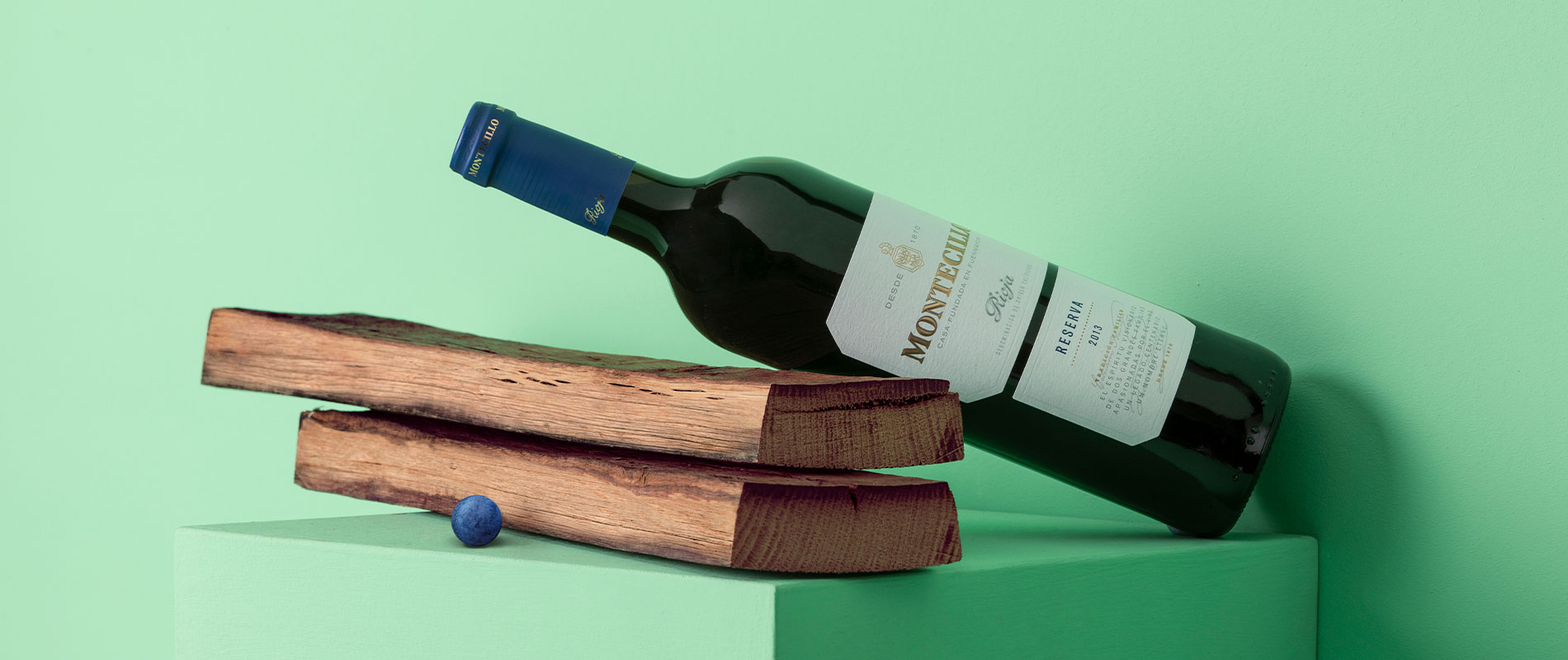
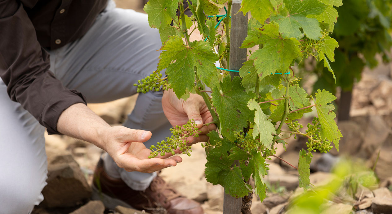
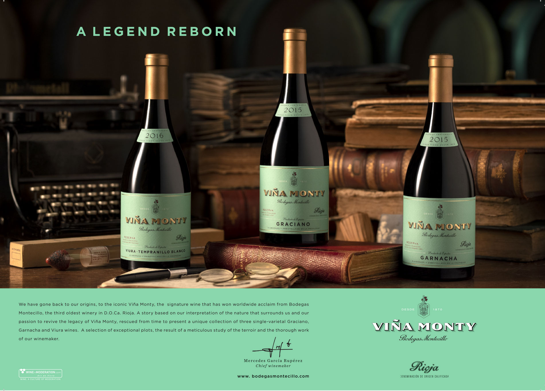
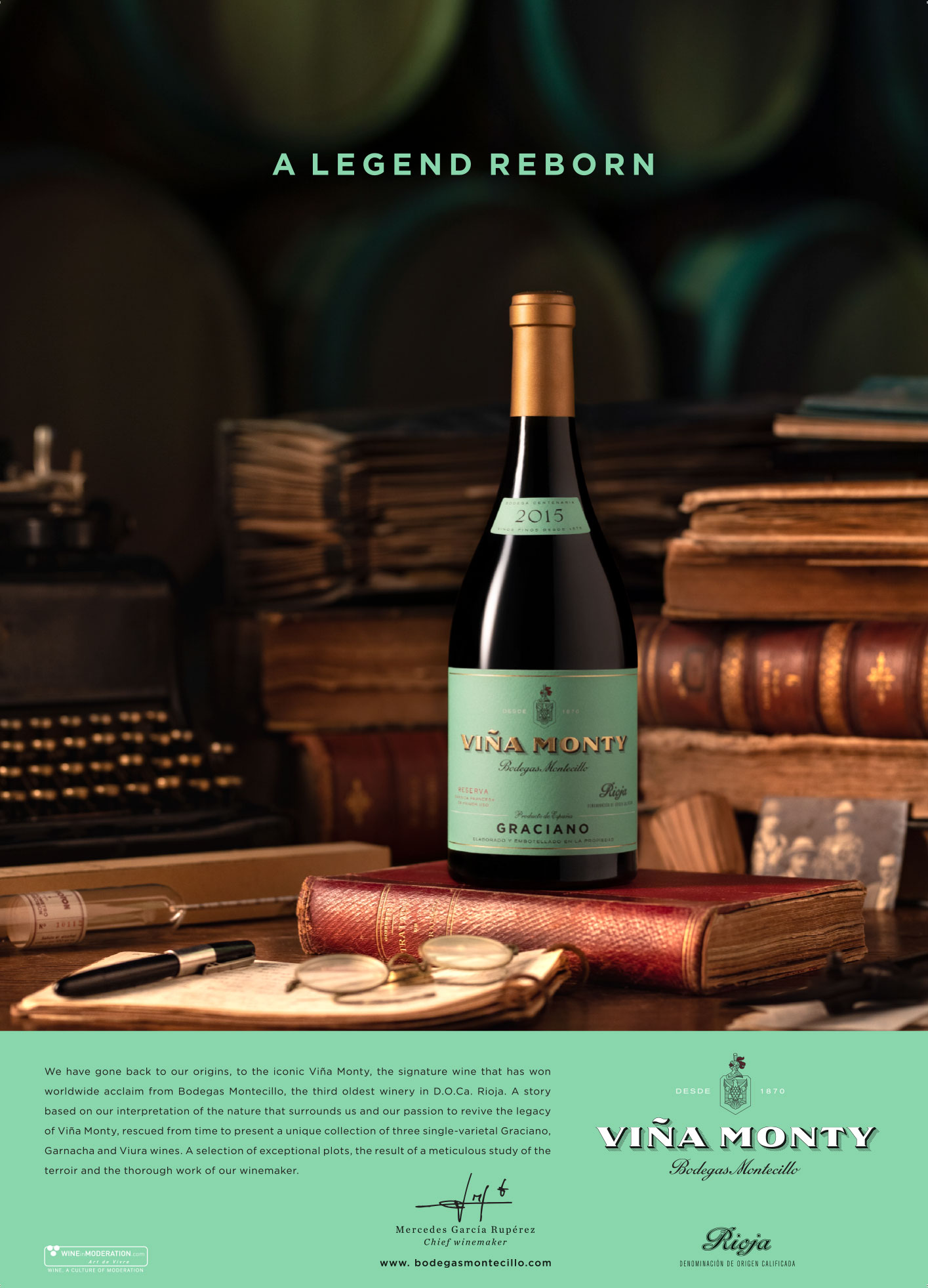
Challenge
As part of the celebrations of their 150th anniversary, Bodegas Montecillo relaunched their historic brand Viña Monty. Its return was marked by releasing three new Reserva wines and unveiling of the last bottles of the award-winning 1975 vintage, in which Viña Monty was chosen #1 among France and Spain’s most prestigious blind tastings.
DAf was approached to create a campaign in support of Viña Monty’s return, including concept, storytelling, claim, brand video, key visual and social media content. The challenge was to build brand equity and elevate Bodegas Montecillo’s credentials by bringing Viña Monty—once its most iconic brand—back to top of mind.
Client |
Grupo Osborne |
|
|
Capabilities |
VOICE OVER
VIDEO
KEY VISUAL
SOCIAL MEDIA CAPSULES |
|
|
Solution
The new Reserva range was developed by chief winemaker Mercedes García Rupérez, over eight years of careful investigation, spanning 800 separate parcels in the Rioja Alta region and revealing some vines over 100 years old.
Alongside its reinvigorated brand color, the chosen claim “A legend, reborn“ communicates the foundation of Viña Monty’s tradition and origin, combined with this modern investigation into nature and terroir.
VOICE OVER
Nature calls upon our land
Ancient stones whisper a secret,
that rises to the surface.
Stories woven into the landscape slowly unravel.
As clues are revealed,
a path is set,
tinged with a distinctive hue.
A hint of things to come,
suffused with passion and tradition.
The past is unearthed,
forever intertwined with the land,
crafted to become the finest expression of our terroir.
Viña Monty. A legend reborn.
BRAND VIDEO
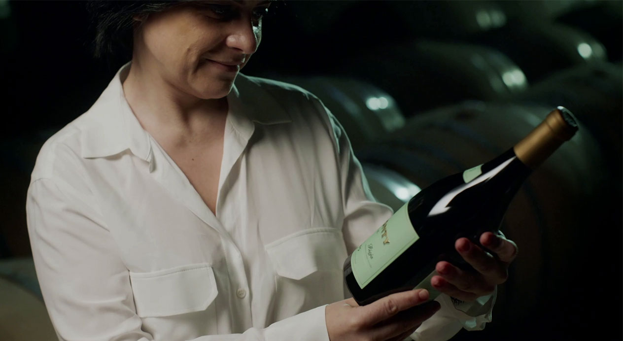
Filmed on-site in Rioja Alta, Viña Monty’s tradition, origin, terroir, influence of nature and chief winemaker all feature prominently in the brand video.
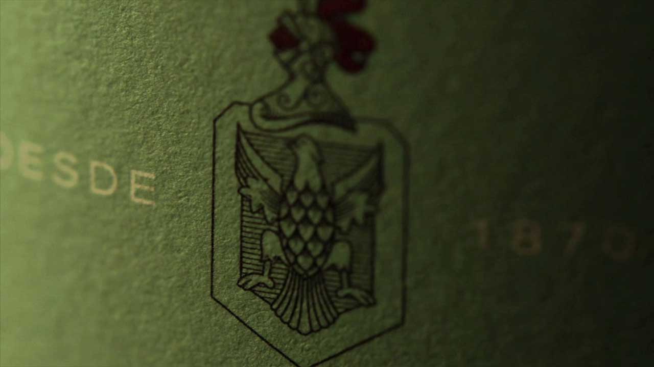
KEY VISUAL
The key visual presents the product, highlighting the contemporary brand color and surrounded by items that explore its tradition, origin, terroir and relationship to nature.
SOCIAL MEDIA CAPSULES
16“ video capsules were developed for social media, highlighting the brand’s cellars, its chief winemaker’s investigation and old vines.
Patricia Contreras August 20, 2020