Challenge
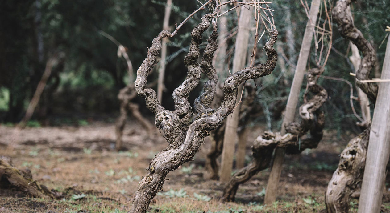
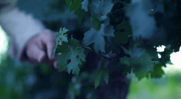
Chilean winery Viña Ventisquero was in a very unique position: The mother brand housed five key wine brands functioning alongside bespoke brands for specific export markets. However, the winery had discovered that consumers confused the similarly named Ventisquero, the winery’s most recognizable range, with its Viña Ventisquero namesake.
Viña Ventisquero came to DAf with a challenging project: To create an umbrella brand that would allow it to better showcase its individual wineries, creating a powerful new identity that would allow brand equity to trickle down through its diverse portfolios.
The process consisted of two distinct phases: Firstly, an analysis of Viña Ventisquero’s brand architecture. Secondly, the rebranding of Viña Ventisquero, including storytelling, naming, tagline, brand identity and a brand book for its application throughout the holding.
Client |
Ventisquero Wine Estates |
|
|
Capabilities |
Brand Strategy
Naming
Portfolio Architecture
Brand Book |
|
|

Solution
DAf conducted a series of interviews with key winery executive and enological players in order to understand the company culture, and how their challenge had impacted upon staff, importers, distributors and consumers.
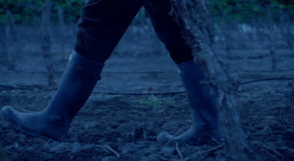
Throughout it became clear that the company culture was one of optimism, exploration and openness, in which employees feel comfortable and at home. In addition, at every interview a particular desire was raised: To communicate that the winery owned and operated their own vineyards in Chile’s principal winegrowing regions, a key differentiator between competitors of similar size or prestige.
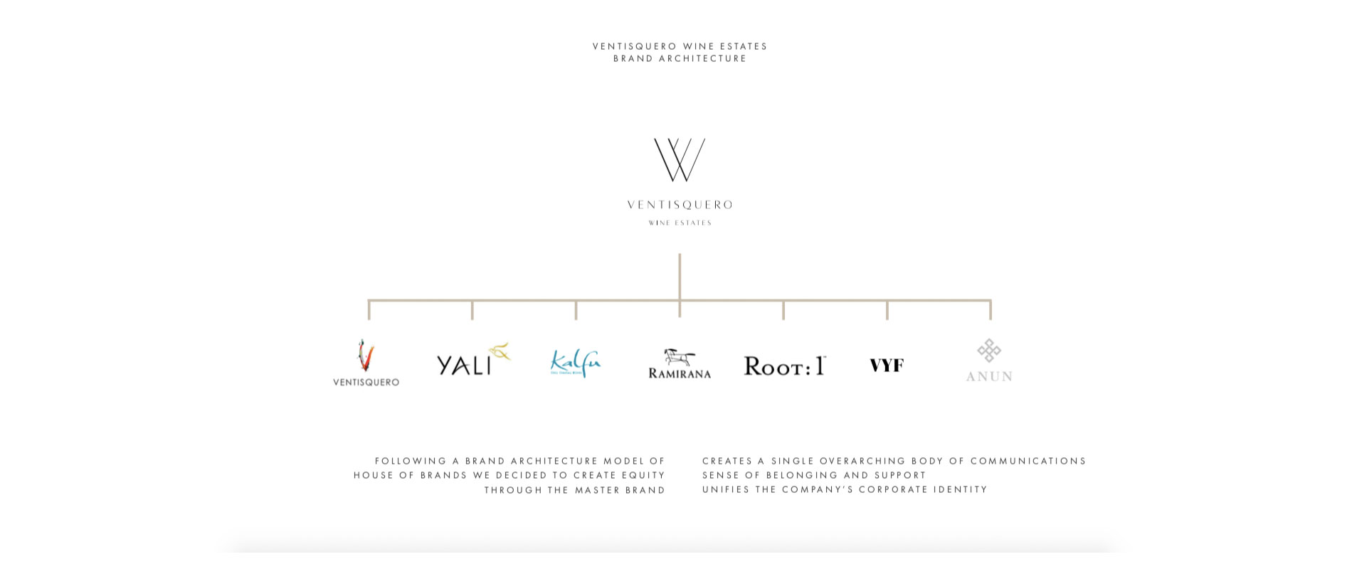
Brand Architecture
After presenting and discussing brand architecture scenarios with the client, it became clear that the best way forward for the winery was a House of Brands structure in which each separate sub-brand and business unit was positioned horizontally beneath the to-be-named mother brand. In this way, each would receive equal weighting in the eyes of importers, trade and consumers — including the Ventisquero portfolio, which up until that point had often been confused with the holding’s name.
Branding
With the corporate structure finalized, our creative team began the task of rebranding the winery. With “Ventisquero“ present in both the winery’s name and one of its sub-brands, the challenge was to continue to use the word in a naming and rebranding proposal that clearly separated winery from wine range, while reinforcing the its ownership of vineyards throughout Chile.
Naming and Tagline
The winery was renamed Ventisquero Wine Estates. During the process it became clear that “vineyards“ did not carry the necessary weight to communicate the vastness of the holding’s land assets. For that reason, DAf arrived at the solution of “estate“, a term that summarizes the idea of an extensive area of land, while also referring to ownership by single family or company, both of which are true in the case of Ventisquero Wine Estates.
The tagline “Growing Origins“ was chosen as a means to further highlight the company’s ownership of winegrowing land throughout the country.
Brand Identity
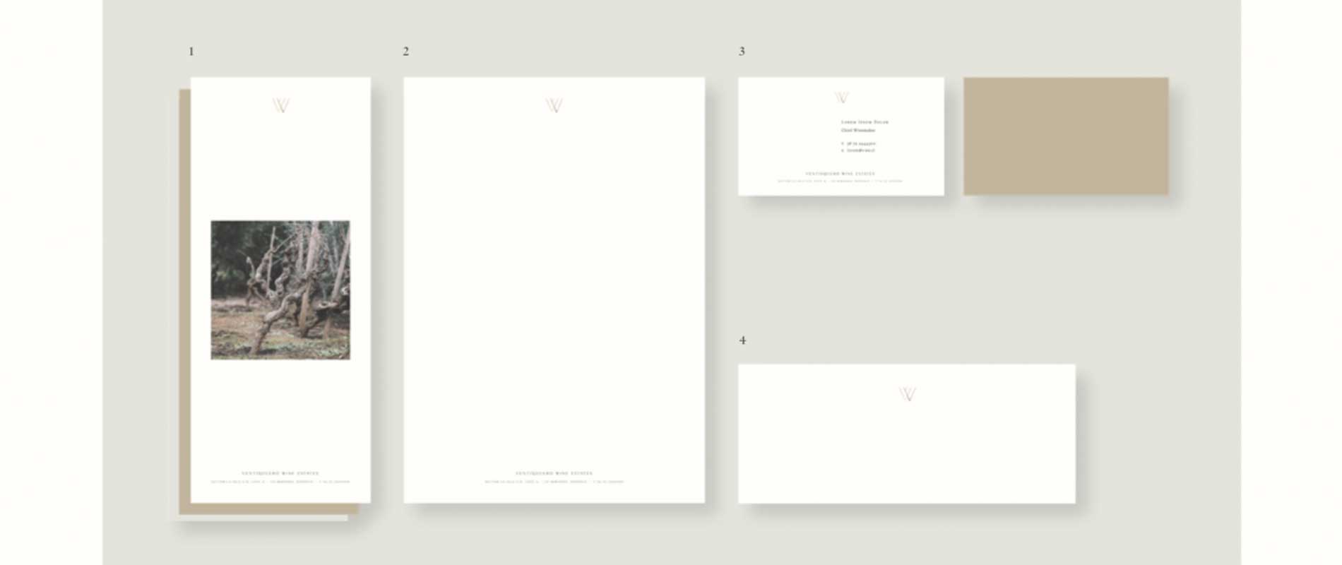
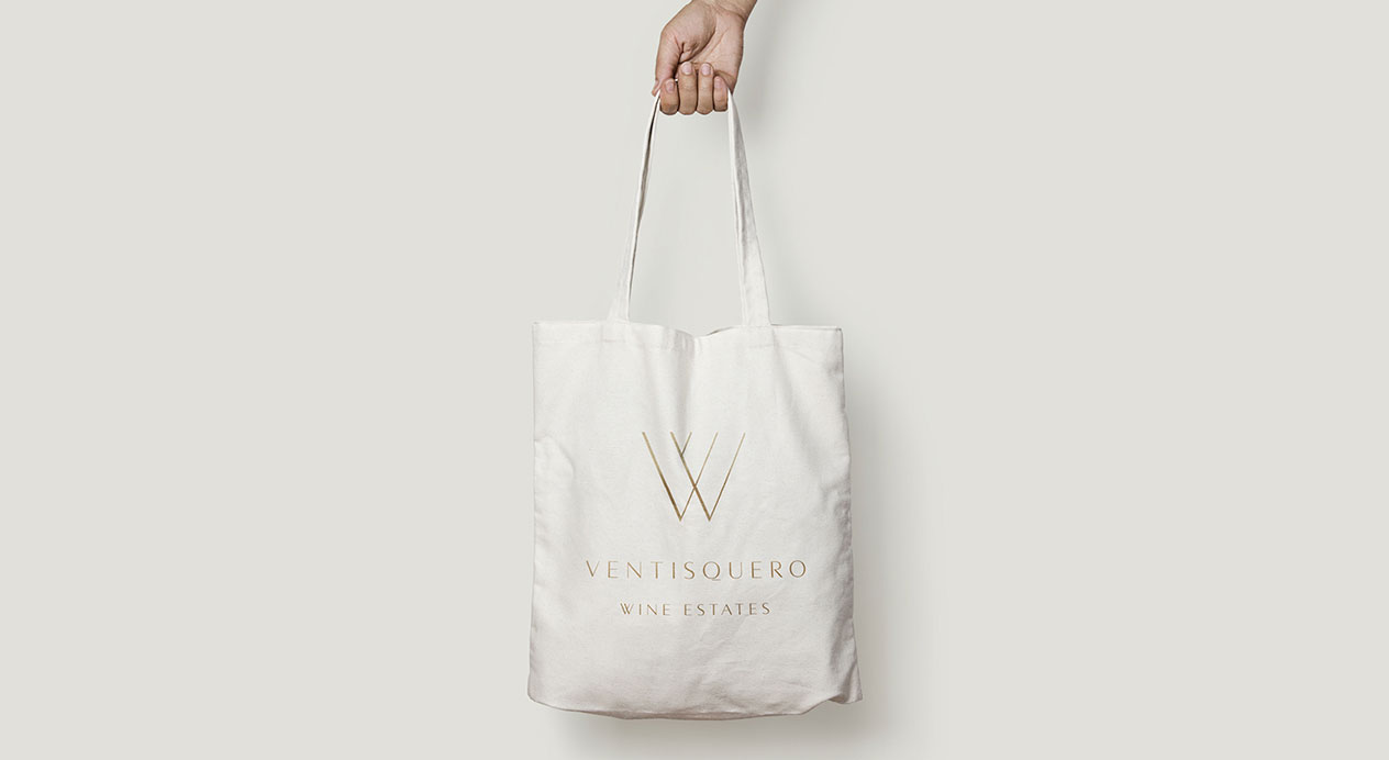
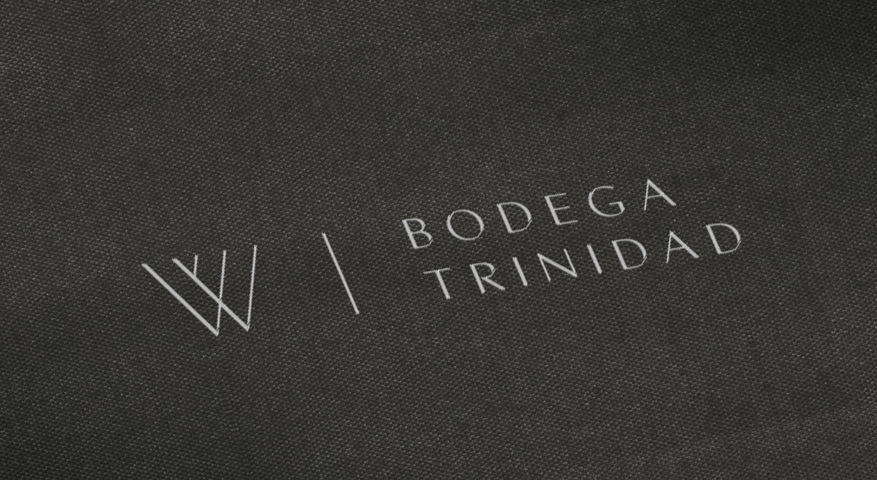
Our designers worked to create a brand identity for Ventisquero Wine Estates that let each of its sub-brands continue to express themselves.
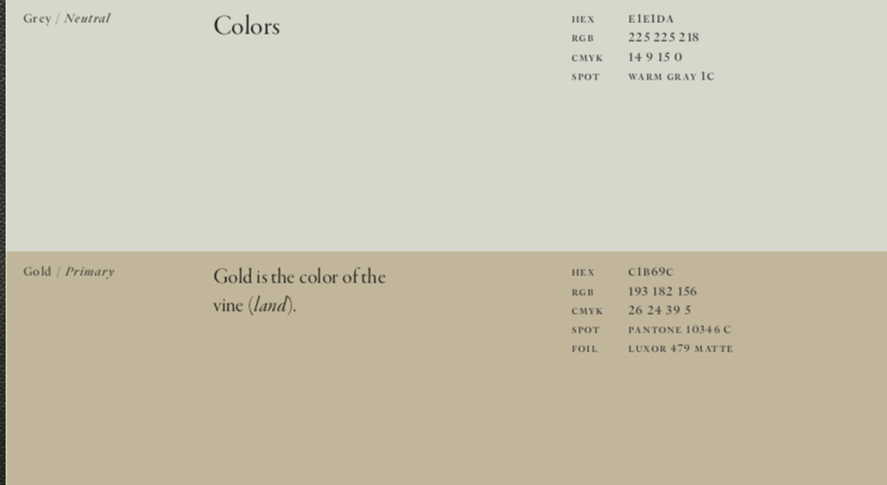
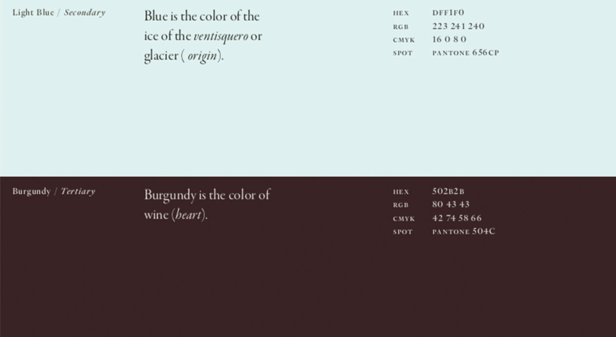
Colors
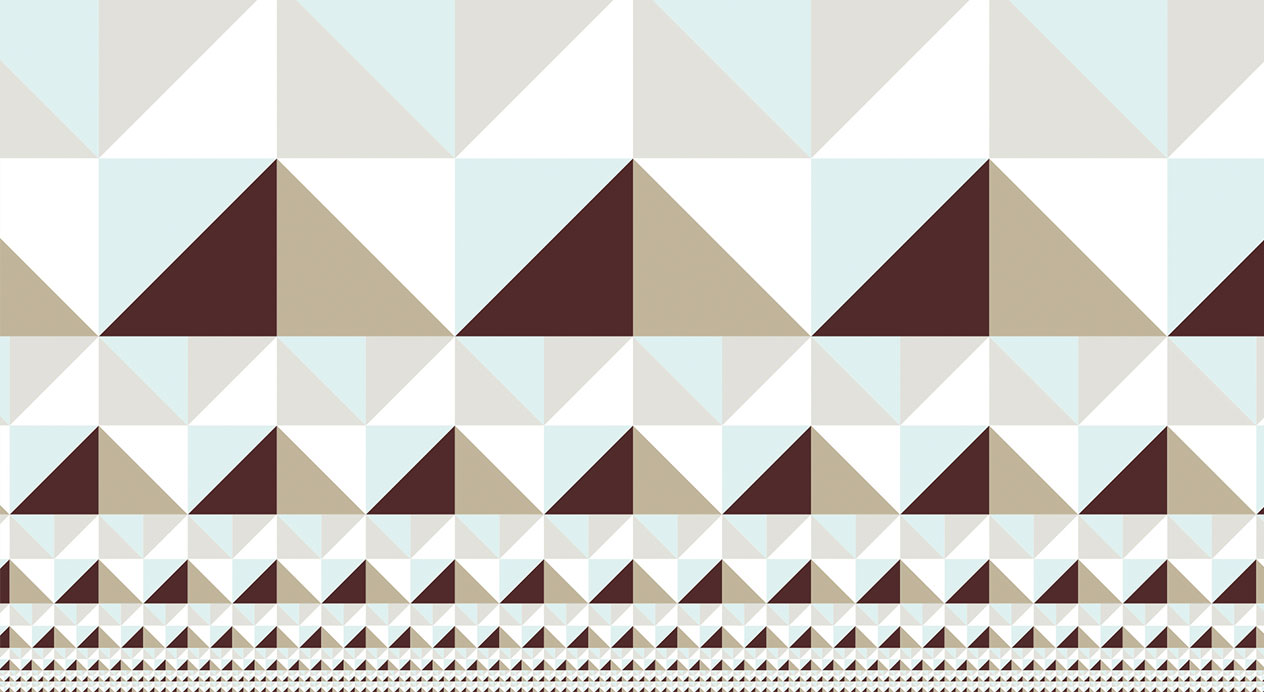
The color scheme of gold, light blue and burgundy reflect brand characteristics of the vine, ventisquero and wine. White and gray are also employed in a neutral or complementary capacity.
A signature “V“ shaped patterns inspired by the ice phenomena of the Queulat hanging glacier are also derived.
Monogram and Logotype
Drawing from the dynamism of the letter “V“ and the sense of growth of the vines, the monogram elegantly presents Ventisquero Wine Estates’ initials.
A variety of formats were designed, including isologotype (combining the brand name and monogram in a single graphic block), logo and compact logo.
Brand Book
DAf designed Ventisquero Wine Estates’ brand book, outlining each brand’s correct usage across all stationery, textiles, materials, digital applications and winery installations. It also proposes a unified style of brand photography.
Storytelling
Based on the concept of “home“, the storytelling reveals Ventisquero Wine Estates’ four pillars of sustainability, innovation, passion and vineyard ownership; while introducing the optimistic, team-based attitude the brand presents.
When it comes to vineyards, we feel at home. In a place of trust, humility and commitment.
At home we are conscious; cultivating our relationship with the planet through sustainable practices.
We are innovators; experimenting with different winemaking styles and advances in technology.
We are explorers; reaching out as founders of our own estates in Chile’s most recognized wine regions.
But above all, at home we are a family.
A family united not by surname, but by a single passion: To share Chile’s finest origins with the world.
Ventisquero Wine Estates
Growing Origins
Patricia Contreras March 3, 2021
Challenge
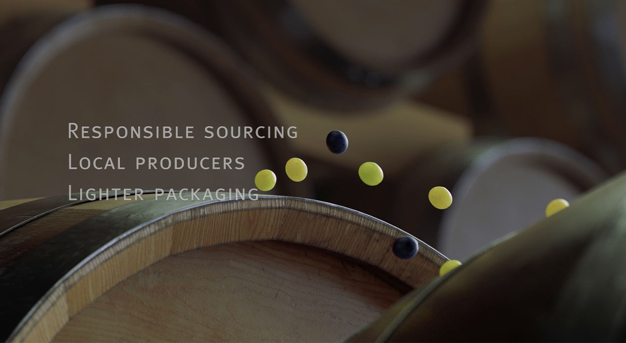
As one of the world’s largest wineries, Viña Concha y Toro’s potential for impact is huge. The winery required a video to communicate their six sustainability pillars in a concise, attractive way to both trade and consumer audiences. DAf was charged with creating an animated video that articulated the winery’s approach to sustainability, based on the philosophy of “giving back, in each bottle, what the Earth has given us.”
Client |
Viña Concha y Toro |
|
|
Capabilities |
Video
Animation |
|
|
Solution
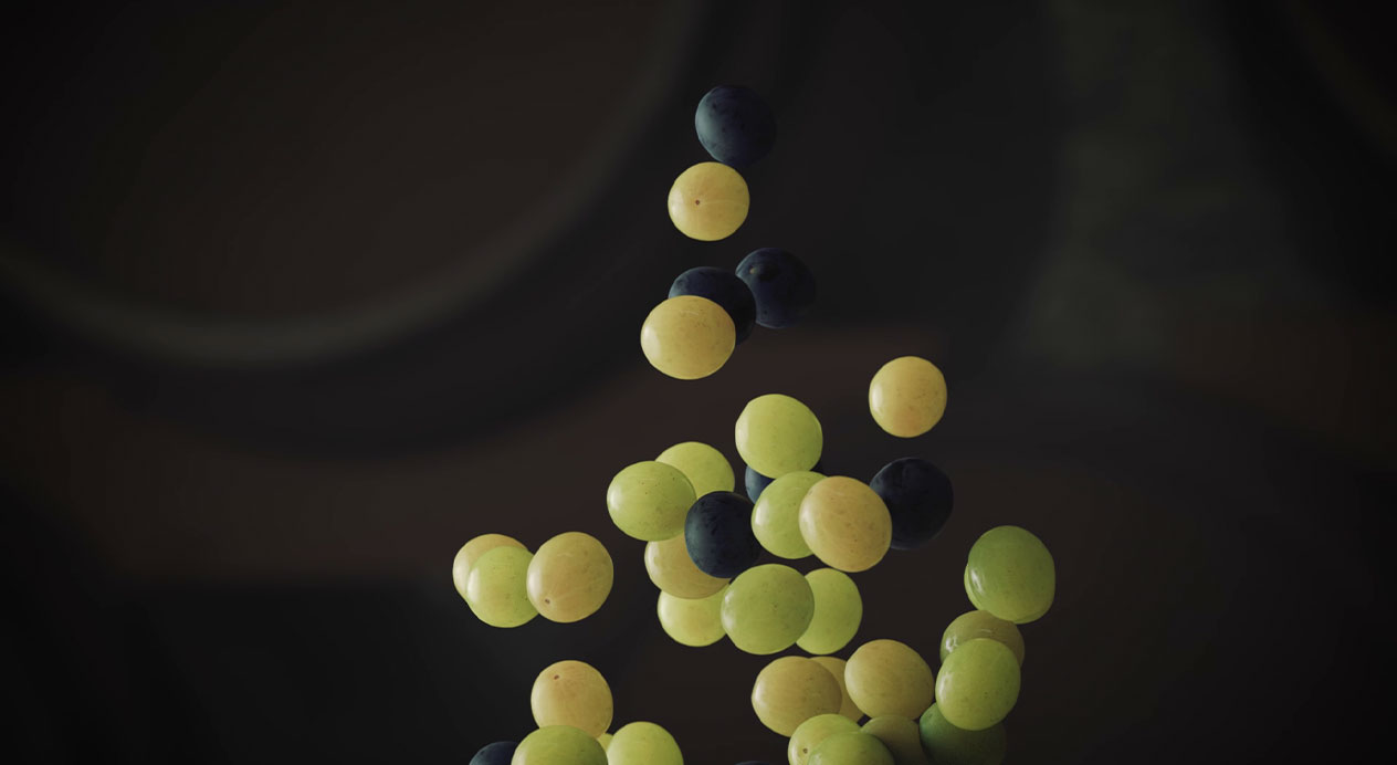
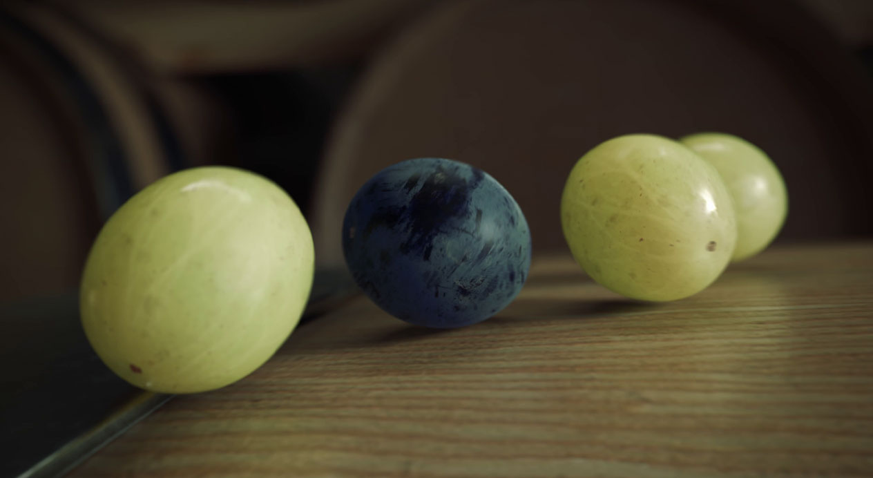
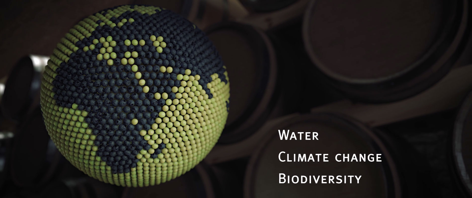
After analyzing the main actions of Viña Concha y Toro’s six sustainability pillars, our next step was to identify a visual style through which to communicate the material. After presenting several options to the client, the concept of grapes as protagonists was selected as a means to present the content energetically and memorably.
Corporate Video
The video follows a group of red and white grapes as they travel through a wine cellar, working together as one to present Viña Concha y Toro’s six sustainability pillars, and reflect the essence of each action taken.
Animation
DAf returned to its roots in animation to create the grapes and elements of wood and metal that make up the cellar space. Designed in 3D, the finished effect is full of life and detail.
Giving back what the Earth has given us.
Patricia Contreras September 25, 2020
Challenge
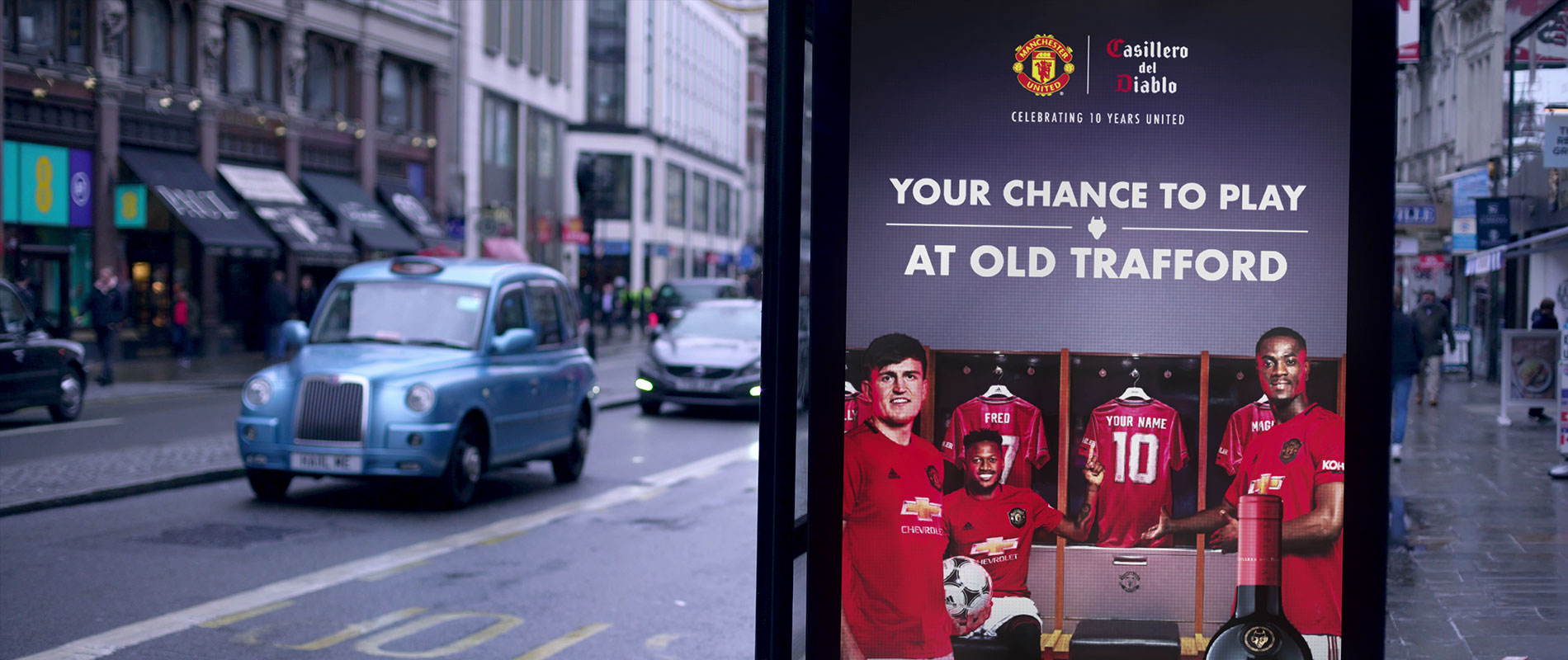
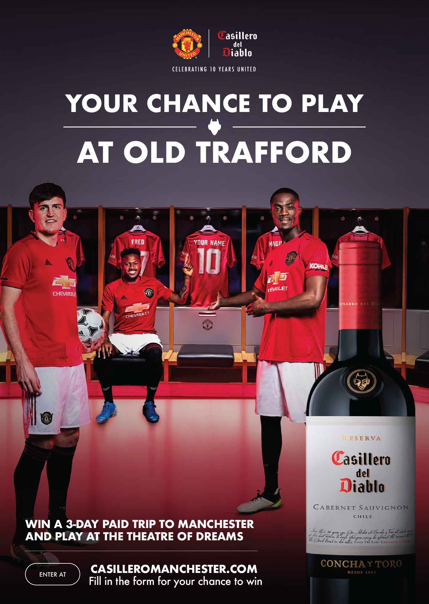
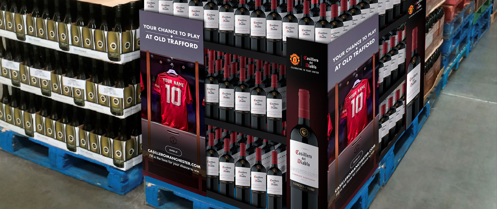
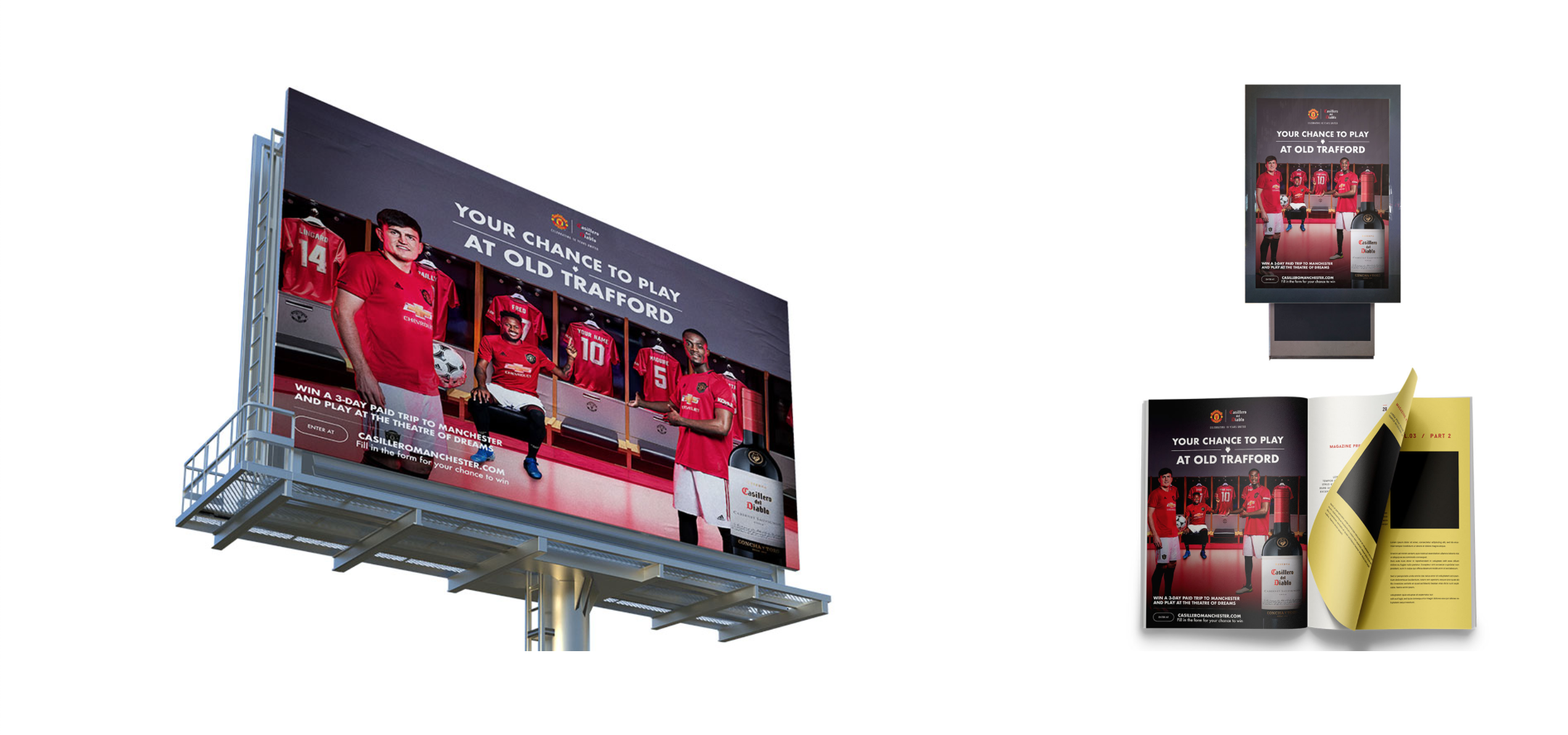
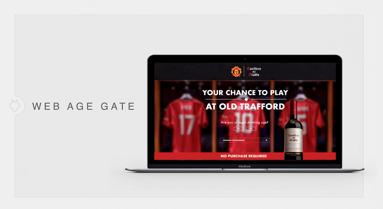
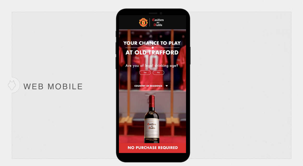
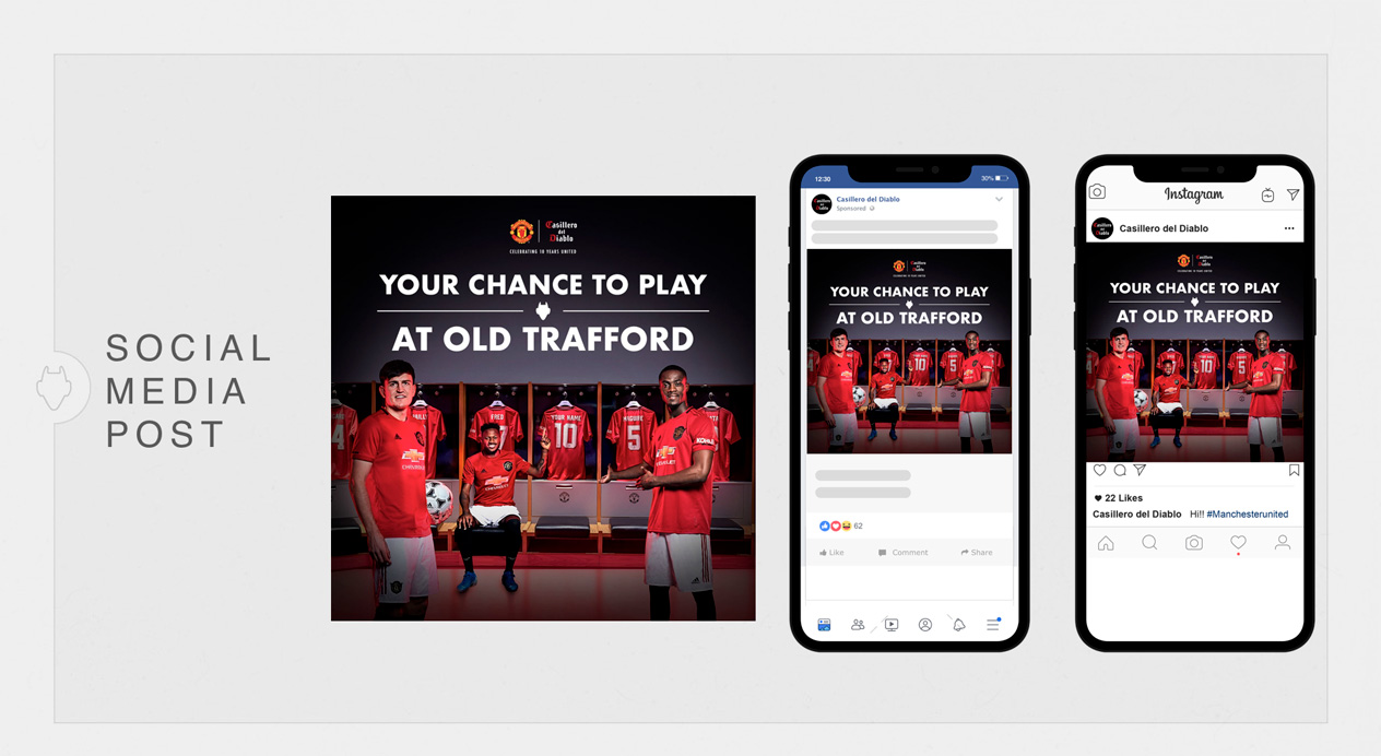
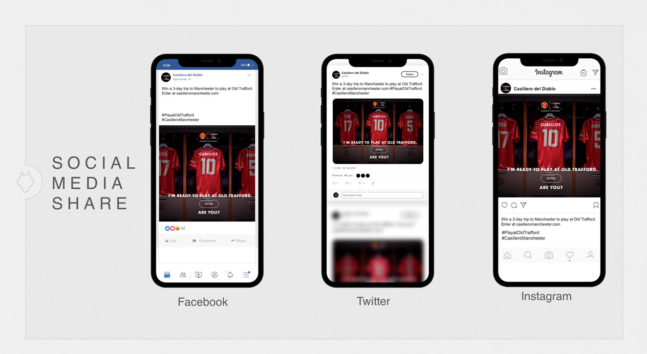
Based on the success of their previous campaign, Casillero del Diablo once again approached DAf to create a global campaign in support of their sponsorship of Manchester United, a partnership now in its 10th year. Featuring one of the most attractive prizes offered by a Manchester United sponsor, Casillero del Diablo’s grand prize was the chance to travel to Manchester and play a game at Old Trafford.
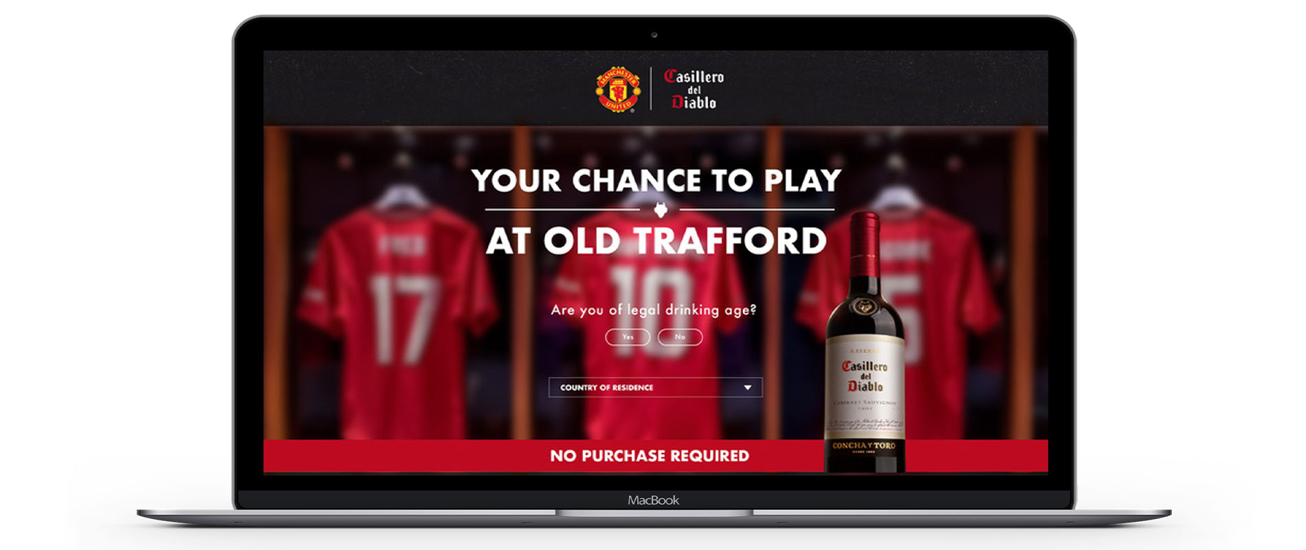
DAf was charged with creating a global brand awareness campaign in promotion of this competition, though it was not dependent on prior purchase. The deliverables were a video, key visual, materials for POS, on-trade and out of home, and a digital competition platform to capture and house entries in both Casillero del Diablo and Manchester United’s key global markets, including the US, Chile, Aruba, the Caribbean and Ukraine.
Client |
Viña Concha y Toro |
|
|
Capabilities |
Integrated Campaign
Video
Digital Strategy and Content
Key Visual and POS
Campaign Toolkit
Web Development
|
|
|
Solution
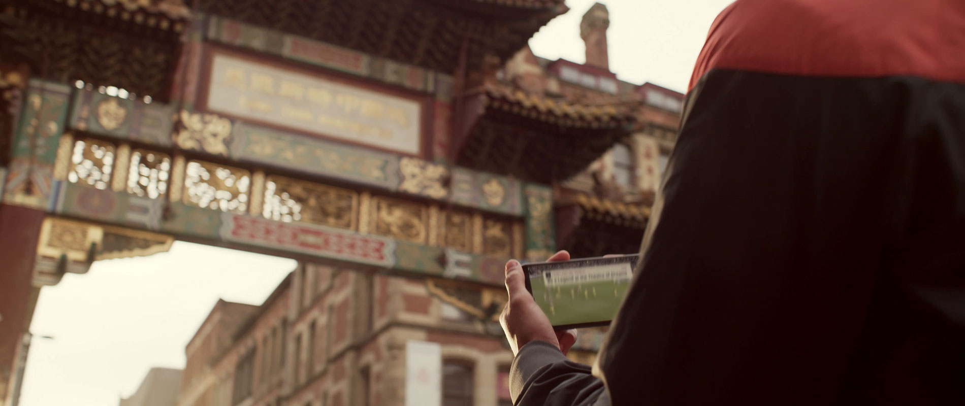
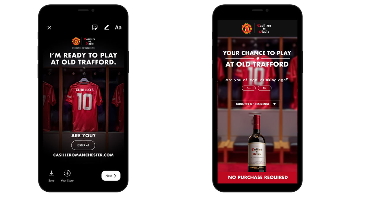
Throughout the process, DAf worked closely with both Casillero del Diablo and Manchester United in order to understand the needs of each. Manchester United’s huge fan database allows the campaign to reach a large audience, so the challenge was to present the same beloved prize to their diehard fan base through a new angle. To do this, we drew from the idea of a dream.
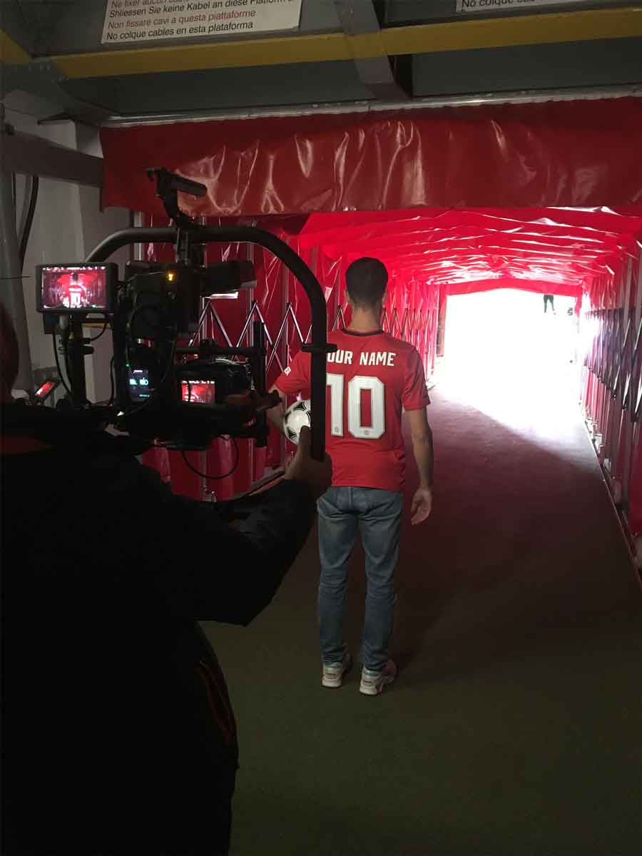
In the face of any dream, there is always someone, or something, that can make it come true. For devoted Manchester United fans dreaming of playing at the Theatre of Dreams, that “something” is the partnership between Casillero del Diablo and Manchester United. Supported by the claim “Your chance to play at Old Trafford,” DAf created a brand video incorporating first-person point of view, following a fan from the moment they first encounter this chance, right to the moment their dream comes true.

VIDEO
Filmed on-site in Manchester and at Old Trafford, the video shows stadium areas and experiences that are normally out of bounds to fans. The dressing room, tunnel and floodlights are seen from the point of view of the fan, providing interest and human connection. Real-life Manchester United players Eric Bailly, Harry Maguire and Fred are also filmed from this same perspective, as they interact with the winning fan, hand them the kit and encourage them as they prepare to play.
VOICE OVER
The voice over was supplied by “The Voice of Old Trafford,” Manchester United’s own stadium announcer, Alan Keegan.
When you get the chance
To be a legend at the Theatre of Dreams
There’s only one answer
So…what do you say?
Win a trip to Manchester
To play at Old Trafford
You dreamt it. We make it happen.
DIGITAL
Video capsules of 6”, 10”, 15”, 30” and 36” subtitled in Spanish and Ukrainian were created in a variety of formats for web and social media use.
KEY VISUAL
In the dressing room, Eric Bailly, Harry Maguire and Fred beckon to the fan, offering the items they’ll need to play and inviting them To take their position on the team.
WEBSITE
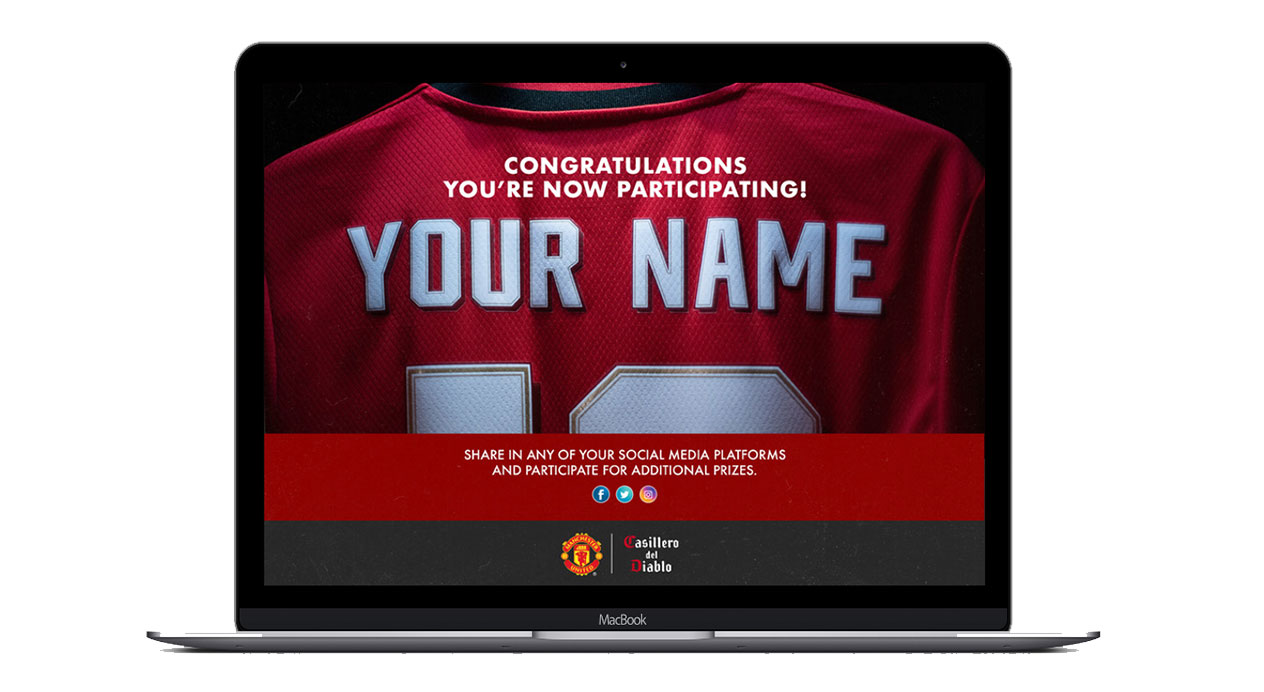
We designed and programed a website to house all competition entries, with an interactive component confirming fans’ entry.
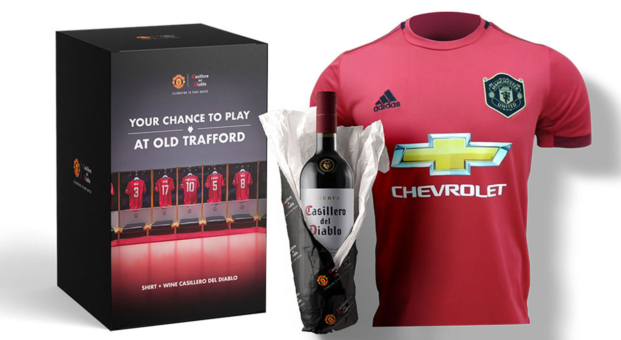
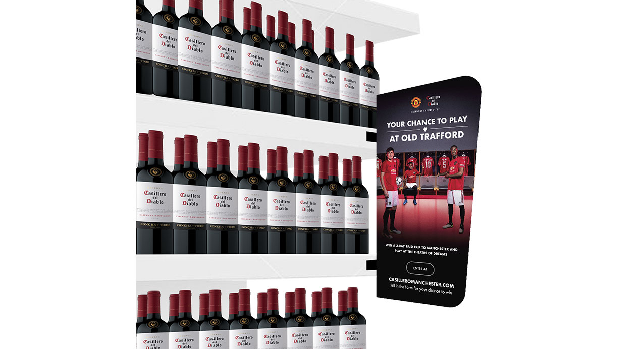
POS AND ON – TRADE
DAf range created a range of materials for off-trade and on-trade, including neck collars, pallet display and gift box.
OUT OF HOME
Based on the key visual, a number of assets were created for out of home, including billboard and LED box displays.
CAMPAIGN TOOLKIT
The campaign toolkit supported global markets to effectively implement the competition online; including step by step web entry instructions, communication mailings as well as promotional banners and social media assets.
BEHIND THE SCENES
DAf traveled to Manchester to film on-location with Manchester United players as well as “The Voice of Old Trafford”, Alan Keegan.
Be a legend at the Theatre of Dreams.
Patricia Contreras September 1, 2020
Challenge
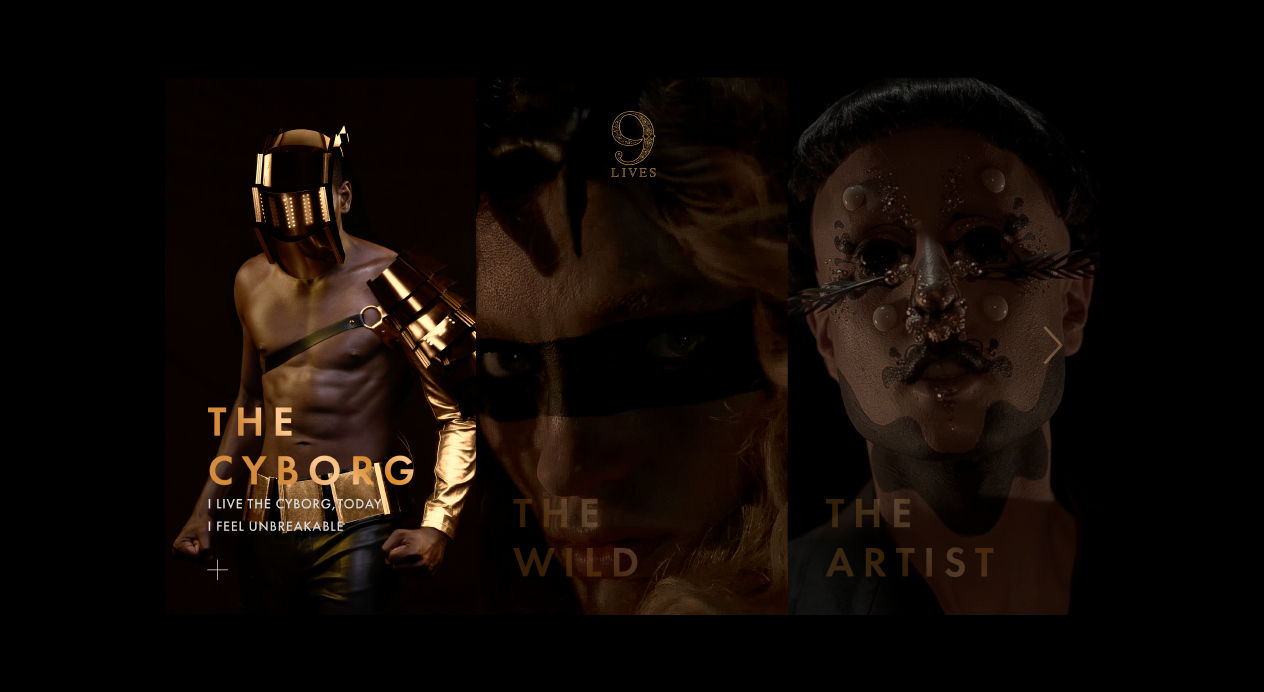
9 Lives is a popular wine targeted to consumers ready to move from everyday brands to a more premium category.
The brand required a totally new campaign to reflect this premiumness, while strengthening their identity and moving into a markedly conceptual territory.
DAf’s challenge was to raise brand awareness through the creation of a highly unique and original campaign to allure the trepidatious millennial consumer, inspiring them to live a life without limits.
Client |
VSPT Wine Group |
|
|
Capabilities |
BRAND VIDEO
KEY VISUAL
WEBSITE
SOCIAL MEDIA CONTENT |
|
|
Solution
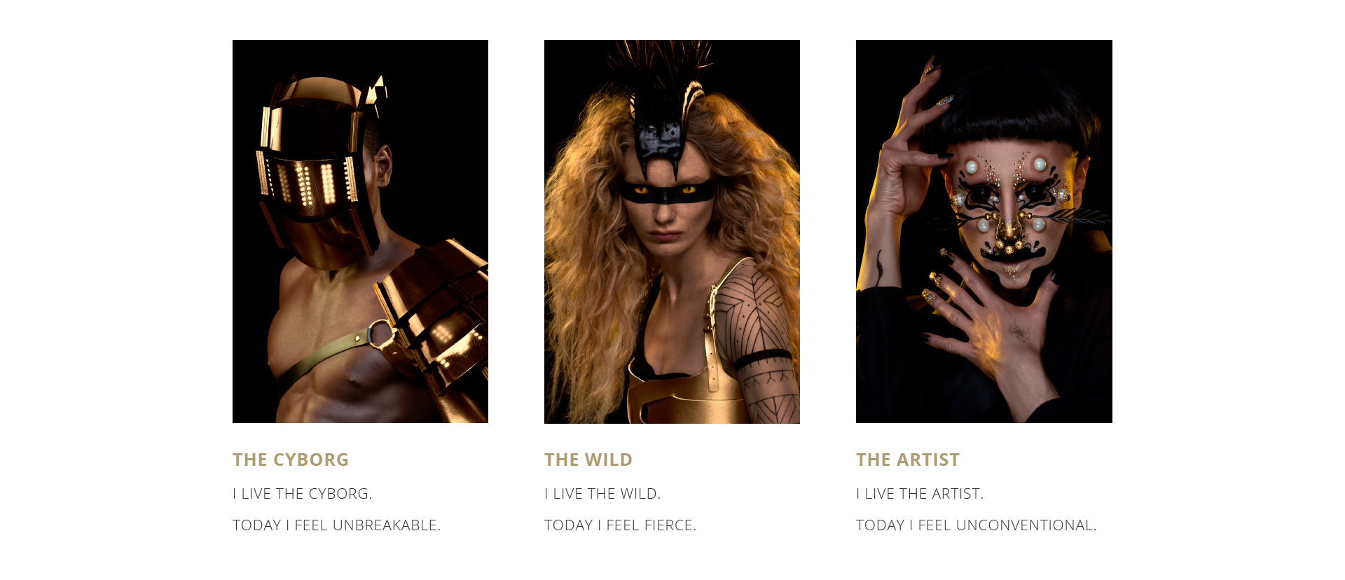
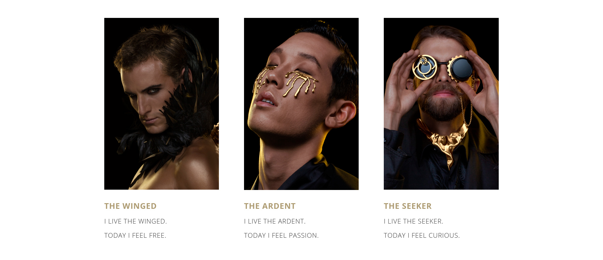
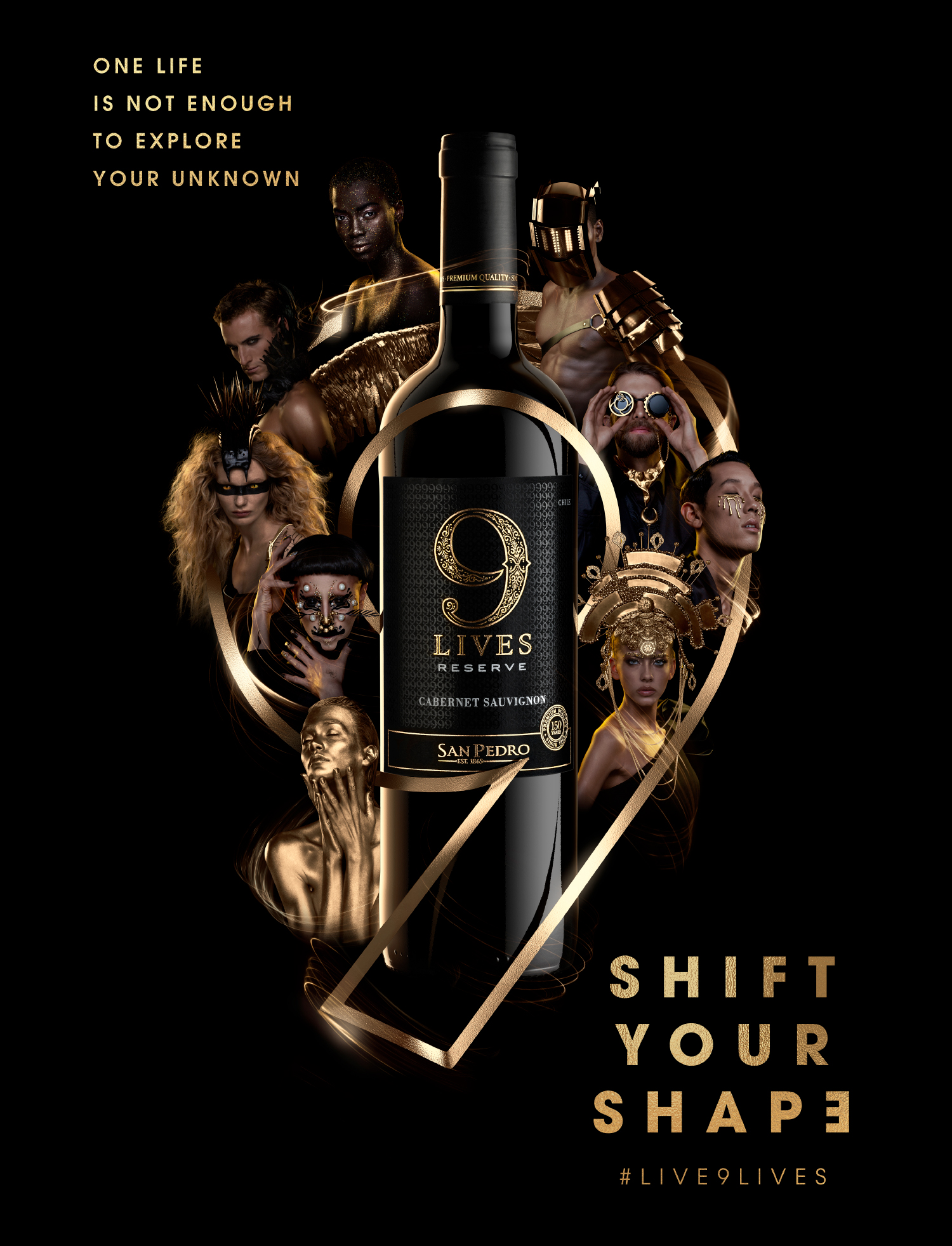
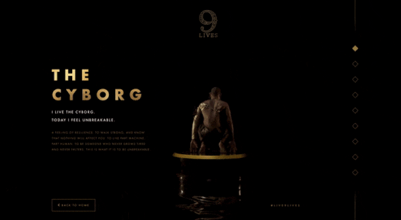
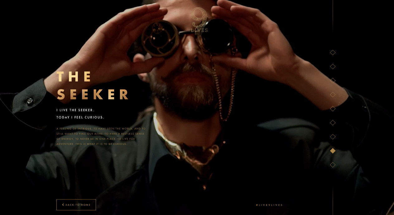
The concept is centered on an interpretation of the brand name, and explored the brand philosophy that “9 lives are better than one.” To do this, DAf created 9 different characters—fantastical, enigmatic and mesmerizing—based on 9 distinct lives; each a life to be lived and celebrated by the consumer.
Totally disruptive and distinct in the industry, the campaign has a strong digital focus—an opportunity to invite the consumer into an immersive experience with the brand.
BRAND VIDEO
Branding was enforced through the principal stage, a cylinder with the 9 logos, which floated upon a liquid ground. The set was kept minimal, and the circular stage enabled us to show the character in 360 as they spun around. A golden motion blur effect was added to the spin, used to highlight the fluidity of the concept “Shift your Shape”, while also connecting the golden elements between the characters in a consistent and stylistic manner.
KEY VISUAL
The key visual iconized the number 9 while presenting each of the characters. The bottle stands proudly in the middle, while the label’s gold and black colors are enforced through the black background and shimmering elements.
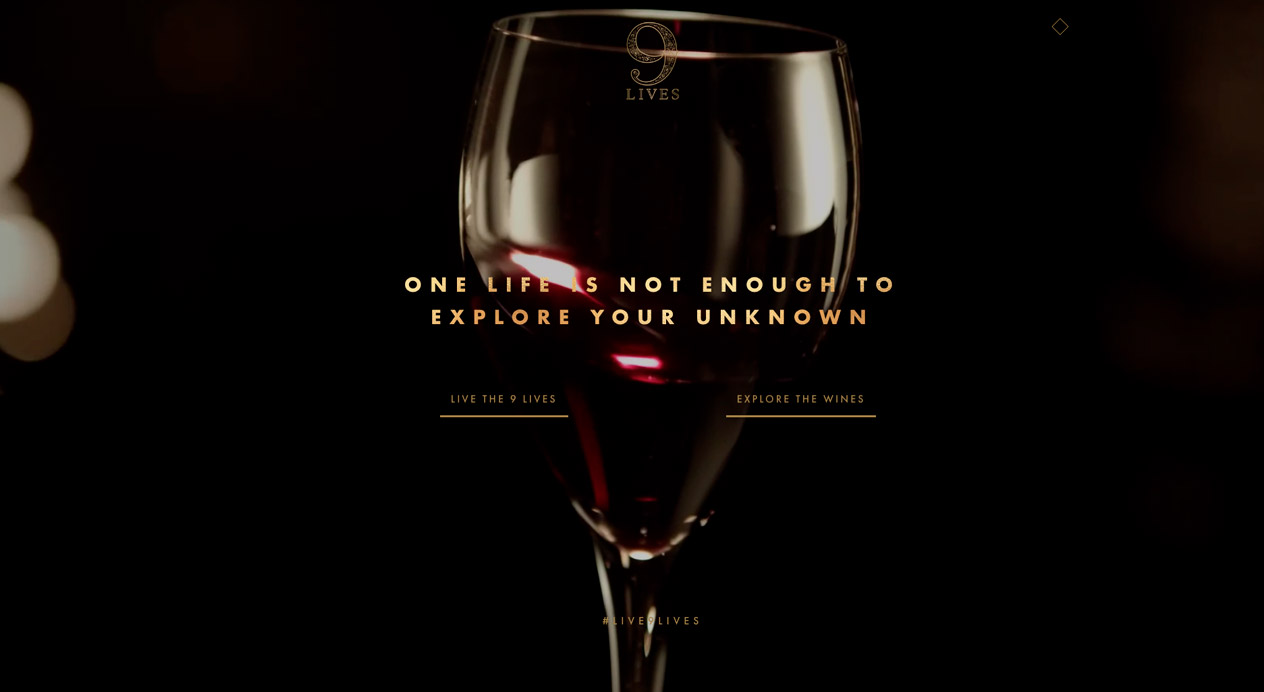
WEBSITE
DAf developed the brand’s new website, using the 9 characters as protagonists throughout.
Launch Website
BEHIND THE SCENES
Filmed in-studio, DAf worked directly with the country’s leading makeup artists, stylists and fashion producers to bring the characters to life, maintaining a premiumness inspired by fashion industry codes.
Shift your shape. Live 9 lives.
Patricia Contreras September 25, 2020
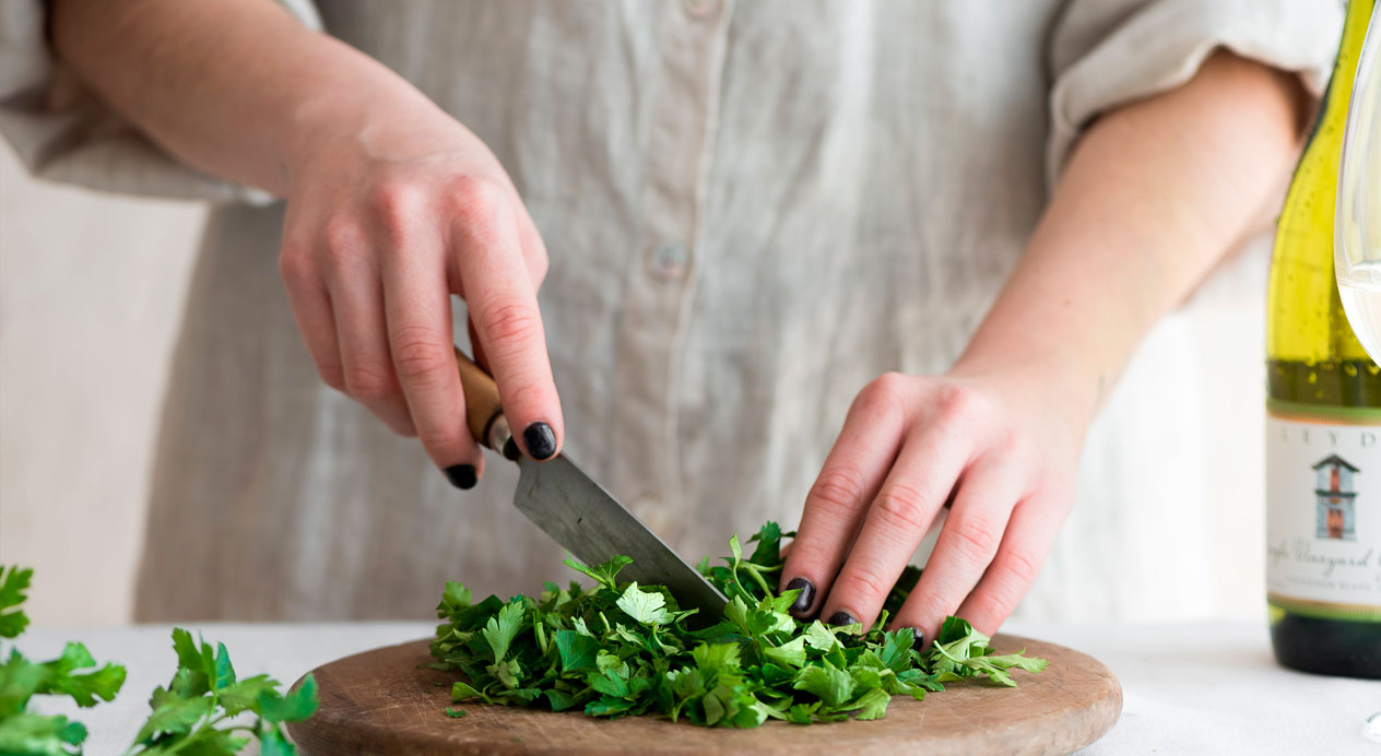
Challenge
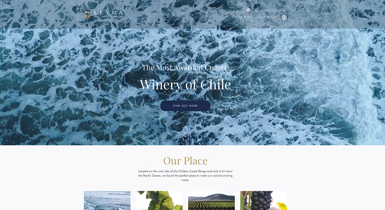
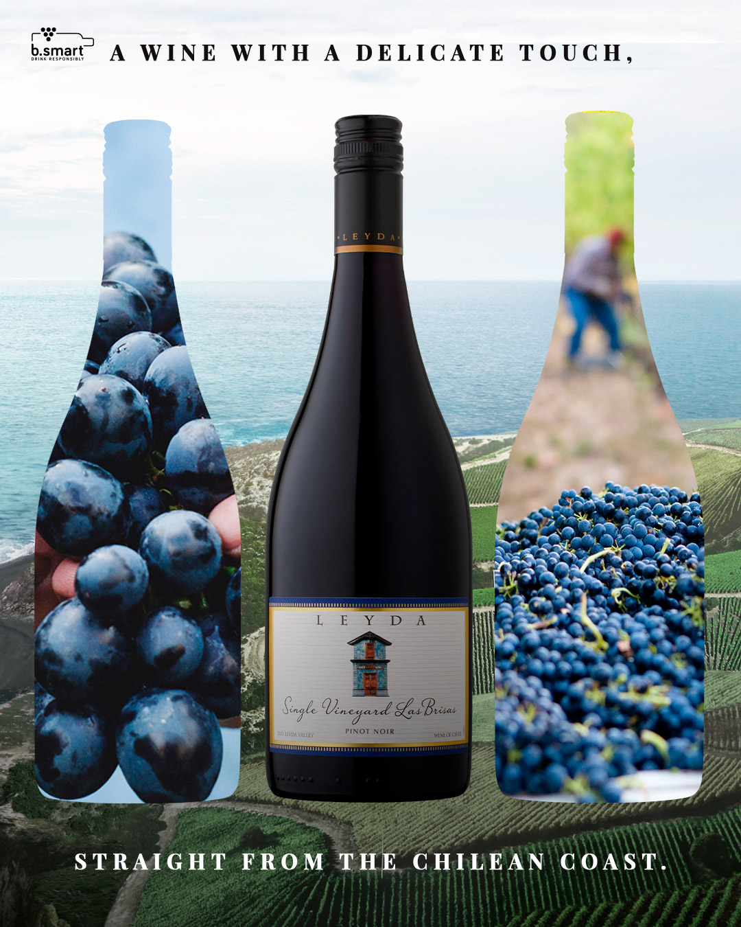
Viña Leyda is a pioneer in the Leyda Valley, having established the first vineyards in this region in 1998. Since then, Leyda has garnered a reputation as a specialist in cool coastal climate wines and as the most awarded coastal winery in the country with a brand essence intrinsically linked to the coast. However, their online communications, while authentic and educational, didn’t reflect the brand’s core attributes. DAf was charged with designing and developing Leyda’s new website, leaving consumers in no doubt as to their cool coastal credentials.
Client |
VSPT Wine Group |
|
|
Capabilities |
Web Development
Photography |
|
|

Solution
Studying the brand, DAf saw that Leyda’s search for a place to call their own was essential to their identity. Having found it in the Leyda Valley, the brand developed a specialty and confidence that many—brands and individuals alike—aspire to. From here the concept “Cool Coastal” was identified, as a way for Leyda to position itself as both expert and inspiration to a target with an interest in discovering wines with a particular philosophy and quality.
DESIGN
We developed an ocean-inspired color palette of blue, green and gray with primary and secondary typography to optimize both premiumness and online readability.
WEBSITE
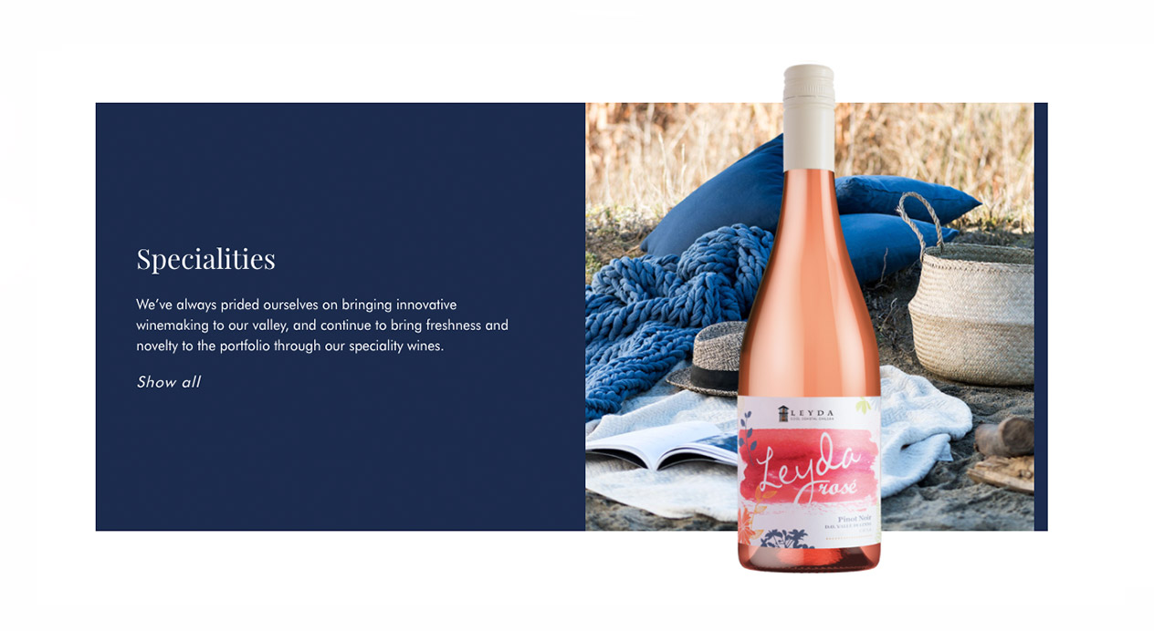
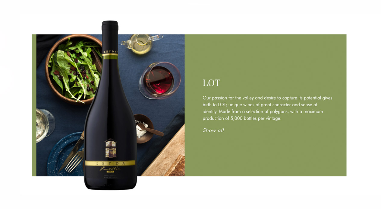
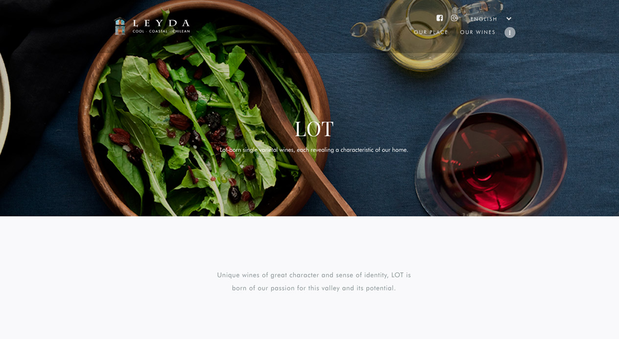
We designed and developed Leyda’s new website, highlighting their key credentials and differentiators: as pioneers in Leyda Valley and Chile’s most awarded coastal winery. A clean design supports readability and user navigation and allows Leyda’s color palette and the beauty of its coastal home to shine through.
LAUNCH WEBSITE
PHOTOGRAPHY
To strengthen Leyda’s cool coastal credentials, an inspirational, evocative style of photography was identified to transport consumers straight to the ocean and feel its temperature, texture and sensations.
Patricia Contreras September 29, 2020
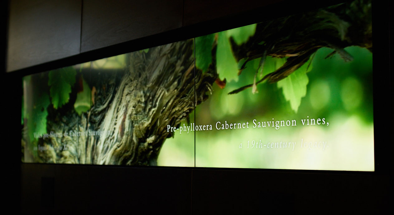
Challenge
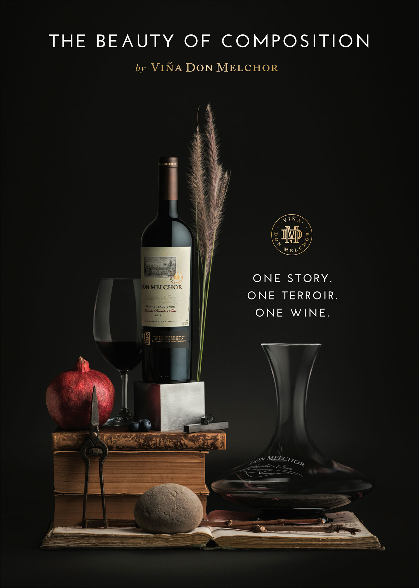
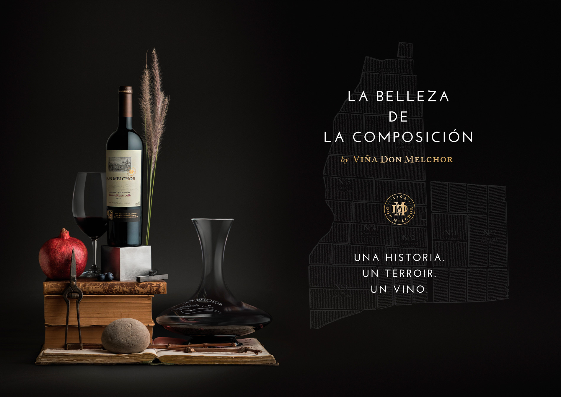
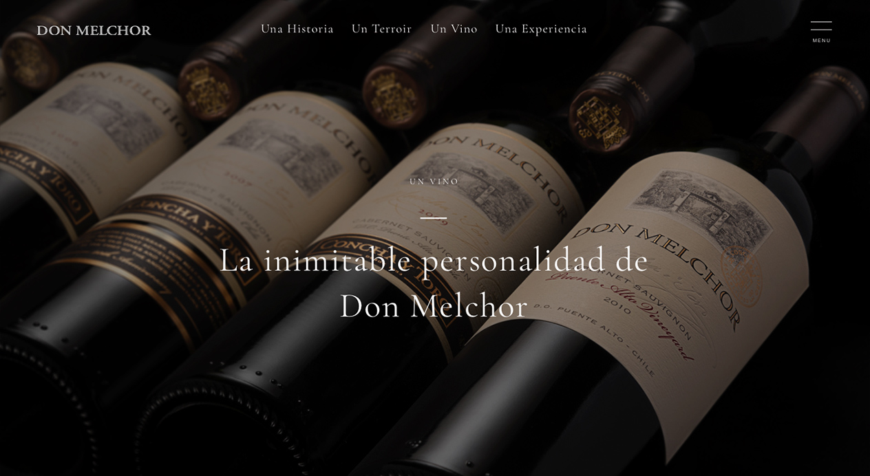
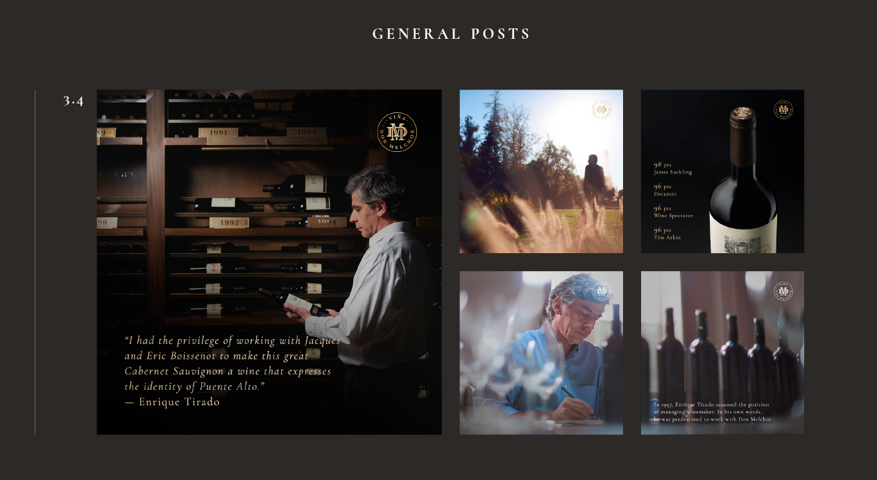
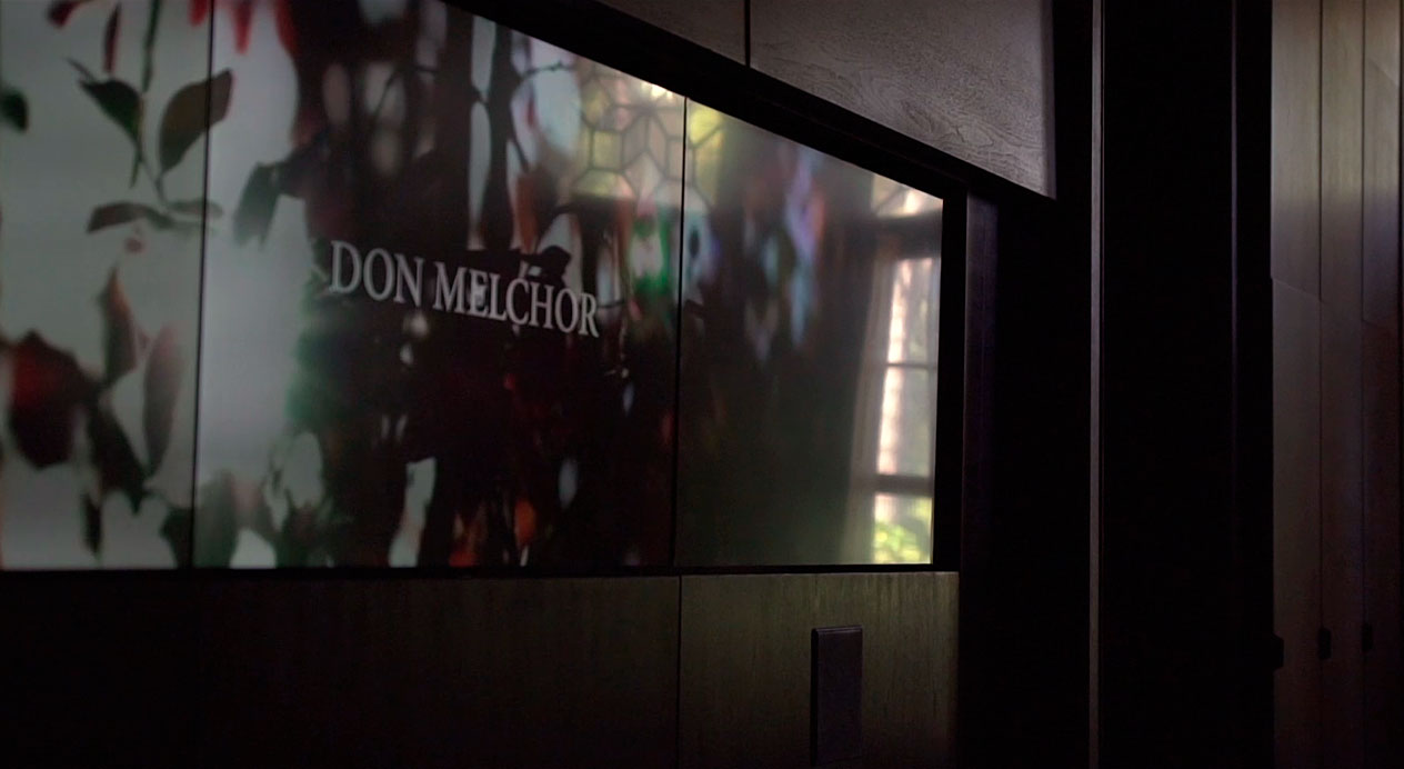
Don Melchor is Viña Concha y Toro’s icon wine, named after Melchor Concha y Toro, the founding father of the winery, who in 1883 brought vines from Bordeaux to plant in the Maipo Valley. In 2019, the year of the release of the 30th vintage of Don Melchor, the wine officially moved away from the endorsement of the Concha y Toro brand to launch as Viña Don Melchor. Viña Don Melchor required a new concept—expressed through a key visual, brand video and edits for social media—to communicate “One Story. One Terroir. One Wine”, the message behind this unique vineyard from which Chile’s first icon wine is grown.
Client |
Viña Concha y Toro |
|
|
Capabilities |
VIDEO
KEY VISUAL
WEBSITE
SOCIAL MEDIA GUIDELINES
|
|
|

Solution
Working with the client, the claim “The Beauty of Composition” was chosen as a way to interpret the composition of of Don Melchor: A wine created from the blend of the seven distinct parcels that make up its Puente Alto vineyard, along with the combination of its three brand pillars: Story, Terroir and Wine.
BRAND VIDEO
Filming both in-studio and on-location at the vineyard and colonial house originally belonging to the Concha y Toro family, DAf created a video that deconstructed and presented these components, to later arrive at the composition final representing Don Melchor’s “One Story. One Terroir. One Wine.”
Key Visual
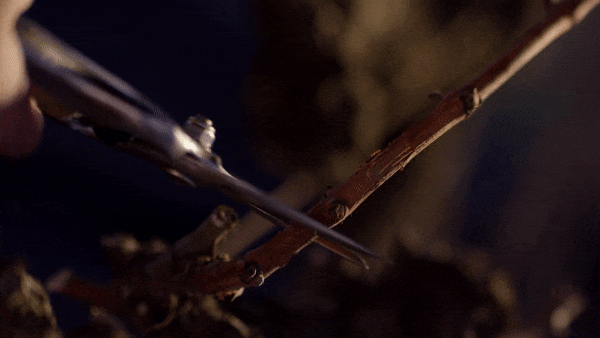
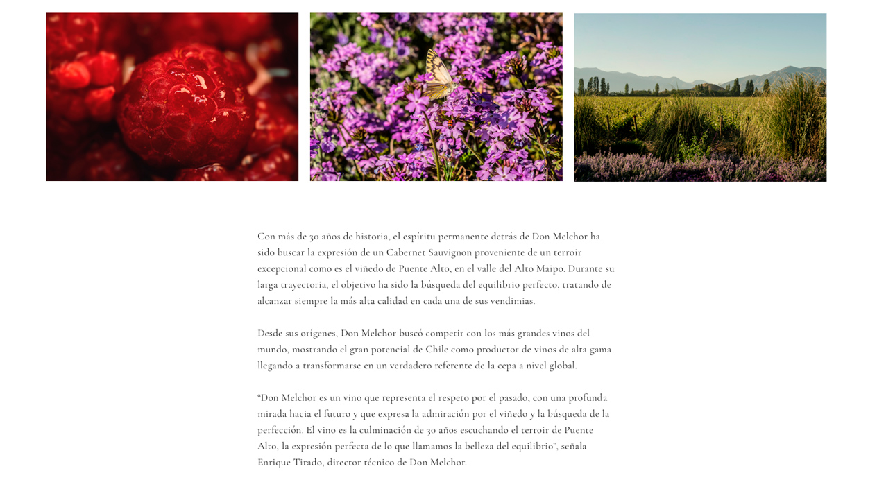
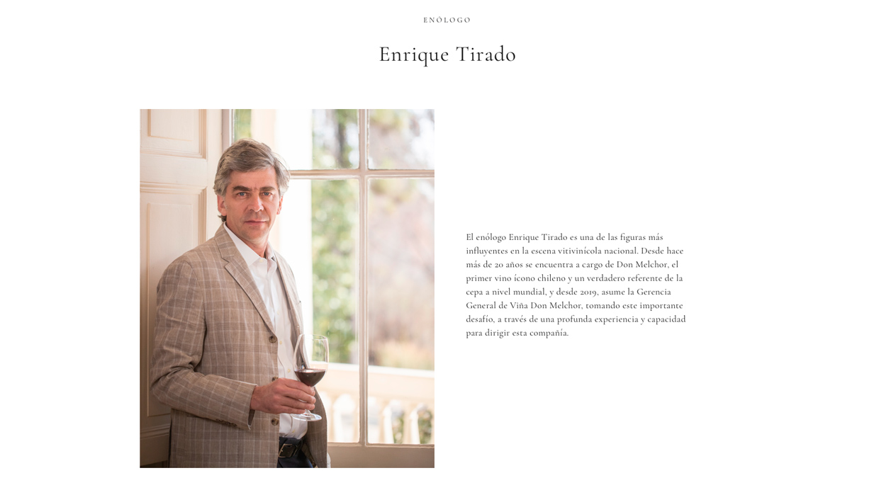
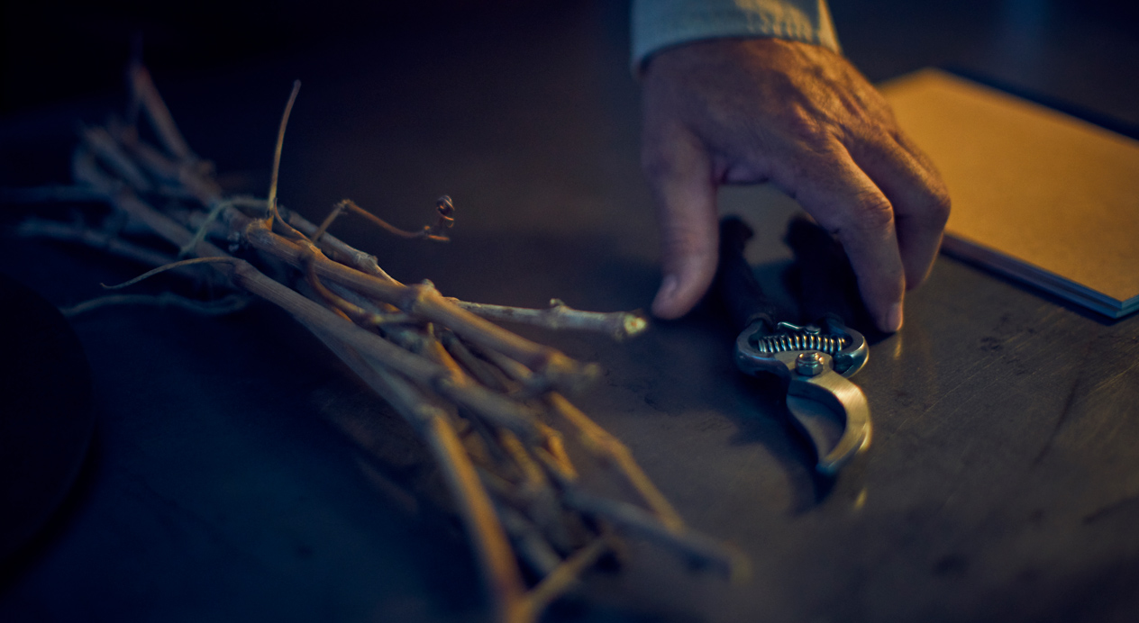
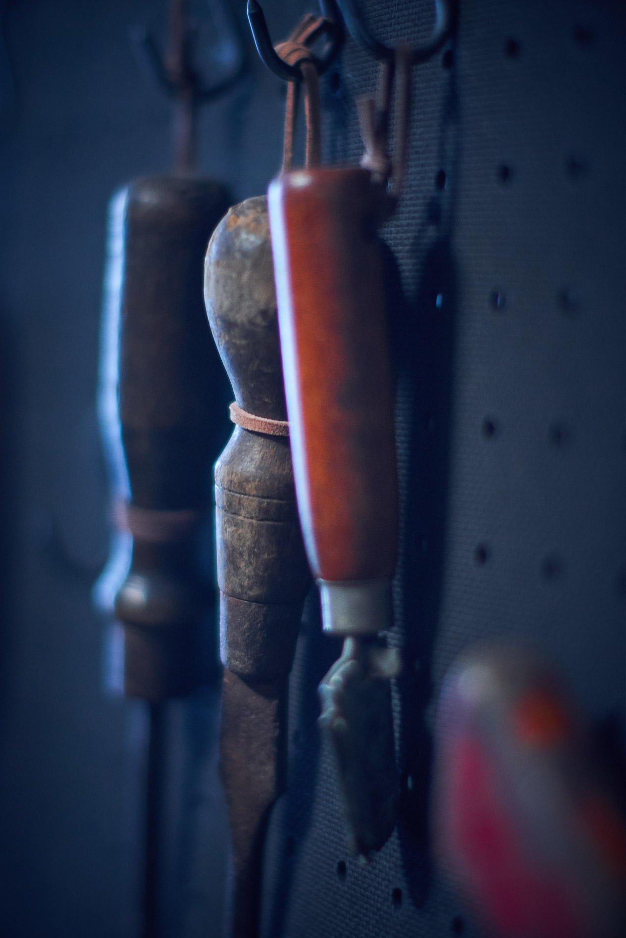
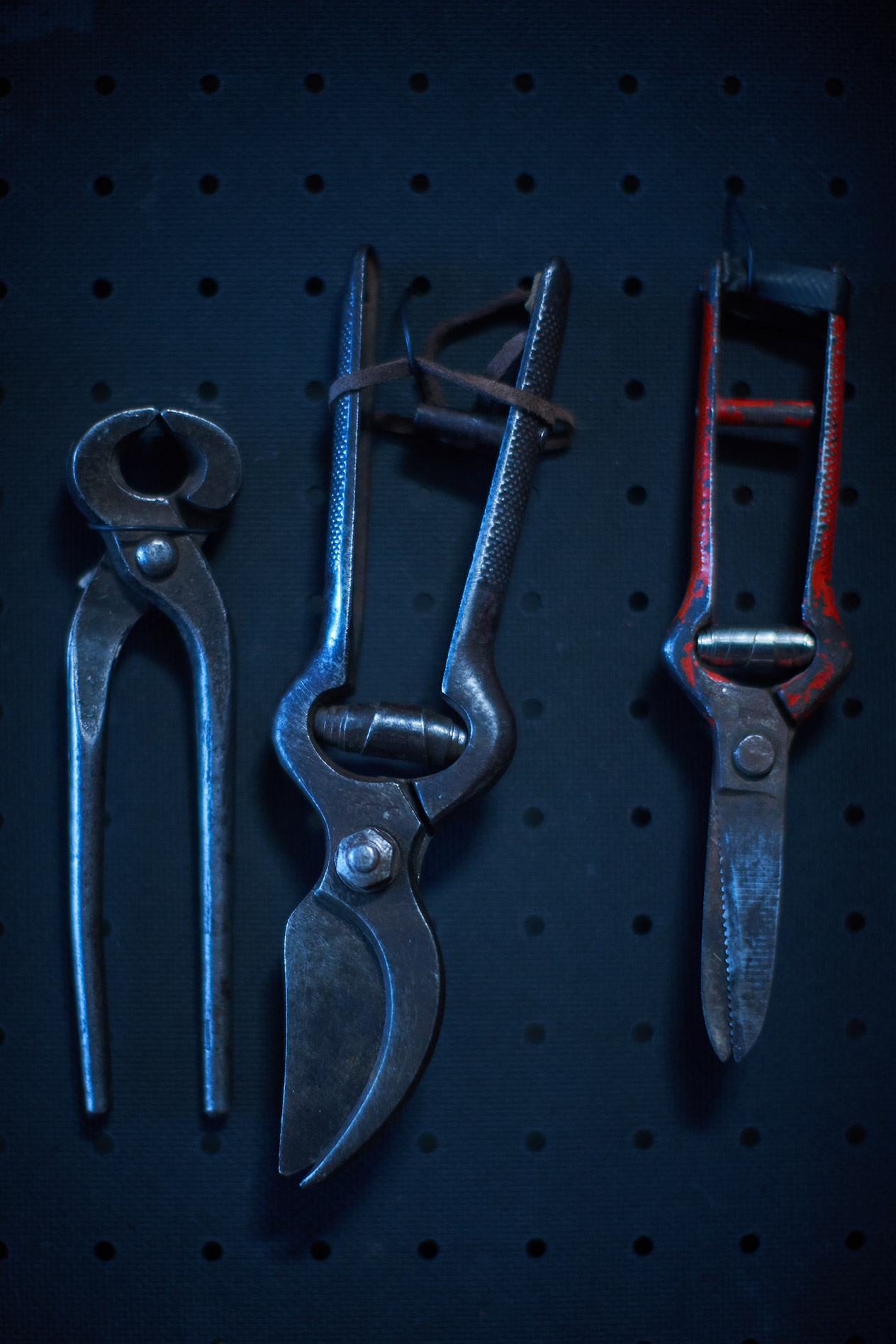
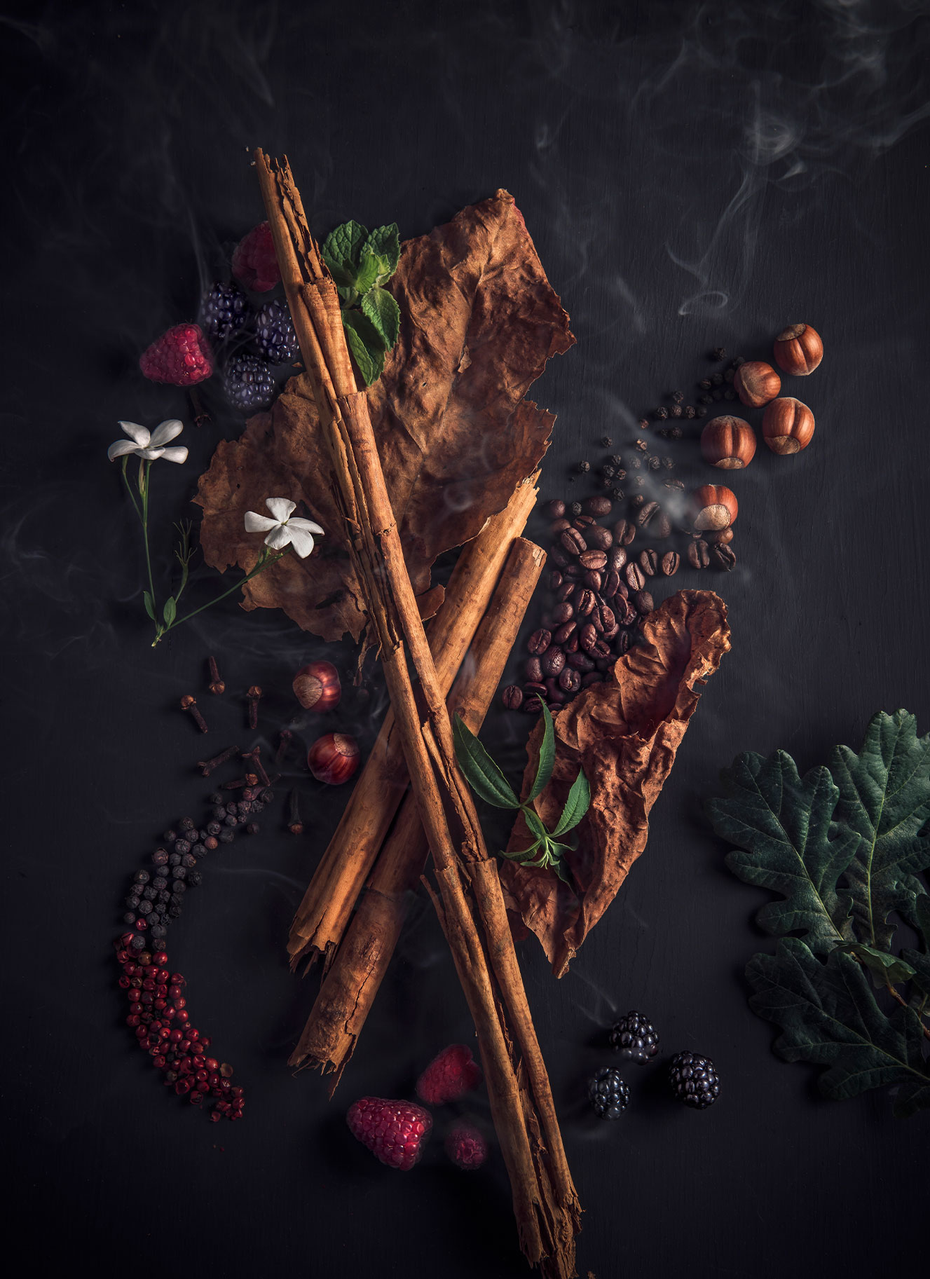
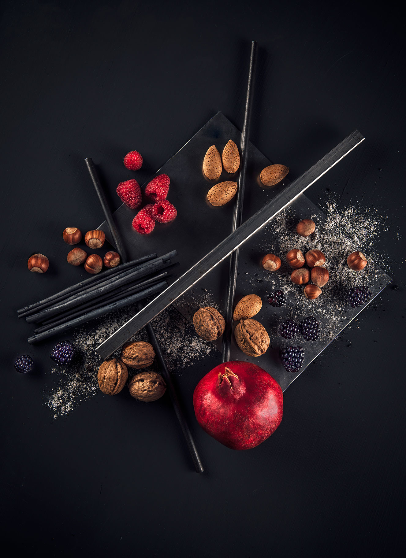
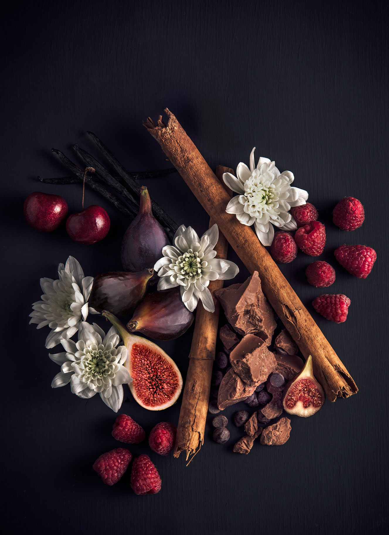
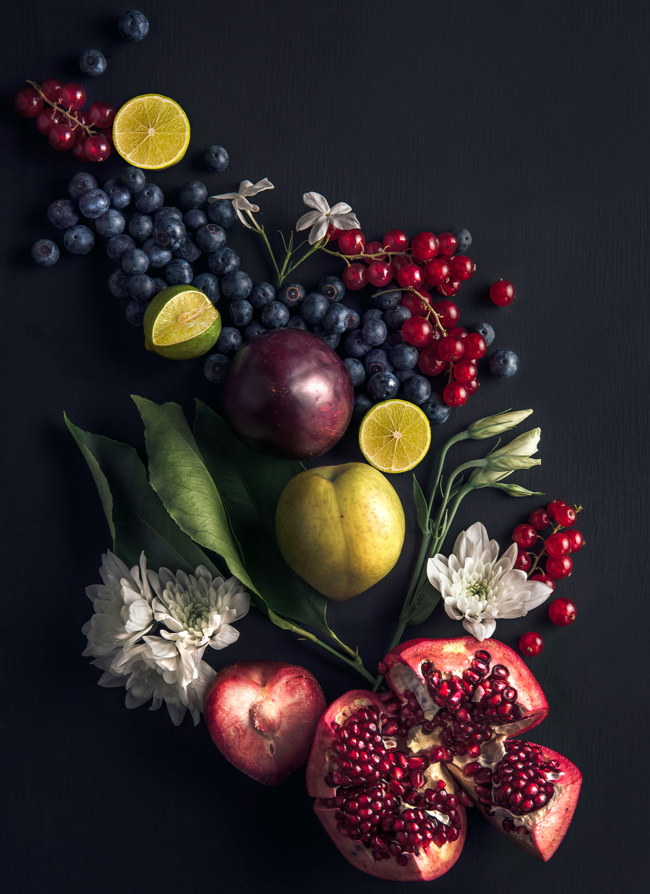
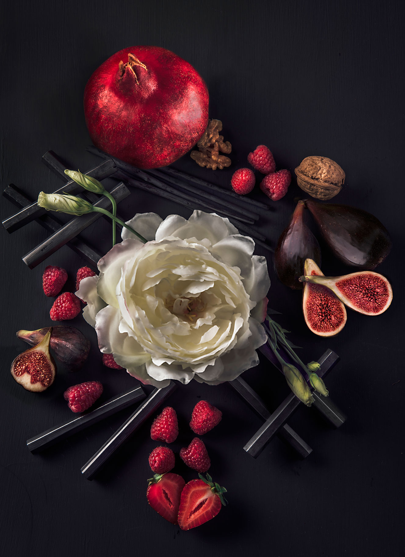
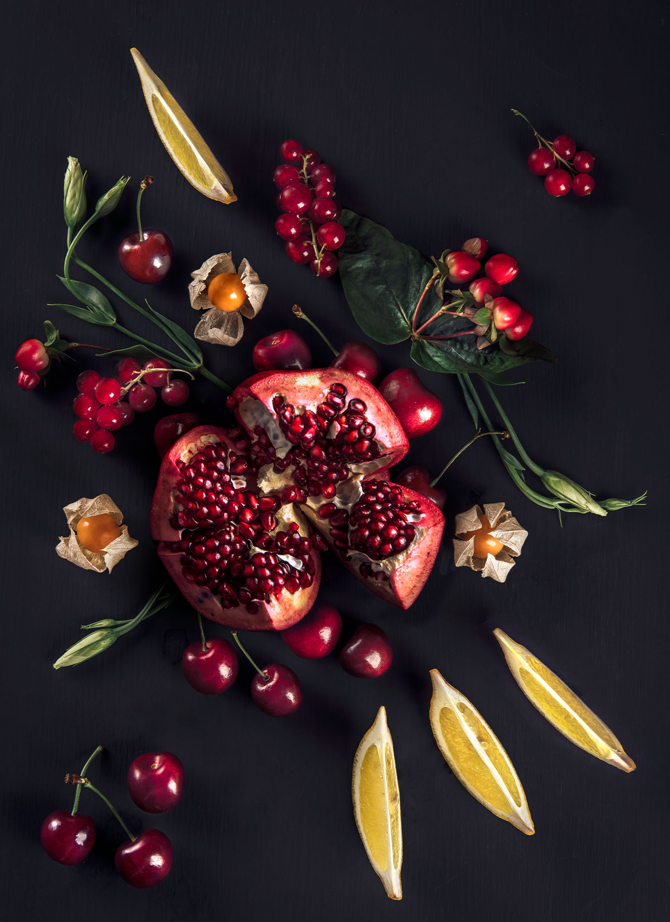
Taking the form of a still life, the key visual presents a selection of elements that, once composed, reflect Don Melchor’s family, natural and enological history. These include original manuscripts and books belonging to the Concha y Toro family, flora typical of the natural canals near the vineyard, a pomegranate (an important tasting note of the final blend), and pruning shears used by Enrique Tirado, Don Melchor’s own winemaker, alongside the wine itself, the result of them all.
WEBSITE
A new website design was developed to communicate the messaging of “One Story. One Terroir. One Wine”, and strengthen the visual codes that give weight to the claim The Beauty of Composition.
SOCIAL MEDIA GUIDELINES
DAf created a brandbook to align the campaign’s digital brand communications; outlining color, typography, brand elements, photography and video, and layouts for end-use on social media.
MAKING OF
Enrique Tirado, Don Melchor’s acclaimed winemaker, explains the philosophy behind the concept “The Beauty of Composition.”
The Beauty of Composition.
Patricia Contreras September 24, 2020
Challenge
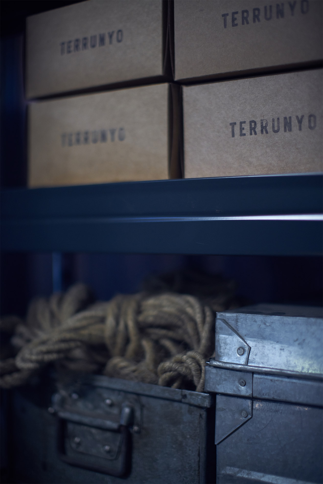
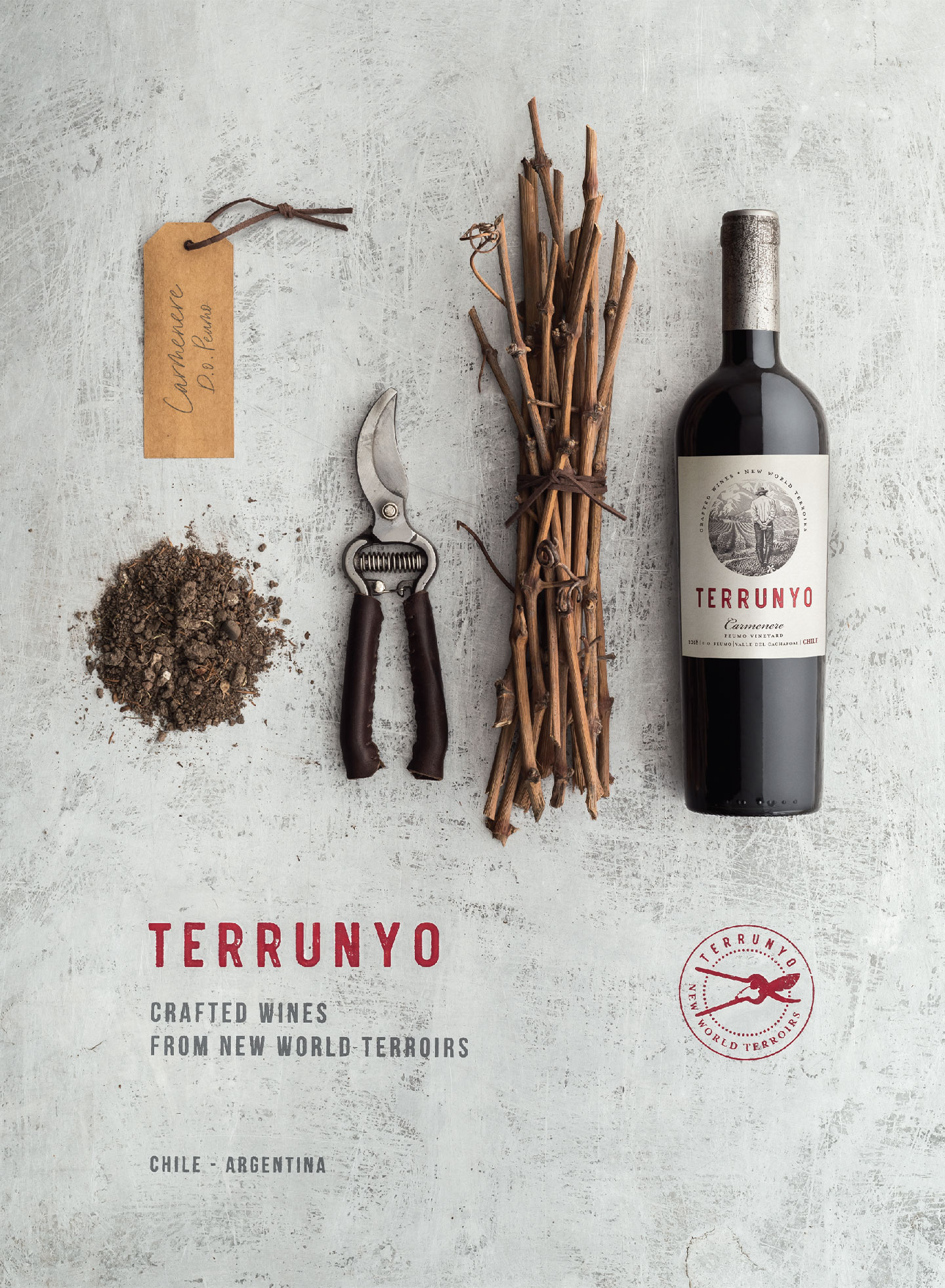
Terrunyo is a brand from Viña Concha y Toro with a focus on crafting wines from specific new world terroirs in Chile and Argentina. With new labels showcasing a clean design, use of illustration and letterpress inspired typography, DAf was called to create a brand video and key visual for use in Terrunyo’s distinct global markets.
Client |
Viña Concha y Toro |
|
|
Capabilities |
Video
Key Visual
Voice Over |
|
|
Solution
Drawing directly from the visual codes of the new label and the considered, methodical work they suggest, the territory of the artisan’s workshop was selected for Terrunyo. In the brand video, this space is brought to life through the character of a vintner who we follow throughout the video and who introduces the viewer to the rhythm of their daily work, and essentially, to the philosophy of the brand itself.
Video
DAf filmed onsite in the vineyards and installations at Pirque, among Viña Concha y Toro’s main estates, using one of the team’s real-life estate managers, who, through his role at the company, is intimately familiar with the life imagined for the video’s protagonist.
Voice Over
The voice over speaks of the simplicity behind Terrunyo’s winemaking, in which nothing more and nothing less than the essential is used to create the final product.
This is the world I enter every day
a place where hands, head, and heart
work on the search for honest wines.
A moment of clarity, a state of flow.
The thirst to explore new origins,
understand each terrain,
and take home at the end of the day,
the satisfaction of a job well done.
Key Visual
In the key visual a pared-back series of objects are shown to showcase only the elements that are intimately connected to the work of our vintner, both in the vineyard and in the workshop space. The design—by means of bottle choice and an adaptation to the text upon the label—is easily adaptable to new regions as Terrunyo’s portfolio increases.
Patricia Contreras September 29, 2020
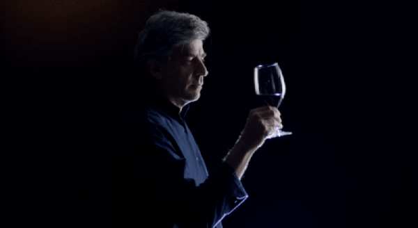
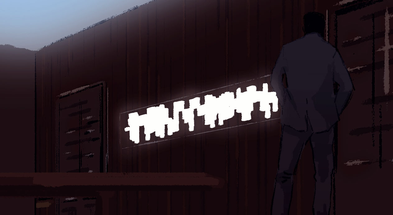
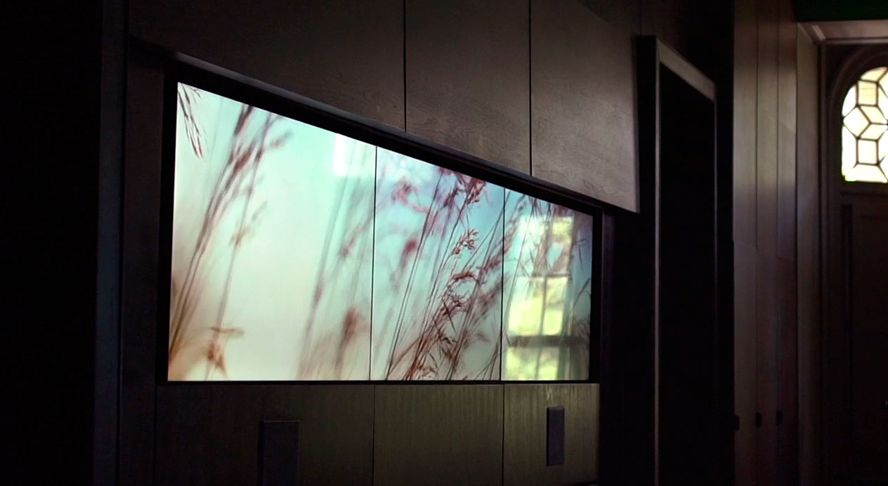
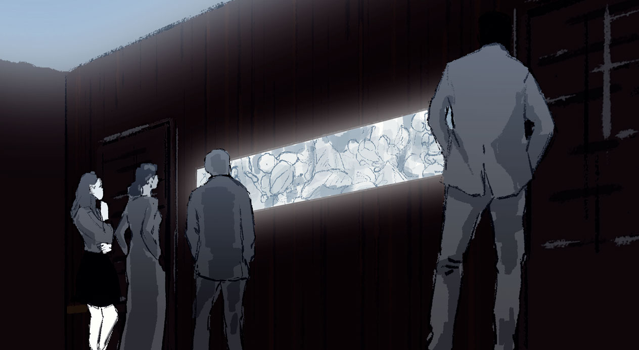
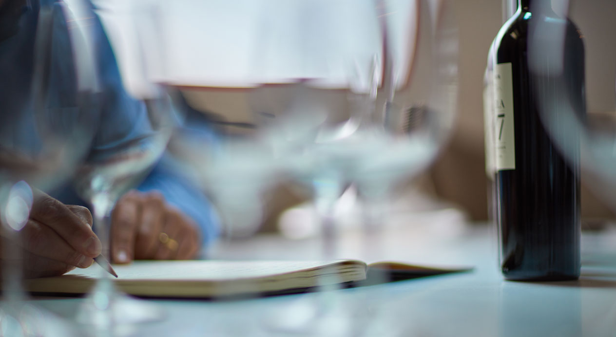
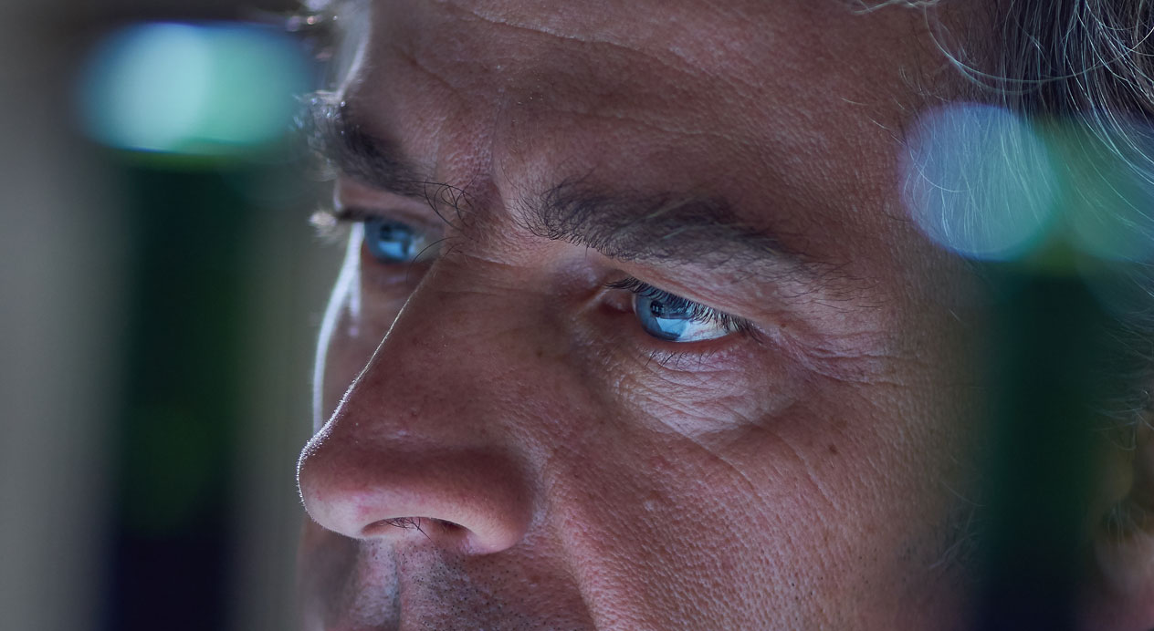
Challenge
DAf was honoured to be involved in the creation of the Don Melchor Experience: a captivating, sensorial wine-tasting installation from Chile’s first Icon wine producers.
The challenge for DAf was clear: to conceptualize and produce cohesive yet artistic content to bring to life the exacting work of long-standing winemaker Enrique Tirado and highlight just what goes into making the ultra premium, multi award-winning Don Melchor wines.
Client |
Viña Concha y Toro |
|
|
Capabilities |
Video
|
|
|
Solution
DAf’s creative and production teams devised an artistic solution that would elegantly profile the natural surroundings and core elements vital to the production of premium wine – while hinting at the winemaker’s thought process when crafting his blends.
The solution was an experience that would visually awaken the senses of those visiting the Don Melchor Experience and perfectly complement the physical wine-tasting experience given by Enrique Tirado himself.
Result
The dual screen video formats, showing different perspectives of the same scene, and bespoke lighting transitions – also directed by DAf – contribute to an intimate atmosphere within the Experience room.
The result effortlessly connects wine enthusiasts with the wine-maker’s philosophy and provides a truly unforgettable experience.
A captivating wine-tasting installation.
Patricia Contreras November 6, 2020
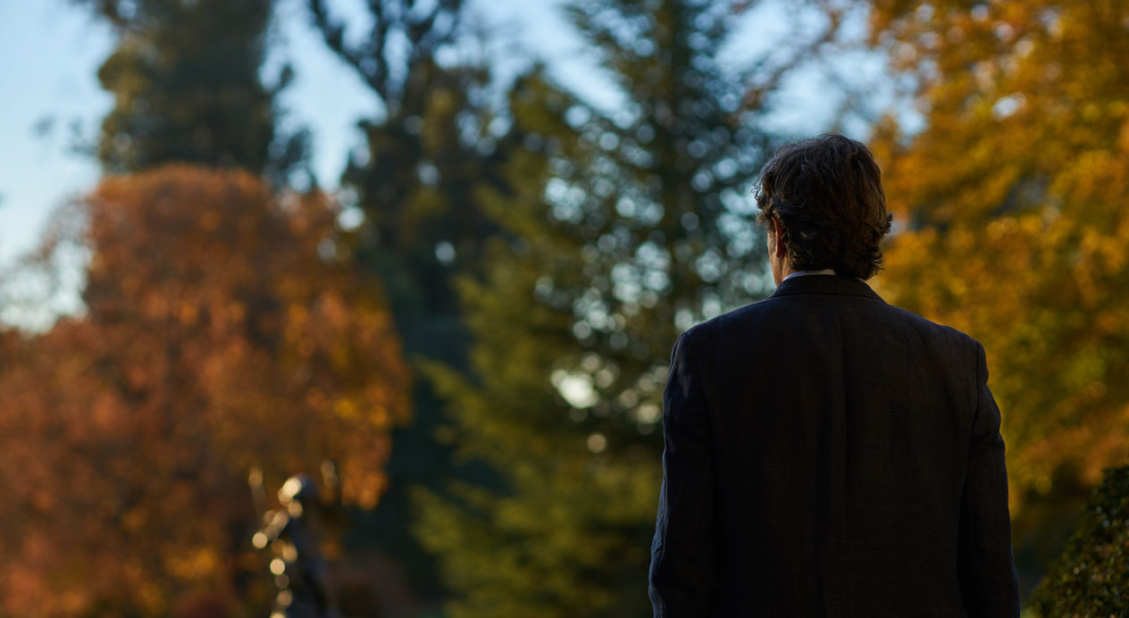
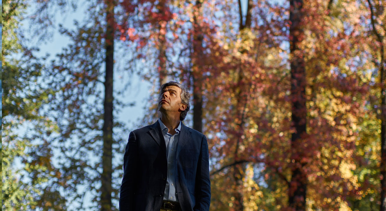
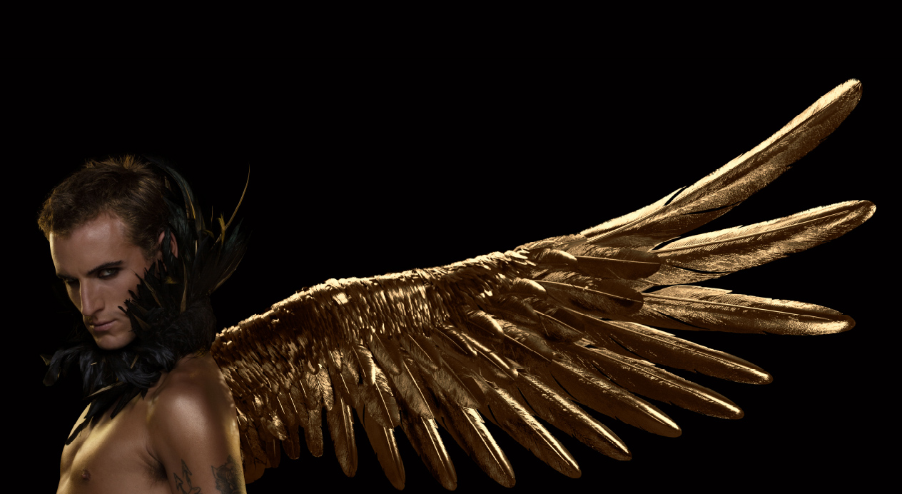
Challenge
Mandarin Oriental Hotel Group, owner and operator of international luxury hotels, resorts and residences, is one of the world’s most celebrated names in the hotel industry. With a multitude of international properties to their name, Mandarin Oriental chose Santiago as the site of their expansión in the Latin American region, and as the 33rd destination in their portfolio.
A highly-consolidated brand with a considered approach to entry in new markets, Mandarin Oriental sought a local agency to create the PR campaign behind their launch in Santiago.
Mandarin Oriental recognized DAf’s expertise with luxury codes and approached the agency to pitch. Successful, we were charged with an exciting project: To develop the PR campaign behind the launch of the new Mandarin Oriental, Santiago.
Client |
Mandarin Oriental |
|
|
Capabilities |
Brand Strategy
PR Strategy
Packaging Design |
|
|

Solution
DAf’s experience in the wine and spirits industry means the agency is very comfortable handling luxury codes. For the launch of Mandarin Oriental, Santiago, our approach was to combine traditional PR tools with the same creativity backed in strategy for which we are known. In this way, as with all our work, we first developed a creative concept to inform each touchpoint; a process a classic PR agency might not necessarily pass through.
Creative Concept
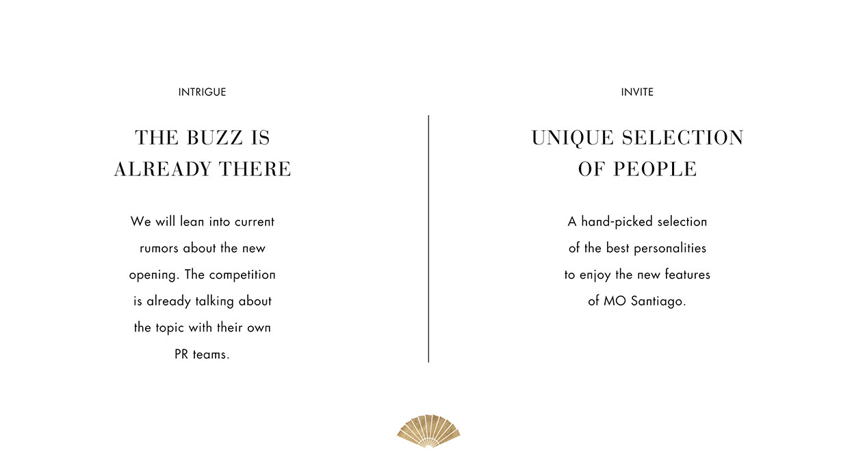
Through conversations with Mandarin Oriental, Santiago executives, DAf uncovered key insights relating to the Group’s founding Asian heritage and philosophy of service. Based on these and the overarching pillar of the fan motif which is present at each destination, we proposed the concept “Unfold the fan” to allude to the world of possibilities and details waiting for consumers to experience, create an attitude behind the hotel and serve as a clear call to action to guests and clients.

PR Strategy
The building selected by Mandarin Oriental Hotel Group as the site of their new Santiago hotel was an architectural icon, extremely well-recognized for its previous role in the hospitality industry. This history meant that the launch of Mandarin Oriental, Santiago would always, in some sense, refer back to this building in the mind of the public.
For this reason, DAf proposed that communications make this situation transparent, talking of the past and current steps taken to transform this icon into a luxury hotel and equip it with the facilities and details befitting of the Mandarin Oriental brand.
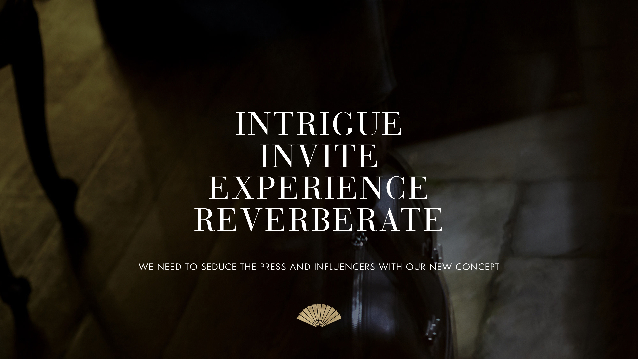
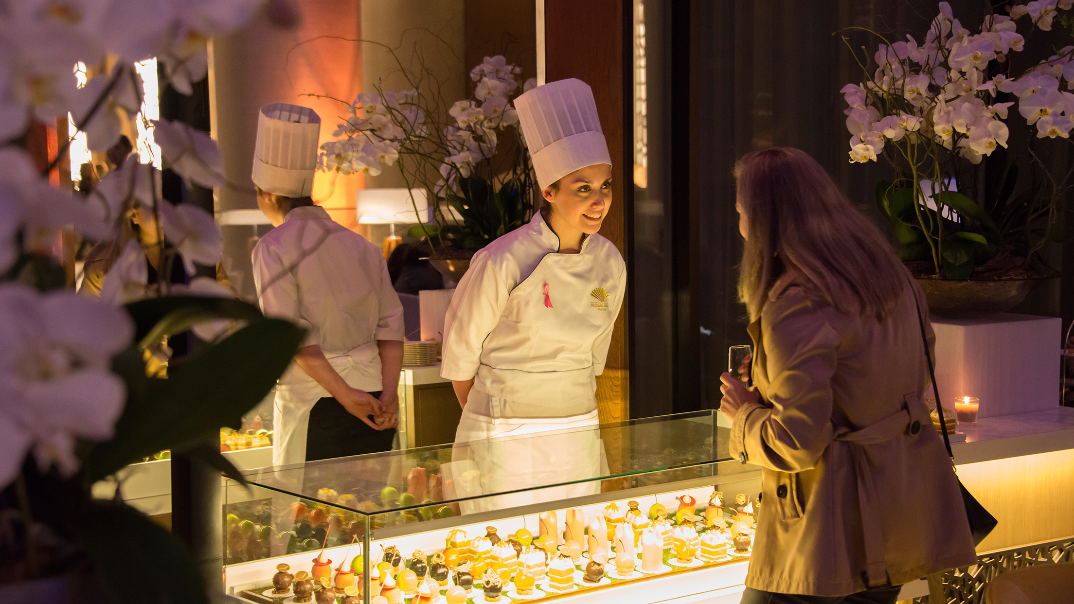
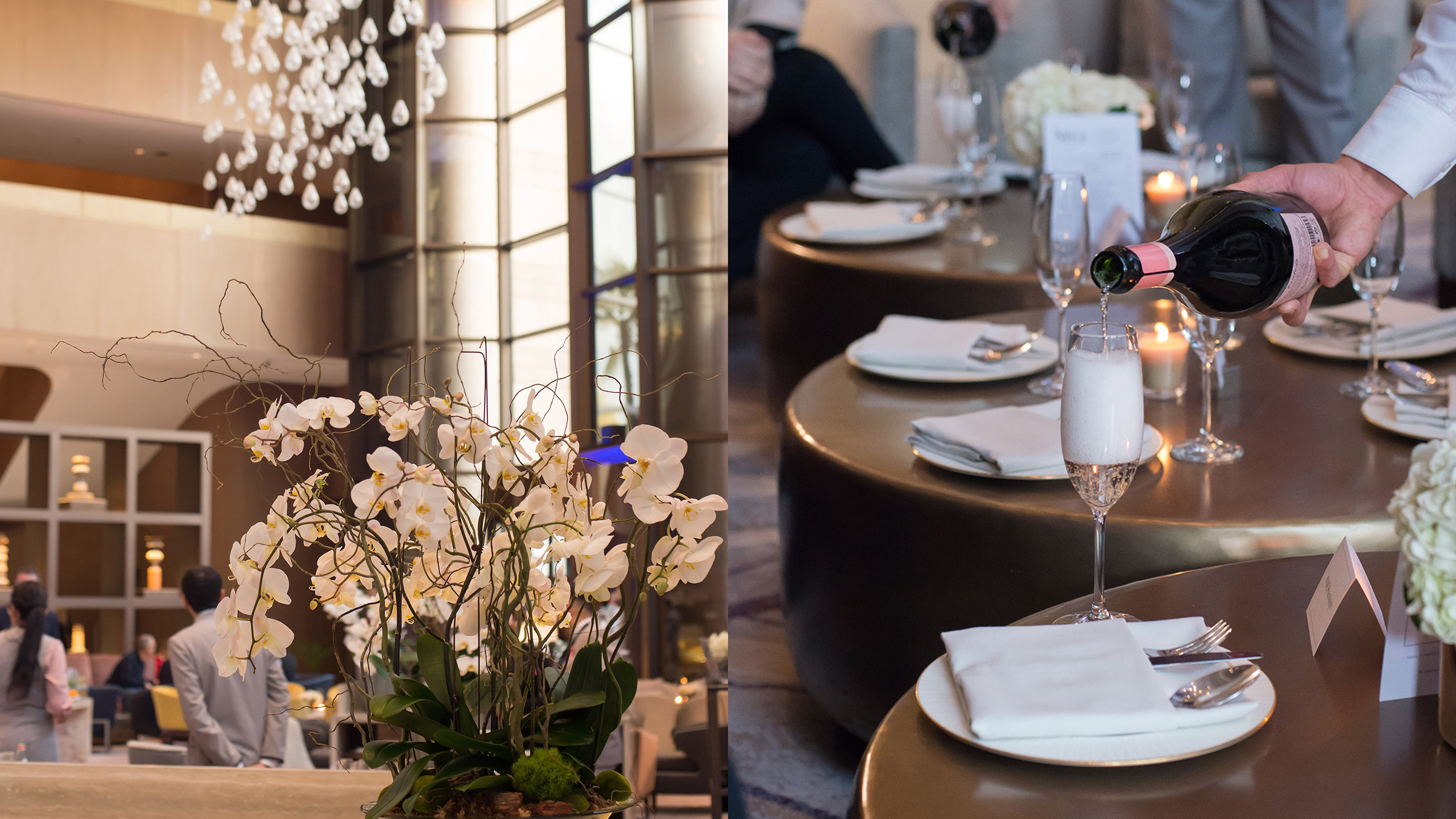
Events
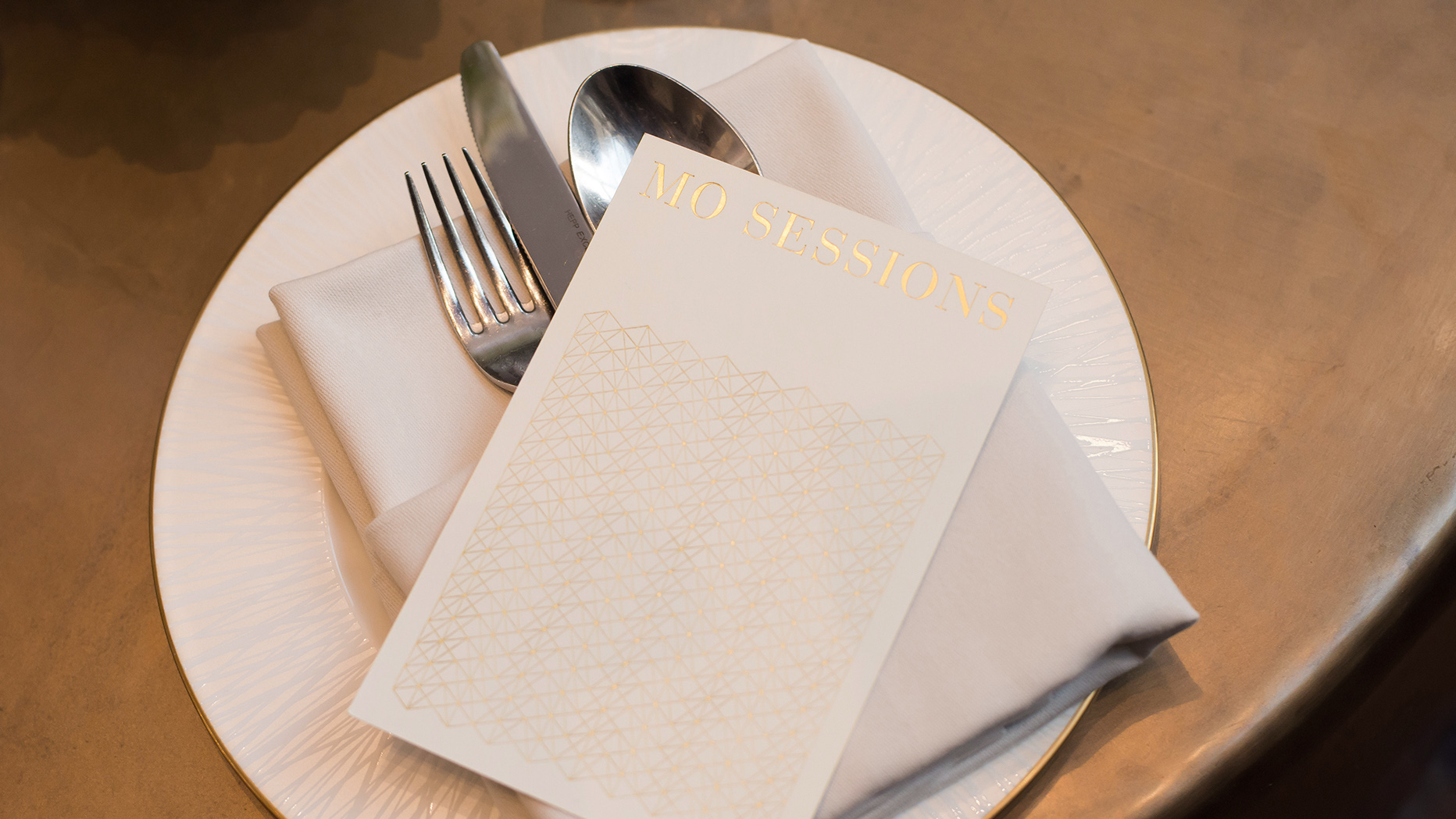
To support this strategy, DAf’s producers and designers collaborated on the creation of a series of events, inviting journalists and influencers to the hotel in order to introduce them to the concept, reveal finished renovations and explain what was to come.
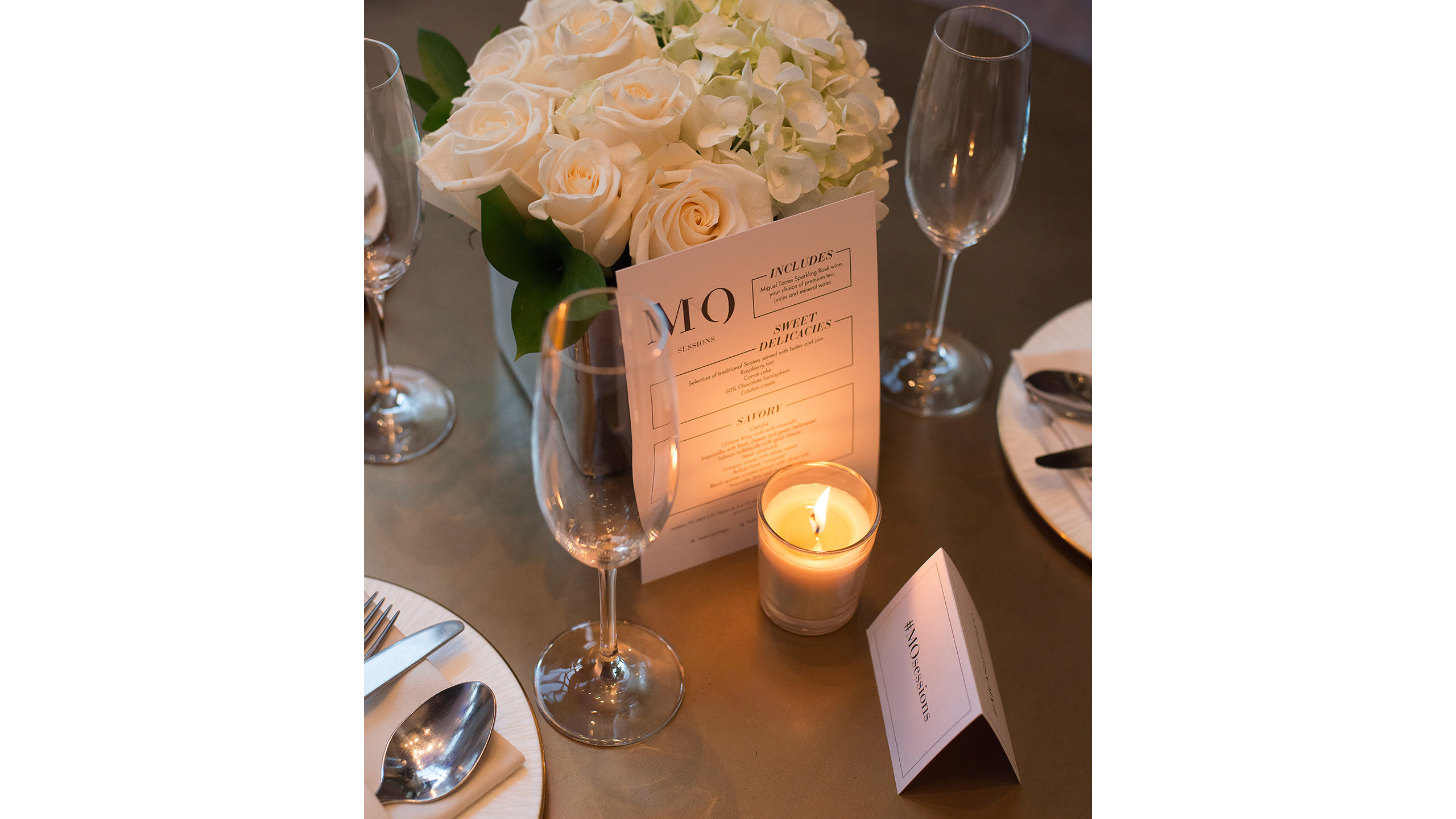
Exclusive iterations of MO Sessions (Mandarin Oriental, Santiago’s pre-weekend after office experience) profiling a selection of national and international gin brands, alongside sparkling wine, canapés and beats) were organized for lifestyle and beauty influencers and socialites to attend. In parallel, a Press Event and private tour of the hotel was held for journalists specializing in business, hospitality, food and wine. We also produced the official Ribbon-Cutting event, attended by the greater Mandarin Oriental Hotel Group community and other selected invitees.
Branding
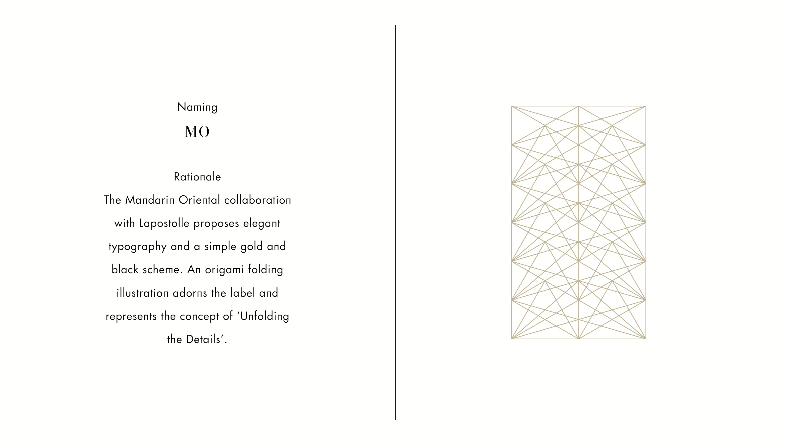
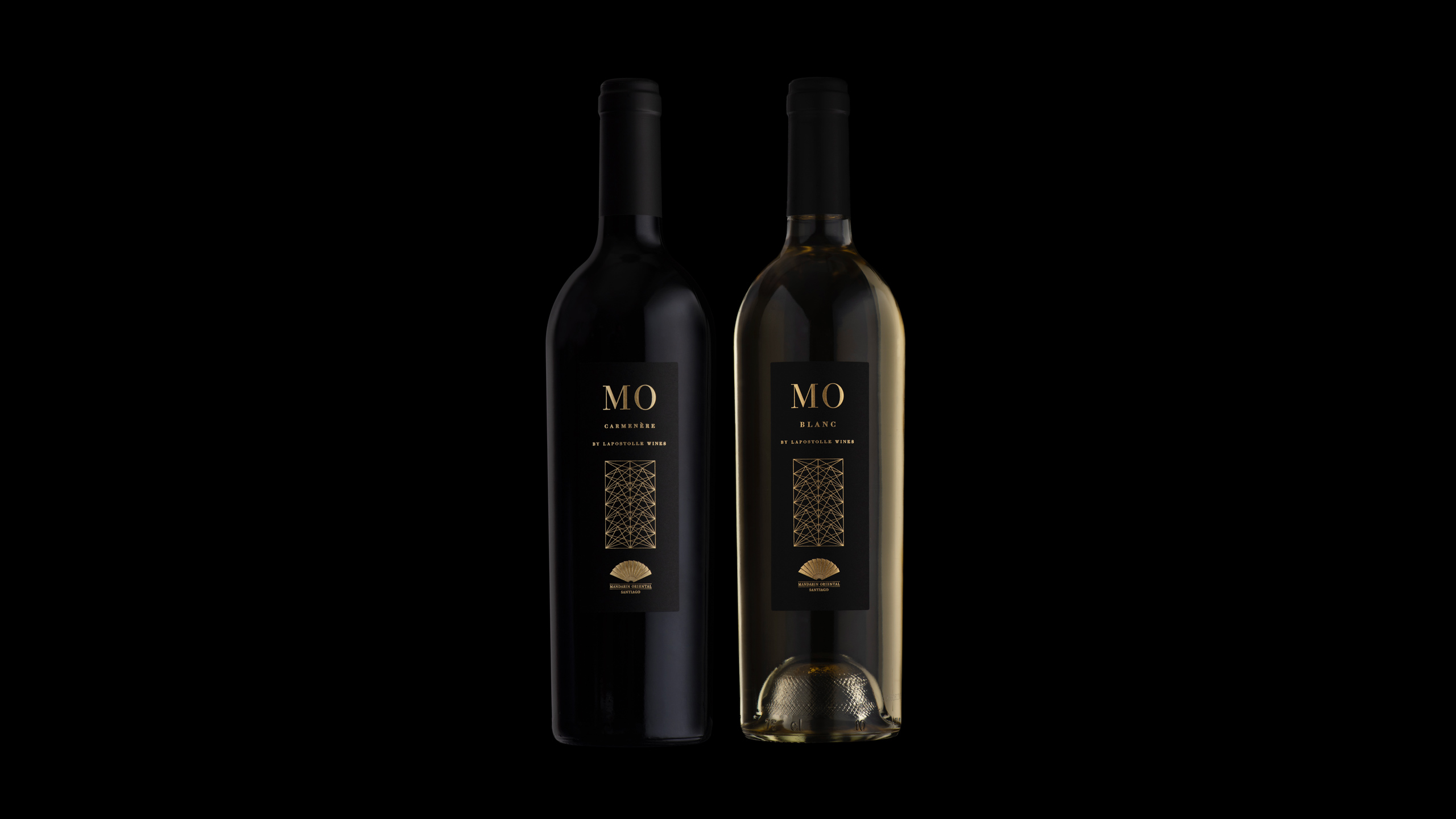
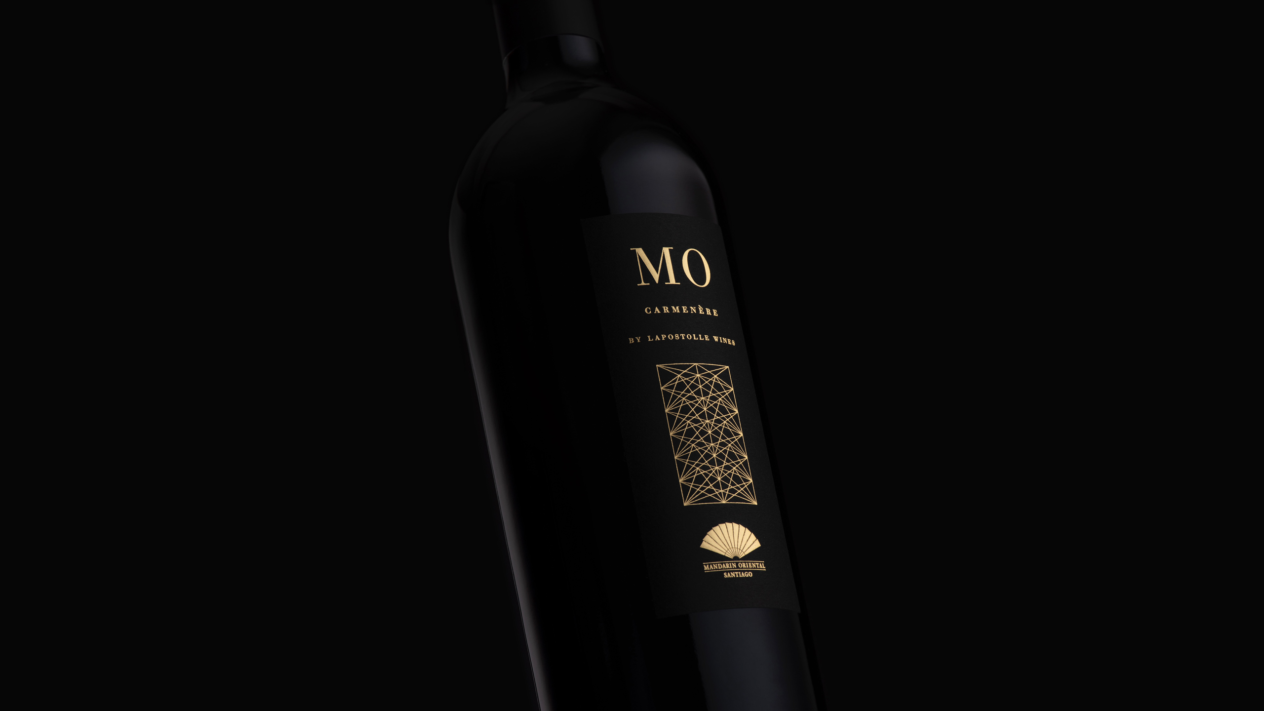
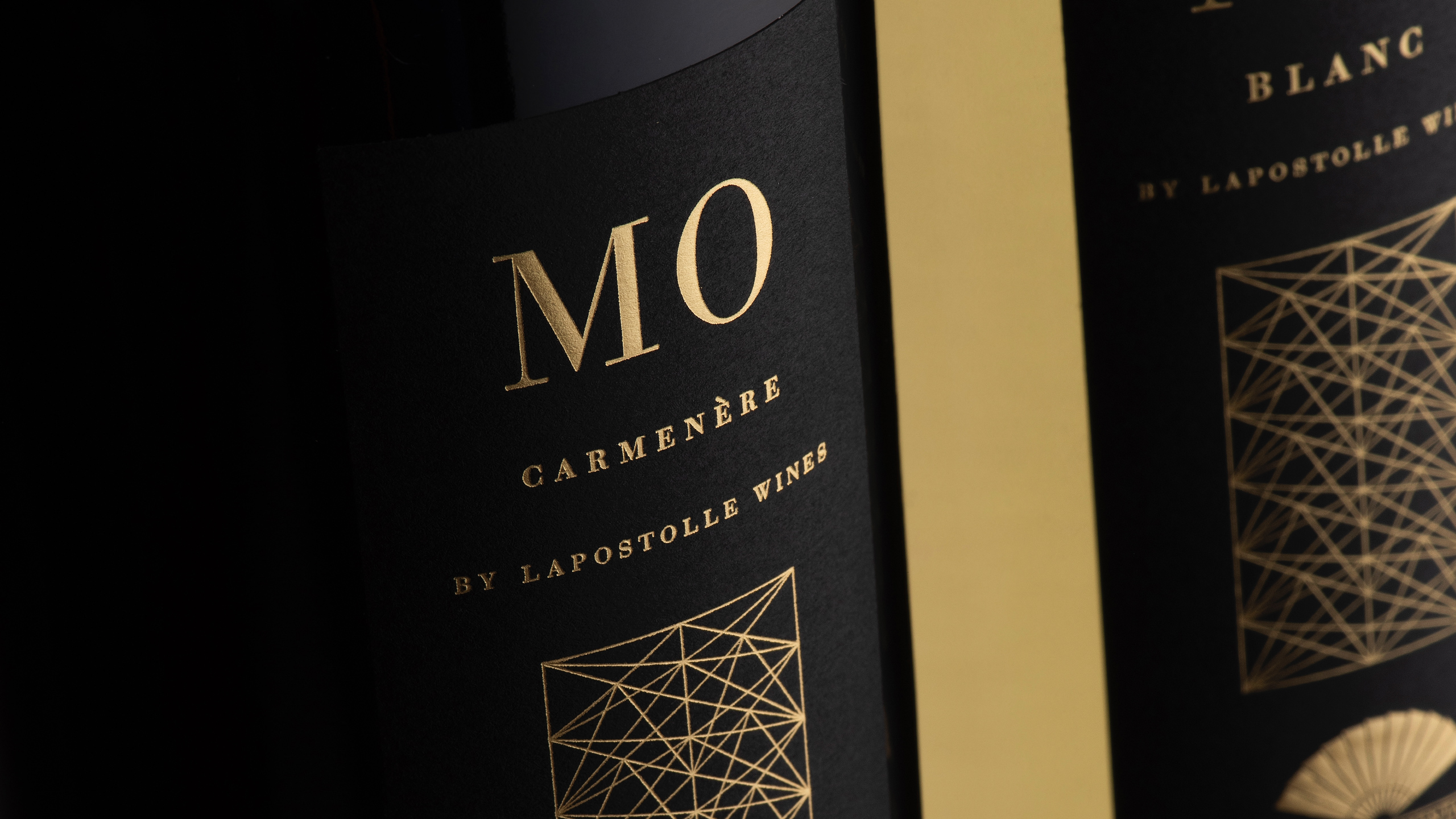
Though in operation for several months, MO Sessions required a new look and feel in keeping with the hotel’s official launch as Mandarin Oriental, Santiago. Inspired by the hotel’s Asian heritage and original fan motif, DAf’s designers created a new logo and typography featuring the initials “MO” and alluding to the act of folding.
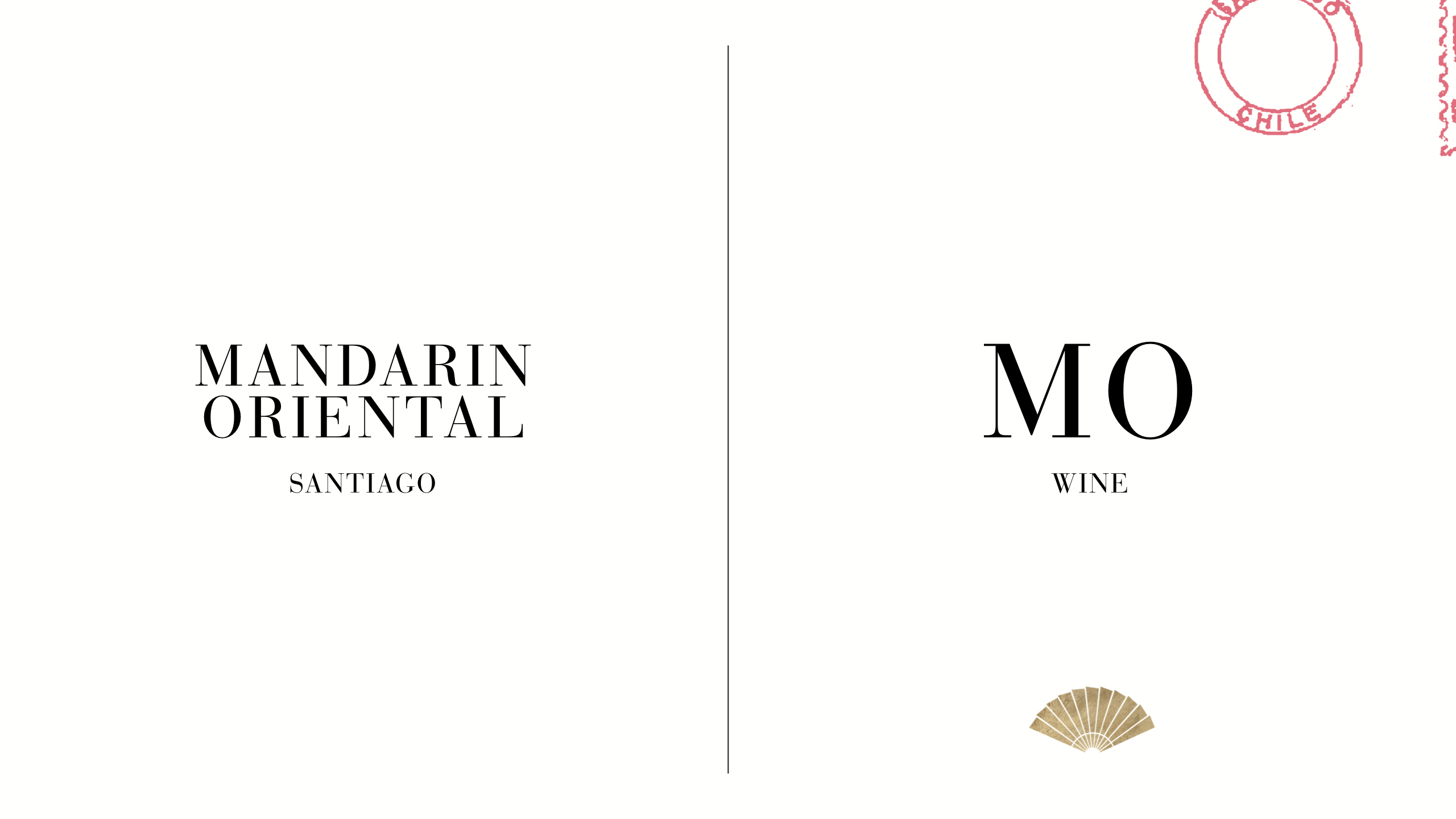
PACKAGING DESIGN
During the process, the opportunity to develop a below-the-line project arose; something additional and unexpected to offer guests and invite others to visit the hotel. Already in the process of creating a house wine, DAf proposed that this wine become something more strategic: A brand. From there MO—the Group’s first signature wine— was born, created in partnership with the enological team at esteemed winery Lapostolle.
The design alludes to an origami folding pattern, referencing the Group’s oriental heritage and representing the creative concept “Unfold the fan.”
Patricia Contreras September 29, 2020
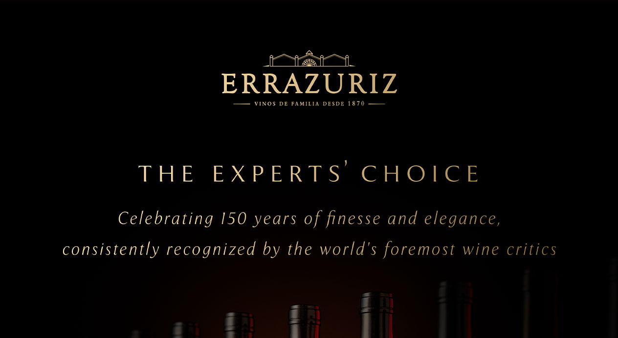
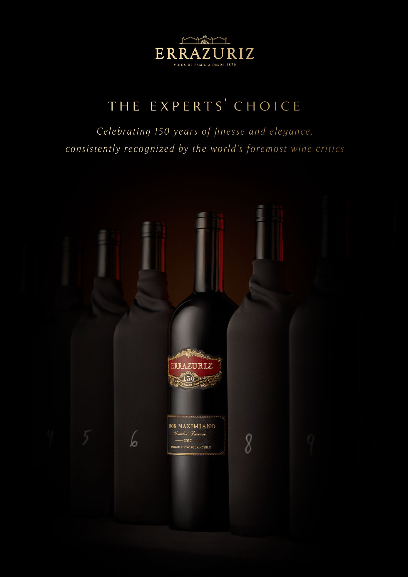
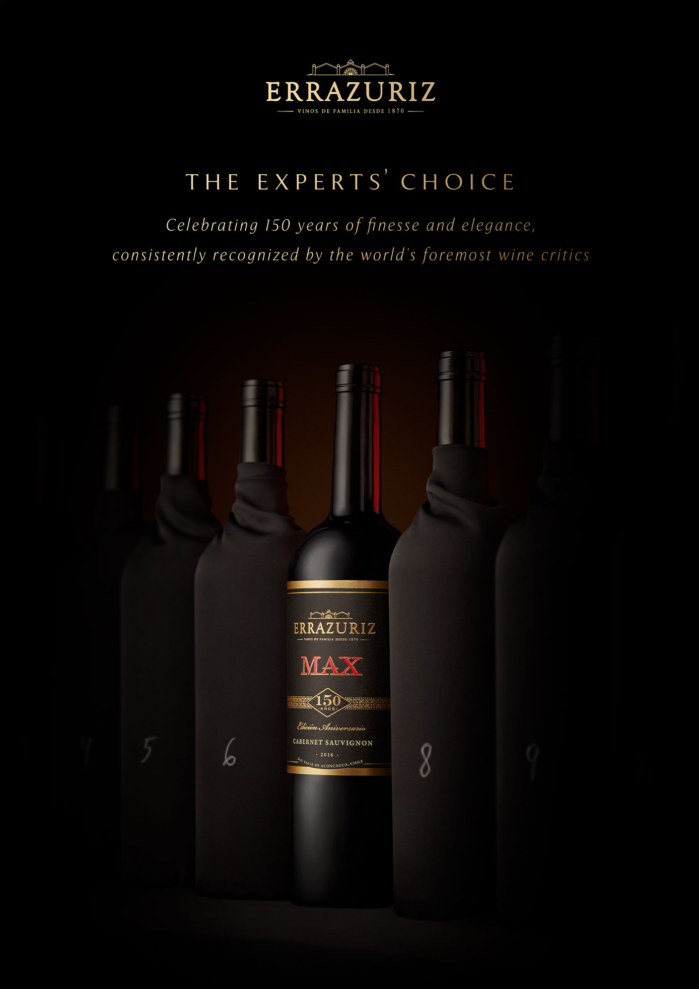
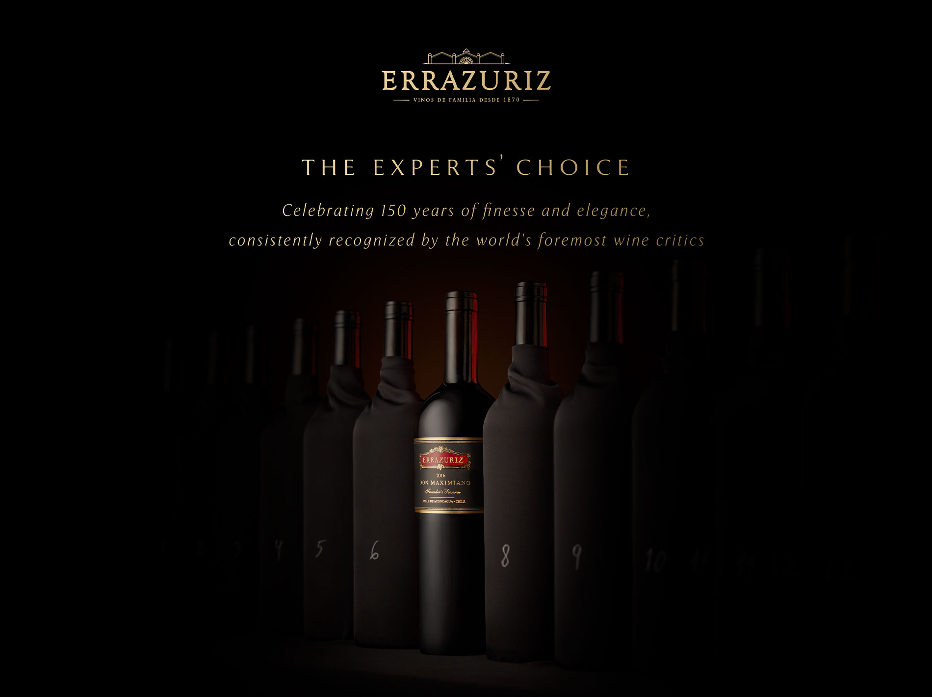
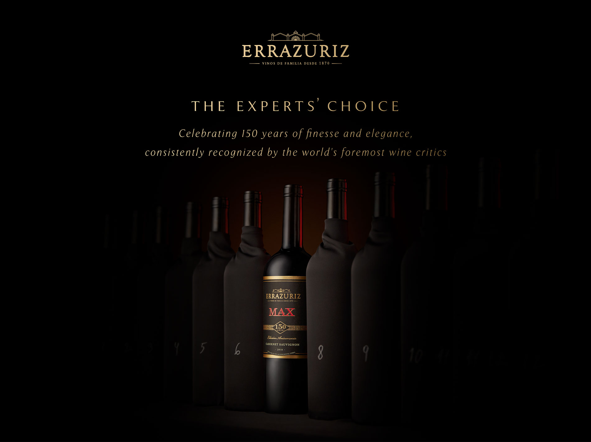
Challenge
Viña Errázuriz is a winery specialized in Chile’s Aconcagua Valley, having pioneered winemaking in the region upon their founding in 1870 by family ancestor Maximiano Errázuriz. To celebrate their 150th anniversary, Viña Errázuriz released a limited edition of their icon wine Don Maximiano Founder’s Reserve and portfolio favorite MAX.
The brand approached DAf to communicate the milestone of their anniversary and reinforce their credentials as a winery recognized internationally by experts for the quality of their portfolio.
Client |
Viña Errázuriz |
|
|
Capabilities |
Key Visuals |
|
|
Solution
The concept “The Experts’ Choice” refers to Viña Errázuriz’s standing as a Chilean winery consistently acclaimed by the world’s wine’s experts. It also subtly refers to the Berlin Tasting, in which the Chadwicks (descendants of Maximiano Errázuriz) pitted some of their icon wines against Europe’s top First Growths—and triumphed.
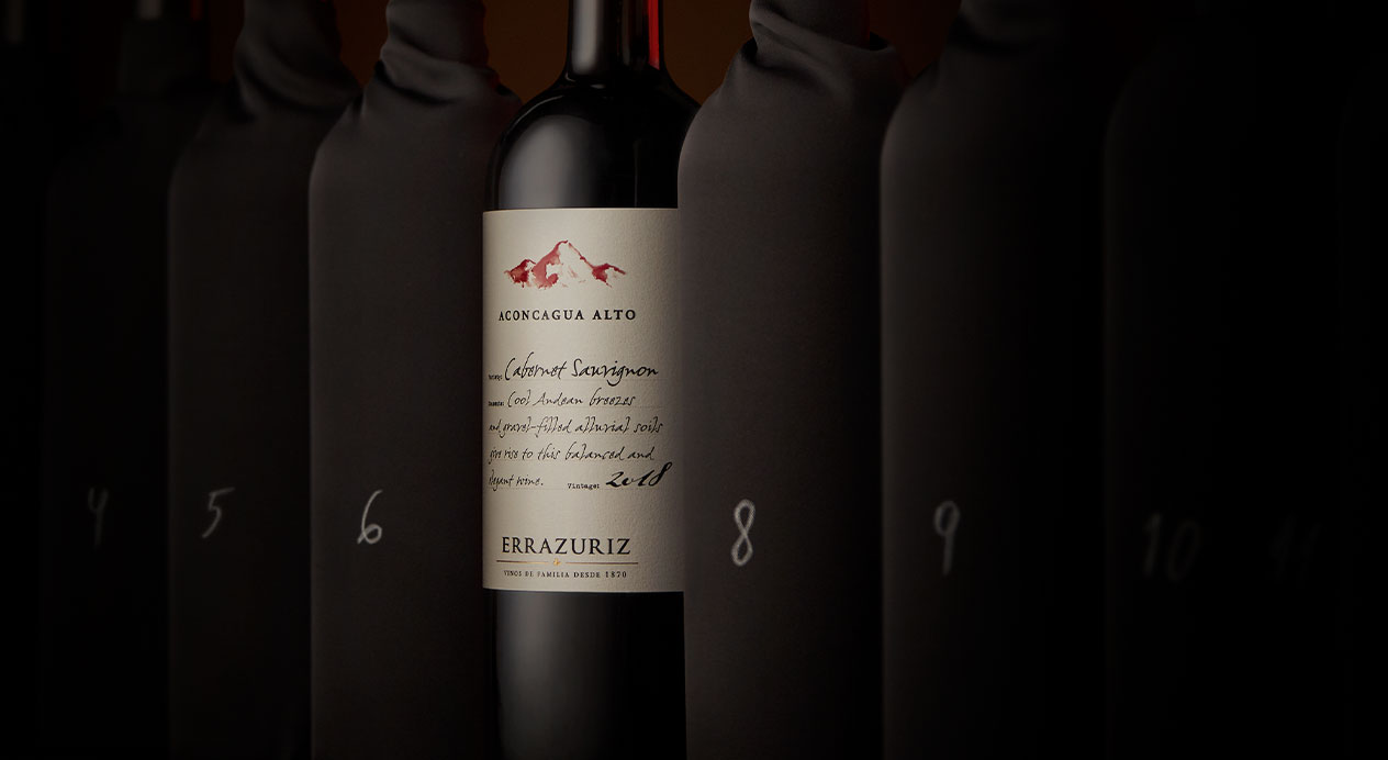
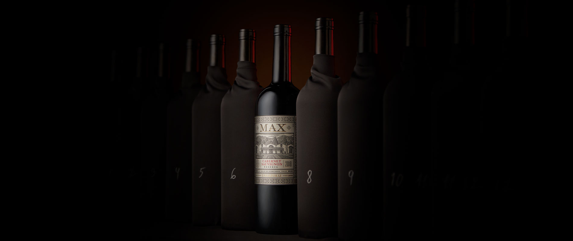
Key Visuals
The key visual takes cues from the world of blind wine tasting, revealing Viña Errázuriz’s brands as those worthy of mention at such events.
Patricia Contreras September 29, 2020